SwiftUI lessons (part 10)
link to part 9

Working with Navigation UI and Navigation Bar Customization
In most applications, you have come across a navigation interface. This type of user interface typically consists of a navigation bar and a list of data, allowing users to drill down to a detailed view when they click on content. In UIKit we implement this type of interface using UINavigationController. For SwiftUI, Apple created NavigationView, in iOS 16 it is known as NavigationStack. In this chapter, I'll walk you through the implementation of navigation views and show you how to make some customizations. As always, we will be working on a demo project so you can get hands-on experience with NavigationStack.
Preparing a start-up project
Let's start with the demo project that we did in the previous lesson; if you haven't done it yet, you'll have to go back there, including in order to dive into the context of table views. I hope you are familiar with this application, but if you forgot something, I still insist that you go through the previous lesson again. You should see this now.
Last time we stopped right here and now we are going to embed this table into the navigation stack.
Implementing Navigation Stack
Before iOS 16, SwiftUI provided us with a view like NavigationView to create navigation. To embed our table in a NavigationView, all we need to do is wrap the List with a NavigationView like this:
struct ContentView: View {
	var rockGroups = RockGroupData.data

	var body: some View {
		NavigationView {
			List(rockGroups) { group in
				RockCell(group: group)
					.listRowBackground(Color.red)
					.listRowSeparatorTint(.blue)
					.listRowInsets(EdgeInsets(top: 20, leading: 50, bottom: 20, trailing: 50))
			}
		.listStyle(.plain)
		}
	}
}
Please note that I removed the ability to ignore the safe area from the table; we will need this later so that we can set the name of our navigation bar.

So, as I said earlier in iOS 16, we have such an object as NavigationStack and NavigationView already has an information note that it will subsequently be deprecated, but if you are still on previous versions of the axis, then I had to show it to you . Now let's replace NavigationView with NavigationStack and move on.
struct ContentView: View {
	var rockGroups = RockGroupData.data

	var body: some View {
		NavigationStack {
			List(rockGroups) { group in
				RockCell(group: group)
					.listRowBackground(Color.red)
					.listRowSeparatorTint(.blue)
					.listRowInsets(EdgeInsets(top: 20, leading: 50, bottom: 20, trailing: 50))
			}
		.listStyle(.plain)
		}
	}
}
As you probably already noticed, nothing has changed externally, but at the same time we are using a modernized version of navigation than the one that Apple provided us earlier, let's finally set a title for our navigation bar, this is quite simple to do using the .navigationTitle modifier
struct ContentView: View {
	var rockGroups = RockGroupData.data

	var body: some View {
		NavigationStack {
			List(rockGroups) { group in
				RockCell(group: group)
					.listRowBackground(Color.red)
					.listRowSeparatorTint(.blue)
					.listRowInsets(EdgeInsets(top: 20, leading: 50, bottom: 20, trailing: 50))
			}
		.listStyle(.plain)
		.navigationTitle("Рок Группы")
		}
	}
}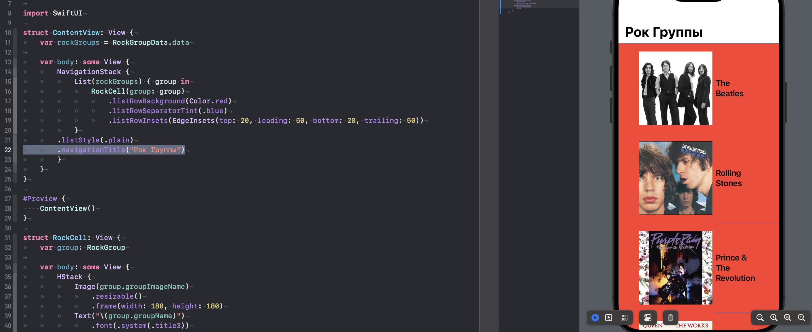
Now our application on this page has a title title, which by default has a large style, when scrolling the table it will be reduced – try scrolling the table

Passing Data to DetailView Using NavigationLink
So, we have added navigation to the project, but we do not use it as intended, in order to understand its capabilities, let's create a simple screen format for detailed display of our rock bands. This will simply be a screen with a large picture of a rock band and its name, of course in a regular application – you would provide the user with really detailed information of his choice, but here we have different learning goals.

Create a new SwiftUI View file and call it RockGroupView and add the following code there:
struct RockGroupView: View {
	var rockGroup: RockGroup

	var body: some View {
		VStack {
			Image(rockGroup.groupImageName)
				.resizable()
				.aspectRatio(contentMode: .fit)
			Text(rockGroup.groupName)
				.font(.system(.title, design: .rounded))
				.fontWeight(.black)
			Spacer()
		}
	}
}

#Preview {
	RockGroupView(rockGroup: RockGroupData.data.first!)
}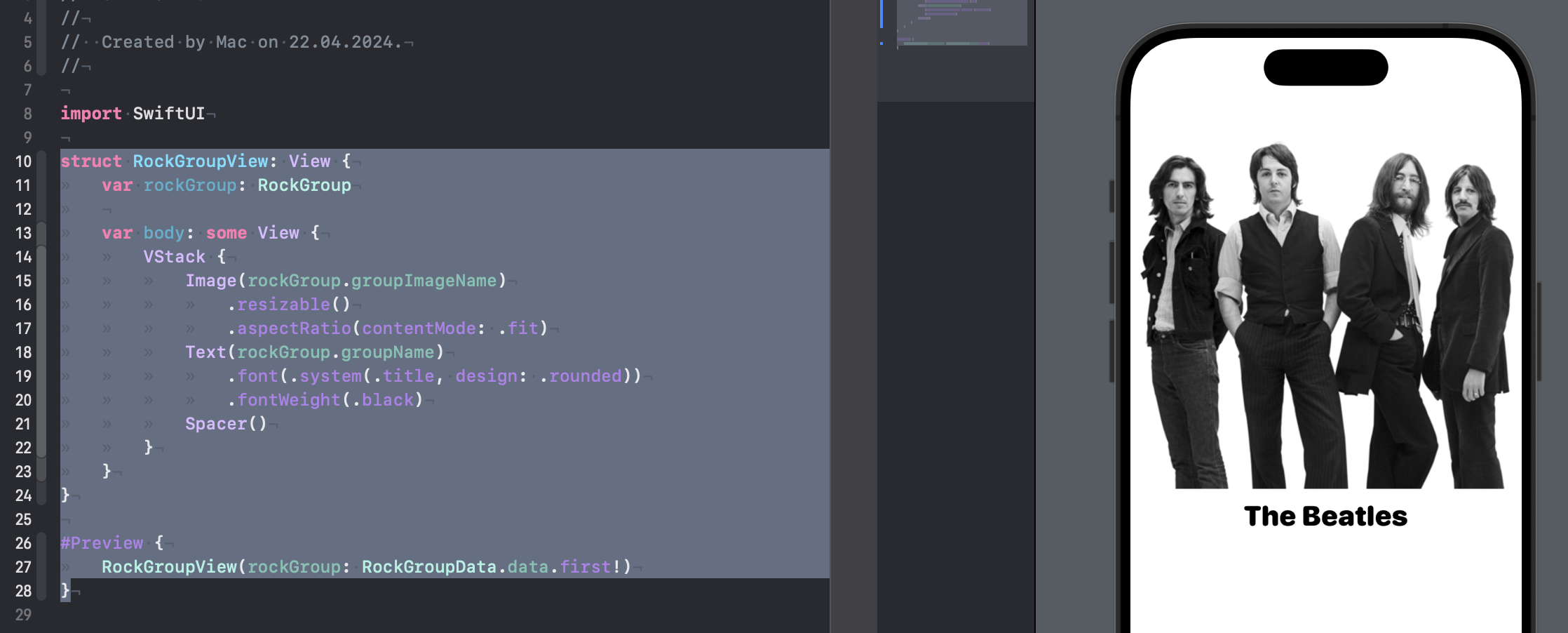
Before we move on, let me explain what we did here.
In the structure we defined the property rockGroup type RockGroupwhich represents the data model of a rock band and we use it to subsequently display exactly the group that our user selects.
In the body of the structure (var body: some View) we use a container VStackwhich arranges its children vertically and contains the following elements inside it:
Image(rockGroup.groupImageName)– creates an image from the file name, which is stored in the propertygroupImageNameobjectrockGroup. Modifiersresizable()AndaspectRatio(contentMode: .fit)resize the image so that it fits in width and height, maintaining proportions.Text(rockGroup.groupName)– creates text with the group name, which is stored in the propertygroupNameobjectrockGroup. Modifiersfont(.system(.title, design: .rounded))AndfontWeight(.black)set a title font with a rounded design and bold style.Spacer()– adds a gap that fills the remaining space between the text and the bottom of the containerVStack.
At the end of the code – in the preview (#Preview) for structure RockGroupView. We use the first element from the array RockGroupData.data to display an example interface in the SwiftUI editor.
Great, the knowledge has been refreshed – now let's move on to the most interesting part. In order to transfer some data along with movement using navigation, we can use such an entity as NavigationLink, it has a parameter such as destination to which we transfer the view to which we want to go. Well, in the body of this NavigationLink itself, we can place the View that will become our link for navigation.
NavigationLink(destination: DetailView()) {
    Text("Я похож на гиперссылку")
}
For example, this code would create text that, when clicked, would lead to a certain DetailView. But let's move from abstraction to real examples. Update your code in ContentView like this:
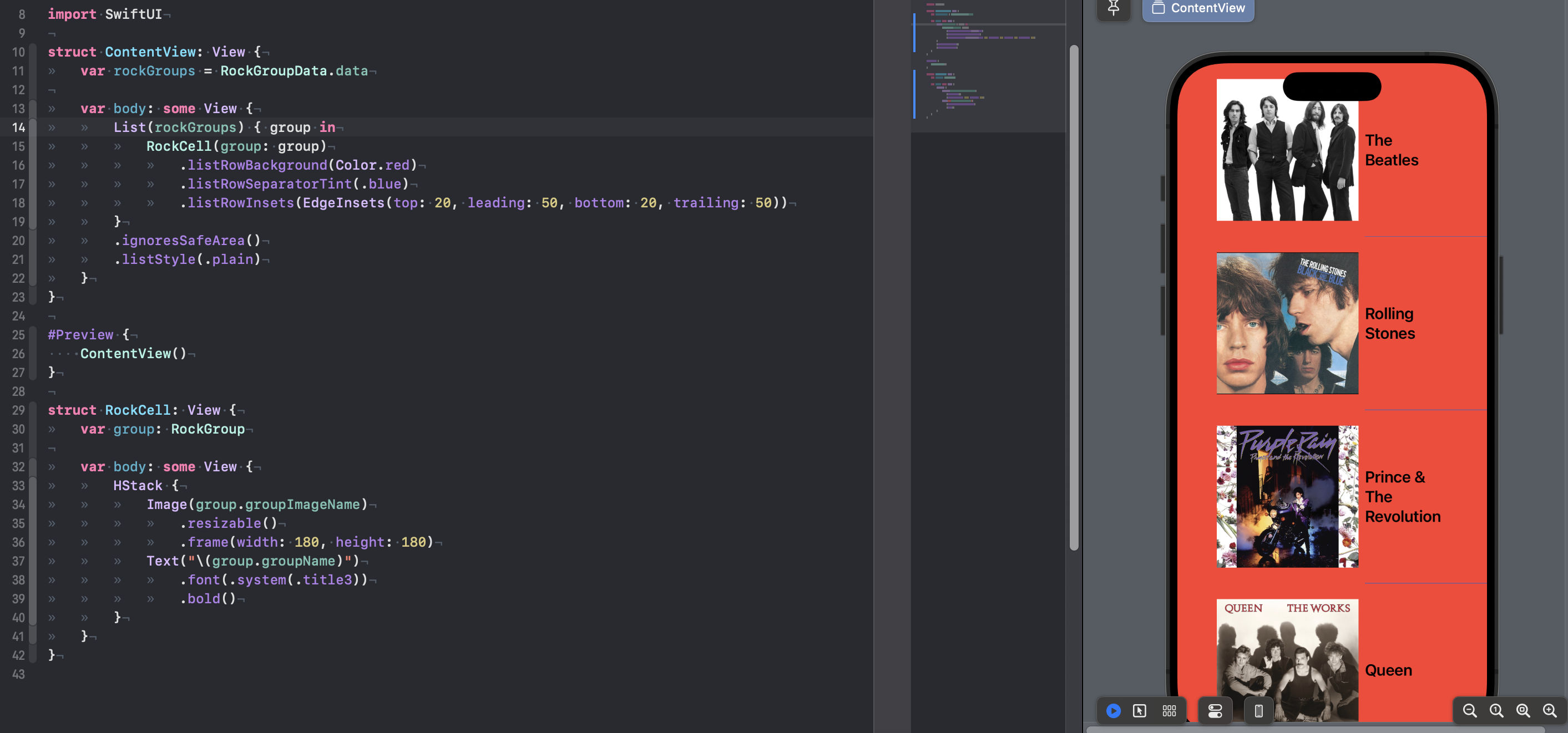
struct ContentView: View {
	var rockGroups = RockGroupData.data

	var body: some View {
		NavigationStack {
			List(rockGroups) { group in
				NavigationLink(destination: RockGroupView(rockGroup: group)) {
					RockCell(group: group)
						.listRowBackground(Color.red)
						.listRowSeparatorTint(.blue)
						.listRowInsets(EdgeInsets(top: 20, leading: 50, bottom: 20, trailing: 50))
				}

			}
			.listStyle(.plain)
			.navigationTitle("Рок Группы")
		}
	}
}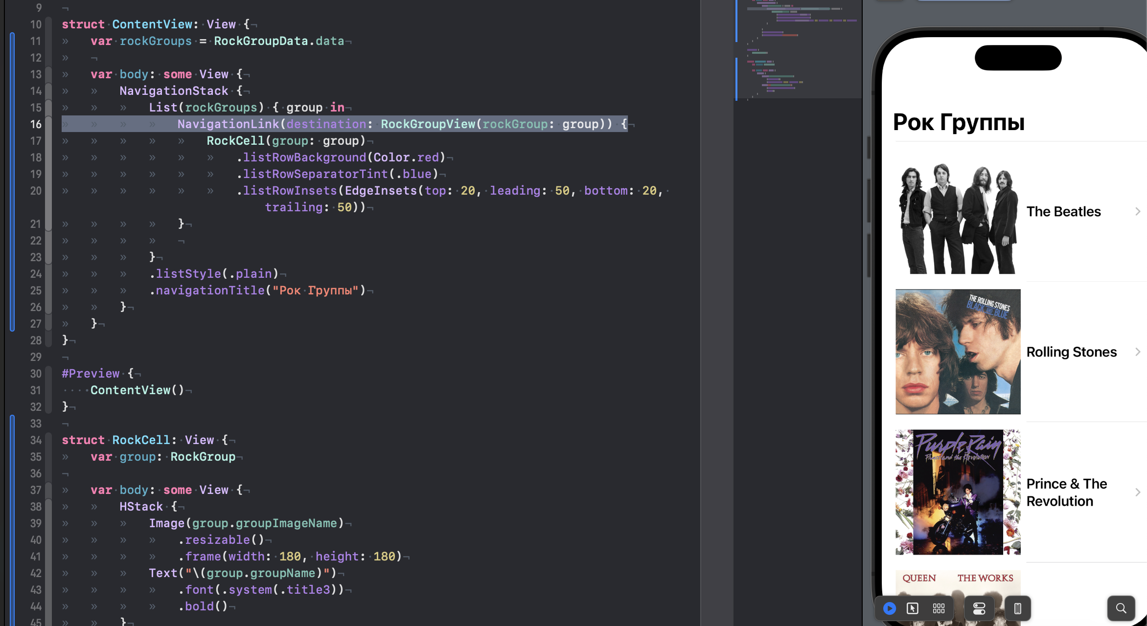
Congratulations, you have just created interactive cells that, when clicked, will take you to a screen with detailed information, specifically about the group you select!
Pay attention to the NavigationLink itself in the destination attribute, we passed the RockGroupView that we created earlier and passed to its initializer the very group that is associated with the cell that the user will subsequently click. At the same time, we placed our cells in the body of NavigationLink – that’s why they became interactive.
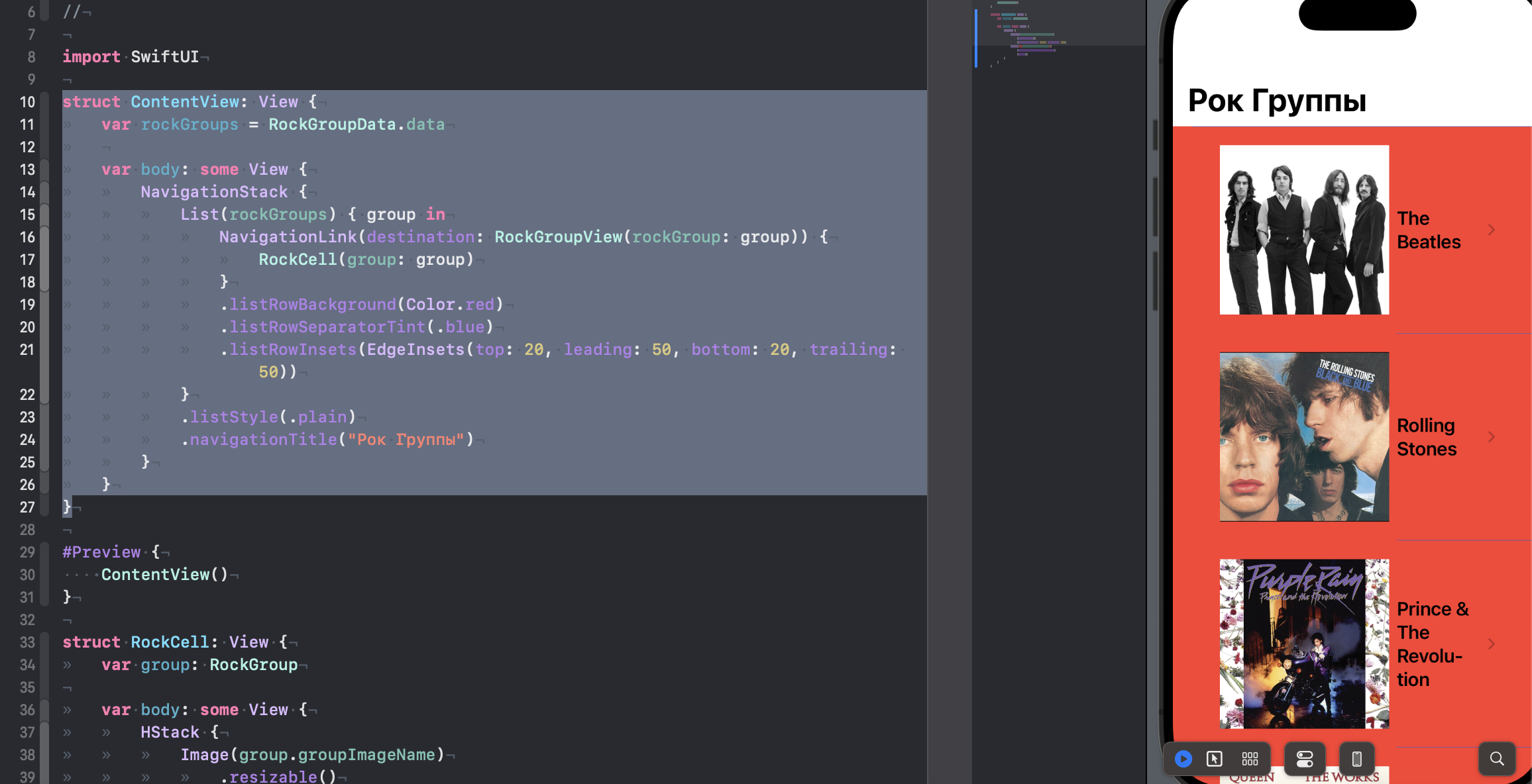
The most attentive people have probably already wondered, what happened to our cells? After all, they should be red!
The problem is that the modifier listRowBackground like other modifiers are applied to the cell RockCell – which is inside NavigationLink. When you click on a cell, NavigationLink becomes active and the background color of the cell is no longer visible because it is replaced by the background color of the active one NavigationLink.
To solve this problem, you can move the modifiers to NavigationLink. Change your code like this:
struct ContentView: View {
	var rockGroups = RockGroupData.data

	var body: some View {
		NavigationStack {
			List(rockGroups) { group in
				NavigationLink(destination: RockGroupView(rockGroup: group)) {
					RockCell(group: group)
				}
				.listRowBackground(Color.red)
				.listRowSeparatorTint(.blue)
				.listRowInsets(EdgeInsets(top: 20, leading: 50, bottom: 20, trailing: 50))
			}
			.listStyle(.plain)
			.navigationTitle("Рок Группы")
		}
	}
}
Customizing the Navigation Bar
First, let's figure out how to display the title text for our navigation bar. As you already understand, by default we are provided with large text, but if we want to initially be able to see our text in a different form, we can use the following modifier.
.navigationBarTitleDisplayMode(.inline)Let's add it to our code:
struct ContentView: View {
	var rockGroups = RockGroupData.data

	var body: some View {
		NavigationStack {
			List(rockGroups) { group in
				NavigationLink(destination: RockGroupView(rockGroup: group)) {
					RockCell(group: group)
				}
				.listRowBackground(Color.red)
				.listRowSeparatorTint(.blue)
				.listRowInsets(EdgeInsets(top: 20, leading: 50, bottom: 20, trailing: 50))
			}
			.listStyle(.plain)
			.navigationBarTitleDisplayMode(.inline)
			.navigationTitle("Рок Группы")
		}
	}
}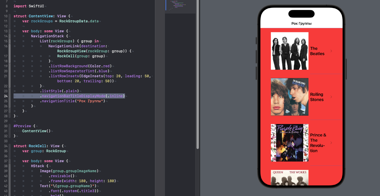
In the default state, this modifier works as .automatic, which gives us a large size, but you can use .inline if you need a compact option
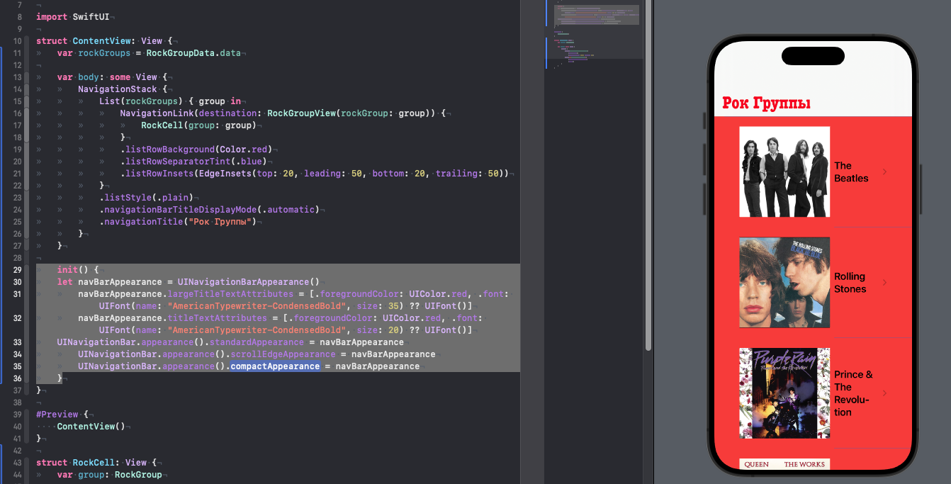
Let's go back to the big option again by setting:
.navigationBarTitleDisplayMode(.automatic)At the moment, Apple has not provided us with an easy way to customize our navigation bars, but I’m sure sooner or later they will get around to this tool, but for now we will have to use the power of UIKit
Let's add the following code inside our ContentView
	init() {
	let navBarAppearance = UINavigationBarAppearance()
		navBarAppearance.largeTitleTextAttributes = [.foregroundColor: UIColor.red, .font: UIFont(name: "AmericanTypewriter-CondensedBold", size: 35) ?? UIFont()]
		navBarAppearance.titleTextAttributes = [.foregroundColor: UIColor.red, .font: UIFont(name: "AmericanTypewriter-CondensedBold", size: 20) ?? UIFont()]
    	UINavigationBar.appearance().standardAppearance = navBarAppearance
		UINavigationBar.appearance().scrollEdgeAppearance = navBarAppearance
		UINavigationBar.appearance().compactAppearance = navBarAppearance
	}
In this code we customize the appearance of the navigation bar. This code is executed in the method init() when our View is loading
In the first line of code we create an instance of the class UINavigationBarAppearance. This class is used to customize the appearance of the navigation bar in your application.
In the next two lines of code, we set up the text attributes for the large title and the regular title. We set the text color to red and the font to “AmericanTypewriter-CondensedBold” with sizes 35 and 20 respectively. If the font “AmericanTypewriter-CondensedBold” is not available (but of course it will be available, Apple is just forcing us to secure the initializer because we could make a mistake and specify a non-existent font), we use the standard font.
In the last three lines of code, we apply the customized appearance to the standard, scrolling, and compact appearance of the navigation bar. We do this using properties standardAppearance, scrollEdgeAppearance And compactAppearance respectively. These properties are accessible through the class UINavigationBarand we use the method appearance()to access common appearance options for all navigation bars in the app.
Ultimately, this code customizes the appearance of the navigation bar in our application by changing the color and font of the headers and applying those changes to all navigation bars in the application.
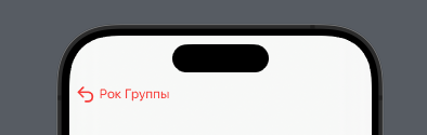
Back button and its color
When we move to the next screen using navigation, we see a button that can send us to the screen that led us to here

By default, this button is always blue and has a chevron facing left, but in fact you can change both the image and the color itself.
Let's start with the chevron, add this code to our initializer:
navBarAppearance.setBackIndicatorImage(UIImage(systemName: "arrow.uturn.left"), transitionMaskImage: UIImage(systemName: "arrow.uturn.left"))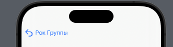
Great, now let's also change the color, for example also to red, add this modifier to your NavigationStack
.accentColor(.red)All code should look like this:
struct ContentView: View {
	var rockGroups = RockGroupData.data

	var body: some View {
		NavigationStack {
			List(rockGroups) { group in
				NavigationLink(destination: RockGroupView(rockGroup: group)) {
					RockCell(group: group)
				}
				.listRowBackground(Color.red)
				.listRowSeparatorTint(.blue)
				.listRowInsets(EdgeInsets(top: 20, leading: 50, bottom: 20, trailing: 50))
			}
			.listStyle(.plain)
			.navigationBarTitleDisplayMode(.automatic)
			.navigationTitle("Рок Группы")
		}
		.accentColor(.red)
	}

	init() {
	let navBarAppearance = UINavigationBarAppearance()
		navBarAppearance.largeTitleTextAttributes = [.foregroundColor: UIColor.red, .font: UIFont(name: "AmericanTypewriter-CondensedBold", size: 35) ?? UIFont()]
		navBarAppearance.titleTextAttributes = [.foregroundColor: UIColor.red, .font: UIFont(name: "AmericanTypewriter-CondensedBold", size: 20) ?? UIFont()]
		navBarAppearance.setBackIndicatorImage(UIImage(systemName: "arrow.uturn.left"), transitionMaskImage: UIImage(systemName: "arrow.uturn.left"))
		UINavigationBar.appearance().standardAppearance = navBarAppearance
		UINavigationBar.appearance().scrollEdgeAppearance = navBarAppearance
		UINavigationBar.appearance().compactAppearance = navBarAppearance
	}
}
And we got the following:
Not bad huh? But let's take it even further and try to customize the panel even more.
Custom back button
Instead of just using the tools given to us by UIKit, we can get our hands on another powerful tool – .toolbar
With it, we can actually make our button as custom as you can customize any button.
Before using this very toolbar, we need to remove our default back button
Let's go to our RockGroupView.swift and update the code as follows:
struct RockGroupView: View {
	var rockGroup: RockGroup

	var body: some View {
		VStack {
			Image(rockGroup.groupImageName)
				.resizable()
				.aspectRatio(contentMode: .fit)
			Text(rockGroup.groupName)
				.font(.system(.title, design: .rounded))
				.fontWeight(.black)
			Spacer()
		}
		.navigationBarBackButtonHidden(true)
	}
}
We just removed the back button and now if you go to this screen from the start screen, it will be a dead-end scenario with the path back cut off – let's fix that.
Let's add the following code to our RockGroupView immediately after the modifier that hides our default back button:
		.toolbar {
			ToolbarItem(placement: .topBarLeading) {
				Button {
					dismiss()
				} label: {
						Image(systemName: "laser.burst")
				}
			}
		}
For some reason, Xcode complains that it does not know any methods back, now we will fix this and I will explain everything to you, add this fragment above rockGroup: RockGroup
@Environment(\.dismiss) var dismissWhat kind of Environment is this? Environment is a special type of property that allows you to pass data between views without having to explicitly pass it through parameters. This avoids creating long parameter chains between views, making the code more readable and easier to maintain.
SwiftUI has many built-in environment properties that you can use in your views. For example, property colorScheme allows you to define the current color scheme (light or dark), property timeZone allows you to find out the current time zone, and the property managedObjectContext provides access to the Core Data context, but in fact there are a lot of these properties, I recommend that you familiarize yourself with them separately.
Actually, .dismiss gave us access to the dismiss() method, which allows us to close the current screen; we call it, as you understand, when we click on our button in the toolbar.
Let's look at the toolbar step by step:
.toolbar { ... }is a modifier that adds a toolbar to the view. Inside the modifier we specify the contents of the toolbar.ToolbarItem(placement: .topBarLeading) { ... }is a container that specifies where the button should be located on the toolbar. In this case, we specify that the button should be located at the top left of the toolbar.Button { ... } label: { ... }is a button that will appear on the toolbar. First block of code ({ ... }) specifies the action to be performed when the button is clicked, and the second block of code (label: { ... }) indicates the label of the button.dismiss()– This is the action that is called when the button is clicked. In this case we call the functiondismiss()which closes the current view.Image(systemName: "laser.burst")is the label of the button that appears on the toolbar. In this case, we specify that the label should be an image of the system name “laser.burst”.In fact, as you understand, the body of the toolbar can contain whatever you want, even a picture, even text, even text and a picture (try experimenting here)
Results
Navigation is an important element of your application, without it you will not be able to build an application that will guide your user through screens that contain features developed by you or your team, experiment and try adding different buttons to the navigation bar, try making a detailed view that, for example, has a ScrollView instead of a table and place a picture on top of it that will shrink if Scroll is swiped up and, on the contrary, increase if it is swiped down (a fairly common scenario in many applications).
By the way, you can achieve this or a similar effect without the participation of the navigation bar (you can hide it altogether)
One More Thing
As an example, I’ll leave you with an extension for our application that will show you an effect with a stretching header in a detailed view.
Update your ContenView like this:
struct ContentView: View {
	var rockGroups = RockGroupData.data

	var body: some View {
		NavigationStack {
			List(rockGroups) { group in
				NavigationLink(destination: struct ContentView: View {
	var rockGroups = RockGroupData.data

	var body: some View {
		NavigationStack {
			List(rockGroups) { group in
				NavigationLink(destination: RockParalax(imageName: group.groupImageName)) {
					RockCell(group: group)
				}
				.listRowBackground(Color.red)
				.listRowSeparatorTint(.blue)
				.listRowInsets(EdgeInsets(top: 20, leading: 50, bottom: 20, trailing: 50))
			}
			.listStyle(.plain)
			.navigationBarTitleDisplayMode(.automatic)
			.navigationTitle("Рок Группы")
		}
		.accentColor(.red)
	}

	init() {
	let navBarAppearance = UINavigationBarAppearance()
		navBarAppearance.largeTitleTextAttributes = [.foregroundColor: UIColor.red, .font: UIFont(name: "AmericanTypewriter-CondensedBold", size: 35) ?? UIFont()]
		navBarAppearance.titleTextAttributes = [.foregroundColor: UIColor.red, .font: UIFont(name: "AmericanTypewriter-CondensedBold", size: 20) ?? UIFont()]
		navBarAppearance.setBackIndicatorImage(UIImage(systemName: "arrow.uturn.left"), transitionMaskImage: UIImage(systemName: "arrow.uturn.left"))
		UINavigationBar.appearance().standardAppearance = navBarAppearance
		UINavigationBar.appearance().scrollEdgeAppearance = navBarAppearance
		UINavigationBar.appearance().compactAppearance = navBarAppearance
	}
}

#Preview {
    ContentView()
}

struct RockCell: View {
	var group: RockGroup

	var body: some View {
		HStack {
			Image(group.groupImageName)
				.resizable()
				.frame(width: 180, height: 180)
			Text("\(group.groupName)")
				.font(.system(.title3))
				.bold()
		}
	}
}(imageName: group.groupImageName)) {
					RockCell(group: group)
				}
				.listRowBackground(Color.red)
				.listRowSeparatorTint(.blue)
				.listRowInsets(EdgeInsets(top: 20, leading: 50, bottom: 20, trailing: 50))
			}
			.listStyle(.plain)
			.navigationBarTitleDisplayMode(.automatic)
			.navigationTitle("Рок Группы")
		}
		.accentColor(.red)
	}

	init() {
	let navBarAppearance = UINavigationBarAppearance()
		navBarAppearance.largeTitleTextAttributes = [.foregroundColor: UIColor.red, .font: UIFont(name: "AmericanTypewriter-CondensedBold", size: 35) ?? UIFont()]
		navBarAppearance.titleTextAttributes = [.foregroundColor: UIColor.red, .font: UIFont(name: "AmericanTypewriter-CondensedBold", size: 20) ?? UIFont()]
		navBarAppearance.setBackIndicatorImage(UIImage(systemName: "arrow.uturn.left"), transitionMaskImage: UIImage(systemName: "arrow.uturn.left"))
		UINavigationBar.appearance().standardAppearance = navBarAppearance
		UINavigationBar.appearance().scrollEdgeAppearance = navBarAppearance
		UINavigationBar.appearance().compactAppearance = navBarAppearance
	}
}

#Preview {
    ContentView()
}

struct RockCell: View {
	var group: RockGroup

	var body: some View {
		HStack {
			Image(group.groupImageName)
				.resizable()
				.frame(width: 180, height: 180)
			Text("\(group.groupName)")
				.font(.system(.title3))
				.bold()
		}
	}
}
Create a RockParalax file and update its code as follows:
import SwiftUI

struct RockParalax: View {
	@Environment(\.dismiss) var dismiss
	var imageName: String

	var body: some View {
		ScrollView {
			LazyVStack(alignment: .leading, spacing: 15, pinnedViews: [.sectionHeaders], content: {
				GeometryReader { reader -> AnyView in
					let offset = reader.frame(in: .global).minY
					return AnyView(
						Image(imageName)
							.resizable()
							.aspectRatio(contentMode: .fill)
							.frame(width: UIScreen.main.bounds.width, height: 250 + (offset > 0 ? offset : 0))
							.cornerRadius(2)
							.offset(y: (offset > 0 ? -offset : 0))
							.overlay(
								HStack {
									Button(action: { dismiss() }, label: {
										Image(systemName: "arrow.left")
											.font(.system(size: 20, weight: .bold))
											.foregroundColor(.red)
									})

									Spacer()

									Button(action: {}, label: {
										Image(systemName: "suit.heart.fill")
											.font(.system(size: 20, weight: .bold))
											.foregroundColor(.red)
									})
								}
									.padding(), alignment: .top
							)
					)
				}
				.frame(height: 250)
				Section() {
					ForEach(1..<70) { index in
						Text("\(index)")
							.font(.title)
							.foregroundColor(.black)
							.padding()
							.background(Color.gray.opacity(0.2))
							.cornerRadius(10)
					}
				}
			}
			)
		}
		.navigationBarHidden(true)
	}
}


struct RockParalax_Previews: PreviewProvider {
	static var previews: some View {
		RockParalax(imageName: "The Jimi Hendrix")
	}
}
Try to figure out for yourself how it happened that now our image reacts to the table swipe, increasing when we swipe down and decreasing when we release the table, and what’s even more interesting is how it happened that we seem to have a navigation bar, and it’s also the same – .navigationBarHidden(true)
And that’s all, the next parts of the lessons on SwiftUI will be released soon, so I recommend practicing with what you learned today and come back again for a new portion of knowledge on SwiftUI.
As before, subscribe to my telegram channel – https://t.me/swiftexplorer
I will be glad to see your comments and likes!
Thanks for reading!