SwiftUI tutorials (part 4)
Understanding ScrollView and creating a carousel UI
link to part 3

In this lesson we will deal with such an element as ScrollView for creating long scrolling canvases. It often happens that our content is too large but at the same time static, because of this, the use of tables or collections UITableView or UICollectionView is simply impractical, so their parent UIScrollView is used, in our particular case we will use the SUI analogue – ScrollView, and we will create such a carousel :
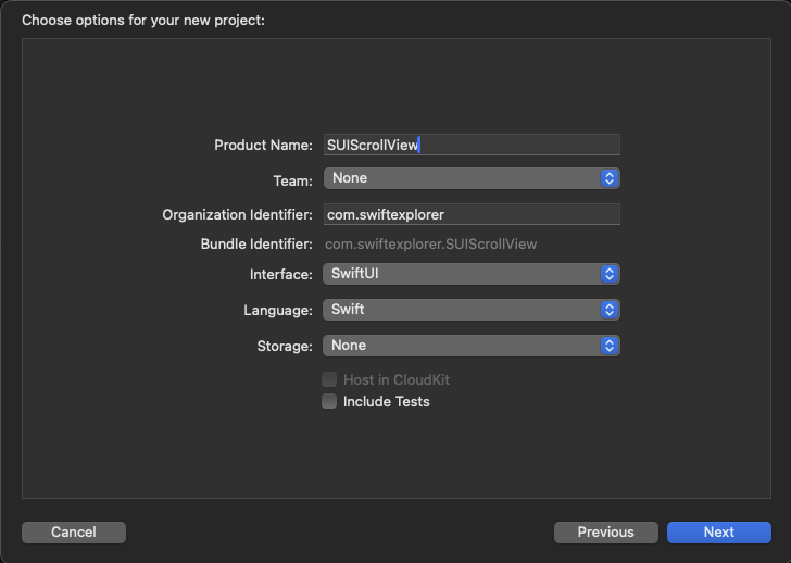
Let's start by creating a new project and calling it SUIScrollView, of course you can name it whatever you like. Select a folder to store the project and, as usual, Xcode will generate a ContentView for us, which we will not work with in the first place.
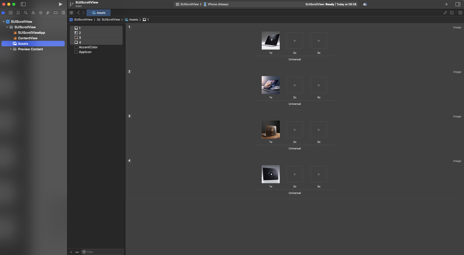
Let's start by adding the pictures that I prepared for you at this link https://disk.yandex.ru/d/WeyQ0sotD8Lq0g download and unzip the archive with pictures and transfer them to the assets directory as we already did in previous lessons.
Now our task is to use the knowledge from past lessons to create a product card

Try to create such a card yourself; if something doesn’t work out, it’s okay, now we will do it together with you.
Let's create a new SwiftUIView file, in which we will make our card
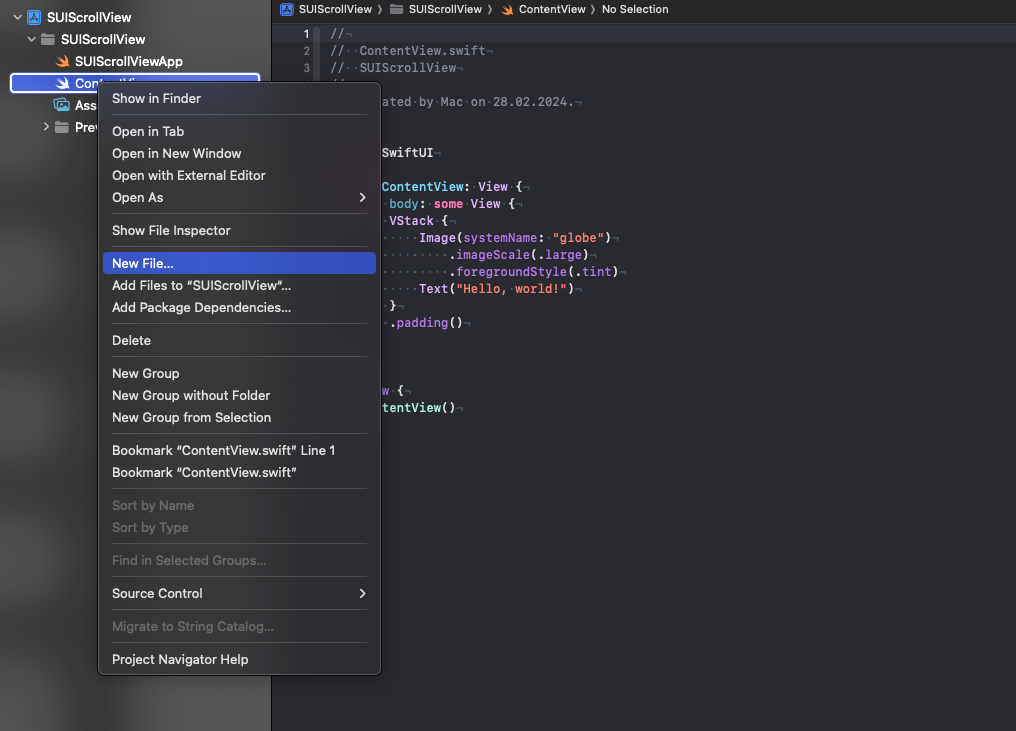
Select SwiftUI View and name the file CardView
Xcode has generated a new file for us in which we will work
Let's first of all decide that our picture and text will actually be located in a stackview that arranges the elements vertically inside itself, add a stackview and a picture
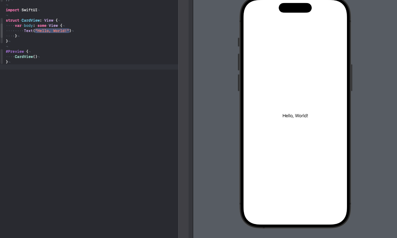
struct CardView: View {
    var body: some View {
		VStack {
			Image("1")
				.resizable()
		}
    }
}
We added resizable because we want our image to subsequently adapt to the containers in which we will place it; do not be alarmed that the image will stretch across the entire device.
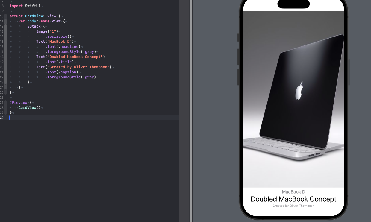
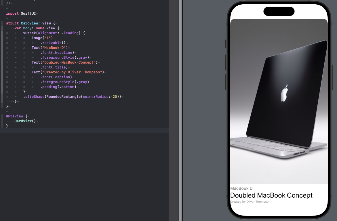
Next we will add text, we will have three text elements (headline, title, caption) and update our code under the image
struct CardView: View {
    var body: some View {
		VStack {
			Image("1")
				.resizable()
			Text("MacBook D")
				.font(.headline)
				.foregroundStyle(.gray)
			Text("Doubled MacBook Concept")
				.font(.title)
			Text("Created by Oliver Thompson")
				.font(.caption)
				.foregroundStyle(.gray)
		}
    }
}
Now we need to align our text from the left border, I remind you that this is done through the property of the stack itself
		VStack(alignment: .leading) {
			Image("1")
				.resizable()
			Text("MacBook D")
				.font(.headline)
				.foregroundStyle(.gray)
			Text("Doubled MacBook Concept")
				.font(.title)
			Text("Created by Oliver Thompson")
				.font(.caption)
				.foregroundStyle(.gray)
		}
We also need to round the edges of our card, but keep in mind that when rounding, the lowest text may be cut off, so we need to somehow get around this situation
struct CardView: View {
    var body: some View {
		VStack(alignment: .leading) {
			Image("1")
				.resizable()
			Text("MacBook D")
				.font(.headline)
				.foregroundStyle(.gray)
			Text("Doubled MacBook Concept")
				.font(.title)
			Text("Created by Oliver Thompson")
				.font(.caption)
				.foregroundStyle(.gray)
				.padding(.bottom)
		}
		.clipShape(RoundedRectangle(cornerRadius: 20))
    }
}
I added a clipShape to round out our entire VStack and added a bottom padding .padding(.bottom) for our last text in the list to achieve the desired effect. In principle, our product card is ready, but now it is not universal, let's create properties for this structure with which we will subsequently fill out our cards in the ContentView
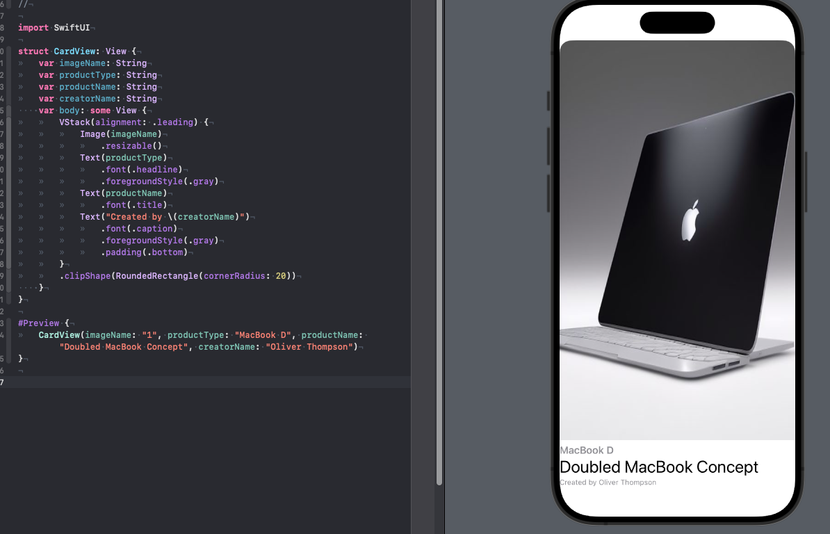
struct CardView: View {
	var imageName: String
	var productType: String
	var productName: String
	var creatorName: String
    var body: some View {
		VStack(alignment: .leading) {
			Image(imageName)
				.resizable()
			Text(productType)
				.font(.headline)
				.foregroundStyle(.gray)
			Text(productName)
				.font(.title)
			Text("Created by \(creatorName)")
				.font(.caption)
				.foregroundStyle(.gray)
				.padding(.bottom)
		}
		.clipShape(RoundedRectangle(cornerRadius: 20))
    }
}
After adding these properties, our preview complains that it does not have enough data to render
Let's add this data
#Preview {
	CardView(imageName: "1", productType: "MacBook D", productName: "Doubled MacBook Concept", creatorName: "Oliver Thompson")
}
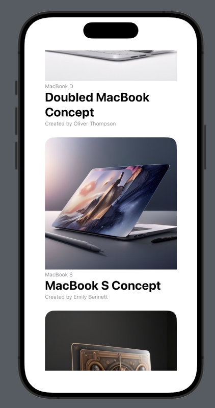
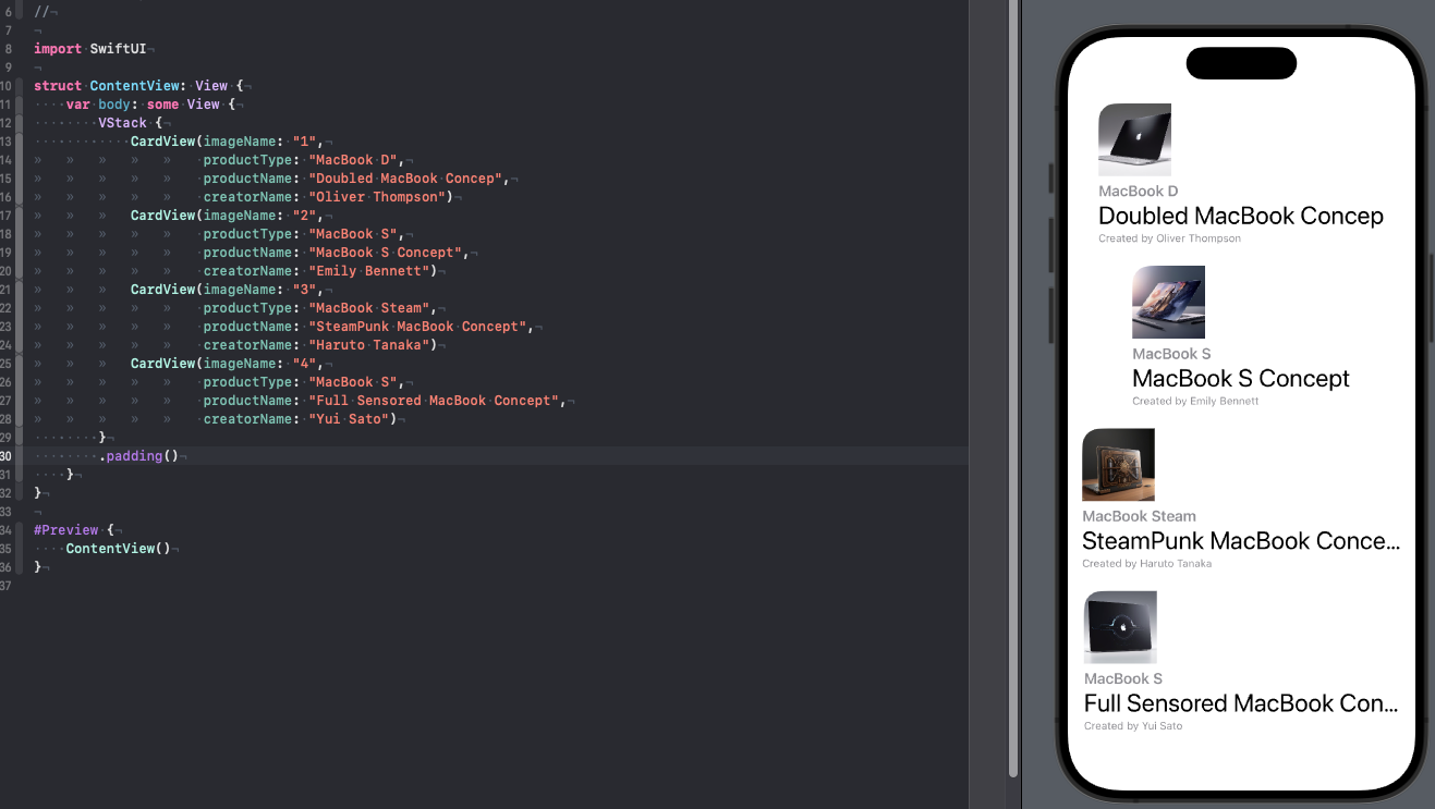
Great, our food card is ready, let's add four copies of these cards to our ContentView
struct ContentView: View {
    var body: some View {
        VStack {
            CardView(imageName: "1",
					 productType: "MacBook D",
					 productName: "Doubled MacBook Concep",
					 creatorName: "Oliver Thompson")
			CardView(imageName: "2",
					 productType: "MacBook S",
					 productName: "MacBook S Concept",
					 creatorName: "Emily Bennett")
			CardView(imageName: "3",
					 productType: "MacBook Steam",
					 productName: "SteamPunk MacBook Concept",
					 creatorName: "Haruto Tanaka")
			CardView(imageName: "4",
					 productType: "MacBook S",
					 productName: "Full Sensored MacBook Concept",
					 creatorName: "Yui Sato")
        }
        .padding()
    }
}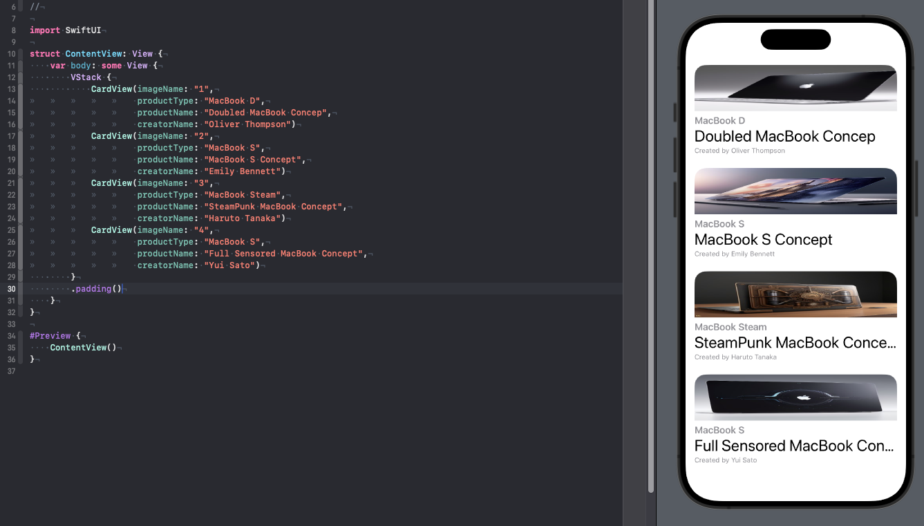
Overall not bad, but we definitely need to force the images to be displayed in their resolution, let's go back to CardView and add aspectRatio
struct CardView: View {
	var imageName: String
	var productType: String
	var productName: String
	var creatorName: String
    var body: some View {
		VStack(alignment: .leading) {
			Image(imageName)
				.resizable()
				.aspectRatio(contentMode: .fit)
			Text(productType)
				.font(.headline)
				.foregroundStyle(.gray)
			Text(productName)
				.font(.title)
			Text("Created by \(creatorName)")
				.font(.caption)
				.foregroundStyle(.gray)
				.padding(.bottom)
		}
		.clipShape(RoundedRectangle(cornerRadius: 20))
    }
}
Our content has moved out again, but don’t worry – this is due to the fact that in SUI all content tries to fill the space that we give it to fill, at the current moment in time we have a vertical stack that contains four complex cards, it compresses the content as much as possible this is possible, as you can see in some places he even shortened the lines of text. Let's add our VStack to ScrollView
struct ContentView: View {
    var body: some View {
		ScrollView {
			VStack {
				CardView(imageName: "1",
						 productType: "MacBook D",
						 productName: "Doubled MacBook Concept",
						 creatorName: "Oliver Thompson")
				CardView(imageName: "2",
						 productType: "MacBook S",
						 productName: "MacBook S Concept",
						 creatorName: "Emily Bennett")
				CardView(imageName: "3",
						 productType: "MacBook Steam",
						 productName: "SteamPunk MacBook Concept",
						 creatorName: "Haruto Tanaka")
				CardView(imageName: "4",
						 productType: "MacBook S",
						 productName: "Full Sensored MacBook Concept",
						 creatorName: "Yui Sato")
			}
			.padding()
		}
    }
}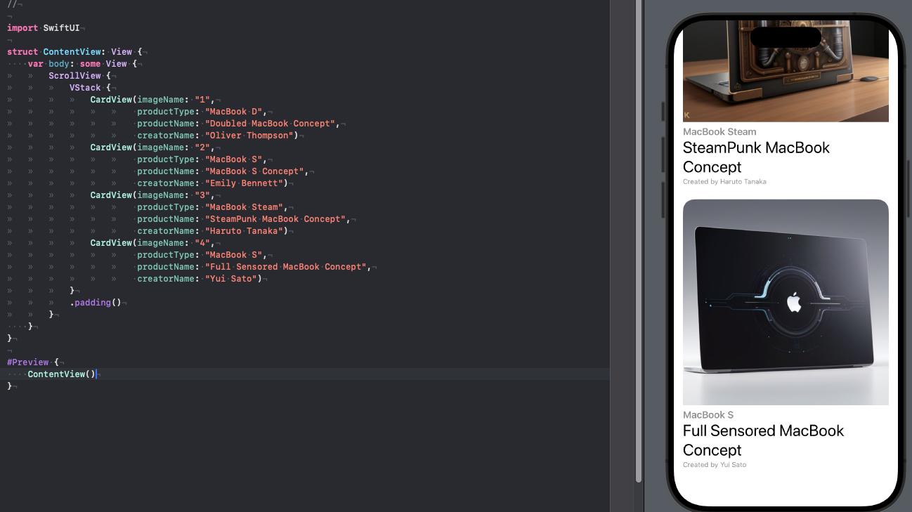
It may seem strange, but in principle we are here only for this reason, and that seems to be all.
But let’s first try to see what will happen if we make our scrollview horizontal, and secondly, you noticed that we have a scroll indicator, it can also be turned off using the scrollIndicators modifier. Of course, if we want our content to be displayed horizontally, then it should be placed in HStack
struct ContentView: View {
    var body: some View {
		ScrollView(.horizontal) {
			HStack {
				CardView(imageName: "1",
						 productType: "MacBook D",
						 productName: "Doubled MacBook Concept",
						 creatorName: "Oliver Thompson")
				CardView(imageName: "2",
						 productType: "MacBook S",
						 productName: "MacBook S Concept",
						 creatorName: "Emily Bennett")
				CardView(imageName: "3",
						 productType: "MacBook Steam",
						 productName: "SteamPunk MacBook Concept",
						 creatorName: "Haruto Tanaka")
				CardView(imageName: "4",
						 productType: "MacBook S",
						 productName: "Full Sensored MacBook Concept",
						 creatorName: "Yui Sato")
			}
			.padding()
		}
		.scrollIndicators(.hidden)
    }
}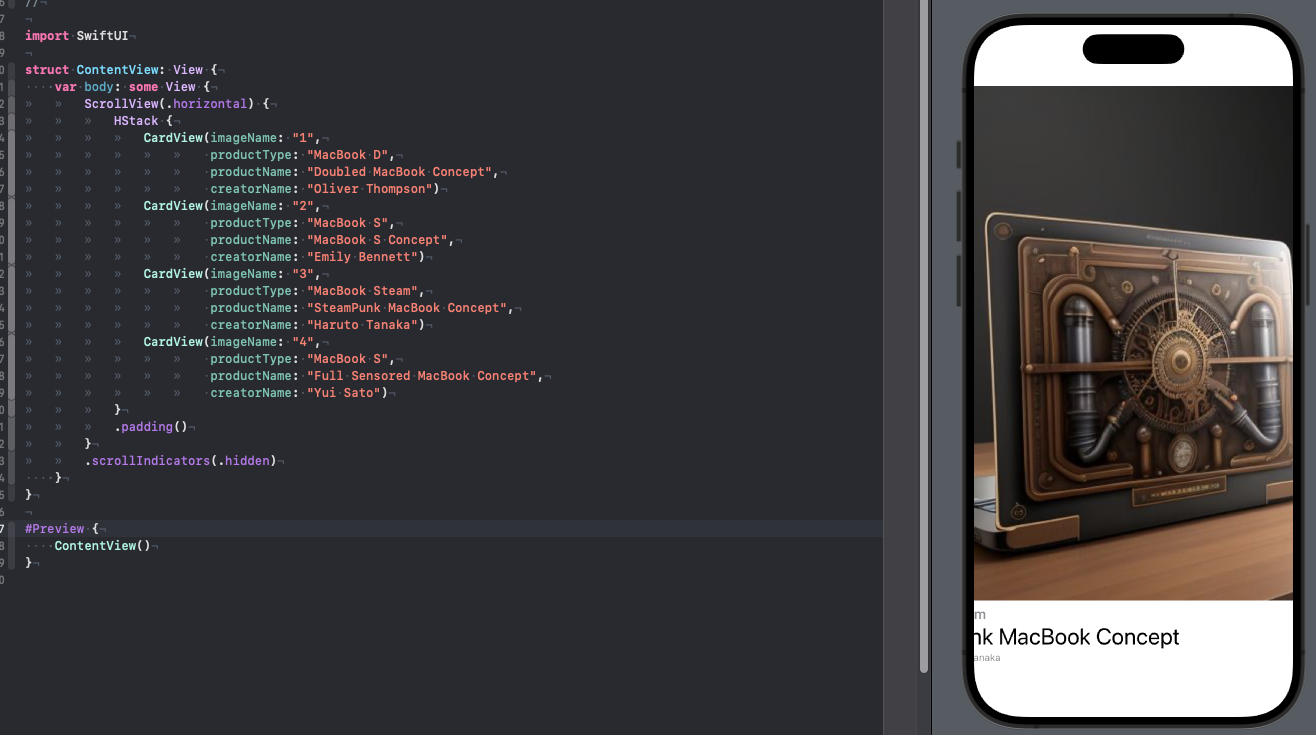
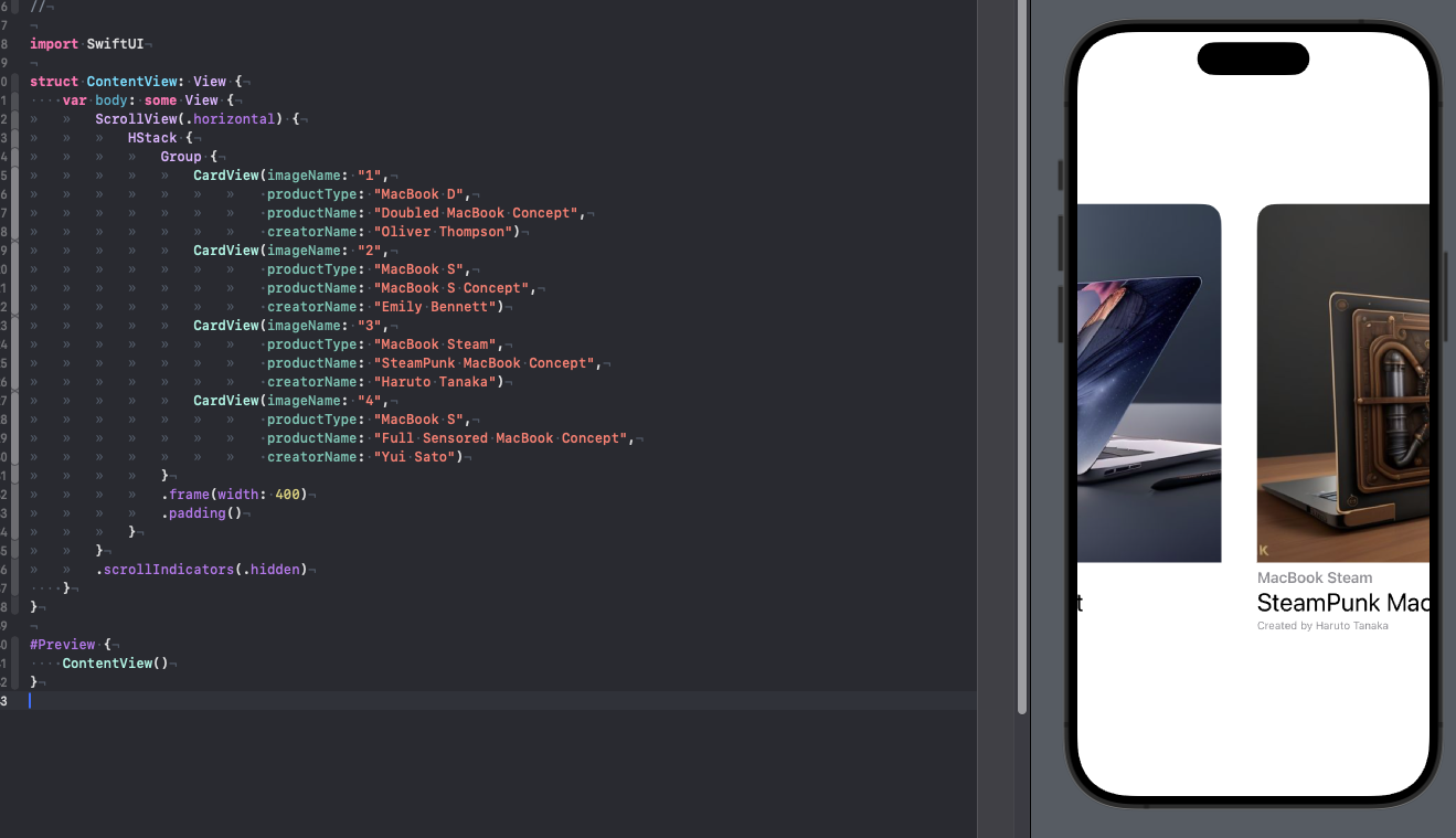
We have achieved the desired effect and our scroll works horizontally, but you must admit that now our pictures have taken up too much space and it does not look as convenient as it could be for our conditional user. There is another element in SUI that allows you to combine other elements into a group, it’s called Group, let’s put our CardViews in Group and set the frame to 400 in width, this way we will get a much cleaner design, plus additional space will be freed up if you want to add something else here.
struct ContentView: View {
    var body: some View {
		ScrollView(.horizontal) {
			HStack {
				Group {
					CardView(imageName: "1",
							 productType: "MacBook D",
							 productName: "Doubled MacBook Concept",
							 creatorName: "Oliver Thompson")
					CardView(imageName: "2",
							 productType: "MacBook S",
							 productName: "MacBook S Concept",
							 creatorName: "Emily Bennett")
					CardView(imageName: "3",
							 productType: "MacBook Steam",
							 productName: "SteamPunk MacBook Concept",
							 creatorName: "Haruto Tanaka")
					CardView(imageName: "4",
							 productType: "MacBook S",
							 productName: "Full Sensored MacBook Concept",
							 creatorName: "Yui Sato")
				}
				.frame(width: 400)
				.padding()
			}
		}
		.scrollIndicators(.hidden)
    }
}
We could end here, but as you know, ScrollView has the ability to scroll content not only vertically and horizontally, but also along both axes at once; for this we just need to pass an array of both axes to the initializer – so you can delete all the code which was written above and replace it with the following just to test this behavior:
struct ContentView: View {
	var body: some View {
		ScrollView([.horizontal, .vertical]) {
			Image(systemName: "macbook")
				.font(.system(size: 999))
		}
	}
}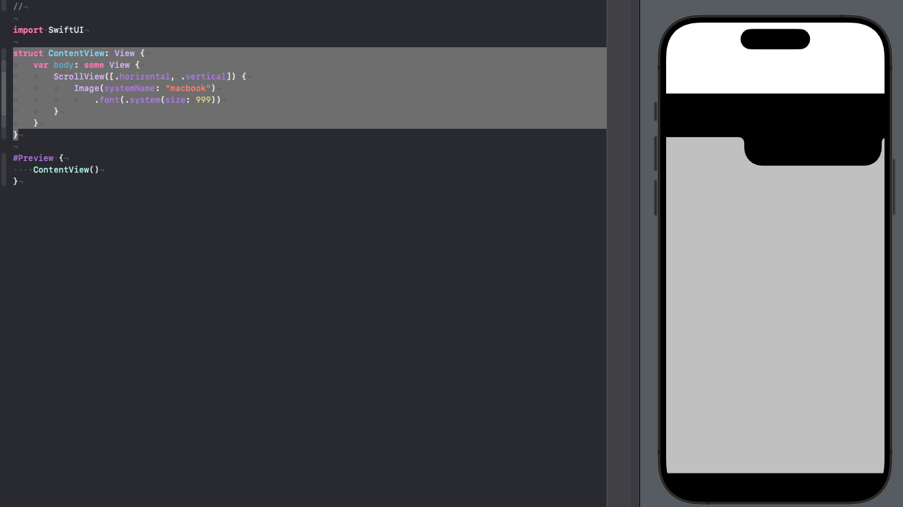
Now the content can be scrolled as you please along all axes available to us at the same time.
Results
In this part, we worked with ScrollView and consolidated the work with stacks to a greater extent, and also learned about such an element as Group. I recommend practicing with the ScrollView element, putting together different layouts or complex versions of them when some part of the screen scrolls only horizontally, and some vertically, and once again I want to remind you that this element is great for static screens with already prepared data, but here’s how to add We will look at dynamic data that can also be scrolled in the next parts, so stay in touch.
As before, subscribe to my telegram channel – https://t.me/swiftexplorer
I will be glad to see your comments and likes!
Thanks for reading!