SwiftUI lessons (part 5)
link to part 4
Buttons, Labels, Gradients
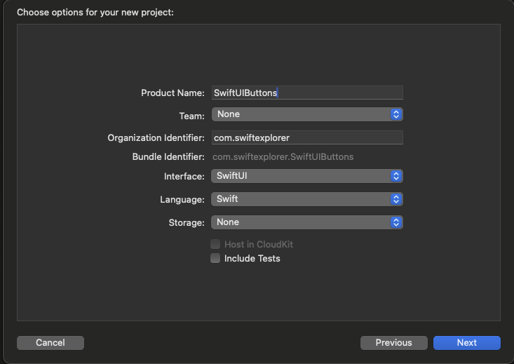
In this tutorial we'll look at elements like buttons, labels and gradients, and we'll start with buttons, but first let's create a new project. As before, create a new project using the SwiftUI interface, name the project SwiftUIButtons, find a location to save it, and let Xcode generate the initial files to work with.
Button is one of the key elements of the user interface that allows the user to interact with the application. It is a widget that the user can click on to perform a specific action.
We are provided with many different initializers for a button, but let's use one of the most common options, put this code in your ContentView
struct ContentView: View {

    var body: some View {

		Button(action: {

			// Здесь можно поместить то, что должно произойти по нажатию на кнопку

		}, label: {

			// Здесь помещаем то, как выглядит наша кнопка

		})

    }
}
As you understand, these two blocks can be used for the tasks that the button solves, let's implement a simple button that you can click on and receive information about it in the console
struct ContentView: View {
    var body: some View {
		Button(action: {
			// Здесь можно поместить то, что должно произойти по нажатию на кнопку
			print("Нажал кнопку")
		}, label: {
			// Здесь помещаем то, как выглядит наша кнопка
			Text("Нажми меня")
		})
    }
}
Try pressing the button and look at the result that is displayed in the console

By the way, I want to note that there is an even more convenient option for creating a button that looks cleaner:
struct ContentView: View {
    var body: some View {
		Button {
			print("Нажал кнопку")
		} label: {
			Text("Нажми меня")
		}
    }
}
The result, as you understand, will be identical.
Now that you know how to create a simple button, let's customize its appearance using the built-in modifiers. To change the background and text color, you can use the background and foregroundStyle modifiers, like this:
struct ContentView: View {
    var body: some View {
		Button {
			print("Нажал кнопку")
		} label: {
			Text("Нажми меня")
				.background(Color.purple)
				.foregroundStyle(.blue)
		}
    }
}
If you want to change the font type, you can use the font modifier and specify the font type (eg .title) as in the following example:
struct ContentView: View {
    var body: some View {
		Button {
			print("Нажал кнопку")
		} label: {
			Text("Нажми меня")
				.background(Color.purple)
				.foregroundStyle(.blue)
				.font(.title)
		}
    }
}
After the change, your button should look something like the one shown in the screenshot.

As you can see, the button doesn't look very good. The button seems to need some extra space around the text. To do this, you can use the padding modifier as shown below:
struct ContentView: View {
    var body: some View {
		Button {
			print("Нажал кнопку")
		} label: {
			Text("Нажми меня")
				.padding()
				.background(Color.purple)
				.foregroundStyle(.blue)
				.font(.title)
		}
    }
}
Once the changes are made, canvas will update the button accordingly. The button should look much better now.
The order of modifiers is important
You probably noticed that I added padding not at the end, but for some reason as the first modifier. Let's just try to change the location of this modifier and put it at the end.
struct ContentView: View {
    var body: some View {
		Button {
			print("Нажал кнопку")
		} label: {
			Text("Нажми меня")
				.background(Color.purple)
				.foregroundStyle(.blue)
				.font(.title)
				.padding()
		}
    }
}
If you place the padding modifier after the background modifier, you can still add some padding to the button, but the background color will not be affected. If you're wondering why, modifiers would work like this:
struct ContentView: View {
    var body: some View {
		Button {
			print("Нажал кнопку")
		} label: {
			Text("Нажми меня")
				.background(Color.purple)  // 1. Изменить цвет фона на фиолетовый
				.foregroundStyle(.blue)    // 2. Установить цвет переднего плана/шрифта на синий
				.font(.title)			   // 3. Изменить тип шрифта
				.padding()				   // 4. Добавить отступы с основным цветом (т.е. синим)
		}
    }
}
Accordingly, modifiers will work like this if the indent modifier is placed before the background modifier:
struct ContentView: View {
    var body: some View {
		Button {
			print("Нажал кнопку")
		} label: {
			Text("Нажми меня")
				.padding()				   // 1. Добавить отступы
				.background(Color.purple)  // 2. Изменить цвет фона на фиолетовый включая отступ
				.foregroundStyle(.blue)    // 3. Установить цвет переднего плана/шрифта на синий
				.font(.title)			   // 4. Изменить тип шрифта
		}
    }
}
Adding a border to a button
This doesn't mean that the indent modifier should always be placed at the very beginning. A lot depends on the design of your button. Let's say you want to create a button with borders like this:

You can change the Text element code like this:
struct ContentView: View {
    var body: some View {
		Button {
			print("Нажал кнопку")
		} label: {
			Text("Нажми меня")
				.padding()
				.foregroundStyle(.purple)
				.font(.title)
				.border(.purple, width: 5)
		}
    }
}
Here we set the foreground color to purple, then add some white space using padding around the text. The border modifier is used to define the width and color of the border. Try playing with the width parameter to see how it works.
Let's look at another example. Let's say a designer shows you the following button design.

How would you make a button like this? Try to implement it yourself, if it doesn’t work, then let’s do it together.
In fact, everything is not so complicated, let's change the code to the following and look at the comments that I left for you.
struct ContentView: View {
    var body: some View {
		Button {
			print("Нажал кнопку")
		} label: {
			Text("Нажми меня")
				.fontWeight(.bold) // меняем наш шрифт на жирный
				.font(.title) // делаем наш шрифт под размеры оглавления
				.padding() // создаем первый отступ вокруг текста
				.background(Color.purple) // красим бэкграунд с учетом отступа который создали строчкой выше
				.foregroundStyle(.white) // меняем шрифт на белый
				.padding(10) // создаем еще один отступ уже поверх того который создали двумя строчками выше (получается он будет такого же цвета какой он был до покраски и это будет та самая разница от границы которую создадим на следующей строчке и до покрашеного бэкграунда)
				.border(Color.purple, width: 5) // создаем новую границу поверх всех предыдущих настроек
		}
    }
}
Add this code to yourself, read the comments and try to play with these modifiers, including turning on and off some of them
Okay, let's try a more complex example, what if we want a round button and also with borders?

Let's look at this issue line by line:
struct ContentView: View {
    var body: some View {
		Button {
			print("Нажал кнопку")
		} label: {
			Text("Нажми меня")
				.fontWeight(.bold) // жирный шрифт
				.font(.title) // размер шрифта
				.padding() // первый отступ
				.background(.purple) // красим в фиолетовый с учетом отступа
				.cornerRadius(40) // скругляем кнопку
				.foregroundStyle(.white) // шрифт белый
				.padding(10) // еще один отступ (начиная отсюда фон становится белым)
				.overlay { // накладываем оверлей поверх нашей кнонпки
				RoundedRectangle(cornerRadius: 40) // делаем еще один квадрат со скругленным краям
				.stroke(.purple, lineWidth: 5) // вырезаем изнутри  этот квадрат красим его в фиолетовый и оставляем линию равную 5 поинтам
				}
		}
    }
}
To understand even better what happened when we added the overlay, try removing the line .stroke(.purple, lineWidth: 5)
Create a button with an image
So far we have only worked with text buttons. In a real project, you or your designer might want to display a button with an image. The syntax for creating an image button is exactly the same, except that you use an Image control instead of a Text control, as in the following example:
struct ContentView: View {
    var body: some View {
		Button(action: {
			print("Нажал кнопку удаления")
		}) {
			Image(systemName: "trash")
		}
		.font(.largeTitle)
		.foregroundColor(.red)
    }
}
For convenience, we use the built-in SF characters (i.e. trash) to create the image button. We specify .largeTitle in the font modifier to make the image a little larger. Your button should look like this:

By the way, if you want to create a button similar to what we did with the text, then all these modifiers will also work
struct ContentView: View {
    var body: some View {
		Button(action: {
			print("Нажал кнопку удаления")
		}) {
			Image(systemName: "trash")
		}
		.padding()
		.background(.red)
		.clipShape(Circle())
		.font(.largeTitle)
		.foregroundColor(.white)
    }
}
As a result, we will get a round button with a red background and a white icon.

In fact, you can even combine different elements within the button display block to create different button options, for example you can make text and an icon within one button, here we will again use our Stack.
struct ContentView: View {
    var body: some View {
		Button(action: {
			print("Нажал кнопку удаления")
		}) {
			HStack {
				Text("Удалить")
					.font(.title)
				Image(systemName: "trash")
					.font(.title)
			}
			.padding()
			.foregroundColor(.white)
			.background(Color.red)
			.cornerRadius(40)
			}
    }
}
Using Label
Starting with iOS 14, the SwiftUI framework introduced a new element called Label, which allows you to place an image and text in the same display. So instead of using HStack you can use Label to create the same layout.
struct ContentView: View {
	var body: some View {
		Button(action: {
			print("Нажал кнопку удаления")
		}) {
			Label(
				title: {
					Text("Удалить")
						.fontWeight(.semibold)
						.font(.title)
				}, icon: {
					Image(systemName: "trash")
						.font(.title)
				} )
			.padding()
			.foregroundColor(.white)
			.background(.red)
			.cornerRadius(40)
		}
	}
}
I can’t say that I personally like labels because they take away flexibility, but if this option suits you, then you should know about it.
Creating a button with a gradient background and shadow
With SwiftUI you can easily style a button with a gradient background. Not only can you define a specific color for the background modifier, but you can also easily apply a gradient effect to any button. All you need to do is replace the following line of code:
.background(.red)On
.background(LinearGradient(gradient: Gradient(colors: [Color.red, Color.blue]), startPoint: .leading, endPoint: .trailing))SwiftUI comes with several built-in gradient effects. The above code applies a linear gradient from left ( .leading ) to right ( .trailing ). It starts with red on the left and ends with blue on the right.

If you want to apply a gradient from top to bottom, you replace .leading with .top and .trailing with .bottom like this:

Of course we can use gradients with our custom colors, let's create something like this

Let's go to our assets catalog and create a new Color Set there

Select Any Appearance and set the color you would like in the right inspector panel


And create another color of a different shade

Let's go back to our ContentView and change our gradient to the following:
.background(LinearGradient(gradient: Gradient(colors: [Color.brightGreen, Color.darkGreen]), startPoint: .top, endPoint: .bottom))As you can see, Xcode has already generated two new properties for you in accordance with the colors we created, sometimes this causes collisions if you try to use the same color name that is already included in the framework, but Xcode will tell you with a warning that you added a color with similar name, so don't worry about it.
In the end we got this result

Finally, to give our button a little more dimension, let's add a shadow right below the corner radius modifier.
.shadow(color: .gray, radius: 20.0, x: 20, y: 10)The final ContentView code should look like this:
struct ContentView: View {
	var body: some View {
		Button(action: {
			print("Нажал кнопку удаления")
		}) {
			Label(
				title: {
					Text("Удалить")
						.fontWeight(.semibold)
						.font(.title)
				}, icon: {
					Image(systemName: "trash")
						.font(.title)
				} )
			.padding()
			.foregroundColor(.white)
			.background(LinearGradient(gradient: Gradient(colors: [Color.brightGreen, Color.darkGreen]), startPoint: .top, endPoint: .bottom))
			.cornerRadius(40)
			.shadow(color: .gray, radius: 20.0, x: 20, y: 10)
		}
	}
}
Creating a full-width button
Large buttons usually focus the user's attention. Sometimes you may need to create a button that spans the entire width of the screen. The frame modifier is intended to control the size of an element. Whether you want to create a button with a fixed size or a button with a dynamic width, you can use this modifier. To create a button that will take up the entire width of the screen, you can change the button code as follows:
struct ContentView: View {
	var body: some View {
		Button(action: {
			print("Нажал кнопку удаления")
		}) {
			Label(
				title: {
					Text("Удалить")
						.fontWeight(.semibold)
						.font(.title)
				}, icon: {
					Image(systemName: "trash")
						.font(.title)
				} )
			.frame(minWidth: 0, maxWidth: .infinity)
			.padding()
			.foregroundColor(.white)
			.background(LinearGradient(gradient: Gradient(colors: [Color.brightGreen, Color.darkGreen]),
									   startPoint: .top, endPoint: .bottom))
			.cornerRadius(40)
			.shadow(color: .gray, radius: 20.0, x: 20, y: 10)
		}
	}
}
We added a frame modifier before the padding and in it we define a flexible width for the button. We set the maxWidth parameter to .infinity. This will cause the button to fill the width of the entire container.
By setting maxWidth to .infinity, the width of the button will automatically adapt based on the width of the device screen. If you want to give the button additional horizontal padding, insert a padding modifier after .cornerRadius(40):
.padding(.horizontal, 20)Accordingly, we get the following display:

Customizing a Button Using ButtonStyle
In a real application, the same button design will be used for multiple buttons at once. Let's say you create three buttons: Delete, Edit and Share, which all have the same button style, like this:

Get ready now there will be a large piece of code.
It is likely that now you will write something like this:
struct ContentView: View {
	var body: some View {
		VStack {
			Button(action: {
				print("Нажал кнопку удаления")
			}) {
				Label(
					title: {
						Text("Удалить")
							.fontWeight(.semibold)
							.font(.title)
					}, icon: {
						Image(systemName: "trash")
							.font(.title)
					} )
				.frame(minWidth: 0, maxWidth: .infinity)
				.padding()
				.foregroundColor(.white)
				.background(LinearGradient(gradient: Gradient(colors: [Color.brightGreen, Color.darkGreen]),
										   startPoint: .top, endPoint: .bottom))
				.cornerRadius(40)
				.padding(.horizontal, 20)
				.shadow(color: .gray, radius: 20.0, x: 20, y: 10)
			}
			Button(action: {
				print("Нажал кнопку Изменить")
			}) {
				Label(
					title: {
						Text("Изменить")
							.fontWeight(.semibold)
							.font(.title)
					}, icon: {
						Image(systemName: "square.and.pencil")
							.font(.title)
					} )
				.frame(minWidth: 0, maxWidth: .infinity)
				.padding()
				.foregroundColor(.white)
				.background(LinearGradient(gradient: Gradient(colors: [Color.brightGreen, Color.darkGreen]),
										   startPoint: .top, endPoint: .bottom))
				.cornerRadius(40)
				.padding(.horizontal, 20)
				.shadow(color: .gray, radius: 20.0, x: 20, y: 10)
			}
			Button(action: {
				print("Нажал кнопку Поделиться")
			}) {
				Label(
					title: {
						Text("Поделиться")
							.fontWeight(.semibold)
							.font(.title)
					}, icon: {
						Image(systemName: "square.and.arrow.up")
							.font(.title)
					} )
				.frame(minWidth: 0, maxWidth: .infinity)
				.padding()
				.foregroundColor(.white)
				.background(LinearGradient(gradient: Gradient(colors: [Color.brightGreen, Color.darkGreen]),
										   startPoint: .top, endPoint: .bottom))
				.cornerRadius(40)
				.padding(.horizontal, 20)
				.shadow(color: .gray, radius: 20.0, x: 20, y: 10)
			}
		}
	}
}
As you can see from the code above, all modifiers must be repeated for each button. What if you or your designer want to change the style of the button? You will have to change all modifiers. This is quite a tedious task and not good programming practice. How can you generalize a style and make it reusable?
SwiftUI provides the ButtonStyle protocol with which you can create your own button style. To create a reusable style for our buttons, create a new structure called GradientBackgroundStyle that follows the ButtonStyle protocol. Paste the following code snippet:
struct GradientBackgroundStyle: ButtonStyle {
func makeBody(configuration: Self.Configuration) -> some View { configuration.label
.frame(minWidth: 0, maxWidth: .infinity)
.padding()
.foregroundColor(.white)
.background(LinearGradient(gradient: Gradient(colors: [Color.darkGreen, Color.brightGreen]), startPoint: .leading, endPoint: .trailing)) .cornerRadius(40)
.padding(.horizontal, 20)
.shadow(color: .gray, radius: 20.0, x: 20, y: 10)
} }
The protocol requires us to provide an implementation of the makeBody function, which takes a configuration parameter. The configuration parameter includes a label property that applies modifiers to change the style of the button. In the above code, we are using the same set of modifiers that we used earlier.
How to apply a custom style to a button? SwiftUI provides the .buttonStyle modifier, which can be used to style a button like this:
			Button(action: {
				print("Нажал кнопку Поделиться")
			}) {
				Label(
					title: {
						Text("Поделиться")
							.fontWeight(.semibold)
							.font(.title)
					}, icon: {
						Image(systemName: "square.and.arrow.up")
							.font(.title)
					} )
			}
			.buttonStyle(GradientBackgroundStyle())
Thus, we greatly simplified our code, shortened it, and what is most important, we made it so that if someone wants to change the style of these buttons, then they will need to do this in only one place, in our case in GradientBackgroundStyle.
The final ContentView will look like this
struct ContentView: View {
	var body: some View {
		VStack {
			Button(action: {
				print("Нажал кнопку удаления")
			}) {
				Label(
					title: {
						Text("Удалить")
							.fontWeight(.semibold)
							.font(.title)
					}, icon: {
						Image(systemName: "trash")
							.font(.title)
					} )
			}
			.buttonStyle(GradientBackgroundStyle())
			Button(action: {
				print("Нажал кнопку Изменить")
			}) {
				Label(
					title: {
						Text("Изменить")
							.fontWeight(.semibold)
							.font(.title)
					}, icon: {
						Image(systemName: "square.and.pencil")
							.font(.title)
					} )
			}
			.buttonStyle(GradientBackgroundStyle())
			Button(action: {
				print("Нажал кнопку Поделиться")
			}) {
				Label(
					title: {
						Text("Поделиться")
							.fontWeight(.semibold)
							.font(.title)
					}, icon: {
						Image(systemName: "square.and.arrow.up")
							.font(.title)
					} )
			}
			.buttonStyle(GradientBackgroundStyle())
		}
	}
}
You can also determine whether a button is pressed by accessing the isPressed property. This will allow you to change the style of the button when the user touches it. For example, let's say we want to make a button shrink a little when someone clicks on it. To do this, you add a line of code like this:
.scaleEffect(configuration.isPressed ? 0.9 : 1.0)struct GradientBackgroundStyle: ButtonStyle {
func makeBody(configuration: Self.Configuration) -> some View { configuration.label
.frame(minWidth: 0, maxWidth: .infinity)
.padding()
.foregroundColor(.white)
.background(LinearGradient(gradient: Gradient(colors: [Color.darkGreen, Color.brightGreen]), startPoint: .leading, endPoint: .trailing)) .cornerRadius(40)
.padding(.horizontal, 20)
.shadow(color: .gray, radius: 20.0, x: 20, y: 10)
.scaleEffect(configuration.isPressed ? 0.9 : 1.0)
} }
The scaleEffect modifier allows you to scale the button (and any View in general). To increase the button size, you specify a value greater than 1.0. To make the button smaller, enter a value less than 1.0.
So this line of code scales the button down (i.e. 0.9) when the button is pressed and returns it to its original size (i.e. 1.0) when the user releases their finger. Launch the application and you will see a beautiful animation when the button scales. This is the power of SwiftUI. You don't need to write any extra lines of code and it comes with built-in animations.
Let's imagine that you need to achieve an effect – so that when a button is pressed, it rotates 90 degrees, how can you implement this if you use ButtonStyle and the rotationEffect modifier. Try it yourself, if it doesn’t work, the result of how you can do it will be lower.

Solution:
struct ContentView: View {
	var body: some View {
		VStack{
			Button(action: {

			}, label: {
				Image(systemName: "plus")
			})
			.buttonStyle(RotatingPlusButton())
		}
	}
}

struct RotatingPlusButton: ButtonStyle {
	func makeBody(configuration: Configuration) -> some View {
		configuration.label
			.padding()
			.background(Color.red)
			.foregroundStyle(.green)
			.font(.title)
			.fontWeight(.bold)
			.clipShape(Circle())
			.rotationEffect(configuration.isPressed ? .degrees(-90) : .degrees(0))
	}
}
Styling a button in iOS 15
We have studied various ways to modify our button and in general we have dealt with a good number of modifiers, but in fact, specifically for buttons there are their own very convenient modifiers that have appeared since IOS 15, let's look at them
struct ContentView: View {
	var body: some View {
		VStack{
			Button {
			} label: {
				Text("Привет IOS 15")
			}
			.tint(.purple) // можно использольвать вместо бэкграунд
			.buttonStyle(.borderedProminent) // меняет стиль кнопки, есть четыре стиля которые подготовили для нас в Apple, но также можно добавлять и свои собстенные кастомные
			.buttonBorderShape(.roundedRectangle(radius: 5)) // можно использовать вместо clipshape
			.controlSize(.large) // отвечает за размер кнопки, от совсем маленькой до очень большой
		}
	}
}
I have left comments for you on what is responsible for what, try playing with the parameters of these modifiers and see what they are capable of. In addition to these modifiers, IOS 15 also introduced a button argument called role, we are given only two roles to choose from, these are .destructive and .cancel, in principle, they are simply needed for the convenient and quick creation of system buttons that should attract the user’s attention, I'll give an example of both:
struct ContentView: View {
	var body: some View {
		VStack{
			Button("destructive", role: .destructive) {

			}
			.buttonStyle(.borderedProminent)
			Button("cancel", role: .cancel) {

			}
			.buttonStyle(.borderedProminent)
		}
	}
}
Results
In this part, we covered the basics of creating buttons in SwiftUI. Buttons play a key role in any application user interface. Well-designed buttons not only make your interface more attractive, but also enhance the user experience of your application. By mixing SF symbols, gradients, and animations together, you can easily create stylish and useful buttons.
In the next part we will finally get to the topic of State and Binding
As before, subscribe to my telegram channel – https://t.me/swiftexplorer
I will be glad to see your comments and likes!
Thanks for reading!