Paradoxes in data and why visualization is necessary
In this post, I want to look at several “paradoxes” in the data, which are useful to know about both for the novice data analyst and for anyone who does not want to be misled by incorrect statistical conclusions.
There is no complex mathematics behind the examples in question beyond the basic properties of the sample (such as the arithmetic mean and variance), but such cases can be encountered both at an interview and in life.
“New Zealanders emigrating to Australia raises both countries' IQs”
This quote attributed to Sir Robert Muldoon, Prime Minister of New Zealand. Could this be possible from a mathematical point of view?
So, the Will Rogers phenomenon is called apparent paradox, which is that moving a (numerical) element from one set to another can increase the average of both sets. Let's start with an obvious example: consider the sets And
. U
the arithmetic mean of the elements is 1, and
the arithmetic mean of the elements is 550. If you take the number 100 and move it from the second set to the first, you get the sets
with arithmetic mean 25.75 > 1 and
with arithmetic mean 1000 > 550.
However, it is not necessary for the sets to be that far apart on the number line, and it is not necessary for the element being moved to be the minimum in the second set and/or the maximum in the first.
For example, let . Average of set elements
is 5, and the elements of the set
– 7. Now we move 6 from the second set to the first, and we get the sets
with an average of 5.1(6) and
with an average of 7.(3).
In fact, such an increase in both averages occurs under the following conditions:
the moved element is strictly less than the average value of the elements of the second set before its removal;
the element being moved is strictly greater than the average value of the first set before it was added;
as a consequence, initially the average value of the elements of the first set (where they are moved) must be strictly less than that of the second (from where they are moved).
Conclusion: A similar situation can occur in various areas. For example, with improved diagnosis of diseases at an early stage, life expectancy among the healthy and among the sick may increase in the same sample if some of the “healthy” (and in fact poorly examined) move into the “sick” category, and many of the They will be successfully treated thanks to early detection of the disease.
And yes, the attentive reader will say that there is no paradox here, and he will be absolutely right. This phenomenon sounds a little counterintuitive in words, but the examples above make it obvious.
Simpson's paradox
Imagine that you work in a company that sells two types of products, say, sepulki and spillikins. (For the sake of simplicity of the model, let’s assume that sepules and spillilets are always taken into account separately in receipts.) In the morning, a joyful intern-analyst runs into your office and reports that over the last month the average check in the sepulk category has increased by 5%, the average check in the spillilets category – by 7%. He did not check the overall average bill, but it is logical to assume that it also increased by some amount in the range between 5 and 7 percent. What could go wrong?
February | March | |
Sepulki, average check | 200 rubles | 210 rubles (+5%) |
Spills, average bill | 100 rubles | 107 rubles (+7%) |
You open the analytics system, look in more detail and understand that the company’s total average bill decreased, although prices for goods did not change (that is, the average check is proportional to the number of goods in the check), and there were no discounts. Let's add additional data to our optimistic table, without which it is impossible to calculate the total average bill:
February | March | |
Sepulki, average check | 200 rubles | 210 rubles (+5%) |
Spills, average bill | 100 rubles | 107 rubles (+7%) |
Share of sepulec purchases | 50% | 35% |
Share of purchases of spillikins | 50% | 65% |
Total average bill | 150 rubles | 145.05 rubles (-4.63%) |
The average bill in March is calculated as follows: .
Conclusion: you should not draw conclusions on individual indicators if they are not the only ones who set the key metric (in this case, the trainee did not take into account that in the average receipt for all purchases, categories are actually weighted in proportion to the share of purchases in them). Understanding Simpson's paradox can protect you from making incorrect conclusions, including during AB testing.
Anscombe Quartet
And now a story about why data visualization is literally necessary. Imagine being told about four sets of points about which the following is known: the average value of the variable
variance of the variable
the average value of the variable
variance of the variable
and correlation between variables
they have the same* for each of the sets. And also the coefficients that define the linear regression line are the same.
*accurate to two or three decimal places
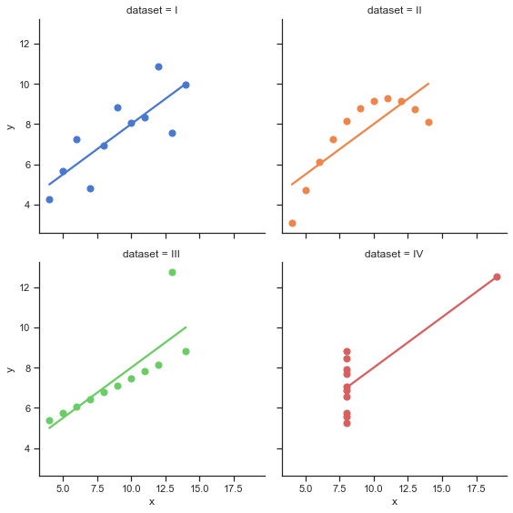
It would seem that the samples should be very similar to each other. But the catch here lies in the fact that by default many people imagine something like a normal distribution (or another of the main types), although nothing is said about this initially. Let's take advantage dataset from the seaborn library and visualize this data:
import seaborn as sns
sns.set_theme(style="ticks")
# Load the example dataset for Anscombe's quartet
df = sns.load_dataset("anscombe")

# Show the results of a linear regression within each dataset
sns.lmplot(
    data=df, x="x", y="y", col="dataset", hue="dataset",
    col_wrap=2, palette="muted", ci=None,
    height=4, scatter_kws={"s": 50, "alpha": 1}
)
Let's calculate the characteristics of these sets of points:
mean_1 = df[df["dataset"] == "I"].mean()
mean_2 = df[df["dataset"] == "II"].mean()
mean_3 = df[df["dataset"] == "III"].mean()
mean_4 = df[df["dataset"] == "IV"].mean()
mean_1, mean_2, mean_3, mean_4
This code is for calculating averages by coordinates And
produces the following result:
(x    9.000000
 y    7.500909
 dtype: float64,
 x    9.000000
 y    7.500909
 dtype: float64,
 x    9.0
 y    7.5
 dtype: float64,
 x    9.000000
 y    7.500909
 dtype: float64)
I put the code for the remaining characteristics under the cat so as not to make the article too long:
Hidden text
Dispersion
std_1 = df[df["dataset"] == "I"].std()
std_2 = df[df["dataset"] == "II"].std()
std_3 = df[df["dataset"] == "III"].std()
std_4 = df[df["dataset"] == "IV"].std()
std_1, std_2, std_3, std_4
(x 3.316625
y 2.031568
dtype: float64,
x 3.316625
y 2.031657
dtype: float64,
x 3.316625
y 2.030424
dtype: float64,
x 3.316625
y 2.030579
dtype: float64)Correlation coefficient And
import numpy as np

corr_1 = np.corrcoef(df[df["dataset"] == "I"]["x"], df[df["dataset"] == "I"]["y"])[0, 1]
corr_2 = np.corrcoef(df[df["dataset"] == "II"]["x"], df[df["dataset"] == "II"]["y"])[0, 1]
corr_3 = np.corrcoef(df[df["dataset"] == "III"]["x"], df[df["dataset"] == "III"]["y"])[0, 1]
corr_4 = np.corrcoef(df[df["dataset"] == "IV"]["x"], df[df["dataset"] == "IV"]["y"])[0, 1]
corr_1, corr_2, corr_3, corr_4
(0.81642051634484, 0.8162365060002428, 0.8162867394895984, 0.8165214368885028)Linear regression line
k1, b1 = np.polyfit(df[df["dataset"] == "I"]["x"], df[df["dataset"] == "I"]["y"], 1)
k2, b2 = np.polyfit(df[df["dataset"] == "II"]["x"], df[df["dataset"] == "II"]["y"], 1)
k3, b3 = np.polyfit(df[df["dataset"] == "III"]["x"], df[df["dataset"] == "III"]["y"], 1)
k4, b4 = np.polyfit(df[df["dataset"] == "IV"]["x"], df[df["dataset"] == "IV"]["y"], 1)

k1, k2, k3, k4, b1, b2, b3, b4
(0.5000909090909095,
0.5000000000000002,
0.499727272727273,
0.4999090909090908,
3.0000909090909076,
3.0009090909090905,
3.0024545454545457,
3.0017272727272712)Conclusion: Sometimes just looking at all the basic statistics will not be enough, and then visualization is necessary. In this case, often even the simplest scatter plot (graph with points on a plane) is enough to notice differences in samples.
The Datasaurus Dozen
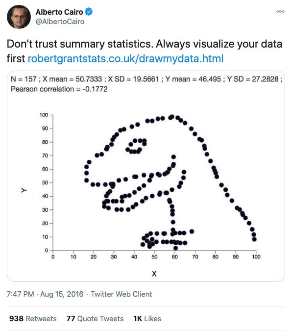
Anscombe's quartet clearly demonstrates why data visualization is important, but picking 4 sets of 11 points is nothing special, is it? A more interesting example would be the “Datasaurus Dozen”, which consists of 13 sets of dots that add up to form different shapes.

The authors' approach was to initially take a “dinosaur” of points, and then iteratively change the data slightly so that the values of the means, variances, and correlation coefficient remained the same, accurate to two decimal places, until another figure (oval, star, etc.). Each of the resulting figures required about 200 thousand iterations of the algorithm.
Pseudocode of the algorithm for generating such sets of points has the following form:
current_ds ← initial_ds
for x iterations, do:
    test_ds ← perturb(current_ds, temp)
    if similar_enough(test_ds, initial_ds):
        current_ds ← test_ds

function perturb(ds, temp):
    loop:
        test ← move_random_points(ds)
        if fit(test) > fit(ds) or temp > random():
return testinitial_ds— initial set of pointscurrent_ds— a set of points at the momentfit()— a function that checks how much a set of points currently resembles the desired figuresimilar_enough()— a function that checks that the values of statistics are close enoughmove_random_points()– a function that randomly shifts points
Conclusion
All these examples bring us to the importance of using exploratory data analysis (exploratory data analysis) – this expression denotes an approach to working with data through the analysis of all key indicators and (almost always) their visualization. A critical look at the conclusions drawn from a pair of indicators is an important trait for both a data analyst and any person who does not want to be deceived.
Thank you for reading! I will be glad to add additions and questions in the comments.


