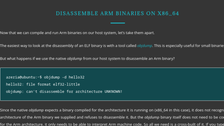
Making a custom modal window for React
Without many words
Do you want less words, more code? Then you can watch the demo codesandbox.custom-modal.
And the explanatory team for the demo is waiting for you further in the text)
Go!
Action plan
Profit
We think and design
We will create a modal window. Not a hint, not a dropdown, not a pop-up info pop-up, but a modal. This is important, since the main essence of the modal window is (usually) to pause the current flow of user interaction with the page and switch to another flow of actions, and after completion/cancellation of which the user must return to the original flow.
About semantic differences popup/modals/lightboxes/tooltip/notice are easy to google. For convenience, I’ll take a look. this And this links.
From this main property/difference comes an important limitation – the modal must be on the page in a single copy.
Since we are writing about React here, we will obviously use built-in features, portals.
And it seems that these same portals will be at the heart of any potential windows that we may want to implement in the course of our work in the future. Therefore, the implementation suggests 2 components:
portal as a ram
modal, as an add-on above the portal
As a result, at the moment it is clear that there can be many portals on the page, but only one modal.
The modal will be built on top of the portal, introducing a limitation into its work on the one hand (the modal should be only 1 on the page at a time), and on the other hand, an extension (closing methods).
Let’s start by creating the base, with the portal component.
Portal component
The task of the portal will be simple – to render its content (children) in a container with a specific id.
For this, as discussed, we will use the function createPortal.
We will also explicitly throw an error if we do not have a container in the markup in which we are trying to create our portal.
Explicit is always better than implicit, so it’s better to explicitly drop our component when trying to render incorrectly.
import { useEffect, useState } from 'react';
import { createPortal } from 'react-dom';

type PortalProps = { id: string; children: React.ReactNode; };

const PORTAL_ERROR_MSG ='There is no portal container in markup. Please add portal container with proper id attribute.';

const Portal = (props: PortalProps) => {
  const { id, children } = props;
  const [container, setContainer] = useState<HTMLElement>();

  useEffect(() => {
    if (id) {
      const portalContainer = document.getElementById(id);

      if (!portalContainer) {
        throw new Error(PORTAL_ERROR_MSG);
      }

      setContainer(portalContainer);
    }
  }, [id]);

  return container ? createPortal(children, container) : null;
};
Minimum code, maximum clarity. Now let’s upgrade.
Making it a little more convenient
We can use this portal in many cases. In a modal, in various pop-ups, in tooltips or drop-down lists.
And in order not to create and mount a container for the portal every time, let’s write a small function that will facilitate the process of creating a container for the portal.
Her task will be to create a div with the desired idand render it in the passed moundNode. But if the container already exists, then do nothing (why re-create and pull the dom tree once again). Well, by default moundNode will equal document body:
type containerOptions = { id: string; mountNode?: HTMLElement };

const createContainer = (options : containerOptions) => {
  if (document.getElementById(options.id)) {
    return;
  }

  const { id, mountNode = document.body } = options;

  const portalContainer = document.createElement('div');

  portalContainer.setAttribute('id', id);
  mountNode.appendChild(portalContainer);
};
And in the end, do not forget to export all our creativity from the portal file for external consumers:
export { createContainer, PORTAL_ERROR_MSG };
export default Portal;
With this, our portal is ready. The main thing when working with the portal is not to forget to create containers and rendering will work without errors.
Don’t forget about tests
Our portal component is minimalistic, so there will be only 2 groups of 2 tests:
Let’s test the correct operation of the rules for creating a container for the portal (mountNode || document.body)
check the rendering of the portal to the container (rendering || throw new Error).
Before starting, we make the imports we need in the test file:
import '@testing-library/jest-dom';
import { render, screen } from '@testing-library/react';

import Portal, { createContainer, PORTAL_ERROR_MSG } from './index';

describe('Portal:', () => {
  const mountNodeId = 'mount-node-id';
  const containerId = 'container-id';
  ...
});
...
And let’s not forget data-testid attribute on our container so that we can easily find it in our test.
const createContainer = (options : containerOptions) => {
  ...
  const { id, ...} = options;

  portalContainer.setAttribute('data-testid', `portalContainer-${id}`);
  ...
};
Testing container creation
  describe('CreateContainer:', () => {
    it('Должен создавать контейнер для портала в document.body', async () => {
      createContainer({ id: containerId });

      const container = screen.getByTestId(`portalContainer-${containerId}`);

      expect(container).toBeInTheDocument();
    });
    it('Должен создавать контейнер для портала в предоставленной ноде', async () => {
      render(
        <div id={mountNodeId} data-testid={mountNodeId}></div>
      );

      const mountNode = screen.getByTestId(mountNodeId);
      createContainer({ id: containerId, mountNode });

      const container = screen.getByTestId(`portalContainer-${containerId}`);

      expect(mountNode).toContainElement(container);
    });
  });
Testing the display in the container
describe('React Portal', () => {
  it('Должен отображать предоставленный контент в существующей ноде', async () => {
    const containerId = 'container-id';

    render(
      <>
        <div id={containerId} data-testid='some-test-id'></div>
        <Portal id={containerId}>
          some text
        </Portal>
      </>
    );

    const container = screen.getByTestId('some-test-id');
    expect(container).toContainHTML('some text');
  });
  it('Должен прокидывать ошибку, если не существует контейнера для рендеринга портала', async () => {
    const containerId = 'container-id';

    expect(() => render(
      <Portal id={containerId}>
        some text
      </Portal>
    ))
    .toThrow(PORTAL_ERROR_MSG);
  });
});
But there is a nuance
When trying to start, we will find 2 problems
jest does not automatically clean up our home tree between tests. This must be done by hand.
when testing for errors, the jest console will glow with a blood red stack trace, even though both the component and the test are behaving correctly.
To solve the first problem (using beforeEach and afterEach ), we’ll trap console.error and manually clean up the body in our dom tree.
We get something like this:
beforeEach(() => {
  jest.spyOn(console, 'error')
  // @ts-ignore
  console.error.mockImplementation(() => null);
});

afterEach(() => {
  // @ts-ignore
  console.error.mockRestore();
})
And to solve the second one, we will do it manually clear document.body after each test:
afterEach(() => {
  // eslint-disable-next-line testing-library/no-node-access
  document.getElementsByTagName('body')[0].innerHTML = '';
})
PS:
Ignore ts-ignore is written in order to remove type errors:
“Property ‘mockImplementation’ does not exist on type”
Property ‘mockRestore’ does not exist on type jest.spyOn adds this functionality to us
modal component
To begin with, let’s put together all the requirements regarding the nuances of the modal window, which are dictated to us by logic, common sense, and best UX practices:
making a modal only onesince by definition we want to use it in scenarios where we need to take control of the flow of user actions without a reason
would be nice to do convenient closing options:
by clicking on the close button
by clicking on the substrate, i.e. on overlay (on click outside the main content)
by pressing the escape key
And in fact, this is already enough for a + – satisfied user.
Connecting Portal and Modal
To implement the first requirement, we just need to use the already created createContainer function and pass the same id. Let’s add conditional rendering to pull our portal guaranteed after the container is created:
import { useEffect, useState } from 'react';
import Portal, { createContainer } from '../portal';

const MODAL_CONTAINER_ID = 'modal-container-id';

const Modal = () => {
  const [isMounted, setMounted] = useState(false);

  useEffect(() => {
    createContainer({ id: MODAL_CONTAINER_ID });
    setMounted(true);
  }, []);

  return (
    isMounted
    ? (<Portal id={MODAL_CONTAINER_ID}>...</Portal>)
    : null
  );
};

export default Modal;
We write options for closing the modal window
On the “Close” button
import { ..., useCallback, useRef } from 'react';
import type { MouseEventHandler } from 'react';
...

import Styles from './index.module.css';

type Props = { onClose?: () => void; };

const Modal = (props: Props) => {
  const { onClose } = props;

  const rootRef = useRef<HTMLDivElement>(null);
  ...
  const handleClose: MouseEventHandler<HTMLButtonElement> =
    useCallback(() => {
      onClose?.();
    }, [onClose]);

  return (
    isMounted
    ? (
      <Portal id={MODAL_CONTAINER_ID}>
        <div className={Styles.wrap} ref={rootRef}>
          <div className={Styles.content}>
            <button
              type="button"
              className={Styles.closeButton}
              onClick={handleClose}
              >
              x
            </button>
            ...
          </div>
        </div>
      </Portal>
    )
    : null
  );
};
By clicking on “escape” and clicking on “overlay”
const Modal = (props: Props) => {
  ...
  useEffect(() => {
    const handleWrapperClick = (event: MouseEvent) => {
      const { target } = event;

      if (target instanceof Node && rootRef.current === target) {
        onClose?.();
      }
    };
    const handleEscapePress = (event: KeyboardEvent) => {
      if (event.key === 'Escape') {
        onClose?.();
      }
    };

    window.addEventListener('click', handleWrapperClick);
    window.addEventListener('keydown', handleEscapePress);

    return () => {
      window.removeEventListener('click', handleWrapperClick);
      window.removeEventListener('keydown', handleEscapePress);
    };
  }, [onClose]);

  return (...);
};
Extending Props
At this stage, the scope for imagination begins. You can implement the layout as you like, only a utilitarian example will be presented here.
Adding title for our modal to display its title. And of course childrenwhich it will display in itself.
type Props = { ..., title: string; children: React.ReactNode;};

const Modal = (props: Props) => {
  const { ..., title, children } = props;
  ...
  return (
    isMounted
    ? (
      <Portal id={MODAL_CONTAINER_ID}>
        <div className={Styles.wrap} ref={rootRef}>
          <div className={Styles.content}>
            ...
            <p className={Styles.title}>{title}</p>
            {children}
          </div>
        </div>
      </Portal>
    )
    : null
  );
};
Testing the newborn modal window
We also define 2 groups for coverage by tests:
Before starting, we make the imports we need in the test file:
import '@testing-library/jest-dom';
import { render, fireEvent, screen } from '@testing-library/react';

import Modal from './index';

describe('Modal:', () => {...});
...
In the same way as in the case of the container, we put down our data-testid. We need a wrapper and a close button:
<div className={Styles.wrap} {/* rest props */} data-testid="wrap">
...
<button className={Styles.closeButton} {/* rest props */} data-testid="modal-close-button">x</button>
...
Display
  describe('Отображение:', () => {
    it('Должен отображаться title', async () => {
      render(
        <Modal title="title" onClose={jest.fn()}>
          children
        </Modal>
      );

      const title = screen.queryByText('title');
      expect(title).toBeInTheDocument();
    });
    it('Должны отображаться children (предоставленный контент)', async () => {
      render(
        <Modal title="title" onClose={jest.fn()}>
          some text
        </Modal>
      );

      const children = screen.queryByText('some text');
      expect(children).toBeInTheDocument();
    });
  });
Close handler
  describe('Обработчик закрытия:', () => {
    it('Должен вызываться обработчик "onClose" при клике на кнопку "закрыть"', async () => {
      const handleClose = jest.fn();

      render(
        <Modal title="title" onClose={handleClose}>
          children
        </Modal>
      );

      const wrapper = screen.getByTestId('modal-close-button');
      fireEvent.click(wrapper);

      expect(handleClose).toHaveBeenCalledTimes(1);
    });
    it('Должен вызываться обработчик "onClose" при клике на wrapper (за пределы модального окна)', async () => {
      const handleClose = jest.fn();

      render(
        <Modal title="title" onClose={handleClose}>
          children
        </Modal>
      );

      const wrapper = screen.getByTestId('wrap');
      fireEvent.click(wrapper);

      expect(handleClose).toHaveBeenCalledTimes(1);
    });
    it('Должен вызываться обработчик "onClose" при нажатии на кнопку "escape"', async () => {
      const handleClose = jest.fn();

      render(
        <Modal title="title" onClose={handleClose}>
          children
        </Modal>
      );

      const wrapper = screen.getByTestId('wrap');
      fireEvent.keyDown(wrapper, { key: 'Escape', code: 'Escape' });

      expect(handleClose).toHaveBeenCalledTimes(1);
    });
  });
Run everything in a container
We will render the modal using the standard useState:
import { useState } from "react";

import Modal from "./components/modal";

import "./styles.css";

export default function App() {
  const [isModalActive, setModalActive] = useState(false);

  const handleModalOpen = () => {
    setModalActive(true);
  };
  const handleModalClose = () => {
    setModalActive(false);
  };

  return (
    <div className="App">
      <h1>Custom Modal component Demo</h1>
      <button className="button" type="button" onClick={handleModalOpen}>
        open modal
      </button>
      <div>
        {isModalActive && (
          <Modal title="some modal title" onClose={handleModalClose}>
            Hello world
          </Modal>
        )}
      </div>
    </div>
  );
}
Total
As a result, we got:
portal componenton top of which you can build any type of pop-ups and enjoy life
modal window component, which is guaranteed to be alone on the page at any given time. In addition, it can be conveniently closed in three different ways.
confidence that we will not break their behavior imperceptibly when processing / refactoring, because we covered everything with tests.
Thanks for reading and good luck implementing your custom components)
PS
Links from the article:
My other articles about React components: