Interactive data visualization using Plotly: building beautiful graphics with Express and Cufflinks
If you are still using Matplotlib to create graphs in Python, it’s time to take a look at the world from the height of an alternative interactive visualization library.
Plotly lets you create beautiful, interactive, exported graphs with just a few lines of code. However, without a map, climbing Mount Plotly can be slow and painful.
Here are the stumbling blocks that may appear on the path of adventurers who decided to conquer this mountain:
- incomprehensible initial setup for working offline without an account;
- incredible number of lines of code;
- outdated documentation;
- many different Plotly tools where you can get lost (Dash, Express, Chart Studio and Cufflinks).
Several times trying to climb this mountain, I still found a map, equipment and a short path to the top. In this article I will show you the way, telling how to start working offline, how to create graphs, and then adjust them, where to go for help and what tools to use.
Plotly
This program was created company of the same nameowning many open source programs for creating interactive charts and charts. The company earns by providing an expanded package of functions of its programs. She also offers to set up your own hosting for a fee. The company is based in Montreal with an office in Boston.
Plotly.py is based on the JavaScript library D3.js. Plotly also has API wrappers for R, Julia, and many other programming languages. It is worth noting that the documentation is not available in all languages.

Sample Libraries from Plotly
In this article, we will focus on options that use Python. I am using Python 3.7 and later versions of the library in this guide.
cufflinks                0.15
jupyterlab             0.35.5
plotly                   3.8.1
plotly-express       0.1.7
Make sure you use cufflinks 0.15 (0.13 is not very friendly with the latest Plotly updates).
AMENDMENT (May 2020): The latest version of Plotly is 4.7.1. Most of the instructions below still apply to the latest version of the program. Please note that the express module is imported as part of the Plotly package.
plotly.py
Despite the fact that it is written in some instructions, you do not need to create an account to use Plotly, nor do you need to work online.
Install a simple plotly.py module with conda or use pip install plotly.
Import the module and configure it for offline use:
import plotly.offline as py
py.init_notebook_mode(connected=False)
Now the program will not require you to create an account. So we overcame the first obstacle on the way to the top of Plotly mountain.
Here is an example of an interactive Plotly graph with a globe that allows you to change the type of projection and location using the sliders. You can evaluate the possibility of interaction with this scheme yourself. here.

Below is a voluminous description codeadapted from documentationnecessary to create such an ornate schedule.
import pandas as pd
import numpy as np
import plotly.offline as py
import plotly.graph_objs as go
import json

py.init_notebook_mode(connected=False)

izip = zip

df = pd.read_csv('https://raw.githubusercontent.com/plotly/datasets/master/globe_contours.csv')
df.head()

contours = []

scl = ['rgb(213,62,79)','rgb(244,109,67)','rgb(253,174,97)',
       'rgb(254,224,139)','rgb(255,255,191)','rgb(230,245,152)',
       'rgb(171,221,164)','rgb(102,194,165)','rgb(50,136,189)']

def pairwise(iterable):
    a = iter(iterable)
    return izip(a, a)

i=0
for lat, lon in pairwise(df.columns):
    contours.append( dict(
        type="scattergeo",
        lon = df[lon],
        lat = df[lat],
        mode="lines",
        line = dict(
            width = 2,
            color = scl[i]
        )
    ) )
    i = 0 if i+1 >= len(df.columns)/4 else i+1

layout = dict(
        margin = dict( t = 0, l = 0, r = 0, b = 0 ),
        showlegend = False,
        geo = dict(
            showland = True,
            showlakes = True,
            showcountries = True,
            showocean = True,
            countrywidth = 0.5,
            landcolor="rgb(230, 145, 56)",
            lakecolor="rgb(0, 255, 255)",
            oceancolor="rgb(0, 255, 255)",
            projection = dict(
                type="orthographic",
                rotation = dict(lon = 0, lat = 0, roll = 0 )
            ),
            lonaxis = dict(
                showgrid = True,
                gridcolor="rgb(102, 102, 102)",
                gridwidth = 0.5
            ),
            lataxis = dict(
                showgrid = True,
                gridcolor="rgb(102, 102, 102)",
                gridwidth = 0.5
            )
        )
    )

sliders = []

lon_range = np.arange(-180, 180, 10)
lat_range = np.arange(-90, 90, 10)

sliders.append(
    dict(
        active = len(lon_range)/2,
        currentvalue = {"prefix": "Longitude: "},
        pad = {"t": 0},
        steps = [{
                'method':'relayout',
                'label':str(i),
                'args':['geo.projection.rotation.lon', i]} for i in lon_range]
    )
)

sliders.append(
    dict(
        active = len(lat_range)/2,
        currentvalue = {"prefix": "Latitude: "},
        pad = {"t": 100},
        steps = [{
                'method':'relayout',
                'label':str(i),
                'args':['geo.projection.rotation.lat', i]} for i in lat_range]
    )
)

projections = [ "equirectangular", "mercator", "orthographic", "natural earth","kavrayskiy7",
               "miller", "robinson", "eckert4", "azimuthal equal area","azimuthal equidistant",
               "conic equal area", "conic conformal", "conic equidistant", "gnomonic", "stereographic",
               "mollweide", "hammer", "transverse mercator", "albers usa", "winkel tripel" ]

buttons = [ dict( args=['geo.projection.type', p], label=p, method='relayout' ) for p in projections ]

annot = list([ dict( x=0.1, y=0.8, text="Projection", yanchor="bottom",
                    xref="paper", xanchor="right", showarrow=False )])

# Update Layout Object

layout[ 'updatemenus' ] = list([ dict( x=0.1, y=0.8, buttons=buttons, yanchor="top" )])

layout[ 'annotations' ] = annot

layout[ 'sliders' ] = sliders
fig = dict( data=contours, layout=layout )
py.iplot( fig)
I’m not sure how to put this example here without spreading it over several pages.
The main reason why you should avoid working with the “vanilla” module plotly.py is the bulkiness of the data. The process of driving in code is very lengthy and often leads to errors. Fortunately, there are two ways out of this situation.
If we still couldn’t turn off ploty.py from the path, we will have to rummage through the constructor. The official documentation looks nice, but often you still have to dig for hours on other sites looking for a suitable way to fix the code. Plotly has his own forum with good advice, but many code samples are not updated and do not work in version 3.0. Therefore, immediately look for samples compatible with the latest version, or you will have to translate them manually.
The next two products from Plotly, which we will focus on, offer high-level wrappers that simplify the plotly.py programming interface. They will help save time if you work with the Pandas library. Let’s look at them in more detail.
Express
The Plotly Express module was released in March 2019 and is under active development. The company is working to create conditions for supporting new schedules and is going to release Plotly 4.0 in the summer of 2019.
Express allows you to reduce the code needed to create Pandas data frames by 10 times. You need to upload your table in the form Tidy data, where each column corresponds to one variable, and each row corresponds to one observation.
Install Express with pip install plotly_express.
To use this library in a Jupyter notebook, enter the following code at the command prompt:
jupyter labextension install @jupyterlab/plotly-extension
This code will allow you to create a histogram from a table with traditional Express import:
import plotly_express as px
px.bar(my_df, x='my_x_column', y='my_y_column')
Voila! You got a histogram according to the table (insert your values where “my_” is given in my code.
You can configure many values. For example, add a title by changing your definition as follows:
px.bar(my_df, x='my_x_column', y='my_y_column', title="My Chart Title")If you want to work with a specific parameter, then you should return to the original Plotly chart. Suppose you want to add text values to columns in a histogram. To do this, you need to save the original diagram and specify the data properties. Here’s how to do it:
_my_fig = px.bar(my_df, x="my_x_column', y='my_y_column', title="My Chart Title")
_my_fig.data[0].update(
    text=my_df['my_y_column'],
    textposition='inside',
    textfont=dict(size=10)
)
_my_fig.iplot()
Attention: I found the documentation Express! It did not appear on my first page of Google search, so I could not immediately attach it. Now she is. You’re welcome!
Express allows you to quickly create different types of diagrams, but not those that you require may be available. For example, you can hardly collect a normal histogram with accumulation now. And if you really need to, you will have to climb the mountain along another path – this time with Cufflinks.
Cufflinks
Cufflinks very similar to Express in that it is a wrapper of the Plotly interface, which makes it easier to work with Pandas. Cufflinks is a third-party open source program that has been around for more than four years.
Install it with pip install cufflinks.
Import the module and configure the file for offline use.
import cufflinks as cf
cf.set_config_file(offline=True)
With Cufflinks, you need only one line of code to create many kinds of diagrams. For example, to make a histogram with accumulation with this library is simple.
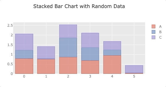
An example of a stacked histogram created with Cufflinks.
And here is the code itself:
df = pd.DataFrame(np.random.rand(6, 3), columns=['A', 'B', 'C'])
df.iplot(kind='bar', barmode="stack", title="Stacked Bar Chart with Random Data")
Please note that to create diagrams using Cufflinks you need to use .iplot().
Like Express, Cufflinks returns the original data so you can make minor corrections. But unlike Cufflinks, you need to refine the variable asFigure=Trueto return information. After that, you can update the schedule in the same way as in Express. Here’s what it will look like if you want to change the name and range of axes.
my_fig = df.iplot(kind='bar', barmode="stack", title="Stacked Bar Chart with Random Data", asFigure=True)
_fig.layout.yaxis = dict(title="Members", range=[0, 600])
Here documentation Cufflinks.
Unfortunately, Cufflinks also has its limits. For example, using this library, you cannot create a scatter plot with geographic coordinates.
Comparison of three options
Further you can observe a comparison of the code with a similar structure for graphs created using plotly.py, Express and Cufflinks.
plotly.py
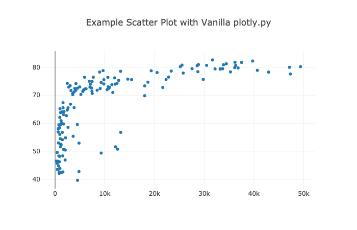
An example of a scatter plot made with plotly.py
fig = {
    'data': [
        {
            'x': df2007.gdpPercap,
            'y': df2007.lifeExp,
            'text': df2007.country,
            'mode': 'markers',
            'name': '2007'},
    ],
    'layout': {
        'title': "Example Scatter Plot with Vanilla plotly.py"
    }
}
py.iplot(fig)
Express
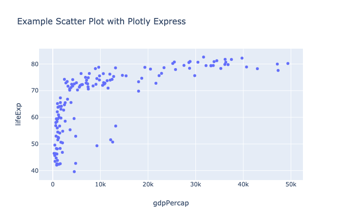
An example of a scatter plot made with Plotly Express
px.scatter(
    df2007,
    x="gdpPercap",
    y="lifeExp",
    title="Example Scatter Plot with Plotly Express"
)
It looks simple and concise! The default formatting is slightly different, and axis names are generated automatically. Now I suggest taking a look at the same graph in Cufflinks.
Cufflinks
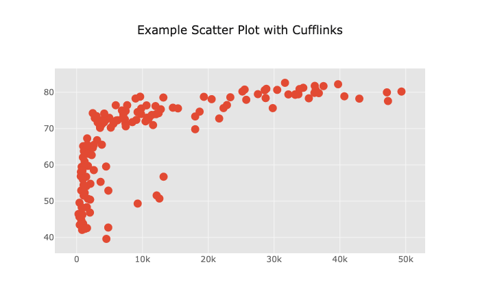
Cufflinks scatter chart example
df2007.iplot(
    kind='scatter',
    mode="markers",
    x='gdpPercap',
    y='lifeExp',
    title="Example Scatter Plot with Cufflinks"
)
The code is similar to Express, but the chart has slightly different default values. Certainly, with Express and Cufflinks you don’t have to tapping codes for hours, which is especially important when creating more complex schedules.
Let’s see how you can return and turn to basic information.
Updating Cufflinks and Express Charts
Let’s move on to the layout of the graph created with Cufflinks and add the axis names.
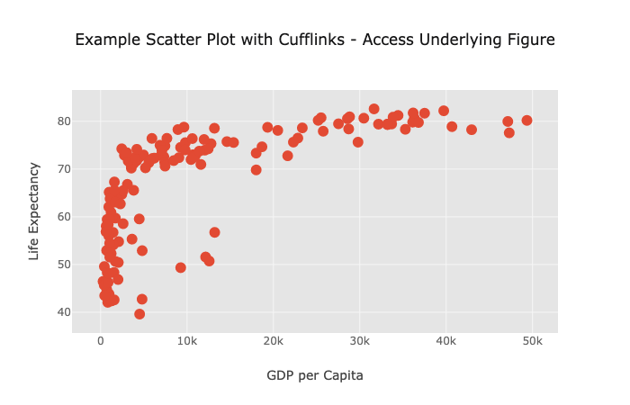
Cufflinks Example Scatterplot Diagram – Accessing the Source Plot
fig = df2007.iplot(
    kind='scatter',
    mode="markers",
    x='gdpPercap',
    y='lifeExp',
    asFigure=True,
    title="Example Scatter Plot with Cufflinks - Access Underlying Figure"
)
fig.layout.xaxis.title = "GDP per Capita"
fig.layout.yaxis.title = "Life Expectancy"
fig.iplot()
Here’s how to do the same with Express. Do not forget that in this library you do not need to specify asFigure=True.
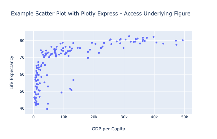
Plotly Express Scatterplot Example – Accessing the Source Plot
fig = px.scatter(
    df2007,
    x="gdpPercap",
    y="lifeExp",
    title="Example Scatter Plot with Plotly Express - Access Underlying Figure"
)
fig.layout.xaxis.title = "GDP per Capita"
fig.layout.yaxis.title = "Life Expectancy"
fig.iplot()
You can refer to the source data to add text labels of the following form:
fig.data[0].update(
text=df2007['gdpPercap'],
textposition=’inside’,
textfont=dict(size=10)
)
What to choose: Plotly.py, Express or Cufflinks
Choosing is always difficult. Once I thought I was working on part of a project in Express, and then I realized that it was Cufflinks!
I really like the expression from “Zen of Python”: “There must be one and, preferably, only one obvious way to do this.” As soon as options appear, there is a need for a long search for information, fatigue from the need to choose, and mistakes. ”
Unfortunately, not a single high-level API currently provides the ability to create any type of graph. However, I personally will definitely try to avoid using the “vanilla” python.py as much as possible and prefer Cufflinks or Express.
I advise you to once again look at the Express and Cufflinks documentation before creating a diagram. Do not forget that Express uses “neat” data frames, while Cufflinks is more flexible in this regard. Use the library that meets your needs and has your preferred format.
The default formatting for the two libraries can be very different. For example, creating a data frame with random data for columns X, Y and Z and using the following code, in Cufflinks we get the following diagram:
df.iplot(kind=’scatter’, mode=’markers’, x=’X’, y=’Y’, title=’Random Data’, categories=’Z’)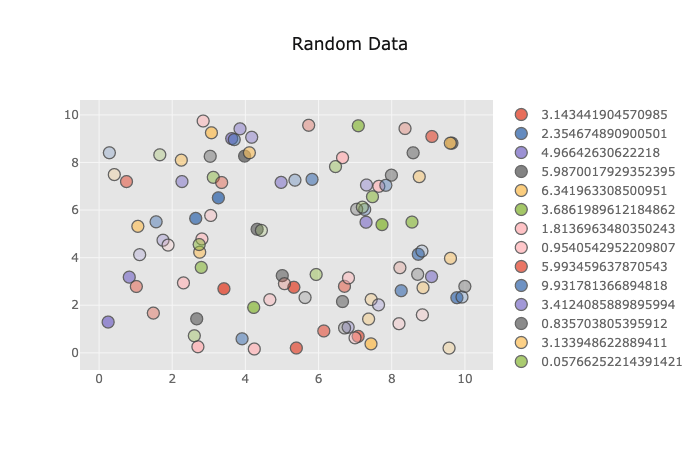
Default Scatter Chart with Cufflinks
And here is what we get with the Express code:
px.scatter(df, x=’X’, y=’Y’, color=’Z’, title=’Random Data’)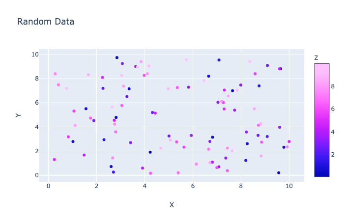
Other presets with Express
Noticeable difference!
Saving Files
When you are finished working with the chart, you can move the mouse over it and click on the camera icon to export it in .png format, or click “Export to plot.ly to save the interactive image to the Plotly server. In addition, you can download files in an interactive HTML format as follows:
py.offline.plot(my_fig, filename=’my_example_file.html’)If you need other image formats, you can use the package orca and download files in .png, .jpg and .pdf formats. This package is currently not available on pypi.org, so installing it using pip will not work. You can manage the package using conda or install an OS-specific version of orca with github pages. After that, you will not need to import the orca library. Learn more about orca here.
Here is the code to create the png file after installing orca:
import plotly as plotly
plotly.io.write_image(fig, file="my_figure_file.png", format="png")
As you can see, you can pull your graphs from Plotly in several different ways.
I suggest a brief run through the two other components of the Plotly ecosystem, so that you understand what is what.
Dash
With Plotly Dash You can create dashboards for your team or for other people. There is an open-access version, which by May 1, 2019 had almost 9,000 GitHub stars. Plotly also offers a range of add-ons. Maybe in the future I will write an article about this. Subscribe in order not to miss.
Chart studio
Plotly chart studio allows you to easily create and edit graphs in the browser. Plotly advertises this program as “the smartest editor for creating D3.js and WebGL diagrams. No need to encode anything manually. ” There is a free version, but if you want to keep your charts, you will have to pay $ 99 per year of use.
Now that we’ve reached the top of Plotly, let’s quickly go through the other mountains of data visualization in the Python range.
Bonus: other options for Python data visualization libraries
I was not going to tell in this article about all the programs for data visualization in the world, but still I want to mention some rather important programs that data specialists should be aware of. So you can get the most out of the territories with which you may have to work.

If you want to make graphics the old fashioned way, refer to the “vanilla” library Matplotlib API

Pandas matplotlib allows you to create some pretty simple graphics. Can create standard Matplotlib objects.

Seaborn – An excellent high-level wrapper based on Matplotlib, which allows you to create various graphs of visualization of statistical data. Unfortunately, due to the rather old matplotlib baseIt’s not very convenient to use.

Bokeh – Plotly competitor. The program is open source, interactive, works with Python.

Holoviews – A high-level wrapper working with Matplotlib, Bokeh, and now with Plotly. I know the guys who use it.

Professionals working with the R language like to use Shiny from RStudio. It allows R users to create interactive visualizations for web applications.

Tableau and Microsoft PowerBI – Two popular options with drag and drop visualization data that work with Python. Tableau is a very good library, but you will have to pay for it if you do not want your work to be in the public domain.

In my opinion, PowerBI has a less intuitive interface, but the program is still very powerful and popular.
Most interactive charting software uses the D3.js library. She is very popular.
Conclusions and useful resources
If you are a data specialist, I advise you to pay attention to Plotly. This program has advanced tools for creating interactive charts. From the top of this mountain, it seems that such a powerful colossus as Plotly, in the near future will definitely not be able to overtake.
Perhaps someday there will be a universal library that allows you to create anything you want using the high-level Plotly API options. In the meantime, if you want to save time and make cool graphics, I suggest contacting Pandas with Cufflinks or Express.
- Will koehrsen tells how to start using Cufflinks.
- Jon mease tells what can be done with plotly.py v3.0 on JupyterLab
Tip: when using color in charts, do not forget about people with color blindness. Use a palette convenient for color blind people. I use the palette from ggplot.

Color swatch
color_list = ["#E69F00", "#56B4E9", "#009E73", "#F0E442", "#D55E00", "#0072B2", "#CC79A7"]
Learn the details of how to get a sought-after profession from scratch or Level Up in skills and salary by completing SkillFactory paid online courses:
- Machine Learning Course (12 weeks)
- Learning Data Science from scratch (12 months)
- Analyst profession with any starting level (9 months)
- Python for Web Development Course (9 months)
Read more
- The coolest Data Scientist does not waste time on statistics
- How to Become a Data Scientist Without Online Courses
- Sorting cheat sheet for Data Science
- Data Science for the Humanities: What is Data
- Steroid Data Scenario: Introducing Decision Intelligence