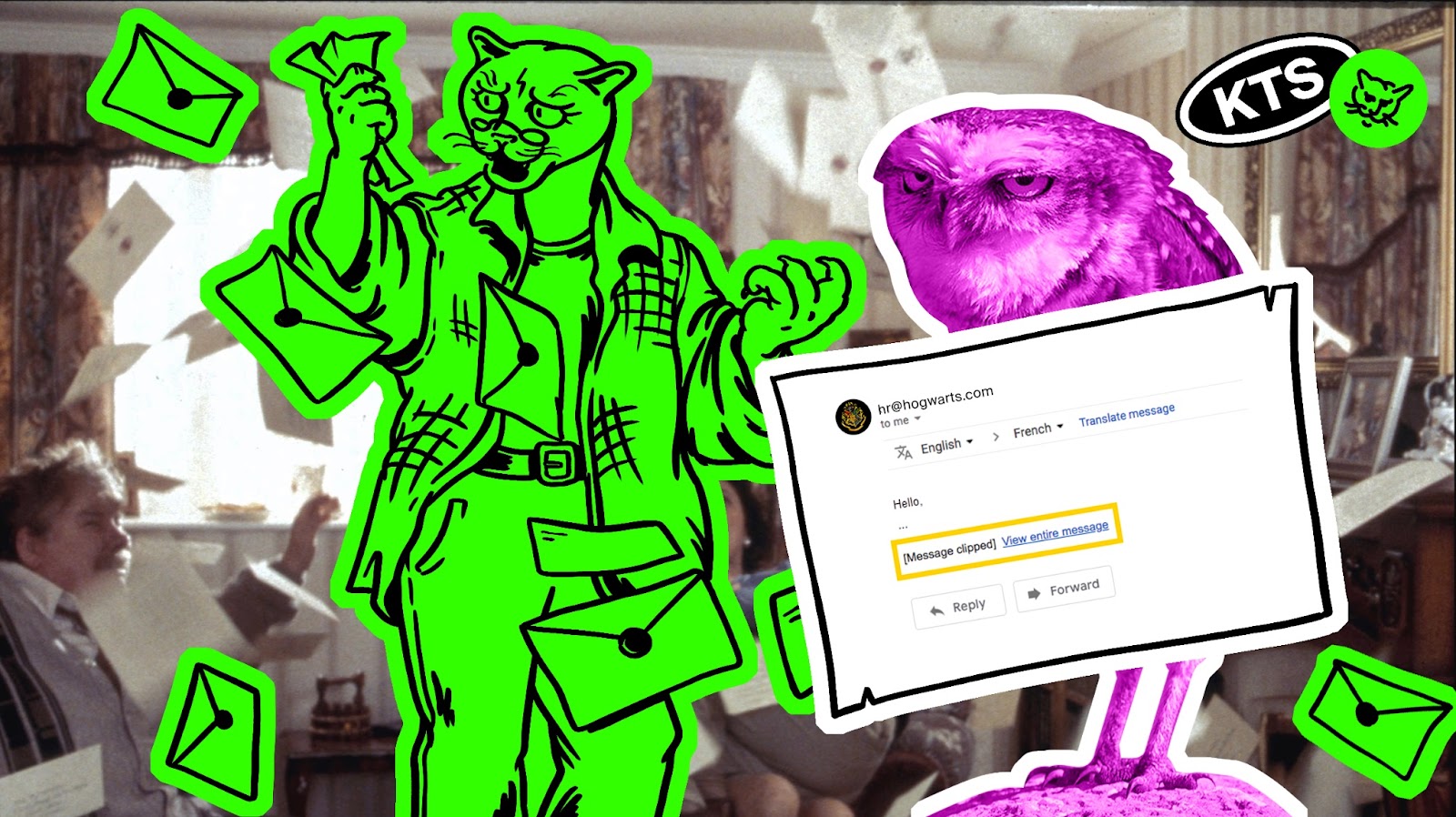
How to layout a letter so that it reaches the recipient as intended
Hello! My name is Egor Steblin, I am a front-end developer in the special projects department at KTS.
In the article I will tell you and show you how to layout a letter so that it is certainly displayed correctly in all email clients – especially in Outlook, which still tops the list of popularity in the Russian Federation.
What will be in the article
Why do we need email newsletters?
Email newsletter has one of the best ROI among digital marketing channels – approximately 36:1.
Mailing allows you to establish the closest possible contact with representatives of your target audience. After all, in it you can contact the user by name and make a personal offer. Here's what else newsletters do:
retain active customers and return those who have already ceased to be them
encourage customers to make repeat purchases
encourage customers to make impulse purchases
Now let’s imagine: your potential or already active client opens a letter that has come from you, and in it there is a floating layout, half-loaded fonts and pictures, and at the bottom there is an inscription “open in a separate window”, cutting off half of the letter. Awkward, isn't it?
Our article will help you make a letter without errors.
Why type out letters manually?
Typesetting letters by hand is a non-standard task. The last time I needed this was to insert email code inside a wrapper that was being developed by other developers.
But if you don’t have specific requirements, and many subtleties scare you, we recommend trying ready-made solutions that will take everything into account for you – for example, mosaico.io.
What could go wrong
According to caniemail.comthe support rating for all available HTML and CSS elements for email layout looks like this:
Google Mail – from 37 to 52% depending on the platform
Other versions of Outlook – from 19 to 61% depending on the platform
Support for accessible HTML and CSS elements in other clients
For this article, we have collected letter layout methods that we have tried and tested from our own experience and that definitely work. We'll tell you why you need to use tabular layout, what the problem is with Outlook, and where to check emails for support.
Outlook problem
Full version
The first Outlook was developed by Microsoft in 1997 as part of the Microsoft Office suite. It was a personal information manager primarily used for email management. Over the years, Outlook has evolved and gained new features such as calendar, tasks, and contacts.
Outlook originally used the Word engine to generate messages and the Internet Explorer engine to display inboxes. This led to inconsistencies in display and difficulties in creating emails. Therefore, in 2007, Microsoft decided to replace Internet Explorer with Word to display incoming emails.
So Outlook lost support for most of the HTML and CSS features for 16 years, as a result of which developers had to use different practices to correctly support emails in Outlook, which I will discuss below.
In September 2023, Microsoft released Outlook on a new engine. Element support is now much broader, but the problem remains, and here's why:
Firstly, on services like caniemail.com Support for the latest version of Outlook has not yet been registered – there is still no reliable data about what it supports.
Secondly, not all users have the new version. It has been fully added to Outlook Web, Microsoft Office 365 subscription and Windows Mail. But this is subject to automatic updates or a pre-installed application in Windows 11, starting in 2024. If your PC has Office 2021 or lower, Outlook will be on the old engine.
In short: Microsoft Outlook supports only from 19 to 65% of the available layout and at the same time is still very common in the Russian Federation. There is a new version, but it is not yet known what elements it supports. Therefore, if potential readers of your letters use Outlook, to be on the safe side, you should use all the rules below.
Basic principles
Use table layout. When Outlook switched to rendering through Microsoft Word, many CSS and HTML features were no longer available. The most stable development path was tabular layout – and remains so to this day.
The new Outlook almost completely supports div development, but many users still use older versions of the client. Perhaps in 2-3 years the majority will switch to the new Outlook, and then the tables will become less relevant – but for now.
Maximum size of a document containing a letter— 100 Kb. Images and fonts loaded from outside do not count. There are several reasons for this:
Spam filters or graphical artifacts
Automatic trimming in some clients, such as Gmail. Instead of a typed letter, the “Open in a separate window” button appears – and all the carefully prepared UX is down the drain:
The maximum width is 800 pixels. Previously, due to Outlook and average screen sizes, the standard of 600 pixels was used. Today the maximum width has increased to 800 pixels. If you do it even wider, a number of problems may arise, from the appearance of horizontal scrolling to incorrect rendering.
Maximum letter width for mobile devices — 400 pixels. Without prescribed styles, the email client itself will compress the letter to fit the screen, maintaining the proportions.
Use only inline styles, because they are supported by most of the customers. The style tag is not supported everywhere. For example, the Google email client accepts styles inside the style tag only in emails from Google accounts. If you link a Yandex client to Google mail, then in letters from Yandex mail the styles in the style tag will not reach the client at all. And style-styles can simply be lost during shipment.
To speed up development, you can use CSS classes. But before rolling out to production, use a service that will wrap everything inline, for example templates.mailchimp.
Check element and property support. You can use the service caniemail.com: each HTML element, attribute, CSS property is tested on 20-30 email clients at once, for each of which a version is written that supports a specific element. If the support is incomplete or has bugs, caniemail will tell you what exactly is not working.
As for the content of the letter itself, of course, the basic elements are available to you:
Text
Images
Links
Unfortunately, video and audio are not supported in most email clients at the moment, but you can use a CSS modifier to add interactivity :hover which applies certain styles when hovering over any element.
Be careful! You can only add this modifier through the use of CSS classes. Accordingly, it is subject to all potential problems associated with the tag <style>.
To get started, simply paste the HTML code into the editor and click “Send Email.”
Layout in HTML
Preheader. This is the email subheading that appears next to the header:
The text in bold is the header, followed by the preheader in gray text. See how often it gets cut? Therefore, the shorter, the more reliable.
The user sees the preheader before opening. He can repeat the text in the letter, or he can briefly summarize it. In general, the recommended length for a preheader is between 30-80 characters. But don’t forget that clients are different and everything needs to be tested beforehand.
Since the preheader can show up to the first 150 non-code characters, after it the main body of the letter may suddenly appear. To avoid this, you need to fill the empty space with a sequence of special characters ending with a space (one such sequence is equal to one space on the client) “ ͏ ”
In any case, it is better to hide the preheader in the body of the letter so as not to duplicate information that the recipient has already seen. Quite a few styles are hung for this purpose to hide for sure.
To hide the preheader we use the following settings:
All links require a title. First of all necessary for the same reason as the attribute alt from the previous section: if the email recipient uses a screen reader, title will give information about the link.
More title can trigger tooltips on mouseover, providing users with additional information about the link. But remember that not all email clients and browsers support and display tooltips the same way.
For alignment use valign and align. They are designed to control the vertical and horizontal alignment of the contents of table cells, respectively. They apply to tags <td> (table cell) or <th> (cell title).
<td valign="top">Содержимое ячейки</td>
<td align="center">Содержимое ячейки</td>
Example
Layout in CSS
Use pixels and percentages as units of measurement, since among the units of measurement they have the greatest support, and:
Percentages can only be applied to height and width
For everything else, such as font styles, indents - only pixels
If we take into account only new clients with a high level of support for CSS functionality, then relative units can also be used. But we act for sure, so we expect to make a letter that even the old version of Outlook will draw, so we don’t take this option.
Immediately type out the rubber. For all key elements of the letter, which should occupy 100% of the width, you need to specify the maximum width through the max-width property. This can help avoid display issues on devices with very wide screens.
Media queries for responsiveness are supported in only 50% of email clients. Therefore, it is necessary to calculate from the very beginning how each element will fill the space.
Avoid styles like position: absolute. There are a number of properties that are only supported in the most advanced clients, such as Apple Mail. Absolute positioning of elements is one of them.
Only table properties can be used for positioning valign And align — and experiment with indentations using padding And margin.
Write styles in full. Clients may not support shorthand styles at all—or may not perceive them in the way the developer expects. That's why:
Use padding on parent components instead of margin on child ones. Padding has a lot of support, so this way you will reduce the number of possible bugs.
Background-image can only be used as a last resort. It's supported in modern clients, but versions of Outlook before 2023 won't understand what it is. If the use of background-image is critical, it is better to reconsider the entire solution and implement some alternative, for example, try background-color.
Fonts
Use email-safe fonts. They are available on the vast majority of devices, and therefore in the email clients installed on them, so their use is safe. The likelihood that the client will fully support another font is 24%.
Another reason to use email-safe fonts: while custom fonts are loading, the text in the letter is not displayed.
The integration code for an email-safe font may differ from the integration code for a custom font in an email. The connection might look something like this:
But not all email clients support loading fonts using @font-face. Therefore, if a custom font is critical, be sure to write a full fallback to the email-safe font:
body {
    font-family: "CustomFont", "FallbackFont", Arial, sans-serif;
  }
Here “FallbackFont” - email-safe font. If “CustomFont” is not available, the browser or email client will look for the next font in the list.
Phantom tables
If there is some block with a width specified in percentage and a limitation in the form max-widthin 100% of cases Outlook will skip the restriction because it simply does not know the property max-width. As a result, defects in the layout may appear.
An example of such defects:
Desired letter structure
Result of erroneous rendering in Outlook
But if you wrap table elements in a comment, it will be perceived only in desktop Outlook versions 2007-2019 due to the engine. Others simply won’t see these commented tables, hence the name.
Therefore, all divs and tables with variable widths, especially for Outlook, should be wrapped in a phantom table with a static width:
<!--[if mso | IE]> And <![endif]--> are comments that will only be accepted by older versions of Outlook. Inside these comments a fixed width table is created
After closing comments for Outlook, any block that uses relative units is added
Sample letter from start to finish
As you can see, in addition to what was stated earlier, we use certain meta tags here. We will not describe each of them in detail, but will focus only on one of the most important - viewport. This tag is responsible for scaling your document on mobile devices. The standard values for it are: width=device-width And initial-scale=1 . Then the contents of the document are scaled to fit the width of the device and the zoom parameter is returned to its original position.
Our approach to email layout may seem a little strange: despite modern technology development, even Gmail supports a little more than half of all HTML and CSS features, not to mention Outlook. All this is reminiscent of the postman Pechkin, who lives in 2024 and still delivers letters on a bicycle, just to be sure.
In fact, new clients with high element support are already in use, they just haven’t replaced the old ones yet. Therefore, for now we have to focus on legacy.
And when the approaches change, we will definitely write a new version of the article and tell you about the new layout rules - stay tuned!