Design patents: part two (examples from Microsoft, Snapchat, Samsung, Netflix, Airbnb, Tinder)
Microsoft
Tiled Start Panel in Windows
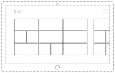
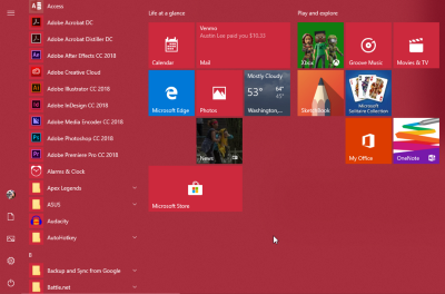
Here's a drawing and rectangles became the visual representation of the Microsoft brand, it is used on all Windows devices. In the version for the stationary computer, when opening the “Start” menu, a tile of this type is also displayed, only smaller in size — it displays the available options. When designing a dashboard, make sure that you do not get a group of rectangles that looks a lot like the one depicted on the patented scheme.
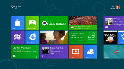
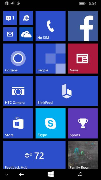
Microsoft reinsured by issuing a separate patent for the mobile application interface that is used on Windows Phone. The defining features here are the ratio of the sizes of the rectangles, and their location relative to each other: they are shifted to the left, so that there is room for the navigation icon on the right in the upper part of the screen. However, it seems that this design is already in the past. On the current interface (the one on the right in the illustration below), the tile fills the entire screen and may include several columns. But you still cannot borrow the old version, which they refused, because the patent is still valid.
Gallery view (old function)
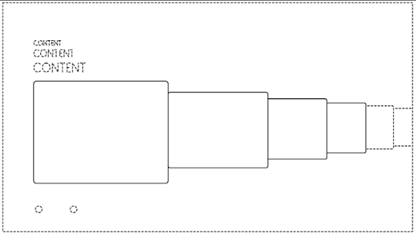
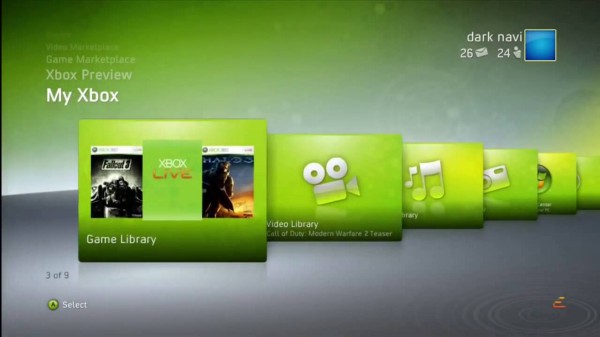
I found this interface to display the contents of the gallery by chance when I looked at Microsoft patents, and it seemed very elegant to me. I have been using Microsoft products for 25 years and have never encountered it in my life. I searched for information and asked around for friends; it turned out that the Dashboard on the Xbox 360 once looked like that. However, I wanted to mention it because it is very cool and someone can inadvertently do something like this in a more modern style, not even knowing that the idea belongs to Microsoft , a huge corporation. Oops. The design is already quite old – it was patented in 2010 – but it is still impossible to touch it until 2024, when the term of the patent should, in theory, expire.
Snapchat
Memories (old function)
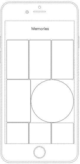
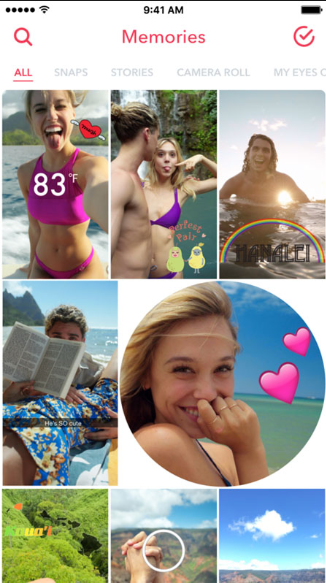

Remember? Personally, I always thought that the design is kind of silly. But I nevertheless decided to include it in the list, before that I was surprised that, despite everything, they patented the idea with a circle among the rectangles – in my opinion, for such an interface, this is already over the edge. Since then, the company has already managed to change the design of the tile, making it more uniform.
Go to Story

Link to the animation
This does not catch the eye, but when you open a snap, it first turns into a circle, and then fills the entire rectangular screen. If you press your finger to the screen and slowly pull it down, you can see how it will roll back into a circle and move closer to the user profile.
Samsung
Swipe to unlock (old feature)
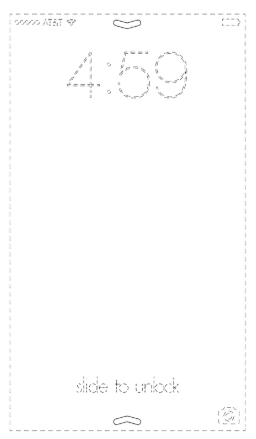
Samsung uses its own version of this gesture, which assumes the presence of two arrows facing towards the center. I was unable to find an illustration to show this concept in action; it seems that now their business is limited to a text prompt.
Netflix
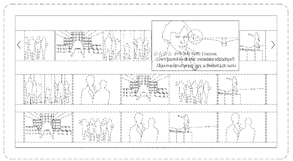
Guidance on the element of the carousel
Link to the animation
Netflix coolly pumped the application of the carousel in the design and tried well to make the pointing gesture to the user experience as much as possible. When you hover the cursor over an icon, the picture unfolds, the video starts playing and all the basic information about the show is displayed. This gesture also “moves apart” all adjacent icons to make room for deployment. This is a very bold decision: Netflix decided to remove some of the information from the screen in order not to attack the user from all sides. Due to the use of such a design, it became necessary to prescribe the name of the series on each icon clearly and coarsely. The Netflix brand gives priority to content personalization over consistent, consistent labeling. This patent is new – it was issued in February 2018.
Unfolding icons in the carousel

Link to the animation
I don't use Netflix services too often, so I didn’t even know about this thing until I started collecting material for an article. When you hover over the icon, an arrow appears on which you can click – and then the tab expands with a larger window where the introductory video is played. There are other tabs with additional information about the series. This is a convenient system, it allows you to move from level to level, consistently revealing new details. The patent came into force in March 2018.
Airbnb
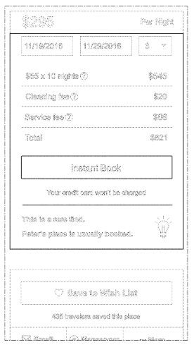
Animated / maximized / fixed over other elements of the reservation window

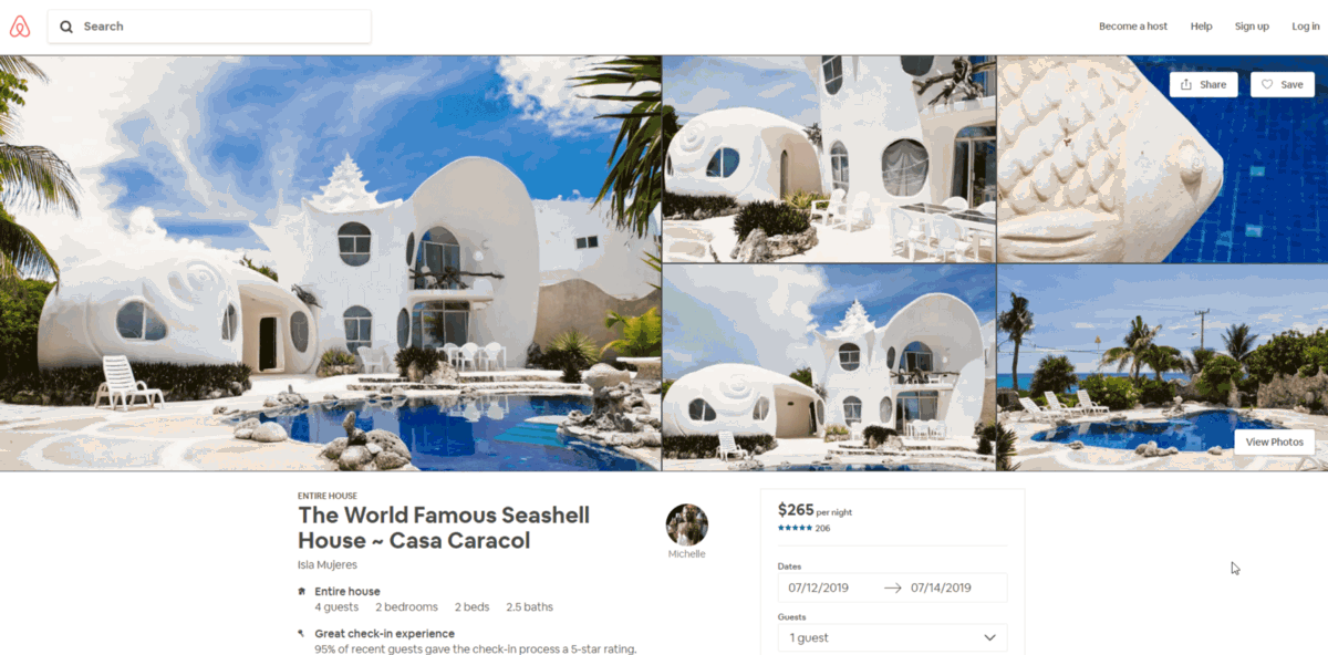
Designers love Airbnb. This product has one of the tidiest interfaces, and we all have something to learn from them. Airbnb designers turned out to be one of those people who took the motto “the main thing is design and user experience” to heart, and they infected this idea with others. In terms of design thinking, this is a leading company in the industry – for a business that is already entrenched in the market, it can be difficult to change the model of work, and you can’t force managers to get into ideas in one day.
In the case of this patent, I had to suffer for a long time to understand what exactly Airbnb claims. They wanted to say the following: if the floating panel occupies a certain position on the screen (that is, to the right of the grid), the company retains the rights to the animation that occurs when scrolling. If you take a good look, you will notice that when you scroll the page, an additional field appears (“Great price” / “Excellent price”). The patent is also quite fresh, from November 2018.
Screen "Back to Home" (for the future)
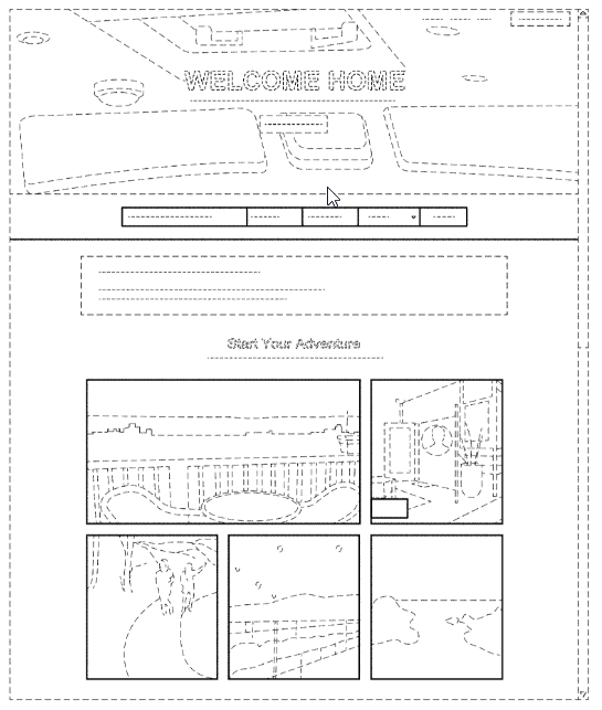
And another new patent, issued in October 2018. The design seems to be standard: on top of the tab, the pictures are tiled, there is a place for a price tag. From the scheme it is not clear: whether it is a spoiler of some kind of experience, the design of the page to which the user returns “home”, or some other screen in the journey that I could not find. Be careful if you decide to repeat this pattern – there is nothing particularly characteristic about it.
Tinder
Swipe right swipe left

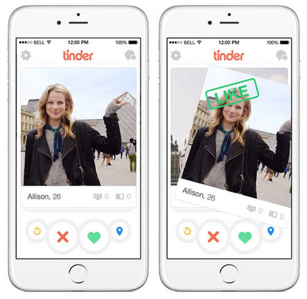
Perhaps, if you decide to rethink the scheme in the spirit of "if you like, lead to the left, if you do not like, lead to the right," you will somehow manage to get out. But in the illustration, only the cards themselves are highlighted with solid lines (like and dizlika buttons, meanwhile, dotted), and this suggests that any pattern associated with such a combination of gestures will be difficult to defend. In any case, if you do something similar and start to point at you with your finger, you will have to blink in the gray zone of the law.
Tap to Like
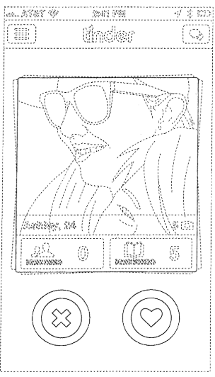
Alas, oh, but Tinder made sure that no one else implemented MVP (it’s also the minimum viable product, it’s also “so we don’t have time, remove the beauty, leave the skeleton”) in this version.
Tinder social

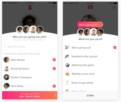
The interface, where a number of other icons are built up from the contacts under the round icon in the user’s profile and all this is complemented by the corresponding button below, is sticking to Tinder. Very specific design screen.
Finally
Finding out which elements of the company's interfaces are considered an integral part of its brand, although it may not be too obvious for an ordinary user, turned out to be a very interesting exercise. But, more importantly, we as designers should be well-versed on which patterns in the design are forbidden to use. Of course, no one is going to copy other people's UX-schemes from and to, but it is useful to have such information in stock, especially in conversations with people who are not related to design.
Some companies (for example, Uber) patent almost every screen that is used in the application, while others (for example, Google) have so many that their head is spinning. I advise you to look for information about the patents of those companies in whose works you get inspiration.
In the process of working on this list, I learned that sometimes even small things are being patented – the form of the element, the location of the icon. Or something very uncomplicated and unintelligible — say, a group of rectangles of certain proportions in a certain order. Other patents, by contrast, are very detailed and intuitive, such as the gradual unfolding of information from the icons in the carousel for Netflix.
So if you are engaged in UX-design or make interfaces and expect to release a popular product, it would be nice to get familiar with current patents. From the fact that someone did not see them, they do not cease to exist. If you have come up with something truly original, a business card for your company, consider whether it is worthwhile to get lawyers to help you apply for a patent. On the scale of the company, this is not so expensive, especially since it will serve you for 15 years. And in general, is there a better way to say to the world: “Do not rock the gun” than with your own patent?