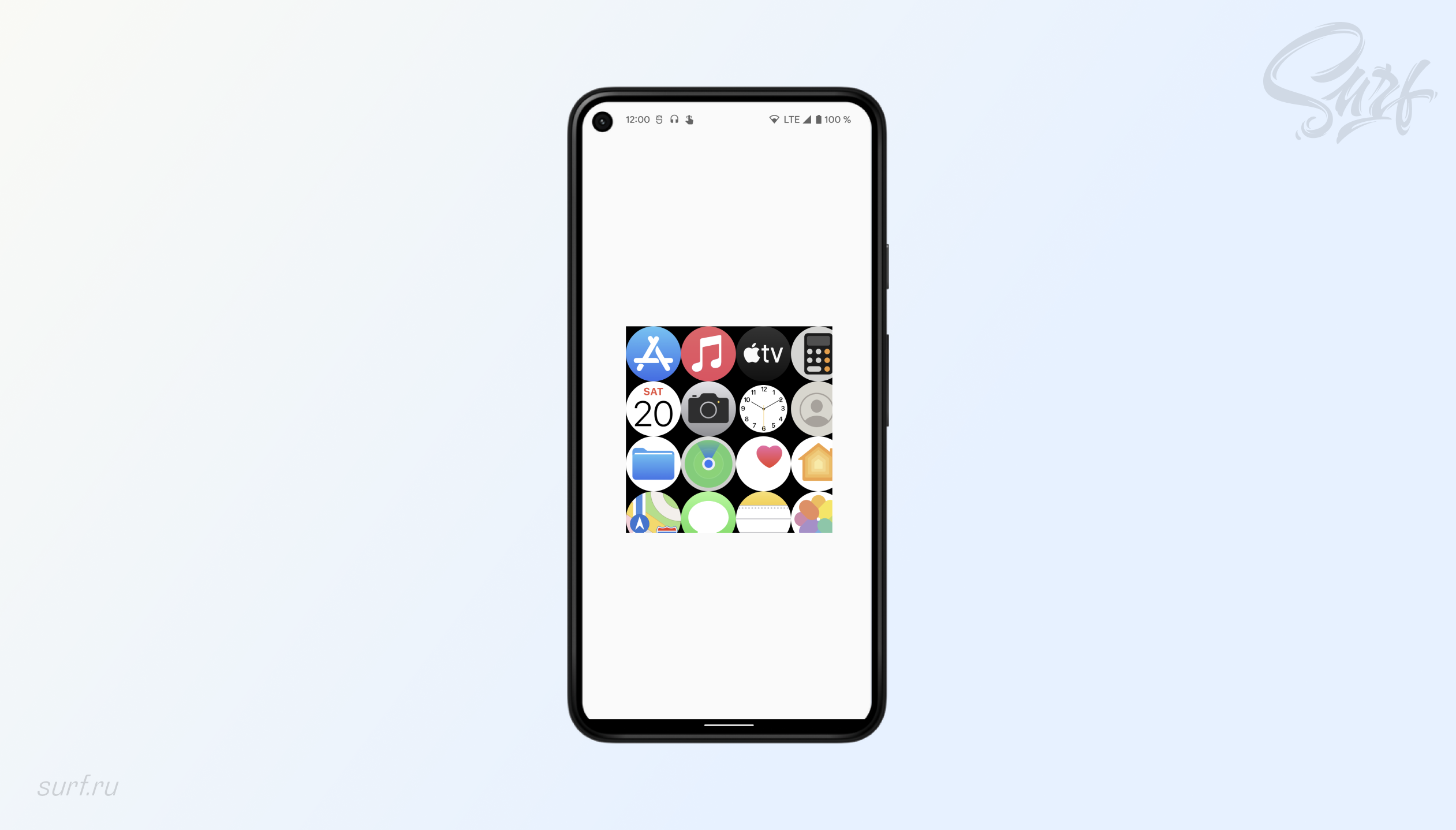
Apple Watch menu implementation
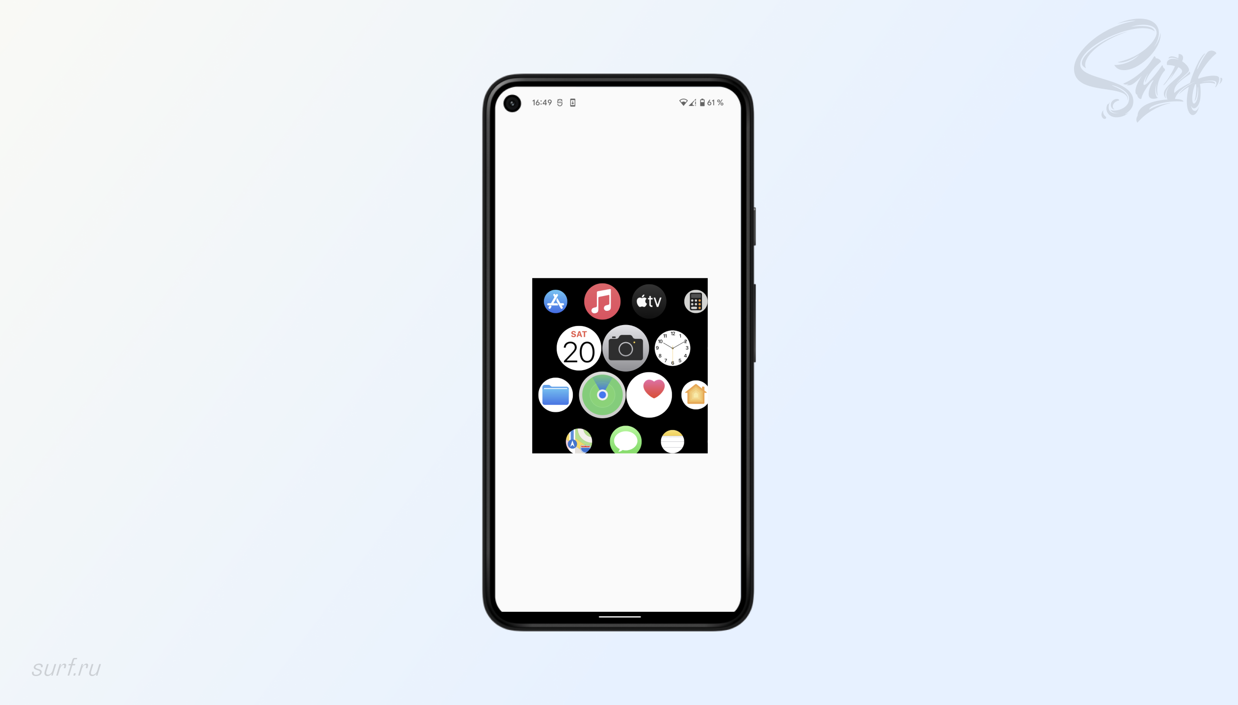
I really like the Apple watch menu: the smoothness of animation, the behavior of icons when moving, the arrangement of elements on an unusual grid. I wanted to replicate this menu on Android. But I didn’t really want to do this using the old approach using ViewGroup or a custom Layout Manager for RecyclerView: it’s too expensive to work “on the table”.
With the advent of Compose, the idea has become more attractive and interesting to implement. A big plus when working with Compose is that the developer is focused on the business logic of the task. He does not need to look in the bowels of the ViewGroup sources and documentation for information on where it is better to place the logic: in onMeasure or in onLayout, and whether the onInterceptTouchEvent method should be overridden.
Let’s figure out together how to create your own ViewGroup on Jetpack Compose.

What you need to create such a Layout:
Create a container to display a grid of elements.
Handle the drag gesture to offset the content properly.
Implement OverScroll and animation for it.
Implement Scale animation similar to the Apple watch menu.
Make a mechanism so that Layout can survive screen rotation.
Step One: Create a Container and Arrange Elements in a Grid
To create custom containers in Compose, use layout, which underlies all containers in Jetpack Compose. If we draw an analogy, then Layout is view group from the familiar Android view system.
Let’s write a basic Composable function:
//1
@Composable
fun WatchGridLayout(
   modifier: Modifier = Modifier,
   rowItemsCount: Int,
   itemSize: Dp,
   content: @Composable () -> Unit,
) {


   //2
   check(rowItemsCount > 0) { "rowItemsCount must be positive" }
   check(itemSize > 0.dp) { "itemSize must be positive" }

   val itemSizePx = with(LocalDensity.current) { itemSize.roundToPx() }
   val itemConstraints = Constraints.fixed(width = itemSizePx, height = itemSizePx)


   //3
   Layout(
       modifier = modifier.clipToBounds(),
       content = content
   ) { measurables, layoutConstraints ->


       //4
       val placeables = measurables.map { measurable -> measurable.measure(itemConstraints) }
       //5
       val cells = placeables.mapIndexed { index, _ ->
           val x = index % rowItemsCount
           val y = (index - x) / rowItemsCount
           Cell(x, y)
       }


       //6
       layout(layoutConstraints.maxWidth, layoutConstraints.maxHeight) {
           placeables.forEachIndexed { index, placeable ->
               placeable.place(
                   x = cells[index].x * itemSizePx,
                   y = cells[index].y * itemSizePx
               )
           }
       }
   }
}
Let’s write a function, label it @Composable–annotation and define the necessary parameters.
modifier – one of the most important attributes of layout on Compose. Needed to determine the size of the container, background, and so on.
rowItemsCount is the number of elements in the grid row.
itemSize is the size of the element. Each element will have the same width and height.
content – composable-lambda, which will provide elements for display.
Let’s make a couple of checks so that only valid values are used in the container. Also, for further work, you need to convert itemSize to pixels. And translate the value in pixels into Constraints – an object for transferring the desired dimensions to the container. We know exactly what size each element will be, so we will use Constraints.fixed(…)
Let’s move on to the important part: Layout. It takes three key parameters:
modifier – we will pass a modifier into it, which takes as a parameter WatchGridLayout. It needs to be added to clipToBounds(). This is important if the container will be used inside another container, for example box. Then the elements of the container will be rendered outside of it.

content – we pass here the parameter that was passed to WatchGridLayout.
measurePolicy – an interface that is responsible for placing elements in a container. In our case, we implement it as a lambda.
The measurePolicy lambda provides two parameters: measurables and layoutConstraints. The first is the elements of the container, the second is the parameters of the container: we need the width and height from it.
To work with measurables, you need to translate them into placeables: “measured” – into “placed”, no matter how strange it may sound. This will require itemConstraints.
For each element of the container, you need to calculate x and y coordinates. At the input we get a one-dimensional array of elements [0, 1, 2, … N-1]. The grid requires a two-dimensional array: it should look like this: [[0,0];[0,1];[0,2]; … [N-1, N-1]]. For this, each index convert to object cellwhich will contain x and y for each element.
Now there is everything to display the elements correctly. AT layout you need to pass the width and height from layoutConstraints. Looping through the list placeables and for each element we call the method place. We transfer to it x and y from array cells, pre-multiplying by itemSizePx.
There are several more methods place*. One of them will be useful to us further, but this is enough for a basic understanding.

As a result, we get a two-dimensional grid of elements. Two dozen lines, and we can already display the elements in a custom container: not bad, Compose 👏
Next, we implement the State, which will be responsible for the location of the elements, scale, overscroll, animation and state saving when the screen is rotated. As well as a config that will contain all the necessary constants.
Let’s first understand how element scale works. If you pay attention to the movement of elements when scrolling, you can see that the elements move along a spherical path.

However, the elements shrink faster when approaching the edge of the container: we can conclude that this is not a completely spherical path, but an elliptical one. Here we need a formula elliptical paraboloid. Let’s figure out how to apply it.
The formula looks like this:

But in this form it will not help us: the paraboloid must be turned over. To do this, you need to make simple transformations:
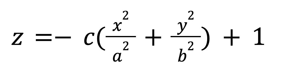
z is the scale value. To understand how this will help in calculating the scale, we need to build a transformed graph. To do this, you can use, for example, the Grapher utility that comes with macOs.

Step Two: Create WatchGridConfig and Write All Necessary Parameters
//1
class WatchGridConfig(
   val itemSizePx: Int = 0,
   val layoutHeightPx: Int = 0,
   val layoutWidthPx: Int = 0,
   val cells: List<Cell> = emptyList()
) {
   //2
   val a = 3f * layoutWidthPx
   val b = 3f * layoutHeightPx
   val c = 20.0f
   //3
   val layoutCenter = IntOffset(
       x = layoutWidthPx / 2,
       y = layoutHeightPx / 2
   )
   val halfItemSizePx = itemSizePx / 2

   //4
   val contentHeight =
       ((cells.maxByOrNull { it.y }?.y?.let { y -> y + 1 }) ?: 0).times(itemSizePx)
   val contentWidth =
       ((cells.maxByOrNull { it.x }?.x?.let { x -> x + 1 }) ?: 0).times(itemSizePx)
   //5
   val maxOffsetHorizontal = contentWidth - layoutWidthPx
   val maxOffsetVertical = contentHeight - layoutHeightPx
   //6
   val overScrollDragDistanceHorizontal = layoutWidthPx - itemSizePx
   val overScrollDragDistanceVertical = layoutHeightPx - itemSizePx
   //7
   val overScrollDistanceHorizontal = layoutWidthPx / 2 - halfItemSizePx
   val overScrollDistanceVertical = layoutHeightPx / 2 - halfItemSizePx
   //8
   val overScrollDragRangeVertical =
       (-maxOffsetVertical.toFloat() - overScrollDragDistanceVertical)
           .rangeTo(overScrollDragDistanceVertical.toFloat())
   val overScrollDragRangeHorizontal =
       (-maxOffsetHorizontal.toFloat() - overScrollDragDistanceHorizontal)
           .rangeTo(overScrollDragDistanceHorizontal.toFloat())

   val overScrollRangeVertical =
       (-maxOffsetVertical.toFloat() - overScrollDistanceVertical)
           .rangeTo(overScrollDistanceVertical.toFloat())
   val overScrollRangeHorizontal =
       (-maxOffsetHorizontal.toFloat() - overScrollDistanceHorizontal)
           .rangeTo(overScrollDistanceHorizontal.toFloat())
}
Let’s create a config class and write in the constructor all the parameters that were calculated during creation WatchGridLayout.
a, b, c are the parameters needed to calculate the scale.
The coordinates of the center of the container and half the size of the element.
We calculate the width and height of the content. Finding the maximum x and y in array cells and multiply by the size of the element.
Scroll parameters: must be such that the content can be fully scrolled.

Parameters for overscroll. The amount by which the content can be moved.

Parameters for overscroll. Used to animate the bounce effect, like on the Apple watch.

Step three. Let’s move on to the implementation of the State
The State will implement the functionality responsible for:
calculation of coordinates of elements,
storing the current content offset,
scroll, overscroll and fling animations.
Let’s define its interface and default implementation.
interface WatchGridState {

   val currentOffset: Offset
   val animatable: Animatable<Offset, AnimationVector2D>
   var config: WatchGridConfig

   suspend fun snapTo(offset: Offset)
   suspend fun animateTo(offset: Offset, velocity: Offset)
   suspend fun stop()

   fun getPositionFor(index: Int): IntOffset
   fun getScaleFor(position: IntOffset): Float
   fun setup(config: WatchGridConfig) {
       this.config = config
   }
}
snapTo — moves the content to the specified indent.
animateTo — moves content with animation to the given indent.
stop – stops the current content animation.
getPositionFor Calculates the position of an element by its index.
getScaleFor – Calculates the scale of the element by its position.
setup – initializes the config.
Let’s consider the implementation in detail.
animated – contains the current content indent, is responsible for its movement and animation.
override val animatable = Animatable(
   initialValue = initialOffset,
   typeConverter = Offset.VectorConverter
)
AT snapTo must first be limited x and y parameters from the config, and then pass them to animatable. snapTo will be called when the finger moves across the Layout.
override suspend fun snapTo(offset: Offset) {
   val x = offset.x.coerceIn(config.overScrollDragRangeHorizontal)
   val y = offset.y.coerceIn(config.overScrollDragRangeVertical)
   animatable.snapTo(Offset(x, y))
}
Logics animateTo similar to snapTo. The method is called when the finger is raised to start the overscroll or fling animation.
private val decayAnimationSpec = SpringSpec<Offset>(
   dampingRatio = Spring.DampingRatioLowBouncy,
   stiffness = Spring.StiffnessLow,
)

override suspend fun animateTo(offset: Offset, velocity: Offset) {
   val x = offset.x.coerceIn(config.overScrollRangeHorizontal)
   val y = offset.y.coerceIn(config.overScrollRangeVertical)
   animatable.animateTo(
       initialVelocity = velocity,
       animationSpec = decayAnimationSpec,
       targetValue = Offset(x, y)
   )
}
Logics getPositionFor already familiar. Part was done when writing the basic implementation WatchGridLayout, only now all parameters are contained in WatchGridConfig. Need to multiply the coordinates x and y of this element to the size of the element and add the current content padding. And do not forget about the additional indentation for every second row.
override fun getPositionFor(index: Int): IntOffset {
   val (offsetX, offsetY) = currentOffset
   val (cellX, cellY) = config.cells[index]
   val rowOffset = if (cellY % 2 != 0) {
       config.halfItemSizePx
   } else {
       0
   }
   val x = (cellX * config.itemSizePx) + offsetX.toInt() + rowOffset
   val y = (cellY * config.itemSizePx) + offsetY.toInt()

   return IntOffset(x, y)
}
AT getScaleFor contains all the logic for calculating the scale element from the plot of the elliptical paraboloid function. A couple of nuances: scale must be calculated for the center of the element and relative to the center of the Layout, and not its point [0, 0].
The final result should be limited so as not to get negative values and values greater than 1.0. I have the scale change from 0.5 to 1.0. Please note: I added 1.1 at the end, not 1, as in the formula above. In my opinion, it works visually better this way.
override fun getScaleFor(position: IntOffset): Float {
   val (centerX, centerY) = position.plus(
       IntOffset(
           config.halfItemSizePx,
           config.halfItemSizePx
       )
   )
   val offsetX = centerX - config.layoutCenter.x
   val offsetY = centerY - config.layoutCenter.y
   val x = (offsetX * offsetX) / (config.a * config.a)
   val y = (offsetY * offsetY) / (config.b * config.b)
   val z = (-config.c * (x + y) + 1.1f)
       .coerceIn(minimumValue = 0.5f, maximumValue = 1f)
   return z
}
Everything is with the state logic. The smallest, but no less important thing remains: to teach Layout to survive screen rotation. For this inside WatchGridStateImpl create a companion object and write an implementation for Saver. All you need to save is the current content indent and then pass it as a parameter initialOffset to the constructor WatchGridStateImpl.
Saver only supports serializable objects. offset is not, so you have to save its parameters x and y separately.
companion object {
   val Saver = Saver<WatchGridStateImpl, List<Float>>(
       save = {
           val (x, y) = it.currentOffset
           listOf(x, y)
       },
       restore = {
           WatchGridStateImpl(initialOffset = Offset(it[0], it[1]))
       }
   )
}
Let’s wrap Saver in a remember wrapper. Everything you can use.
@Composable
fun rememberWatchGridState(): WatchGridState {
   return rememberSaveable(saver = WatchGridStateImpl.Saver) {
       WatchGridStateImpl()
   }
}
Step four. Connect the implemented state to Layout
Let’s write state in the parameters.
@Composable
fun WatchGridLayout(
   modifier: Modifier = Modifier,
   rowItemsCount: Int,
   itemSize: Dp,
   state: WatchGridState = rememberWatchGridState(),
   content: @Composable () -> Unit,
) {// . . .}
Before calling layout(…) let’s pass the config to state.
state.setup(
   WatchGridConfig(
       layoutWidthPx = layoutConstraints.maxWidth,
       layoutHeightPx = layoutConstraints.maxHeight,
       itemSizePx = itemSizePx,
       cells = cells
   )
)

layout(layoutConstraints.maxWidth, layoutConstraints.maxHeight) {...}
And inside layout(…) we will replace the old logic with method calls from state. Let’s use the method placeWithLayer to place elements.
We get a grid with the correct shift of the rows and the already calculated scale of the elements.
The most interesting thing remains: handle the drag gesture to move the content inside the layout.
Compose under the hood contains a lot of coroutine code, and coroutines will not bypass us either. But it’s for the best: I’ve never seen an easier way to work with gestures in Android.
Drag gesture processing will be done through custom Modifier. To keep the code clean WatchGridLayoutcreate a class WatchGridKtx and write the implementation in it.
//1
fun Modifier.drag(state: WatchGridState) = pointerInput(Unit) {
   //2
   val decay = splineBasedDecay<Offset>(this)
   val tracker = VelocityTracker()
   //3
   coroutineScope {
       //4
       forEachGesture {
           //5
           awaitPointerEventScope {
               //6
               val pointerId = awaitFirstDown(requireUnconsumed = false).id
               //7
               launch {
                   state.stop()
               }
               tracker.resetTracking()
               //8
               var dragPointerInput: PointerInputChange?
               var overSlop = Offset.Zero
               do {
                   dragPointerInput = awaitTouchSlopOrCancellation(
                       pointerId
                   ) { change, over ->
                       change.consumePositionChange()
                       overSlop = over
                   }
               } while (
                 dragPointerInput != null && !dragPointerInput.positionChangeConsumed()
                       )
               //9
               dragPointerInput?.let {

                   launch {
                       state.snapTo(state.currentOffset.plus(overSlop))
                   }
                   drag(dragPointerInput.id) { change ->
                       val dragAmount = change.positionChange()
                       launch {
                           state.snapTo(state.currentOffset.plus(dragAmount))
                       }
                       change.consumePositionChange()
                       tracker.addPointerInputChange(change)
                   }
               }
           }
           //10
           val (velX, velY) = tracker.calculateVelocity()
           val velocity = Offset(velX, velY)
           val targetOffset = decay.calculateTargetValue(
               typeConverter = Offset.VectorConverter,
               initialValue = state.currentOffset,
               initialVelocity = velocity
           )
           launch {
               state.animateTo(
                   offset = targetOffset,
                   velocity = velocity,
               )
           }
       }
   }
}
Let’s create an extension Modifier.drag with parameter state: WatchGridState.
The decay and tracker parameters will be needed to calculate the velocity parameter, which is needed for the animateTo method.
Since you will need to work with suspend functions, you will need a coroutineScope.
Working with gestures starts with a block forEachGesture. The logic of this block is simple: after raising the last finger, it runs the code inside itself again.
Block awaitPointerEventScope needed directly for gesture processing.
We are waiting for the touch to occur.
We stop the current animation and stop tracking the velocity tracker.
In the do…while.. loop, you need to make sure that a drag gesture has occurred: this is necessary to distinguish between types of gestures. For example, if the Layout element is made clickable, it will override the drag gesture. Therefore, before tracking the movement of the finger, you need to understand that this is definitely a drag, and not an accidental click or tap on the Layout element.
Now that we know for sure that the lowered finger moves around the screen continuously, we can process it as a drag gesture. We pass the finger id to the special drag method, which will transmit the change in the position of the finger through the callback. We pass it to the method snapTo, and the content will start moving around the Layout. Also don’t forget to pass this change to tracker, to calculate velocity.
As soon as the finger is raised from the Layout area, the block awaitPointerEventScope stops working. The parameters for the animation to work are calculated. All calculated parameters, respectively, are passed to the method animateTo. If you raise your finger while quickly scrolling through content, you will see a fling animation. If you scroll content to the edge of the screen, you will see a debounce effect, and the content will scroll to the middle of the Layout – just like on an Apple watch.
That’s all. Sources can be viewed on Github. Good luck writing your custom Layouts 😉