why is this important for everyone
Hi all! My name is Yulia Alyokhina, I am a designer in AGIMA. In this article we will talk about inclusive design, why it concerns not only people with disabilities, and how to correctly argue the importance of accessibility in communication with the customer. I’ll also tell you how our design department learned to work with accessibility, about our new goals and plans for the future.
Inclusive design is a method of designing interfaces to meet the needs of as many users as possible.
Our design team recently completed an educational course on inclusion and digital accessibility. It was conducted by Aida Pacheva, ex-digital art director of ONY.
Our training took place in three stages.
1. We listened to the lecture and learned the main principles and terms of inclusive design, what limitations people with disabilities have, how to eliminate them, and how to argue to a business why it is worth investing in accessibility.
2. At the next stage, Aida told us how to work with accessibility on real layouts and what tools to use for this.
3. Finally, we applied what we learned to mock-ups of our current projects.
This course became part of an educational program for designers, organized by Oleg Zilberg, our design director. Oleg develops design at AGIMA, helps our department with training and instills new values. Our goal is to apply and translate best practices into digital. And one of the main tasks is to create interfaces that are accessible to all types of users.
To do this, first of all, in our work we need to think about the person, and not focus only on the needs of the user and client. When designing an interface, we must keep in mind the question: “How will a person feel when using our product?” Ensuring comfortable human interaction with a service is the simplest and most humane thing we can do as designers.
Why is it important
Accessibility is not just for people with disabilities.
People with disabilities use the same sites and applications as everyone else, but often cannot do it fully — often interfaces are simply not designed for them.
Of the 146 million people in Russia, approximately 11 million have disabilities. However, this concept is so broad that it concerns not only people with disabilities, but can directly apply to each of us.

Disabilities may vary:
permanentfor example, complete loss of hearing or vision;
temporarywhen a person wears a cast due to a broken arm;
situationalwhen we have difficulty hearing due to noise in the subway or our vision is limited while driving;
elderly peoplewhose health indicators deteriorate over time.

Therefore, when we create interfaces that take into account different restrictions, we help not only a narrow category of people, but also a wide range of users.
How to make design accessible
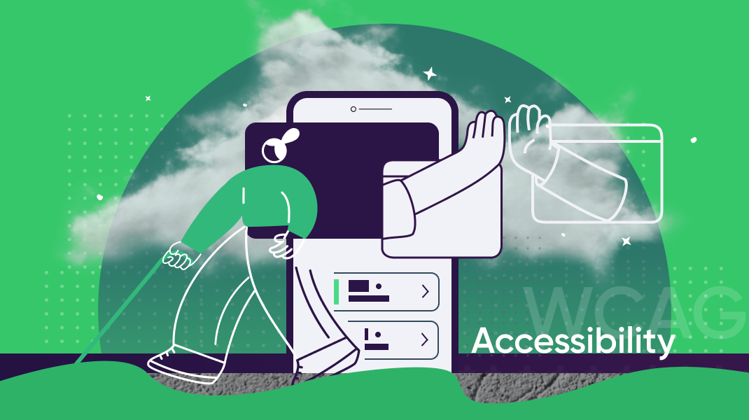
According to Web Content Accessibility Guidelines (WCAG)there are three levels of accessibility compliance:

Our goal for the future is to maintain a high level of accessibility for our projects. Then our services will be able to not only remove barriers for people with disabilities, but also be as convenient as possible for everyone.
To meet high availability levels, you must adhere to four WCAG principles and fulfill all the requirements of the selected level. I'll tell you about each of them.
1. Perceptibility
According to this principle, users should be able to perceive information in the way that is available to them at the moment. Our task as designers is to provide this opportunity.
There should always be a text alternative to non-text content. For example, alt-text for icons and images in the page code so that the screen reader can tell the user what is on the page.

If images do not in any way affect the transmission of content, it is better to hide them so as not to overload the user.
Captcha must be presented in several formsbecause very often for people with vision problems it becomes the end of any scenario.
")

2. Clarity
The interface and content should be understandable to all people, including those with disabilities. When creating a design, we should not rely only on the visual characteristics of the content. For example, choosing the color of a product in an online store should have a text explanation in order to be understandable for people with color vision impairment.
Also, system response notifications or infographics should be marked not only with color, but also have an explanatory icon or shading.

3. Controllability
Our goal is to enable people to interact with the interface and manage content in all available ways. Including from the keyboard, because many people with motor impairments do not use a computer mouse. All functional elements of the page should be available by default, such as slider buttons. The screen focus with which a person moves must work correctly and be visible.

In the picture below there are two examples where you need to swipe the slider. But let's say that the user does not have a mouse, he interacts with the interface using the keyboard, and there are no buttons for paging. Bottom line: keyboard control does not work on the site – a person cannot use the service:

In addition, functional elements must be accessible without special conditions. Even people with no apparent health limitations are annoyed by windows that fade or disappear too quickly only after successive key presses.
An even more common example is when the banner slider scrolls automatically quickly, the user does not have time to focus on the information and/or he does not have the opportunity to stop the carousel. Therefore, the rule here is that the user must have enough time to analyze and interact with the content of the page.
Navigation should be simple and suitable for all types of users. You also need an option to skip blocks that are repeated on every page: for example, a long header or side filters. The purpose of all links should be clear from the link text, and the page titles should match the meaning of what is written and have the correct attribute in the code.
4. Reliability
The interface must remain accessible when product or operating system versions change.

Accessibility is a must have for modern digital
The market is changing, and now many large companies have already adjusted to modern reality.
So in 2021, Yandex adapted Yandex for the blind. Taxi, and in the next two years twelve more of its services. Sber, Alfa-Bank and other large banks have achieved a high level of accessibility of their applications. The service for self-employed “Contour.Sign” was the first to become available to the blind and visually impaired in 2023. Dodo Pizza has also implemented a high level of accessibility for its application and continues to popularize this topic in the market.
All of these large companies understand the importance of accessibility and consider users with disabilities a large and significant part of their customers.
There was a lot of controversy on this topic, including the fact that all these are only recommendations, not obligations. There are laws and regulations that state that digital resources must be accessible to people with disabilities. So people with disabilities may well sue a company whose product they cannot use on an equal basis with everyone else.
Compliance with accessibility standards can also bring positive bonuses. For example:
Improving the company's image. There is an increased chance to work with many innovative companies and investors who share the same beliefs and are also focused on caring for people.
Increasing brand audienceas more people get the opportunity to use your service.
Improving SEO effectiveness. Accessible sites rank high in search results because they are optimized for search engine algorithms.
The process of introducing accessibility is quite labor-intensive and slow, but we have already set foot on this path and will continue to follow it. 90% of websites do not meet accessibility criteria. Therefore, every step we take in working with inclusion makes life easier for a large number of people.
Our design team has a cool telegram channel. There we write about best practices and collect interesting design examples from around the world. Come get inspired!