SVG widgets for tcl
I want to start the article with Brian Kernighan quoteswhich I was lucky enough to find:
Tcl/Tk brings magical productivity to work, in a few hours you can achieve the same results as in days or weeks when developing in C or C++… Tk is very effective for most applications, many interface elements (widgets) are implemented so well that it remains One can only wonder how such work could be done so efficiently… It also seems fortunate that the division of tasks between Tcl and C/C++ is quite easy, you just need to know which tool copes better with the task… Expansion of the system with additional Tcl code loaded directly into the application's Tcl library, in full agreement with Osterout's original idea, increases the efficiency of the program, generally simplifies its structure and improves portability… I'm not sure that Tcl could survive as an independent product – y there are too many competitors. But the Tcl/Tk combination has no competitors in the Unix world… The system is extremely reliable, very well documented… freely available… of impeccably high quality
For me personally, Brian Kernighan is no less authoritative than Richard Stallman, which is referred to when they want to disparage tcl/tk. In this regard, I will give one comment on this:
Stallman said that Tcl is not suitable for large projects. If you read the criticism in full (and this is a fairly well-known holywar), it is clear that Tcl for him is the center of context-sensitive languages and free grammars. As a Lisp fan, he is a little offended that there is a language that is even theoretically more flexible. He (and many now), by the way, did not understand then that lisp and tcl, despite all the similarities, are fundamentally different languages and comparing them is like comparing sour with soft.
In addition, Stallman is a clear contrast with Oosterhout (author of tcl) – Richard is an idealist and anarchist, John is a pragmatist and conservative. The first one spends his whole life using free funds and is publicly promoted, the second one is in the corporate sector and quietly dictators over projects. So personal relationships played an important role.
It's really 'suddenly' difficult to run projects with Tcl 😉 Serious use of Tcl involves creating your own language that is as convenient as possible for the developer and the specific task.
And in order for the “language” of all parts of the project to be equally understandable to everyone, the developers themselves must be of approximately the same (high) qualifications and the project must be conducted centrally and strictly. We can say that Tikl is as flexible and easy to use as possible and just as strict in managing projects.
And this position appeals to me.
In this article we will talk not so much about tcl (although all the examples and the project itself are written in it), but rather about tk.
Few people do not recognize the convenience of tk. Moreover, it is tk called Tkinter, and not something else, that is directly integrated into Python, and into many other languages.
But as soon as you show an application in which the gui is developed in tk, you can immediately hear – again this poor, primitive, outdated interface at best. And here I am, I agree with these critics. Quite a few attempts have been made to improve the presentation of tk-widgets (in addition to ttk-widgets), some of which can be viewed Here.
But even they look pale against the background of the user interface on mobile phones, on qt or gtk.
And since I am a fan of tcl/tk, I really want to correct this situation. It is clear that this problem can be solved by using SVG graphics. Support for SVG graphics in tcl/tk is implemented through the tkpath package, authored by Mats Bengtsson. I tested the capabilities of this package when embedding vector graphics into the tksvgpaint editor. With this experience behind me, I decided to develop SVG widgets for tcl/tk. In addition to the tkpath package, the treectrl package was also needed to implement the project; its role will be discussed later.
As a result, a package was developed svgwidgetssome widgets of which are given below (example script_button_PACK.tcl):
All widgets in the package are grouped into five classes – cbutton, ibutton, mbutton, cmenu and cframe. Now, after the passage of time, we can say that there are many classes or vice versa, but for now it is so. Time will pass and things may change. It is already clear, for example, that some of them actually duplicate each other. But let's not touch them for now. Before moving on to looking at widgets, let's look at the tools. It is clear that these tools are the wish interpreter and the tkpath and treectrl packages. But besides wish, today there are other more convenient interpreters with a set of packages already integrated into them. First of all, it is an interpreter freewrap with a graphical console and its clone tclexecomp. I added not only the tkpath and treectrl packages to these interpreters, but also the svgwidgets package presented here. Now it’s enough to download one of these modified interpreters (today, however, only tclexecom for 64-bit platforms Linux And Windows) and you can start working. Moreover, these interpreters will allow you to create binary code for an application written in TCL/TK. If anyone has not worked with these interpreters before, then it’s worth a try to see all their advantages.
All examples discussed here and the interpreters themselves are on github. There are three folders in the TkSVGwidgets repository. The svgwidgets folder contains a package of the same name; the examples folder contains TCL scripts demonstrating the use of the package to create various widgets. The tclexecomp140_svg folder contains two tclexecomp distributions with built-in packages tkpath, treectrl and svgwidgets, for Linux and Windows platforms – tclexecomp140_svg_Linux64 And tckexecomp140_svg_Win64.exe.
By downloading the project to your computer, you will get everything you need to test new widgets. I almost missed it, the svgwidgets package also works successfully on the Android platform. On all three platforms, svg widgets look the same.
In order to see the above picture on your monitor, just run the command:
#tclexecomp140_svg_Linux64 ~/TkSVGwidgets/examples/скрипт_,button_PACK.tcl
But when training, developing, debugging, it is more advisable to first launch the interpreter:
#tclexecomp140_svg_Linux64

After launching it, we execute/interpret the required script. In our case, the script is_,button_PACK.tcl (see the figure above).
Attention! If you were testing the examples on the Windows platform, then before executing them, run the following command in the tclexecomp console:
%encoding system utf-8
All examples were prepared on the Linux platform in utf-8 encoding. You most likely have a different encoding on Windows (cp1251). Running this command will allow tcl/tk to figure out the example encodings on its own.
Now we have a window with an example and a graphical interpreter console. We will need the console, for example, to modernize the example in the broadest sense: changing the layout, color palette, adding widgets, etc.
Here is the time to talk about the structure of svg widgets. An SVG widget is formed on a canvas, which is created by the designer as tkp::canvas without border (-borderwidth 0 and -highlightthickness 0):
package require tkpath
tkp::canvas <имя холста> -bd 0 –highlightthickness 0
The canvas name for the svg widget is formed in the same way as for classic Tk widgets and it always starts with a dot.
If anyone is dealing with tcl/tk for the first time, then I would recommend reading the tutorial Andrey Viktorovich Stolyarov “Programming: an introduction to the profession. IV: Paradigms”, published by MAKS Press in 2020:

Creating svg widgets is practically no different from creating classic widgets in tcl/tk. If we remember how objects of a particular class are created during object-oriented programming in tcl/tk, it turns out that there are two ways. The difference between these methods is that in the first method the identifier of the created object is assigned by the class constructor:
<имя класса> new <имя холста> [параметры объекта]
In the second method, the object identifier is assigned by the programmer.
<имя класса> create <идентификатор объекта> <имя холста> [параметры объекта]
In both cases, the constructor returns the identifier of the created object.
To destroy an object, use the destroy method:
<идентификатор объекта> destroy
When an object is destroyed, the canvas on which the widget was created is also deleted.
Let's start getting acquainted with svg widgets with the cbutton class:
#tclexecomp140_svg_Linux64 ~/TkSVGwidgets/examples/скрипт_button_GRID.tcl
As a result of execution, two windows will appear on the screen:

On the left is a console for entering tcl/tk commands, and on the right is a window with svg widgets of the cbutton class.
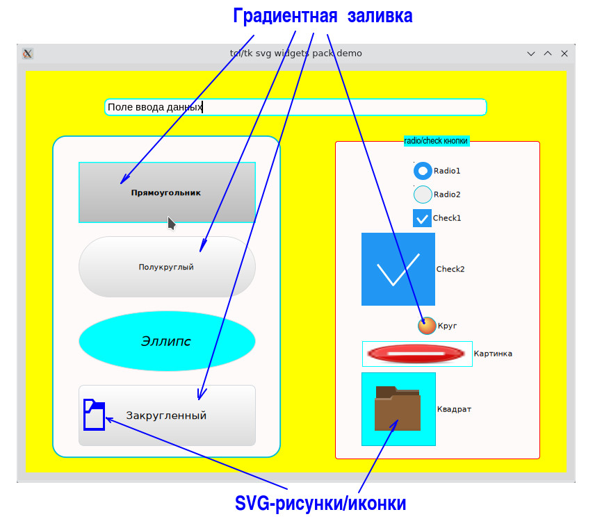
The appearance of a widget of the cbutton class is specified by the option –type.
Conventionally, in the cbutton class, three groups of buttons can be distinguished (don’t blame me, it happened that way). The first group consists of classic buttons of three types (option –type
-type rect – создать прямоугольный виджет;
-type round – создать виджет, у которого узкая сторона имеет полукруглые окончания;
-type ellipse – виджет в виде эллипса.
If we want to create a rectangular widget with rounded corners, then we need to specify the rect type and set the value of the roundness of the corners using the option –rx.
These buttons in the screenshot are combined in the left frame with a greenish border.
The frame is also created as a class object cbutton typev frame:
cbutton new $t.frame –type frame –rx 5m
The second group includes radio and check buttons, which are presented in the middle frame with a red border:
-type radio – создать radio-кнопку
-type check – создать check-кнопку (чекбокс)
And the third group includes buttons that are functionally identical to the first, but have a slightly different appearance:
-type circle – создать круглую кнопку
-type square – создать квадратную кнопку
These buttons are presented in a third frame with a gray border.
Now you can take your mouse and run through the widgets, and even click on them.
You will be able to see which widgets respond to the mouse cursor, to pressing buttons on the mouse, and some that ignore the mouse.
To obtain a list of created objects of a certain class, use the command:
info class instances <класс>
Each object has a specific set of properties, which can be obtained or changed by calling the config method:
<объект> config [[-параметр [значение параметра]]]
Calling the config method without parameters returns a list of all parameters with set values. When you call the config method specifying a parameter, the current value of that parameter is returned. To change the value of a parameter, you must call the config method indicating the parameter being changed and its new value.
Run the following script in the graphical console:
puts " Объект\t\t Тип\t\tТекст";
foreach obj [info class instances cbutton] {
puts " obj type]\t[$obj config -text]"
}
we will get a list of objects indicating their type (method type: $obj type) and the text that is displayed in the widget (method config –text: $obj config -text):

Looking at the result obtained, we can assume that for two objects, namely Rectangle and Square, identifiers were explicitly specified when they were created. For all other objects, the interpreter itself assigned identifiers for them and they all begin with the prefix ::oo::Obj.
Each button can change its fill and stroke when you hover the mouse over it (parameters –fillenter And -strokeenter) or click (-fillpress And -strokepress) on it.
Three methods monitor the current fill and stroke.
Method “method enter» when you hover the mouse over the widget, sets the fill and stroke in accordance with the values of the object parameters -fillenter And -strokeentermethod “method press» uses parameters -fillpress And -strokepressand the method “method leave” – options –fillnormal And -strokenormal.
Let's show how this works on the Rectangle object. The fill of an object can be specified not only by color, but also by gradient fill. Fill and stroke for the normal state are set by parameters –fillnormal And -strokenormal. Fill and stroke may be absent, for example:
<объект> config –fillnormal {} –strokenormal {}
I would like to note right away that the fill and stroke can be made transparent (partially transparent). For this purpose the parameters are used –fillopacity And –strokeopacity. Outwardly it all looks identical, but these are two big differences. In the first case, you can easily “pass” through the opening without filling (without glass); in the second case, you will “rest” your forehead against transparent (invisible glass).
By the way, each object has several gradient fills created by default, a list of which can be obtained by running the following command:
<имя холста> gradient names
If you have forgotten the name of the canvas on which the widget was created, you can get it using the method canvas:
[<объект> canvas] gradient names
Getting a list of gradient fills for a Rectangle object will look like this:
%[Прямоугольник canvas] gradient names
gradient2 gradient3 gradient4 gradient0 gradient5 gradient1
Now everyone can play around with filling and strokes of different objects for different states, for example:
%Прямоугольник config –fillnormal gradient2
%Прямоугольник config –fillnormal gradient4 –strokeenter blue
%Прямоугольник config –fillnormal #fefefe
Naturally, the buttons also have a parameter –commandwhich is triggered when the button is clicked;
%Квадрат config –command {puts «Нажата кнопка Квадрат»}
After executing this command, when you click on the Square widget, the text “Square button pressed“
You can also invoke the execution of a command assigned to a button by calling the invoke method:
%Квадрат invore
Нажата кнопка Квадрат
It may seem that a widget like “label” is missing.
However, it can easily be implemented, say, through an object of type rectwhich has an empty parameter –commandand the parameter –fillpress has the meaning “##“(two bars). If some object has parameters –fillenter or –fillpress have meaning “##“, then the fill and stroke colors for this object do not change.
But there is an easier way to turn an object of type rect to the mark. To do this, just set the value of the parameter –state equal disabled:
<объект> config –state disabled
To return the object to its normal state, just run the following command:
<объект> config –state normal
There is also a hidden state, which is when the object becomes invisible.
In our example, using the parameter –state in the method config demonstrate the widgets ::oo::Obj62, ::oo::Obj64, ::oo::Obj70 and ::oo::Obj76 (label at the beginning of each frame):
%::oo::Obj76 config –state
disabled
In objects of type rect and square you can set icons. It can be svg icons or pictures created by the team image create photo.
The icon can be set as when creating an object (parameter –image or -isvg), or installed into an already existing object:
%<объект> config –image <иконка>
If the icon is a picture of the image type, then it is specified by the name that was assigned to it during creation.
You can view the entire list of pictures using the command
%image names
…
::tk::icons::question
…
From the resulting list, select the “::tk::icons::question” icon and insert it into the “Rectangle” widget:
%Прямоугольник config –image «::tk::icons::question»
Before you can set an SVG image as an icon, you need to create it.
For example, let's take two functions (file folderbrown.tcl):
proc folderbrown {canv} {
    set grfolder [$canv create group]
    set path1 [$canv create path "M 2 3 L 2 10 L 1 10 L 1 29 L 12 29 L 13 29 L 31 29 L 31 8 L 30 8 L 30 5 L 16 5 L 14 3 L 2 3 z "]
    $canv itemconfigure $path1 -parent $grfolder -fill "#8b6039" -strokewidth 0
    set path2 [$canv create path "m 2 3 0 7 9 0  L 13 8 30 8 30 5 16 5 14 3 2 3 Z"]
    $canv itemconfigure $path2  -parent $grfolder -fillopacity 0.33 -fillrule "evenodd" -fill black -strokewidth 0
    set path3 [$canv create path "M 14 3 L 15 6 L 30 6 L 30 5 L 16 5 L 14 3 z M 13 8 L 11 10 L 1 10 L 1 11 L 12 11 L 13 8 z"]
    $canv itemconfigure $path3 -parent $grfolder -fillopacity 0.2 -fillrule "evenodd" -fill "#ffffff"  -strokewidth 0
    set path4 [$canv create path "M 13 8 L 11 9 L 2 9 L 2 10 L 11 10 L 13 8 z M 1 28 L 1 29 L 31 29 L 31 28 L 1 28 z"]
    $canv itemconfigure $path4 -parent $grfolder -fillopacity 0.2 -stroke "#614d2e" -fill "#614d2e" -fillrule "evenodd" -strokewidth 0
    return $grfolder
}

proc foldercolor {canv {fcol blue}} {
    set grfolder [$canv create group]
    set path1 [$canv create path "M 0.0 0.0 L 0.0 1.0 L 0.0 16.0 L 1.0 16.0 L 16.0 16.0 L 16.0 15.0 L 16.0 2.0 L 9.0 2.0 L 7.0 0.0 L 7.0 0.0 L 7.0 0.0 L 1.0 0.0 L 0.0 0.0 Z \
	M 1.0 1.0 L 4.0 1.0 L 6.6 1.0 L 7.6 2.0 L 3.6 6.0 L 3.6 6.0 L 1.0 6.0 L 1.0 1.0 Z \
	M 6.0 5.0 L 15.0 5.0 L 15.0 15.0 L 1.0 15.0 L 1.0 7.0 L 2.6 7.0 L 4.0 7.0 L 4.0 7.0 L 4.0 7.0 L 6.0 5.0 Z"]
    $canv itemconfigure $path1 -parent $grfolder -fill $fcol -strokewidth 1 -stroke $fcol
    return $grfolder
}
First function folderbrow creates a folder icon in chocolate tones. Second function foldercolor also creates a folder icon, but it’s a little simpler and you can set the color of the folder outline yourself. By default, the outline color will be blue.
Both functions return the identifier of the group in which the icon is located. Icons can be created on any canvas. After creating a widget, they can be created (temporarily) on the canvas of the widget itself.
Let's create one icon on the left frame, and the second on the right:%set idicon1 [foldercolor [::oo::Obj63 canvas] blue]
% set idicon2 [folderbrown [::oo::Obj75 canvas] ]
After creation, insert the first icon into the widget with rounded vertices, and the second into the Square widget:
%::oo::Obj68 config –image «[::oo::Obj63 canvas] $idicon1»
%Квадрат config –image «[::oo::Obj75] $idicon2»
When installing an svg icon, instead of the –image parameter, you can use the –isvg parameter:
%Квадрат config –isvg «[::oo::Obj75] $idicon2»
An SVG icon is specified by two parameters, the first is the name of the canvas where it is located, and the second is the identifier of the icon itself. In this case, the identifier can also indicate a group if the icon is composite.
By default, icons are placed on the left side of the widget (parameter –compound left). Parameter –compound can take the following values – left, right, top, bottom.
To set the coordinates of the icon in the widget, use the parameter -ipadwhich is a list of four values:
-ipad {<смещение по х> <ширина иконки> <смещение по y> <высота иконки>}
After installing icons in widgets, the original icons should be deleted (but if they do not bother you, you can not delete them or make them invisible):%[::oo::Obj63 canvas] delete $idicin1
%[::oo::Obj75 canvas] delete $idicon2
%
After all our manipulations, the example picture may take the following form:

Until now, we have used managers to place widgets grid And pack, which do not allow widgets to overlap. And we used gradient fill only on the final widgets (they do not contain other widgets). All this allowed us to avoid problems with the color scheme.
It's time to part with this example and move on to the next one. To do this, we will close the example window and then load the example from the file demoPackSVGwithImageMes.tcl:

After reading the information in the left window, click on the button “Yes» and click on the buttons. If a window appears asking you to exit, then take your time and click on the “No“:

Please review the informational callouts carefully. These are class widgets mbutton.
They can be 6 (six) types: yesno, msg, left, right, up, down. The widget type of the mbutton class must be specified during creation via the parameter –type. The penultimate screenshot shows the class widgets mbutton type msg (window on the left) and type down (window on the right), and in the last screenshot – like right (left window) and type yesno (right window).
These widgets have a specific parameter –tongue, which specifies the position of the protruding tab on the top or bottom, right or left side of the widget. Parameter –tongue list of 4 values, for example:
-tongue «0.45 0.5 0.55 5m»
The last (fourth) element in the list specifies the length of the tongue (in the example it is 5 millimeters). The remaining three values (from 0 to 1) determine the coordinates of the three points of the tongue. The coordinates are specified in fractions of the length of the side of the widget to which the tab belongs.
The last screenshot shows widgets of the mbutton class right (widget on the left) and type yesno (widget on the right). You may notice that widgets like yesno And msg no tongues. Sometimes it is useful to remove the tabs on the up, down, left and right types as well. This is achieved simply by specifying the zero length of the tongue and, for example, the type down:
-type down -tongue «045 0.5 0.55 0»
If you look closely at the latest screenshots, you will notice that some of the captions on the class widgets cbutton type rect rotated 90 degrees. (“Vertical 4”, “Vertical 8”, “Vertical 12”). Yes, text on class widgets cbutton can be rotated by a certain degree by setting the parameter –rotate
In this example, for widgets with the text “Vertical 4”, “Vertical 8” and “Vertical 12” the parameters were set –rotate 90 And –compound topwhich ensured that the folder icon was placed above the text and the text was rotated 90 degrees.
But the main thing in this example is how we managed to place these messages on top of other widgets. It is clear that a linker must be used placebut simply applying it to our information widget would lead to this result:

The screenshot clearly shows that our information callout lies on some kind of substrate. How this problem was solved will be discussed in the next article.
And we will end this first article with an example on the topic of checkers (example demoGridSVGboard.tcl):

Here you can see inverted text, a gradient fill, and you can even walk around. You can only walk in turns and only on empty black squares. On the walking side, the line with letters is highlighted in blue (cyan). To end the application, click on the upside down letter E (bottom). To return to the original state, you can click on the greenish squares in the corners of the board. Easy to play. The first click selects a pawn to move, and the second click selects the square where the selected pawn should go.
In the following articles we will get acquainted not only with how managers work pack, grid And placebut let's get acquainted with different types of menus (example script_menu.tcl):

And let's continue our acquaintance with gradient fills and transparency (example script_button_PACK_gradient_opacity.tcl):

And here is a screenshot of an application written entirely using the svgvidgets package:

I look forward to constructive criticism.