Reproducing the Whittaker biome map from Nature Communications with R
Introduction
This article may be of interest to biology lovers who like to classify and systematize information, as well as to those who start their journey in the R language. Personally, I am always pleased with small discoveries, especially if I learn something new that I did not know before. This time it was Whittaker’s biome. And I want to share this translation of the article with you.
The Whittaker biome, also known as the ecosystem classification method, divides the earth’s ecosystems into different types based on factors such as geographic distribution and environmental conditions. This classification method was proposed by the American ecologist Robert Whittaker in 1962 to improve the understanding and description of ecosystem diversity and function. According to the chart, Whittaker uses two factors to classify biological communities: rainfall and temperature (Figure 1).
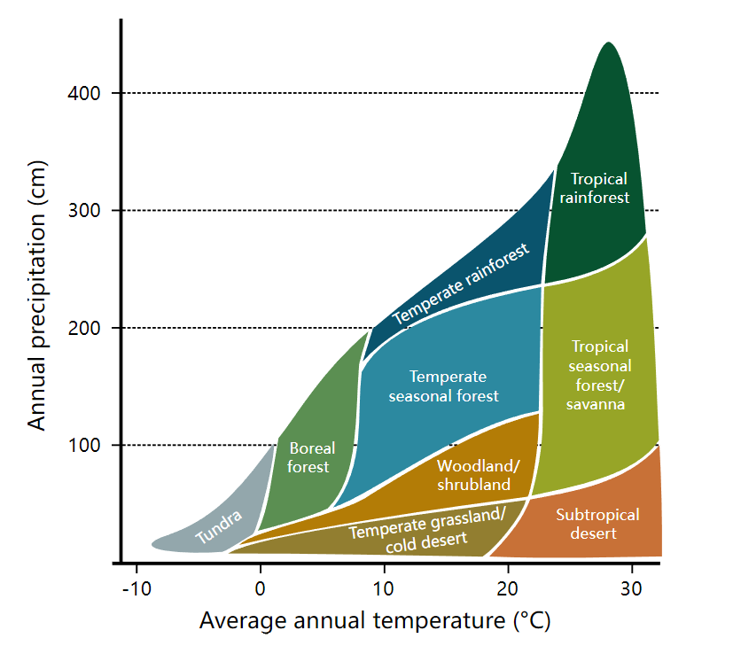
The Whittaker biome divides ecosystems on the earth’s surface into five types depending on the combination of climate and vegetation types: tropical rainforests, temperate coniferous forests, temperate deciduous broadleaf forests, grasslands, and deserts. Among these, tropical rainforests are common near the equator, with warm and humid climate and rich and varied vegetation; temperate coniferous forests are common in the higher latitudes of the Northern Hemisphere and Antarctica, with a cold climate and vegetation dominated by conifers; temperate broadleaf forests common in mid- and high latitudes, with four distinct seasons and vegetation dominated by deciduous broadleaf trees; grasslands are common in middle and low latitudes, with a dry climate and grassland-based vegetation; deserts are common in low latitudes, with a dry climate and sparse vegetation.
In an article from the journal Nature Communications Hammond, WM, Williams, AP, Abatzoglou, JT et al. Global field observations of tree die-off reveal hotter-drought fingerprint for Earth’s forests a more expanded view of the Whittaker Biome diagram is presented (Figure 2). It is used to display temperature, precipitation, altitude, and communities at various sampling points. It is rich in information and beautiful in its presentation.
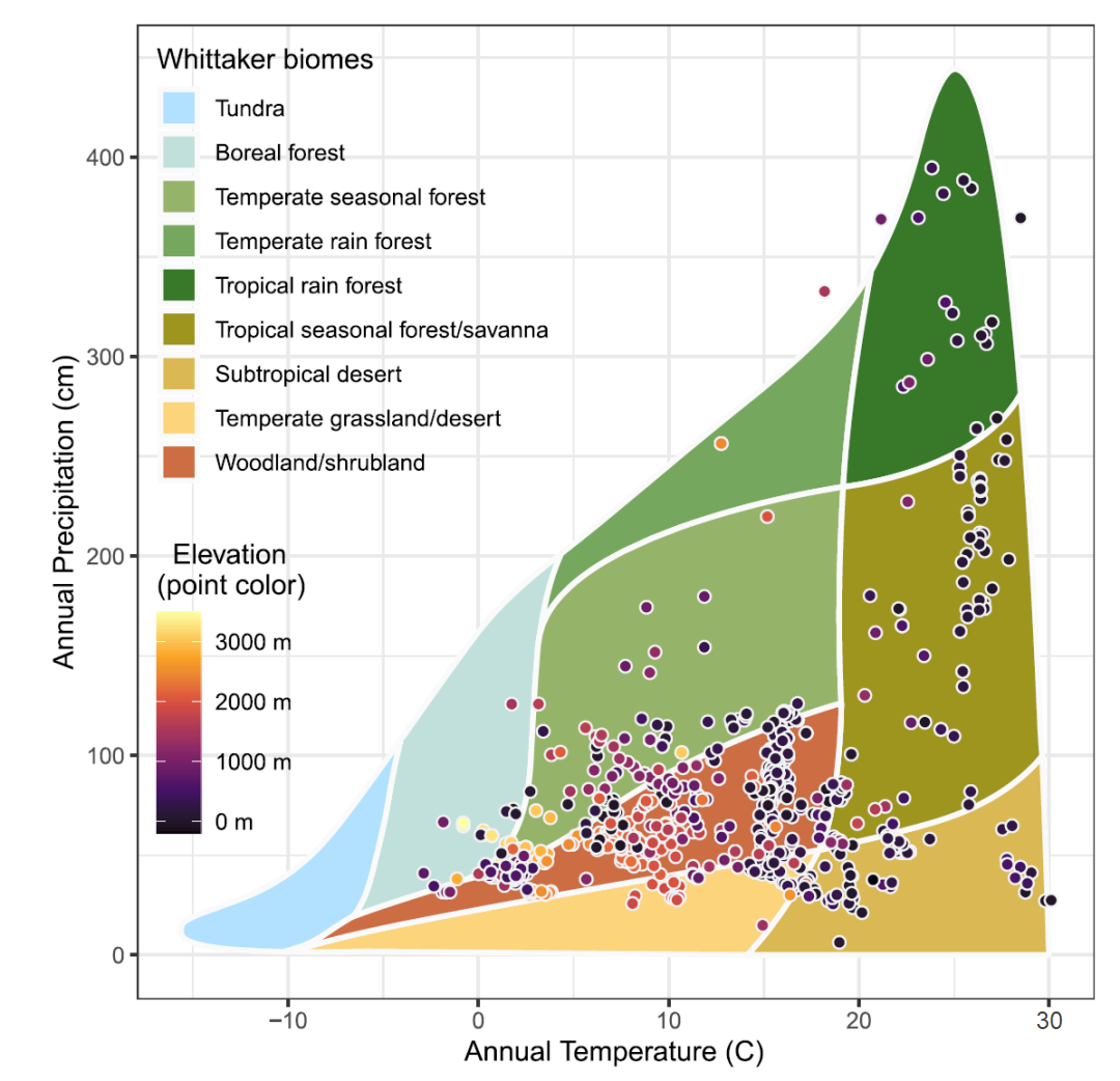
In order to imprint information about the Whittaker biome in my memory, I decided to reproduce this diagram using the R language. Let’s see how I achieved this and what happened in the end.
plotbiomes library in R language
Well, I’ll be cunning, initially I intended to use Python for visualization. However, after a few minutes of googling, I found such a wonderful library in R as plotbiomes and the simplest implementation of the Whittaker biome can be done with two lines of code:
library(plotbiomes)
whittaker_base_plot()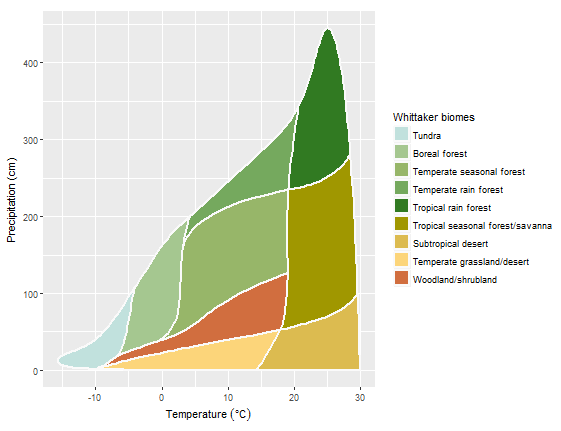
The chart is based on ggplot, and the same result can be achieved with ggplot:
library(plotbiomes)
library(ggplot2)

plot_1 <- ggplot() +
  # add biome polygons
  geom_polygon(data = Whittaker_biomes,
               aes(x    = temp_c,
                   y    = precp_cm,
                   fill = biome),
               # adjust polygon borders
               colour = "gray98",
               size   = 1) +
  theme_bw()
plot_1
Whittaker_biomes is the base data for the chart. If you want to change the chart shape, you can change the data:
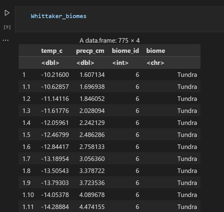
Optionally change the color, such as using the classic Whittaker_biomes color,
Ricklefs_colors is a predefined set of colors that comes with the plotbiomes package. These colors were used in Ricklefs, RE (2008). The economy of nature. W. H. Freeman and Company. (Chapter 5, Biological Communities, The biome concept):
Ricklefs_colors
plot_2 <- plot_1 +
  # fill the polygons with predefined colors
  scale_fill_manual(name   = "Whittaker biomes",
                    breaks = names(Ricklefs_colors),
                    labels = names(Ricklefs_colors),
                    values = Ricklefs_colors)
plot_2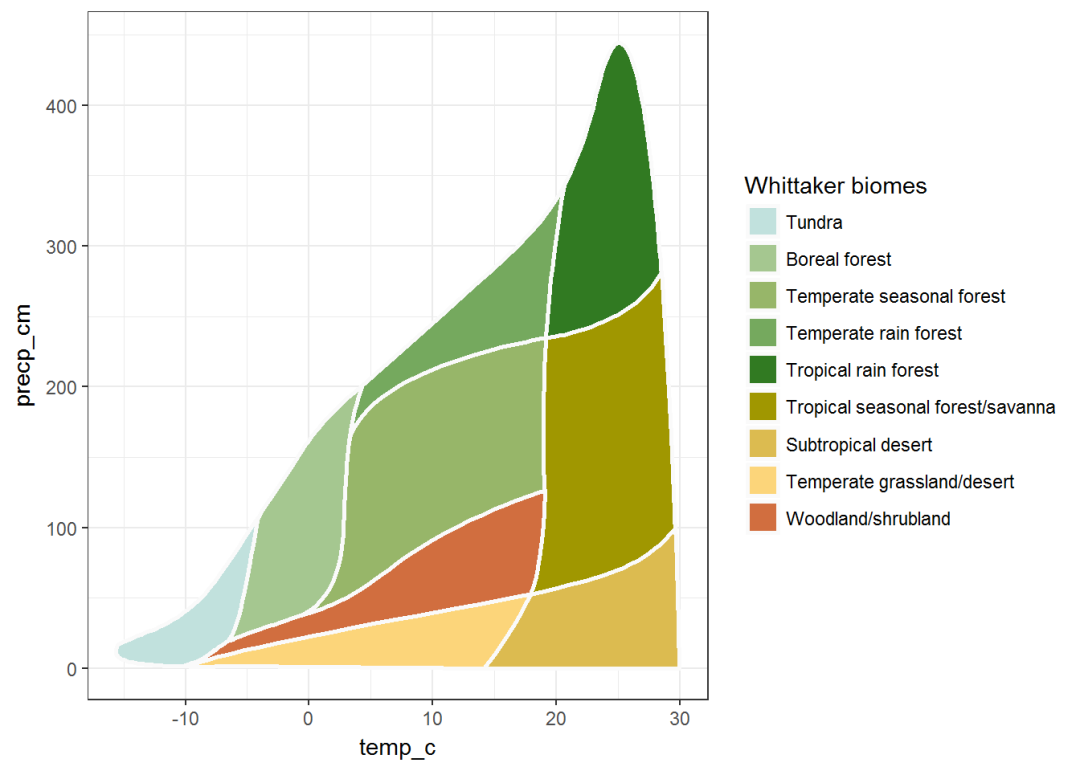
Based on ggplot, you can make more detailed changes using the syntax:
whittaker_base_plot() + theme_bw()You can use different color schemes to improve aesthetics, for example with the RColorBrewer package. In the following example, I used a custom palette:
library(RColorBrewer)

# the main rule - create 9 colors for the 9 biomes

# failed trial with RColorBrewer :)
my_palette_1 <- rev(brewer.pal(n = 9, name = "BrBG"))
whittaker_base_plot(color_palette = my_palette_1)

# this seems a better approach - interpolate 9 colors from given main 3
my_palette_2 <- colorRampPalette(colors = c("#F5F5F5",  "#01665E", "#8C510A"))(9)
whittaker_base_plot(color_palette = my_palette_2)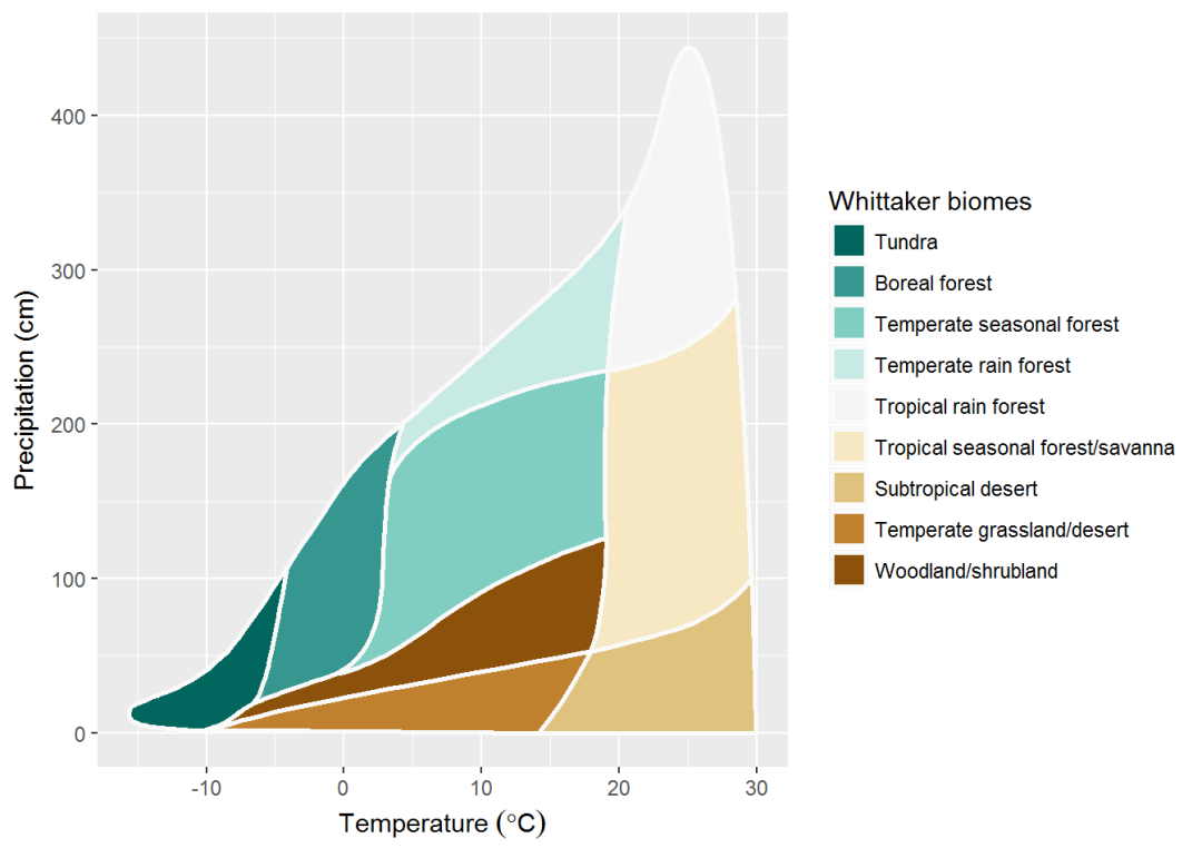
The above method using whittaker_base_plot() encapsulation can be customized with ggplot:
names(my_palette_2) <- names(Ricklefs_colors)

ggplot() +
  # add biome polygons
  geom_polygon(data = Whittaker_biomes,
               aes(x    = temp_c,
                   y    = precp_cm,
                   fill = biome),
               # adjust polygon border
               colour = "gray98",
               size   = 1) +
  # fill the polygons with desired colors
  scale_fill_manual(name   = "Whittaker biomes",
                    breaks = names(Ricklefs_colors),
                    labels = names(Ricklefs_colors),
                    values = my_palette_2)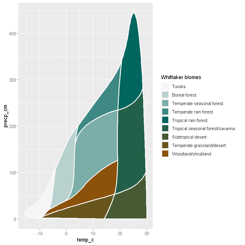
Replaying results from a log
To reproduce the diagram presented in the publication, you need to add some points, as in the article (Figure 8)
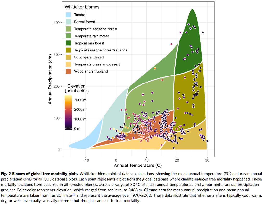
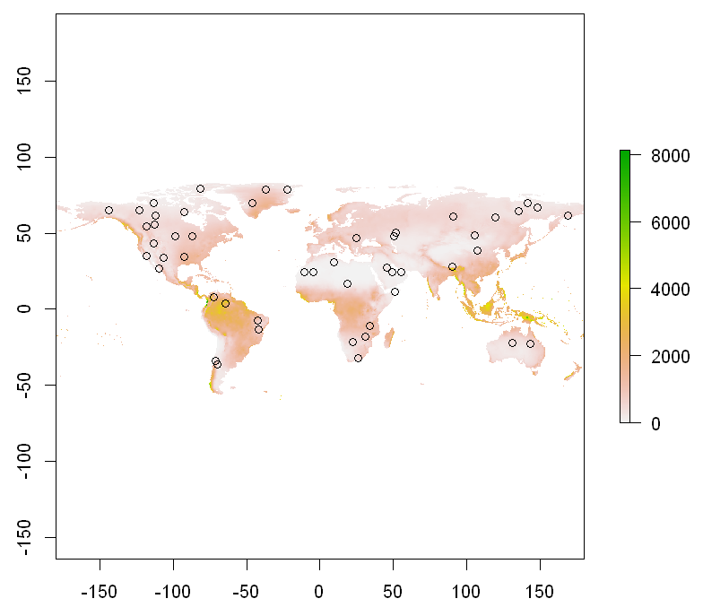
We first add random points by generating random locations and extracting temperature and precipitation from the WorldClim data.
library(raster)
library(maptools)

path <- system.file("extdata", "temp_pp.tif", package = "plotbiomes")
temp_pp <- raster::stack(path)
names(temp_pp) <- c("temperature", "precipitation")

data(wrld_simpl) # load world polygons from maptools

wrld_simpl <- wrld_simpl[wrld_simpl$NAME != "Antarctica", ]

set.seed(66) # random number generator
points <- sp::spsample(x = wrld_simpl, n = 50, type = "random")

extractions <- raster::extract(temp_pp, points, df = TRUE)

extractions$temperature <- extractions$temperature/10

extractions$precipitation <- extractions$precipitation/10
extractions$Elevation <- runif(10) * 100
plot(temp_pp[[1]]/10); points(points)
plot(temp_pp[[2]]); points(points)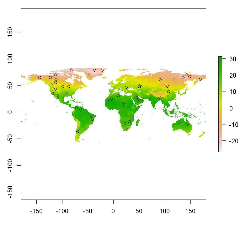
Plotting based on encapsulation whittaker_base_plot:
whittaker_base_plot() +
  # add the temperature - precipitation data points
  geom_point(data = extractions,
             aes(x = temperature,
                 y = precipitation),
             size   = 3,
             shape  = 21,
             colour = "gray95",
             fill   = "black",
             stroke = 1,
             alpha  = 0.5) +
  theme_bw()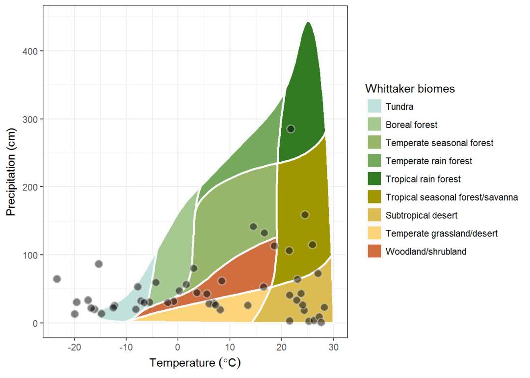
The illustration in the magazine also features hills in different colors and has white borders that add beauty to the diagram.
The color matching of the dot border color and the background fill is very creative and relatively troublesome since the fill was used for biome polygons and ggplot2 only allows one scale.
Therefore, we cannot use two different fill displays. One solution is to double call geom_point (6.4.1 Specify Values in the ggplot2 whitepaper). First, the boundary line of the given point is called, and the next step is the coloring of the point.
plot_3 <- whittaker_base_plot() +
  geom_point(data = extractions,
             aes(x = temperature,
                 y = precipitation),
             shape  = 21,
             stroke = 1, # acts as the thickness of the boundary line
             colour = "gray95", # acts as the color of the boundary line
             size   = 3.5) +
  geom_point(data = extractions,
             aes(x = temperature,
                 y = precipitation,
                 color = Elevation),
             shape = 16,
             size  = 3,
             alpha = 0.5) +
 scale_color_viridis_c()
plot_3 + theme_bw()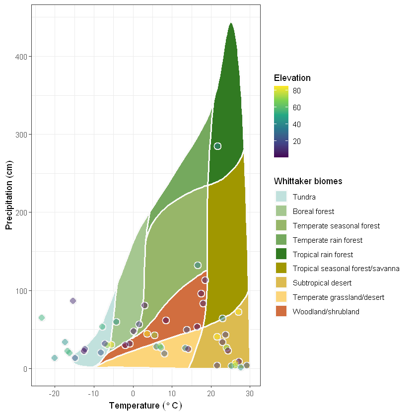
Finally, use the power of ggplot to fully update and fit the legend to the border of the chart:
my_plot <- plot_3 +
  # Optional - Overwrite axis ranges (the scale warning is expected):
  # - set range on OY axes and adjust the distance (gap) from OX axes
  scale_y_continuous(name="Precipitation (cm)",
                     limits = c(min = -5, max = ceiling(max(460, extractions$precipitation)/10)*10) ,
                     expand = c(0, 0)) +
  # - set range on OX axes and adjust the distance (gap) from OY axes
  scale_x_continuous(name = expression("Temperature " ( degree*C)),
                     limits = c(min = floor(min(-20, extractions$temperature)/5)*5, max = 30.5),
                     expand = c(0, 0)) +
  coord_fixed(ratio = 1/10) + # aspect ratio, expressed as y / x
  theme_bw() +
  theme(
    legend.justification = c(0, 1), # pick the upper left corner of the legend box and
    legend.position = c(0, 1), # adjust the position of the corner as relative to axis
    legend.background = element_rect(fill = NA), # transparent legend background
    legend.box = "horizontal", # horizontal arrangement of multiple legends
    legend.spacing.x = unit(0.5, units = "cm"), # horizontal spacing between legends
    panel.grid = element_blank() # eliminate grids
  )
  my_plot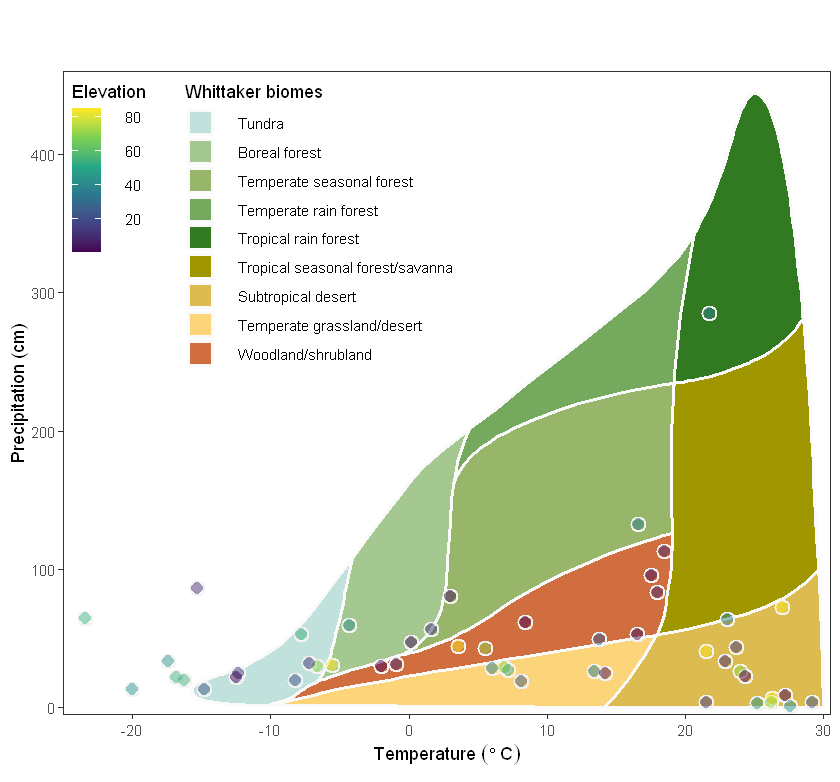
The Whittaker biome classification method takes into account not only the composition of plants and animals, but also the influence of environmental factors on the ecosystem. This provides a basis for ecological research, allowing us to better understand the characteristics and functions of different ecosystems, and to better protect and manage ecosystems.


![The art of ETL. Writing our own SQL engine in Spark [часть 6]](https://prog.world/wp-content/uploads/2024/04/x1lx17qduwak6ilxb0z0y6y0srg-768x461.png)

