information design
Team and wisdom (it is knowledge multiplied by experience) are the two main components and results in projects and the efficiency of structural units. I am a leader and I have my own team, and each of its members has skills and abilities, sharing which with colleagues will strengthen the entire structure. The best atmosphere for sharing ideas with each other is something calm and conducive to conversation, preferably with a hookah. Such gatherings have become a good tool for strengthening me and my people. The first pilot was Evgeniy V., head of design, with whom we spent several pleasant moments in a conversation about information design. I immediately set myself the goal of making this conversation available to each employee, and for better assimilation of information, we used several channels of its reporting – this an article in the corporate space, a recording of the conversation itself, and interesting excerpts in the corporate channel. Now we are ready to share our wisdom 😊 with a wider range of readers. I hope you enjoy the principles outlined in this article and improve your design.
If this format comes to you, then I will continue to publish my observations and excerpts from conversations on various topics in the field of IT and not only.
So, about information design, information flows, about time and benefit
We are confronted with a flood of information every day. Some of this information is useful to us, some is just wasting attention. If the essence of this information is to entertain or attract attention, then it is difficult to isolate the superfluous from this information. Expressive techniques are most often aimed at creating spectacularity and conveying the required emotion. But if this is information designed to help in making decisions, then you should take care of its purity.
informative
This is the most important principle of the information designer. Informativeness can be expressed using the noise-to-signal ratio. If there is a lot of noise, then the useful signal hardly makes its way to the brain. If the noise is minimal, then the useful signal is better recognized, the details and patterns that the noise hides begin to appear. Useful information begins to come to the surface.
In the struggle for information content, it is common practice to reduce the number of decorations and other objects that are not directly related to the data. This inevitably makes the design less expressive. However, this allows you to reveal the essence of the original message, to enhance its effect. “Dried” data can always be made attractive by changing the style. The main thing is that decoration should not be the primary move in data visualization.
So the formula is:

It follows from this formula that the less “ink” is spent on the transmission of useful information, the higher the information content. This can be compared with parasitic words in speech: the fewer of them, the clearer the message of the interlocutor and the more pleasant it is to conduct a dialogue.
Here you can doubt. We most often work with data, which means we have to spend energy on them in order to get results. But the principle of increasing information content takes into account human nature. Psychological experiments have shown that in the intervals between sleep a person is given a limited amount of attention, and it is most spent in moments of concentration and decision-making. Therefore, information visualizers should take care of their users and not force them to waste their daily resource on useless brain work.
Let’s look at the most common example, the table:
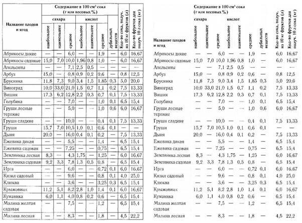
If you remove the dividing stripes, then a good table will not fall apart. To make a table good, you need to arrange its elements so that they form even rows and columns, which themselves will “hold” the structure of the table. Therefore, in tables it is worth aligning texts to the left, and numbers – by category (that is, by comma). The table is not perfect, and there is still work to be done on its clarity, but it shows well that you can easily get rid of what might normally seem necessary.
Separators create noise and graphical artifacts that affect the experience. In the original table, the cells in the rows “blueberries” and “tart wild pears” look and are perceived differently due to the different shape of the cell. If you remove the grid, then the visual difference between them is minimized – only numbers and dashes remain. And this is exactly what we are interested in when studying this table.
Sometimes the data structure itself is chosen incorrectly. This results in not only graphical noise, but also “semantic” or even “navigational” noise – when the brain has to perform unnecessary actions in order to decipher the message hidden in the visualization.
Let’s look at an example with reincarnation:
There was a table, there was a list of colors.
In the original table, the amount of noise is high: “hash”, checkmarks, “zebra” in the cells, separators in the sidebar. Alignment is chaotic, there is no order. Lines of different thickness. The message this table is trying to convey is hidden behind noise and implicit relationships—we have to move our eyes across the table from left to right and top to bottom to match the left column to the colors. All this wastes our precious attention in vain.
The corrected version got rid of unnecessary elements – getting rid of the scenery increased the information content. In many ways, the role of scenery is now performed by the alignment of elements. And one more step has been passed – in order not to jump with our eyes from the sidebar to the headline, the colors are placed opposite their values. Of the useful information here, only the colors and names from the sidebar. Therefore, they stood close, opposite each other, so that their semantic correspondence would be maximally manifested.
Was
Health → Checkmark → Red, (return of gaze to the side), Health → Checkmark → Green
It became
Health → Red and green color
The color data was encoded with a tick, its position in the table. The checkmark itself does not tell us anything, any other symbol could have been in its place. Plus, she’s green all the time, even though she’s reporting different colors, which is weird. In the corrected version, this symbol was chosen sensibly, it lost its “special” form, but acquired a specific property – color. The data tells us about colors – let’s show them.
As you can see, there was an approximation of the data to the user, his path to useful information was reduced, to the patterns and connections embedded in it. We honestly looked at the data and found it to be a good fit.

Another example is with a table with many values. It is difficult to make sense of this array of poorly formatted data, which is hidden behind the noise of the “grid” of the table. It is impossible to cover everything with a glance and understand the patterns. To say what is happening in this table and what idea it conveys to us, we will have to decipher all the values, compare them in memory, and after a few minutes of such an analysis, a general picture may emerge.
To simplify the process of understanding, they resort to visualization. Cells colored in accordance with the values immediately suggest how things are with this data. As soon as the brain understands that the darker the cell, the higher the value in it, then from that moment the pattern and the main idea that the table is trying to convey becomes visible. This happens in seconds.
Imagine that the data in the table is different and the visualization is not so smooth:

we would not be able to read such a picture, looking only at the numbers in the cells. Visualization helps to see the data “from a bird’s eye view”, in isolation from their letter or number designations. After all, if you reach the maximum pragmatism, then visually the number 5 is also the “noise” that stands behind the real data ••••• – five objects. Similarly, the numbers 2423 and 7822 in an array of other four-digit numbers look almost the same from a distance, but in the context of other data, there may be a gap between them.
The job of a designer with information in many ways is to understand this information well, to feel the underlying message, and to display it as honestly as possible, getting rid of everything superfluous. This applies not only to tables and graphs. Even a small marginal note will become more useful if you clean out unnecessary words and phrases from it, pulling the meaning “to the surface”. This is the designer’s superpower that makes the world a better place. You spend a little of your time, but save the attention, nerves and efforts of tens, hundreds and thousands of people who will encounter this information.