Implementing a modern UI using Jetpack Compose
Hello everyone, this is Nikita Pyatakov, Android developer at MTS Digital. In this article I will tell you about how work was done on the UI of the new service card in the My MTS application.
My story will be sequential – first about the problem itself, then about the solution, which is divided into subpoints.
Formulation of the problem
On the service card, the first block displays a header consisting of a banner (picture), name, price, descriptions and a “connect” button. It is necessary to “combine” the navbar and header as follows:

What changes to the UI needed to be implemented? Let’s divide all the work into subtasks and discuss each separately:
1. Implementation of a crop banner header with p2r and a parallax effect (scrolling the banner is 2 times slower than all other content);
2. Banner resistance effect at p2r;
3. “Lightening” of the header banner as the content scrolls;
3. Adding a dynamic blur for icons in the navbar;
4. Display/remove title with animation in the navbar when scrolling content to a certain threshold value.
Banner cropping with p2r and parallax effect
On compose we can subscribe to the p2r state and configure its parameters:
val pullRefreshState = rememberPullRefreshState(
            refreshing = state.isRefreshing,          // ловим событие p2r
            onRefresh = { onRefresh() },              // аналитика
            refreshingOffset =
              HEADER_HEIGHT * 0.5f + INDICATOR_SIZE   // задаем высоту спиннера
    )
Let’s introduce a few concepts: we have a base banner height and an “incremental” height, which is 0 without the p2r event, but increases with it. pullRefreshState has a progress field defined, which is responsible for changing the progress of p2r (the value varies from 0 to 3.5). Thus, it is necessary that the “additional” height of the banner is directly proportional to the progress field. If the user wants to update the contents of the screen, due to recomposition we will receive a new (increased) value of the “additional” height.
To achieve the parallax effect, you can use the Modifier.graphicsLayer setting, where you set the speed of vertical scrolling of the content.
As a result, the code will look like this:
val additionalP2rPadding: Dp by animateDpAsState(Utils.calculateServiceCardHeaderHeight(progress).dp)

Box(modifier = Modifier
        .background(color = DesignSystemTheme.colors.backgroundSecondary)
        .fillMaxWidth()
        .height(HEADER_HEIGHT + additionalP2rPadding) // меняем высоту бокса в зависимости от прогресса p2r
        .graphicsLayer {
            translationY = HEADER_SCROLL_COEFFICIENT * offsetScroll // замедляем скролл в 2 раза
        }
        .semantics { testTagsAsResourceId = true }
        .testTag(HEADER_BANNER_TAG)
    ) {
(We will talk about calculateServiceCardHeaderHeight below).
Banner resistance effect at p2r
As you can see in the video at the beginning of the article, when the user wants to refresh the page, the banner increases with a resistance effect – the lower we pull, the less the size changes. How can this be implemented? Now there will be some mathematics, but not at all difficult, don’t switch!
Let’s see what the graph of additional banner height versus p2r progress looks like. We have already found out that the dependence must be directly proportional. Okay, what does the resistance effect mean in mathematical terms? This means that the growth rate of the function should decrease – the faster progress changes, the slower the values of the additional height change. That is, the graph will look something like this:
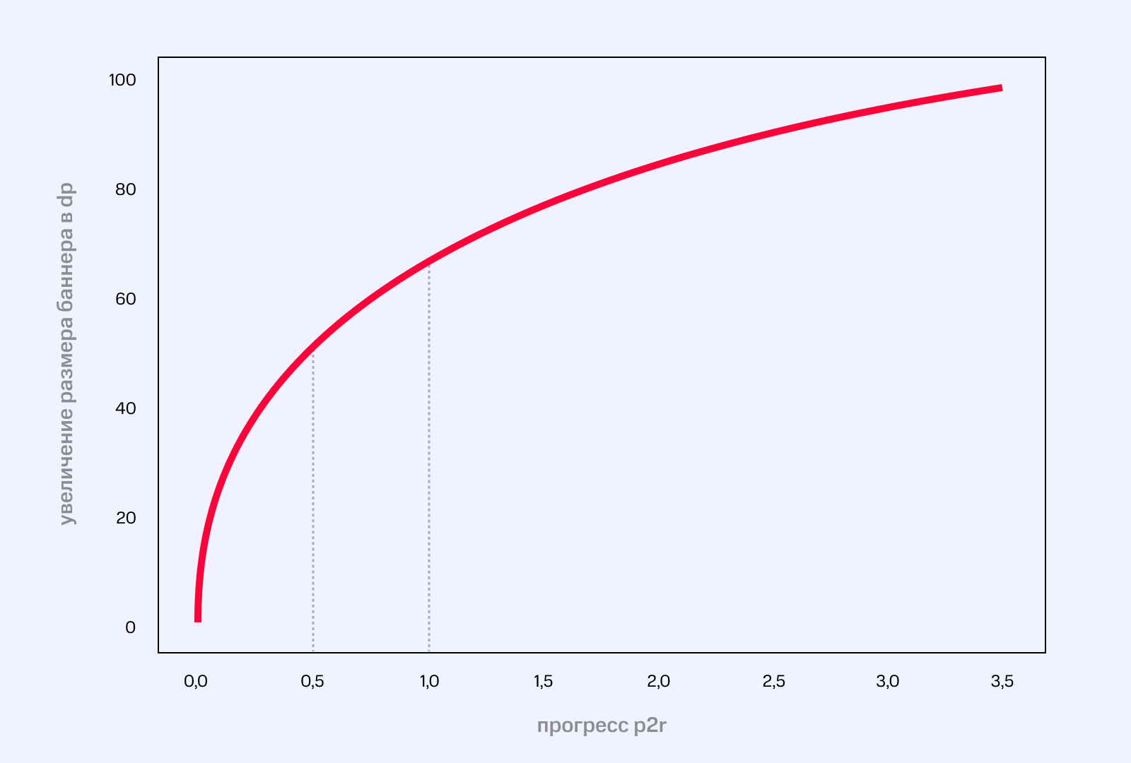
You drew the graph, great, but what function should you use in the end? If you remember higher mathematics, the derivative is responsible for the growth rate of a function. We need to look at the table of derivatives and find a function whose derivative will decrease. Found it? For example, I took ln and the root. Our function:

Here x + 1 and 80 are taken for normalization – we want that with zero progress p2r the value of the “additional” height will also be zero, and with the maximum value the banner will noticeably increase. The calculateServiceCardHeaderHeight function stores exactly this formula.
The resistance effect is ready! The teachers told me that vyshmat will be useful in life…
“Brightening” the banner
The idea is that we display a Box on top of the banner with a white background and dynamic transparency, which will depend inversely on the amount of content scrolling. We use scrollState, access the value field, which is responsible for scroll progress, and use it as the value for alpha:
val scrollState = rememberScrollState()
val offsetScroll by remember { derivedState0f { scrollState.value } }
Box(
        modifier = Modifier
                .fillMaxSize()
                .background(color = DesignSystemTheme.colors.backgroundPrimary.copy(alpha =
                (if (offsetScroll >= COVER_LAYER_MAX_HEIGHT) {
                    1f
                } else {
                    offsetScroll / COVER_LAYER_MAX_HEIGHT
                })))
)
Adding a dynamic blur for icons in the navbar
If you look closely at the “back” and “share” buttons in the navbar, you can see that they are blurred. Unfortunately, at the moment there is no dynamic blur out of the box on compose – you have to come up with something of your own. And here’s what I came up with:
1) Take the banner and blur it entirely using the third-party Blurry library;
2) From the blurred banner we “cut out” the pieces we need, which will be used as the background of the icons;
3) We display these pieces on top of the banner in those places where icons are displayed, so we get a three-layer sandwich – a banner, a piece of a blurred banner and an icon on top. For this to work dynamically, the pieces must be “cut out” taking into account the scroll progress.
It is also worth noting that with p2r our banner increases in size, which means that in this case we need to calculate the necessary pieces of the blurred banner in a special way, which will be described further.
First, let’s figure out how to properly crop a blurred banner with p2r, from which we will later cut out the background for the icons. The difficulty here lies in calculating the amount by which the banner width should be reduced. If we solve this simple geometric problem, we get the following value:
val croppedWidth = (additionalP2rPadding.dpToPx.toDouble() * headerBitmaps.headerBitmap.width /
  (headerBitmaps.headerBitmap.height + additionalP2rPadding.dpToPx.toDouble())
  ).toInt() // пересчёт ширины
Where additionalP2rPadding is the “additional” banner height for p2r, respectively.
Next, we take the original banner (headerBitmap), create a new already cropped bitmap and adjust it to the screen size. In code it looks like this:
fun cropBitmap(
            headerBannerBitmaps: HeaderBannerBitmaps,
            croppedWidth: Int,
            croppedHeight: Int,
            newHeight: Int
    ): HeaderBannerBitmaps {
        val headerBitmap = headerBannerBitmaps.headerBitmap
        val croppedBitmap = Bitmap.createBitmap(  // обрезаем заблюренную картинку
                headerBannerBitmaps.blurredHeaderBitmap,
                croppedWidth / 2,
                0,
                headerBitmap.width - croppedWidth, croppedHeight
        )
        return HeaderBannerBitmaps(
                headerBitmap,
                headerBannerBitmaps.blurredHeaderBitmap,
                Bitmap.createScaledBitmap(    // подгоняем под нужный размер
                  croppedBitmap,
                  headerBitmap.width,
                  newHeight,
                  true
                ),
        )
    }
Voila, we have a copy of the blurred banner that appears on the screen!
Now let’s deal with the icon blur directly. We need to cut out the necessary pieces from the blurred banner, the position of which depends on the size of the banner, the position of the icons, p2r progress and scrolling! Sounds creepy… but doable!
We use the Path class to select pieces of the banner:
private fun DrawScope.addBlurredIcon(path: Path, xPadding: Float, yPadding: Float) {
    path.addRoundRect(
            RoundRect(
                    Rect(
                            Offset(xPadding, yPadding),
                            Size(NAVBAR_ICON_SIZE.dp.toPx(), NAVBAR_ICON_SIZE.dp.toPx())
                    ),
                    CornerRadius(NAVBAR_ICON_BOARDER_RADIUS.dp.toPx())
            )
    )
}
We can add an icon outline to the path using the addRoundRect function. In Rect we pass the coordinates of the upper left point of our icon and the length and width, do not forget to set the corner radius.
To draw this beauty we will use Canvas:
val yPadding = getStatusBarHeight + additionalScrollPadding * HEADER_SCROLL_COEFFICIENT // пересчитываем высоту
    Canvas(
            modifier = Modifier.fillMaxSize()
    ) {
        val path = Path()  // класс для создания контуров

        addBlurredIcon(path, (screenWidthDp - NAVBAR_ICON_SIZE - NAVBAR_ICON_PADDING_WIDTH).dp.toPx(), yPadding)
        addBlurredIcon(path, NAVBAR_ICON_PADDING_WIDTH.dp.toPx(), yPadding)
           // передаем координаты для добавления нужной части картинки
        clipPath(path, ClipOp.Intersect) {  // Intersect - пересечение с контуром
            drawImage(
                    image = bmpBlurred.asImageBitmap(),
                    colorFilter = monochromeFilterOrNull(isArchive)
            )
        }
    }
The ordinate coordinates of the upper left corners of the icons coincide and are equal to the sum of the indentation of the icons themselves and the scroll value multiplied by 0.5. Where did this coefficient come from? We remember that we implemented a parallax effect; the banner scrolls 2 times slower than the rest of the content.
After that, we add two outlines of our icons to the path and, using the clipPath function, display these pieces of the bmpBlurred banner.
It is worth noting separately that all these calculations are quite heavy and because of this, slowdowns began to appear on weak devices. As a result, it was decided to move the work with Bitmap to a background thread, which helped solve the problem.
Display/remove title with animation in navbar
To animate the appearance and disappearance of text, you can use the AnimatedVisibility function:
AnimatedVisibility(
                        visible = scrollStateValue.pxToDp.value.absoluteValue >= MAX_SCROLL_UNTIL_TITLE_HIDDEN,
                          // условие вывода title
                        enter = fadeIn(),
                        exit = fadeOut()
                ) {
                    HtmlText(
                            color = DesignSystemTheme.colors.textHeadline,
                            textSize = 17.dp,
                            lineHeight = 24.dp,
                            fontRes = RDesignFont.mts_compact_medium,
                            text = title,
                            truncateAt = TextUtils.TruncateAt.END
                    )
                }
In visible we again pass the scroll value – when the limit value is reached, the text will appear/disappear. As an animation effect, select fadeIn for output (text that appears smoothly) and fadeOut for removal (text that fades out smoothly).
That’s all. I hope this article was interesting and informative. If you have any questions, I will be happy to answer them in the comments!
PS I would like to express special thanks to Yuri Sheftel, the Android developer of the My MTS application, who advised me on the implementation of the ideas outlined above!