how to effectively visualize data
My name is Sasha, I currently work at Lamoda Tech as a senior business/data analyst. Previously, I was a data scientist at another company for several years and regularly presented analysis and forecasts of physical and business indicators to the board of directors. The ability to convey research results to the customer, especially if he is not immersed in working with data, is an important aspect of my profession. I hope this article will help improve this skill.
Visualization of graphs
Let's get started. Seaborn will be used as a visualization library. The hidden blocks will contain code, and the basis of the article will be pictures: is it not for nothing that the article is about visualization?
Let's imagine that we have data on a certain metric for several years (2006-2011), and we need to present the results to management. Files for this article – code, dataset and graphs — you can find on GitHub.
Note: the following block of code is the only one required. All others are needed only to reproduce a specific example of visualization.
Code block
import matplotlib.pyplot as plt
import numpy as np
import pandas as pd
import seaborn as sns

path_graphs="../graphs/"
is_save_graph = False

df_data = pd.read_pickle('../data/df_data.pkl')
display(df_data.head(), df_data.tail())

# Пригодится позже №1
# Для графиков синусойд
df_sin = df_data.copy(deep=True)
sin_base = np.sin(np.arange(0, np.pi*2, np.pi*2/12)) * 1.5*10**4
df_sin['metrics1'] = np.concatenate([sin_base + i*10**4 for i in range(6,12)])

# Пригодится позже №2
# Для графиков с предположением, что 2011 год — прогноз
df_predict = df_data.copy(deep=True)
df_predict['year'] = df_predict['year'].apply(lambda x: f'{x} прогноз' if x == 2011 else f'{x} факт')

# Пригодится позже №3
# Для графиков, предложенных вместо 3Д визуализаций
df_data3d = pd.concat([df_data.iloc[:, 2:], df_data.iloc[:, 2:]*1.01, df_data.iloc[:, 2:]*1.05], axis=0)
Base
Code block
sns.lineplot(data=df_data, x=df_data.index, y='metrics1') # Отрисуем график

if is_save_graph: plt.savefig(f'{path_graphs}plot_base.jpeg') # Сохраним график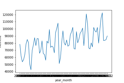
As can be seen from the graph, this is a time series of some metric. Such visualization is only suitable for internal use by the team, and then only with a stretch: the time period is unreadable, the dimensionality is poorly perceived, the quality of the image leaves much to be desired. If we need to use a similar graph in a report or presentation, we will have to restart the notebook and format it, and we will be lucky if it is done by the same person who performed the task – he will already have the necessary data and understanding of what needs to be highlighted.
Let's apply a little effort to improve the perception.
Code block
plt.figure(figsize=(10,5), dpi=300) # Изменим размер подложки графика и качество

sns.lineplot(data=df_data, x=df_data.index, y='metrics1') # Отрисуем график

plt.xticks(rotation=90, fontsize=6) # Повернем подписи делений оси абсцисс
plt.xlim(0, len(df_data)-1) # Ограничим ось абсцисс
plt.xlabel('Дата', fontsize=10) # Изменим подпись оси абсцисс

y_ticks, y_label = plt.yticks() # Получим индексы и подписи оси ординат
plt.yticks(ticks=y_ticks, labels=['{:.0f}'.format(i) for i in y_ticks/10**3], fontsize=8) # Изменим подписи оси ординат
plt.ylim(4*10**4, 12.5*10**4) # Ограничим ось ординат
plt.ylabel('Метрика №1, тыс.шт.', fontsize=12) # Изменим подпись оси ординат

plt.title('Изменение метрики №1 в период 2006-2011 годов', fontsize=16) # Изменим название графика
plt.tight_layout() # Растянем график на всю подложку

if is_save_graph: plt.savefig(f'{path_graphs}plot_base_advanced.jpeg') # Сохраним график
It took 2 minutes, and the graph became much more attractive and readable. It became clearer to the reader:
The essence of the graph is the title.
Time period: the signatures were rotated and became visible.
Metric dimension: moved the thousand prefix to the axis name.
I agree that such changes will take more time at first. But each time you will have more experience, and you will cope with formatting faster. Even when you are 99% sure that the graph will not need to be presented, format it. This way you will leave behind a pleasant and understandable notebook and show your attitude towards the work done and colleagues who will immerse themselves in it.
You only have 10 seconds
Do you know the “10 second rule”? We mostly form our opinions about a stranger in the first few moments. The same thing happens with graphs, so at first glance they should be as intuitive as possible and immediately give an idea of the content!
A little about hue
The hue parameter allows you to perform visualization with additional breakdown by feature. To do this, you can use two types of color palettes (more details https://seaborn.pydata.org/tutorial/color_palettes.html):
Continuous (suitable for continuous features) – this is some kind of gradient. No matter how many values there are in a feature, they will be located within the gradient strictly from minimum to maximum.
Code block
for palette in ('viridis', 'flare', 'rocket'):
    plt.figure(figsize=(5,1), dpi=300)
    sns.heatmap(data=[range(10**4)], cbar=False, cmap=palette)
    plt.axis('off')
    plt.tight_layout()
    if is_save_graph: plt.savefig(f'{path_graphs}plot_palette_{palette}_1.jpeg') # Сохраним график


Discrete (logical for discrete features) – a finite number of colors in the palette. When the last color is reached, the cycle of assigning a color to a category begins again.
Code block
for palette in ('pastel', 'Set2', 'rocket'):
    plt.figure(figsize=(5,1), dpi=300)
    sns.barplot(data=[[1]]*20, palette=palette)
    for w in plt.gca().patches:
        w.set_width(1)
    plt.axis('off')
    plt.tight_layout()
    if is_save_graph: plt.savefig(f'{path_graphs}plot_palette_{palette}_2.jpeg') # Сохраним график


There are 10 colors in the 'pastel' palette, so starting from color 11 the cycle starts again.
There are 8 colors in the 'Set2' palette, so starting from color 9 the cycle starts again.
Some palettes can be used as both the first and second types, for example, 'rocket'. No matter how many color palettes we get from these, they will all be unique, but this will not always be noticeable visually.
Gradient palette
For example, if we want to present trends that have developed within years (represent the year of a categorical feature), we will specify the hue=”year” parameter.
Note: let’s additionally correct the legend name and font size.
Code block
plt.figure(figsize=(10,5), dpi=300) # Изменим размер подложки графика и качество

sns.lineplot(data=df_data, x='month', y='metrics1', hue="year") # Отрисуем график

x_unique = df_data.month.unique()
plt.xticks(ticks=x_unique, fontsize=6) # Изменим подписи делений оси абсцисс
plt.xlim(x_unique.min(), x_unique.max()) # Ограничим ось абсцисс
plt.xlabel('Месяц', fontsize=10) # Изменим подпись оси абсцисс

y_ticks, y_label = plt.yticks() # Получим индексы и подписи оси ординат
plt.yticks(ticks=y_ticks, labels=['{:.0f}'.format(i) for i in y_ticks/10**3], fontsize=8) # Изменим подписи делений оси ординат
plt.ylim(4*10**4, 13*10**4) # Ограничим ось ординат
plt.ylabel('Метрика №1, тыс.шт.', fontsize=12) # Изменим подпись оси ординат

plt.legend(title="Год", loc="upper right", fontsize=8) # Укажем название и положение легенды
plt.title('Годовое изменение метрики №1 в период 2006-2011 годов', fontsize=16) # Изменим название графика
plt.tight_layout() # Растянем график на всю подложку

if is_save_graph: plt.savefig(f'{path_graphs}plot_gradient.jpeg') # Сохраним график
Let's try to change the order of categories using the hue_order parameter.
Code block
plt.figure(figsize=(10,5), dpi=300) # Изменим размер подложки графика и качество

sns.lineplot(data=df_data, x='month', y='metrics1', hue="year", hue_order=df_data.year.unique()[::-1]) # Отрисуем график

x_unique = df_data.month.unique()
plt.xticks(ticks=x_unique, fontsize=6) # Изменим подписи делений оси абсцисс
plt.xlim(x_unique.min(), x_unique.max()) # Ограничим ось абсцисс
plt.xlabel('Месяц', fontsize=10) # Изменим подпись оси абсцисс

y_ticks, y_label = plt.yticks() # Получим индексы и подписи оси ординат
plt.yticks(ticks=y_ticks, labels=['{:.0f}'.format(i) for i in y_ticks/10**3], fontsize=8) # Изменим подписи делений оси ординат
plt.ylim(4*10**4, 13*10**4) # Ограничим ось ординат
plt.ylabel('Метрика №1, тыс.шт.', fontsize=12) # Изменим подпись оси ординат

plt.legend(title="Год", loc="upper right", fontsize=8) # Укажем название и положение легенды
plt.title('Годовое изменение метрики №1 в период 2006-2011 годов', fontsize=16) # Изменим название графика
plt.tight_layout() # Растянем график на всю подложку

if is_save_graph: plt.savefig(f'{path_graphs}plot_gradient_test.jpeg') # Сохраним график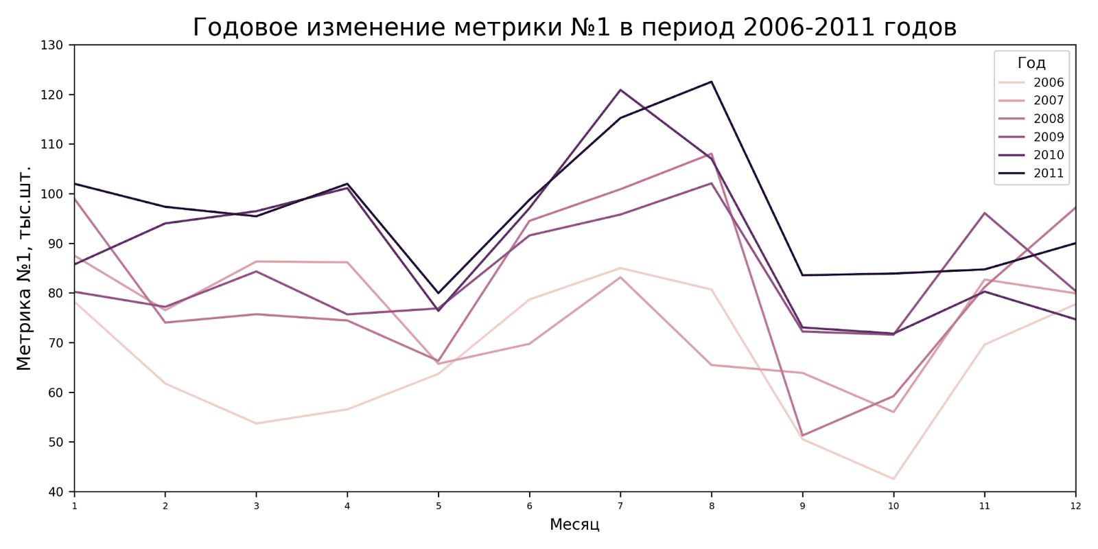
Did not work out.
If data with a number data type is passed to hue, then by default seaborn will use a continuous (gradient) palette, and we will not be able to change the order of categories via hue_order, since they will be recognized as continuous data. If you're wondering why, then https://stackoverflow.com/a/68136043/23121666.
But if we want to correct the order of years (“categories”) so that they visually, as far as possible, coincide with the location of trends, then we can force this in the legend. In versions of matplotlib >=3.7, you can use reverse=True in plt.legend for this, but we will consider an option that will allow us to work with the legend at our discretion in any version.
Code block
plt.figure(figsize=(10,5), dpi=300) # Изменим размер подложки графика и качество

sns.lineplot(data=df_data, x='month', y='metrics1', hue="year") # Отрисуем график

x_unique = df_data.month.unique()
plt.xticks(ticks=x_unique, fontsize=6) # Изменим подписи делений оси абсцисс
plt.xlim(x_unique.min(), x_unique.max()) # Ограничим ось абсцисс
plt.xlabel('Месяц', fontsize=10) # Изменим подпись оси абсцисс

y_ticks, y_label = plt.yticks() # Получим индексы и подписи оси ординат
plt.yticks(ticks=y_ticks, labels=['{:.0f}'.format(i) for i in y_ticks/10**3], fontsize=8) # Изменим подписи делений оси ординат
plt.ylim(4*10**4, 13*10**4) # Ограничим ось ординат
plt.ylabel('Метрика №1, тыс.шт.', fontsize=12) # Изменим подпись оси ординат

plt.title('Годовое изменение метрики №1 в период 2006-2011 годов', fontsize=16) # Изменим название графика
handles, labels = plt.gca().get_legend_handles_labels() # Получим данные легенды
plt.legend(handles[::-1], labels[::-1], title="Год", loc="upper right", fontsize=8) # Укажем название и положение легенды и порядок категорий
plt.tight_layout() # Растянем график на всю подложку

if is_save_graph: plt.savefig(f'{path_graphs}plot_gradient_advanced.jpeg') # Сохраним график
The graph has already turned out to be visually pleasing, but it seems that this palette is not suitable for our feature. In our case, the trends of 2010 and 2011 are completely mixed, and it is completely unclear which is which.
Below is a version of the graph in a vacuum, when the categories are ranked in exactly the same way as the trends of these categories, and are not mixed. In such cases, a gradient palette is appropriate.
Code block
plt.figure(figsize=(10,5), dpi=300) # Изменим размер подложки графика и качество

sns.lineplot(data=df_sin, x='month', y='metrics1', hue="year") # Отрисуем график

x_unique = df_sin.month.unique()
plt.xticks(ticks=x_unique, fontsize=6) # Изменим подписи делений оси абсцисс
plt.xlim(x_unique.min(), x_unique.max()) # Ограничим ось абсцисс
plt.xlabel('Месяц', fontsize=10) # Изменим подпись оси абсцисс

y_ticks, y_label = plt.yticks() # Получим индексы и подписи оси ординат
plt.yticks(ticks=y_ticks, labels=['{:.0f}'.format(i) for i in y_ticks/10**3], fontsize=8) # Изменим подписи делений оси ординат
plt.ylim(4*10**4, 13*10**4) # Ограничим ось ординат
plt.ylabel('Метрика №1, тыс.шт.', fontsize=12) # Изменим подпись оси ординат

plt.title('Годовое изменение метрики №1 в период 2006-2011 годов', fontsize=16) # Изменим название графика
handles, labels = plt.gca().get_legend_handles_labels() # Получим данные легенды
handles = handles[::-1]
labels = labels[::-1]
plt.legend(handles, labels, title="Год", loc="upper right", fontsize=8) # Укажем название и положение легенды и порядок категорий
plt.tight_layout() # Растянем график на всю подложку

if is_save_graph: plt.savefig(f'{path_graphs}plot_vacuum.jpeg') # Сохраним график
Discrete palette
Using the palette parameter, we will select another palette – discrete.
Code block
plt.figure(figsize=(10,5), dpi=300) # Изменим размер подложки графика и качество

sns.lineplot(data=df_data, x='month', y='metrics1', hue="year", palette="Set2") # Отрисуем график

x_unique = df_data.month.unique()
plt.xticks(ticks=x_unique, fontsize=6) # Изменим подписи делений оси абсцисс
plt.xlim(x_unique.min(), x_unique.max()) # Ограничим ось абсцисс
plt.xlabel('Месяц', fontsize=10) # Изменим подпись оси абсцисс

y_ticks, y_label = plt.yticks() # Получим индексы и подписи оси ординат
plt.yticks(ticks=y_ticks, labels=['{:.0f}'.format(i) for i in y_ticks/10**3], fontsize=8) # Изменим подписи делений оси ординат
plt.ylim(4*10**4, 13*10**4) # Ограничим ось ординат
plt.ylabel('Метрика №1, тыс.шт.', fontsize=12) # Изменим подпись оси ординат

plt.title('Годовое изменение метрики №1 в период 2006-2011 годов', fontsize=16) # Изменим название графика
plt.legend(title="Год", loc="upper right", fontsize=8) # Укажем название и положение легенды и порядок категорий
plt.tight_layout() # Растянем график на всю подложку

if is_save_graph: plt.savefig(f'{path_graphs}plot_discrete.jpeg') # Сохраним график
Now we can use the hue_order parameter and change the order of the categories. With this palette it is already obvious where the trends of 2010 and 2011 are. But it all looks like a set of felt-tip pens.
Code block
plt.figure(figsize=(10,5), dpi=300) # Изменим размер подложки графика и качество

sns.lineplot(data=df_data, x='month', y='metrics1', hue="year", palette="Set2", hue_order=df_data.year.unique()[::-1]) # Отрисуем график

x_unique = df_data.month.unique()
plt.xticks(ticks=x_unique, fontsize=6) # Изменим подписи делений оси абсцисс
plt.xlim(x_unique.min(), x_unique.max()) # Ограничим ось абсцисс
plt.xlabel('Месяц', fontsize=10) # Изменим подпись оси абсцисс

y_ticks, y_label = plt.yticks() # Получим индексы и подписи оси ординат
plt.yticks(ticks=y_ticks, labels=['{:.0f}'.format(i) for i in y_ticks/10**3], fontsize=8) # Изменим подписи делений оси ординат
plt.ylim(4*10**4, 13*10**4) # Ограничим ось ординат
plt.ylabel('Метрика №1, тыс.шт.', fontsize=12) # Изменим подпись оси ординат

plt.legend(title="Год", loc="upper right", fontsize=8) # Укажем название и положение легенды
plt.title('Годовое изменение метрики №1 в период 2006-2011 годов', fontsize=16) # Изменим название графика
plt.tight_layout() # Растянем график на всю подложку

if is_save_graph: plt.savefig(f'{path_graphs}plot_discrete_advanced.jpeg') # Сохраним график
Combined palette
These palettes embody two ideas at once: intense color changes and gradual changes in shade. This will be useful when we need to create accents through color and transparency. For example, the colors are grouped into two groups and divide the category into more current, and most likely, more significant years, and less significant ones, which are displayed more for a historical fact. Of course, there are already such ready-made palettes.
Code block
plt.figure(figsize=(10,5), dpi=300) # Изменим размер подложки графика и качество

sns.lineplot(data=df_data, x='month', y='metrics1', hue="year", palette="tab20b", alpha=0.7, hue_order=df_data.year.unique()[::-1]) # Отрисуем график

x_unique = df_data.month.unique()
plt.xticks(ticks=x_unique, fontsize=6) # Изменим подписи делений оси абсцисс
plt.xlim(x_unique.min(), x_unique.max()) # Ограничим ось абсцисс
plt.xlabel('Месяц', fontsize=10) # Изменим подпись оси абсцисс

y_ticks, y_label = plt.yticks() # Получим индексы и подписи оси ординат
plt.yticks(ticks=y_ticks, labels=['{:.0f}'.format(i) for i in y_ticks/10**3], fontsize=8) # Изменим подписи делений оси ординат
plt.ylim(4*10**4, 13*10**4) # Ограничим ось ординат
plt.ylabel('Метрика №1, тыс.шт.', fontsize=12) # Изменим подпись оси ординат

plt.title('Годовое изменение метрики №1 в период 2006-2011 годов', fontsize=16) # Изменим название графика
plt.legend(title="Год", loc="upper right", fontsize=8) # Укажем название и положение легенды и порядок категорий
plt.tight_layout() # Растянем график на всю подложку

if is_save_graph: plt.savefig(f'{path_graphs}plot_combine.jpeg') # Сохраним график
In our example, this palette does not perfectly reflect the task. Let's try to add a new condition: suppose that the data for 2011 is a forecast, and then we should focus on it. To do this, let's create our own palette. You can select RGB online on any website, and the shades are generated based on the opacity level.
Code block
def calculate_rgb(
    rgb: tuple((int, int, int)),
    opacity: float,
) -> [float, float, float, float]:
    """
    Функция получает на вход RGB палитру в виде чисел 0-255, а также уровень непрозрачности в диапазоне 0-1.
    Возвращает список из четырех чисел. Первые три числа - RGB, пересчитанные для seaborn. Последнее число - уровень непрозрачности.
    """
    return [i/255 for i in rgb] + [opacity]

def make_palette(
    rgb_tuple: tuple((int, int, int)),
    opacity_tuple: tuple((float, float)),
    elem_numbers: int,
) -> [list]:
    """
    Функция получает на вход числа RGB, диапазон непрозрачности и количество элементов, которые нужно сгенерировать.
    Возвращает список элементов (списков) согласно задааному количеству элементов.
    """
    return [calculate_rgb(rgb_tuple, o) for o in np.linspace(opacity_tuple[0], opacity_tuple[1], elem_numbers)]

# make_palette((R, G, B), (opacity_max, opacity_min), element_numbers)
own_palette = make_palette((200, 50, 50), (1.0, 1.0), 1) + make_palette((50, 50, 200), (0.7, 0.3), 3) + make_palette((200, 200, 200), (0.8, 0.3), 2)

plt.figure(figsize=(5,1), dpi=300)
sns.barplot(data=[[1]]*6, palette=own_palette)
asd = plt.gca().patches
for w,o in zip(plt.gca().patches, own_palette):
    w.set_width(1.0)
    w.set_alpha(o[-1])
plt.axis('off')
plt.tight_layout()

if is_save_graph: plt.savefig(f'{path_graphs}plot_personal_palette.jpeg')
Code block
plt.figure(figsize=(10,5), dpi=300) # Изменим размер подложки графика и качество

sns.lineplot(data=df_predict, x='month', y='metrics1', hue="year", palette=own_palette, hue_order=df_predict.year.unique()[::-1]) # Отрисуем график

x_unique = df_predict.month.unique()
plt.xticks(ticks=x_unique, fontsize=6) # Изменим подписи делений оси абсцисс
plt.xlim(x_unique.min(), x_unique.max()) # Ограничим ось абсцисс
plt.xlabel('Месяц', fontsize=10) # Изменим подпись оси абсцисс

y_ticks, y_label = plt.yticks() # Получим индексы и подписи оси ординат
plt.yticks(ticks=y_ticks, labels=['{:.0f}'.format(i) for i in y_ticks/10**3], fontsize=8) # Изменим подписи делений оси ординат
plt.ylim(4*10**4, 13*10**4) # Ограничим ось ординат
plt.ylabel('Метрика №1, тыс.шт.', fontsize=12) # Изменим подпись оси ординат

plt.title('Годовое изменение метрики №1 в период 2006-2011 годов', fontsize=16) # Изменим название графика
plt.legend(title="Год", loc="upper right", fontsize=8) # Укажем название и положение легенды и порядок категорий
plt.tight_layout() # Растянем график на всю подложку

if is_save_graph: plt.savefig(f'{path_graphs}plot_combine_advanced.jpeg') # Сохраним график
Here you can notice that a clear emphasis is placed on 2011 (conventionally, we made a forecast for it and present/analyze the results). The following three periods make the greatest contribution to our understanding of the forecast trend, and the last two are presented as historical fact.
Instead of 3D graphs
Sometimes there is a need to show the distribution of data along three axes, that is, use a 3D graph. Take your time, they have several big disadvantages:
they require more resources
visually they are more complex,
they cannot be transferred to the report so that all three axes and the distribution of all data are visible.
To display the third dimension I suggest using:
color,
point size,
dot shape.
We want to visually assess whether there is a relationship between two metrics. To make it more clear, we need more points in the dataset: we use the previously generated dataset.
Code block
plt.figure(figsize=(10,5), dpi=300) # Изменим размер подложки графика и качество

sns.scatterplot(data=df_data3d, x='metrics2', y='metrics1', color="orange") # Отрисуем график

x_ticks, x_label = plt.xticks() # Получим индексы и подписи оси ординат
plt.xticks(ticks=x_ticks, labels=['{:.1f}'.format(i) for i in x_ticks/10**6], fontsize=6) # Изменим подписи делений оси абсцисс
plt.xlim(0.1*10**6, 1*10**6) # Ограничим ось абсцисс
plt.xlabel('Метрика №2, млн.шт.', fontsize=10) # Изменим подпись оси абсцисс

y_ticks, y_label = plt.yticks() # Получим индексы и подписи оси ординат
plt.yticks(ticks=y_ticks, labels=['{:.0f}'.format(i) for i in y_ticks/10**3], fontsize=8) # Изменим подписи делений оси ординат
plt.ylim(4*10**4, 13*10**4) # Ограничим ось ординат
plt.ylabel('Метрика №1, тыс.шт.', fontsize=12) # Изменим подпись оси ординат

plt.title('Зависимость метрики №1 от метрики №2', fontsize=16) # Изменим название графика
plt.tight_layout() # Растянем график на всю подложку

if is_save_graph: plt.savefig(f'{path_graphs}plot_3d.jpeg') # Сохраним график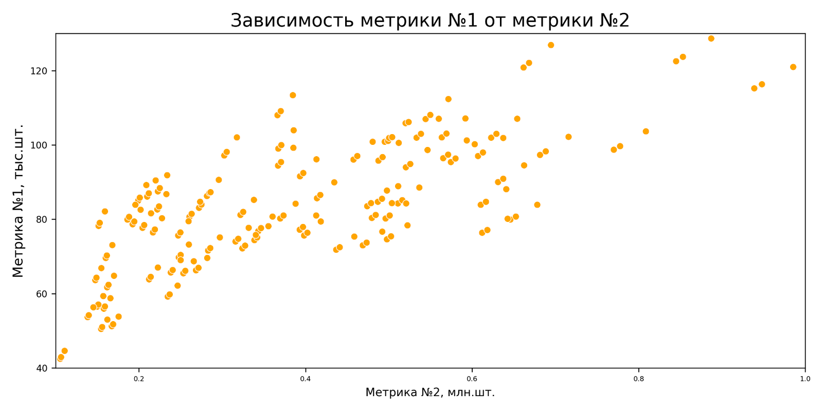
We see that the metrics are correlated. For greater clarity, we can make the points more transparent, then it will be easier for us to evaluate the accumulation of such points (when overlapping each other, the level of opacity will increase).
Code block
plt.figure(figsize=(10,5), dpi=300) # Изменим размер подложки графика и качество

sns.scatterplot(data=df_data3d, x='metrics2', y='metrics1', color="orange", alpha=0.6) # Отрисуем график

x_ticks, x_label = plt.xticks() # Получим индексы и подписи оси ординат
plt.xticks(ticks=x_ticks, labels=['{:.1f}'.format(i) for i in x_ticks/10**6], fontsize=6) # Изменим подписи делений оси абсцисс
plt.xlim(0.1*10**6, 1*10**6) # Ограничим ось абсцисс
plt.xlabel('Метрика №2, млн.шт.', fontsize=10) # Изменим подпись оси абсцисс

y_ticks, y_label = plt.yticks() # Получим индексы и подписи оси ординат
plt.yticks(ticks=y_ticks, labels=['{:.0f}'.format(i) for i in y_ticks/10**3], fontsize=8) # Изменим подписи делений оси ординат
plt.ylim(4*10**4, 13*10**4) # Ограничим ось ординат
plt.ylabel('Метрика №1, тыс.шт.', fontsize=12) # Изменим подпись оси ординат

plt.title('Зависимость метрики №1 от метрики №2', fontsize=16) # Изменим название графика
plt.tight_layout() # Растянем график на всю подложку

if is_save_graph: plt.savefig(f'{path_graphs}plot_3d_opacity.jpeg') # Сохраним график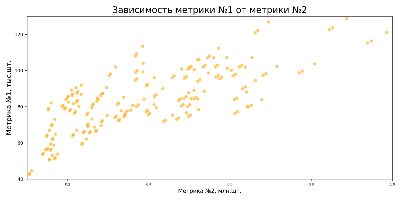
But what if we need to look at the behavior of the data relative to the third axis, but we don’t want to draw a 3D graph? We use the size of the points as an additional dimension.
Unlike the graph with orange dots without changing the size of the dots, I increased the opacity level.
Note: I also corrected the color of the points in the legend, otherwise they will just be black).
Code block
plt.figure(figsize=(10,5), dpi=300) # Изменим размер подложки графика и качество

sns.scatterplot(data=df_data3d, x='metrics2', y='metrics1', size="metrics3", color="orange", alpha=0.8) # Отрисуем график

x_ticks, x_label = plt.xticks() # Получим индексы и подписи оси ординат
plt.xticks(ticks=x_ticks, labels=['{:.1f}'.format(i) for i in x_ticks/10**6], fontsize=6) # Изменим подписи делений оси абсцисс
plt.xlim(0.1*10**6, 1*10**6) # Ограничим ось абсцисс
plt.xlabel('Метрика №2, млн.шт.', fontsize=10) # Изменим подпись оси абсцисс

y_ticks, y_label = plt.yticks() # Получим индексы и подписи оси ординат
plt.yticks(ticks=y_ticks, labels=['{:.0f}'.format(i) for i in y_ticks/10**3], fontsize=8) # Изменим подписи делений оси ординат
plt.ylim(4*10**4, 13*10**4) # Ограничим ось ординат
plt.ylabel('Метрика №1, тыс.шт.', fontsize=12) # Изменим подпись оси ординат

plt.title('Зависимость метрики №1 от метрики №2', fontsize=16) # Изменим название графика
legend_handles, legend_labels = plt.gca().get_legend_handles_labels() # Получим индексы и подписи оси ординат
for l in legend_handles: # Поправим цвет и непрозрачность подписей в легенде
    l.set_color('orange')
    l.set_alpha(0.8)
legend_labels = ['{:.0f}'.format(float(l)*100) for l in legend_labels] # Изменим подписи легенды
plt.legend(legend_handles, legend_labels, title="Метрика №3, млн.шт.", loc="lower right", fontsize=8) # Укажем название и положение легенды и порядок категорий
plt.tight_layout() # Растянем график на всю подложку

if is_save_graph: plt.savefig(f'{path_graphs}plot_3d_size.jpeg') # Сохраним график
The difference in the sizes of the dots is currently not clear enough, and it is not clear which is which. For clarity, let's increase the range between the minimum and maximum sizes.
Code block
plt.figure(figsize=(10,5), dpi=300) # Изменим размер подложки графика и качество

sns.scatterplot(data=df_data3d, x='metrics2', y='metrics1', size="metrics3", sizes=(10, 150), color="orange", alpha=0.8) # Отрисуем график

x_ticks, x_label = plt.xticks() # Получим индексы и подписи оси ординат
plt.xticks(ticks=x_ticks, labels=['{:.1f}'.format(i) for i in x_ticks/10**6], fontsize=6) # Изменим подписи делений оси абсцисс
plt.xlim(0.1*10**6, 1*10**6) # Ограничим ось абсцисс
plt.xlabel('Метрика №2, млн.шт.', fontsize=10) # Изменим подпись оси абсцисс

y_ticks, y_label = plt.yticks() # Получим индексы и подписи оси ординат
plt.yticks(ticks=y_ticks, labels=['{:.0f}'.format(i) for i in y_ticks/10**3], fontsize=8) # Изменим подписи делений оси ординат
plt.ylim(4*10**4, 13*10**4) # Ограничим ось ординат
plt.ylabel('Метрика №1, тыс.шт.', fontsize=12) # Изменим подпись оси ординат

plt.title('Зависимость метрики №1 от метрики №2', fontsize=16) # Изменим название графика
legend_handles, legend_labels = plt.gca().get_legend_handles_labels() # Получим индексы и подписи оси ординат
for l in legend_handles: # Поправим цвет и непрозрачность подписей в легенде
    l.set_color('orange')
    l.set_alpha(0.8)
legend_labels = ['{:.0f}'.format(float(l)*100) for l in legend_labels] # Изменим подписи легенды
plt.legend(legend_handles, legend_labels, title="Метрика №3, млн.шт.", loc="lower right", fontsize=8) # Укажем название и положение легенды и порядок категорий
plt.tight_layout() # Растянем график на всю подложку

if is_save_graph: plt.savefig(f'{path_graphs}plot_3d_size_range.jpeg') # Сохраним график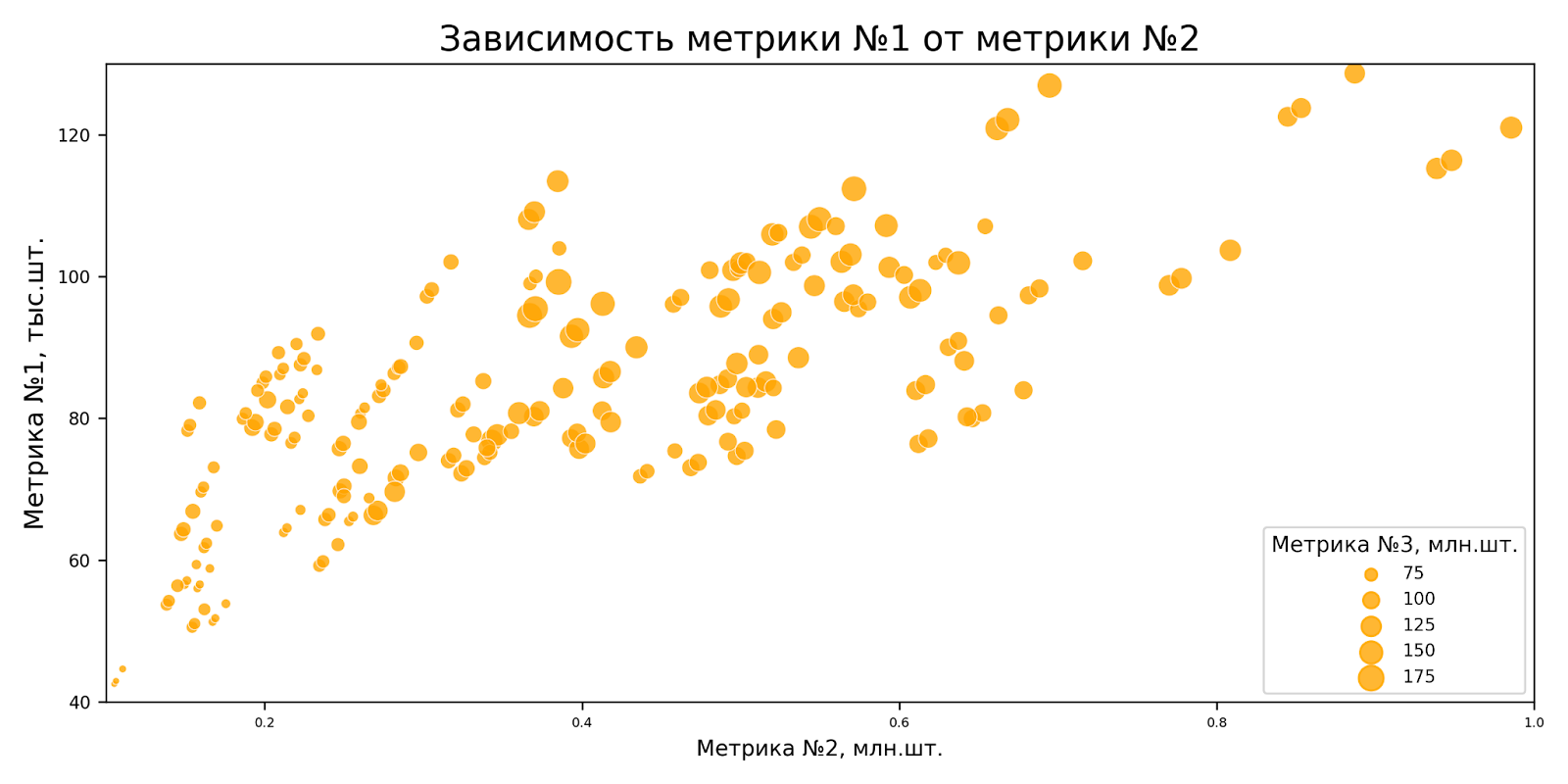
Still not very clear. I suggest using the color of the dots instead of the size. I like this option better and others seem more receptive.
Code block
plt.figure(figsize=(10,5), dpi=300) # Изменим размер подложки графика и качество

sns.scatterplot(data=df_data3d, x='metrics2', y='metrics1', hue="metrics3") # Отрисуем график

x_ticks, x_label = plt.xticks() # Получим индексы и подписи оси ординат
plt.xticks(ticks=x_ticks, labels=['{:.1f}'.format(i) for i in x_ticks/10**6], fontsize=6) # Изменим подписи делений оси абсцисс
plt.xlim(0.1*10**6, 1*10**6) # Ограничим ось абсцисс
plt.xlabel('Метрика №2, млн.шт.', fontsize=10) # Изменим подпись оси абсцисс

y_ticks, y_label = plt.yticks() # Получим индексы и подписи оси ординат
plt.yticks(ticks=y_ticks, labels=['{:.0f}'.format(i) for i in y_ticks/10**3], fontsize=8) # Изменим подписи делений оси ординат
plt.ylim(4*10**4, 13*10**4) # Ограничим ось ординат
plt.ylabel('Метрика №1, тыс.шт.', fontsize=12) # Изменим подпись оси ординат

plt.title('Зависимость метрики №1 от метрики №2', fontsize=16) # Изменим название графика
legend_handles, legend_labels = plt.gca().get_legend_handles_labels() # Получим индексы и подписи оси ординат
legend_labels = ['{:.0f}'.format(float(l)*100) for l in legend_labels] # Изменим подписи легенды
plt.legend(legend_handles, legend_labels, title="Метрика №3, млн.шт.", loc="lower right", fontsize=8) # Укажем название и положение легенды и порядок категорий
plt.tight_layout() # Растянем график на всю подложку

if is_save_graph: plt.savefig(f'{path_graphs}plot_3d_hue.jpeg') # Сохраним график
Another example that seems very clear to me. We will again add the condition, as we did earlier, that 2011 is a forecast, and use our own palette that we have already created.
Code block
plt.figure(figsize=(10,5), dpi=300) # Изменим размер подложки графика и качество

sns.scatterplot(data=df_predict, x='metrics2', y='metrics1', hue="year", hue_order=df_predict.year.unique()[::-1], palette=own_palette) # Отрисуем график

x_ticks, x_label = plt.xticks() # Получим индексы и подписи оси ординат
plt.xticks(ticks=x_ticks, labels=['{:.1f}'.format(i) for i in x_ticks/10**6], fontsize=6) # Изменим подписи делений оси абсцисс
plt.xlim(0.1*10**6, 1*10**6) # Ограничим ось абсцисс
plt.xlabel('Метрика №2, млн.шт.', fontsize=10) # Изменим подпись оси абсцисс

y_ticks, y_label = plt.yticks() # Получим индексы и подписи оси ординат
plt.yticks(ticks=y_ticks, labels=['{:.0f}'.format(i) for i in y_ticks/10**3], fontsize=8) # Изменим подписи делений оси ординат
plt.ylim(4*10**4, 13*10**4) # Ограничим ось ординат
plt.ylabel('Метрика №1, тыс.шт.', fontsize=12) # Изменим подпись оси ординат

plt.title('Зависимость метрики №1 от метрики №2', fontsize=16) # Изменим название графика
plt.legend(title="Год", loc="lower right", fontsize=8) # Укажем название и положение легенды и порядок категорий
plt.tight_layout() # Растянем график на всю подложку

if is_save_graph: plt.savefig(f'{path_graphs}plot_3d_palette.jpeg') # Сохраним график
Well, let's add the size of the points as a dimension. Maybe it’s even the same…
Code block
plt.figure(figsize=(10,5), dpi=300) # Изменим размер подложки графика и качество

sns.scatterplot(
    data=df_predict, x='metrics2', y='metrics1', hue="year", hue_order=df_predict.year.unique()[::-1], palette=own_palette,
    size="metrics3", sizes=(10, 150),
) # Отрисуем график

x_ticks, x_label = plt.xticks() # Получим индексы и подписи оси ординат
plt.xticks(ticks=x_ticks, labels=['{:.1f}'.format(i) for i in x_ticks/10**6], fontsize=6) # Изменим подписи делений оси абсцисс
plt.xlim(0.1*10**6, 1*10**6) # Ограничим ось абсцисс
plt.xlabel('Метрика №2, млн.шт.', fontsize=10) # Изменим подпись оси абсцисс

y_ticks, y_label = plt.yticks() # Получим индексы и подписи оси ординат
plt.yticks(ticks=y_ticks, labels=['{:.0f}'.format(i) for i in y_ticks/10**3], fontsize=8) # Изменим подписи делений оси ординат
plt.ylim(4*10**4, 13*10**4) # Ограничим ось ординат
plt.ylabel('Метрика №1, тыс.шт.', fontsize=12) # Изменим подпись оси ординат

plt.title('Зависимость метрики №1 от метрики №2', fontsize=16) # Изменим название графика
legend_handles, legend_labels = plt.gca().get_legend_handles_labels() # Получим индексы и подписи оси ординат
# Изменим подписи легенды
legend_labels[0] = 'Год'
legend_labels[7] = 'Метрика №3, млн.шт.'
legend_labels[8:] = ['{:.0f}'.format(float(l)*100) for l in legend_labels[8:]]
plt.legend(legend_handles, legend_labels, loc="lower right", fontsize=8) # Укажем название и положение легенды и порядок категорий
plt.tight_layout() # Растянем график на всю подложку

if is_save_graph: plt.savefig(f'{path_graphs}plot_3d_palette_size.jpeg') # Сохраним график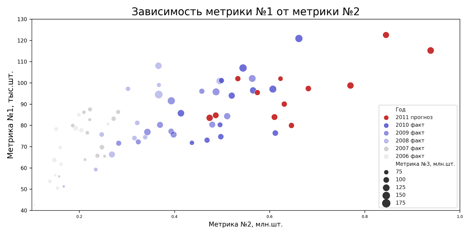
What conclusions can be drawn from our graph? Like what:
We are planning intensive growth of metric No. 2 in 2011.
Metric No. 1 is also expected to grow, but to a lesser extent.
In 2009-2010 there are growth drivers for metric No. 3, which we do not expect in 2011.
Conclusion
In this short article, I was able to only slightly expand on the topic of the possibilities of using color for visualization and show very little graphs with changes in the size of a point depending on the input data. I hope that the examples were interesting and of practical use.
There are no restrictions regarding visualization, and everything depends only on your imagination. I try to adhere to the following recommendations:
Correct captions and legend, add title. Over time, you will do it faster and faster, and eventually it will become a habit.
Do not overload the chart: do not use more than 3 basic colors, without taking into account their shades, do not simultaneously add visualization of dot sizes, colors and shapes. You need to choose one, maximum two types of visualization, if appropriate.
Priority trends—those that the customer should pay attention to first—are best displayed in richer and darker shades.
If there are several trends of the same shade, they must be united by something ideologically: market segment/year/month. You have to show it, make it obvious.
Use the palette type according to the data type: discrete, continuous. This will eliminate problems and conflicts when working with the library.
The more varied visualizations you make, the better. First quantity, then quality.