Can design affect delivery speed?

About the author of the article: Murad Gammadov, leader of B2B design Dodo Pizza.
When ordering food for delivery, people are no longer ready to wait an hour. This is too long. Half an hour – this is the maximum that the client is willing to spend on waiting. In 2018, we drove pizza on average in 43 minutes, but wanted in 30!
To achieve the goal, we had to expand the transport line (we added gas scooters, electric scooters and cycle trips), revised the delivery areas, and learned to predict travel times. And also to remake the terminal of couriers and using design to change the perception paradigm from “to be in 60 minutes” to “deliver as quickly as possible”.
This article is about design. In it I will show the whole way of working with the interface: how it all began, where it moved, and how the designer heart calmed down.
How it all started
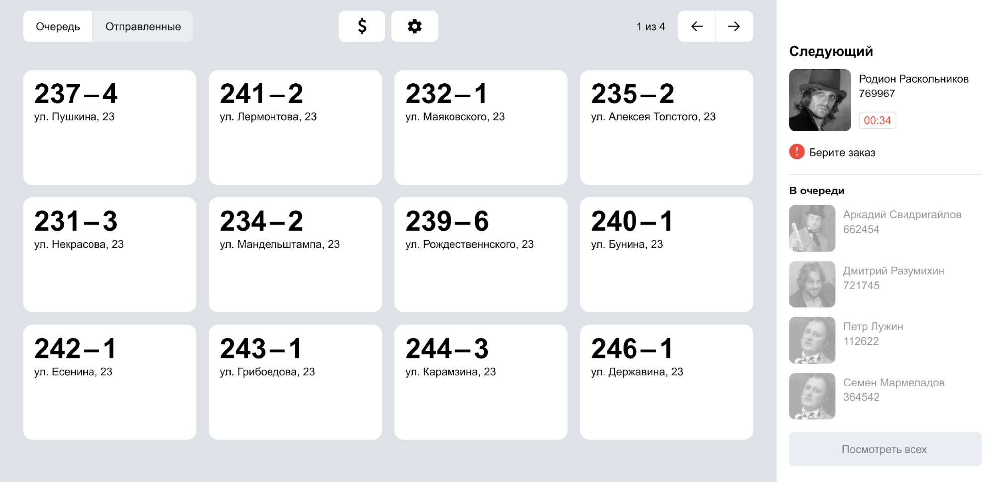
In each pizzeria, between the kitchen and the courier area, there is a candy bar with a “delivery counter” open – the Dodo IS section, which is responsible for interacting with couriers:
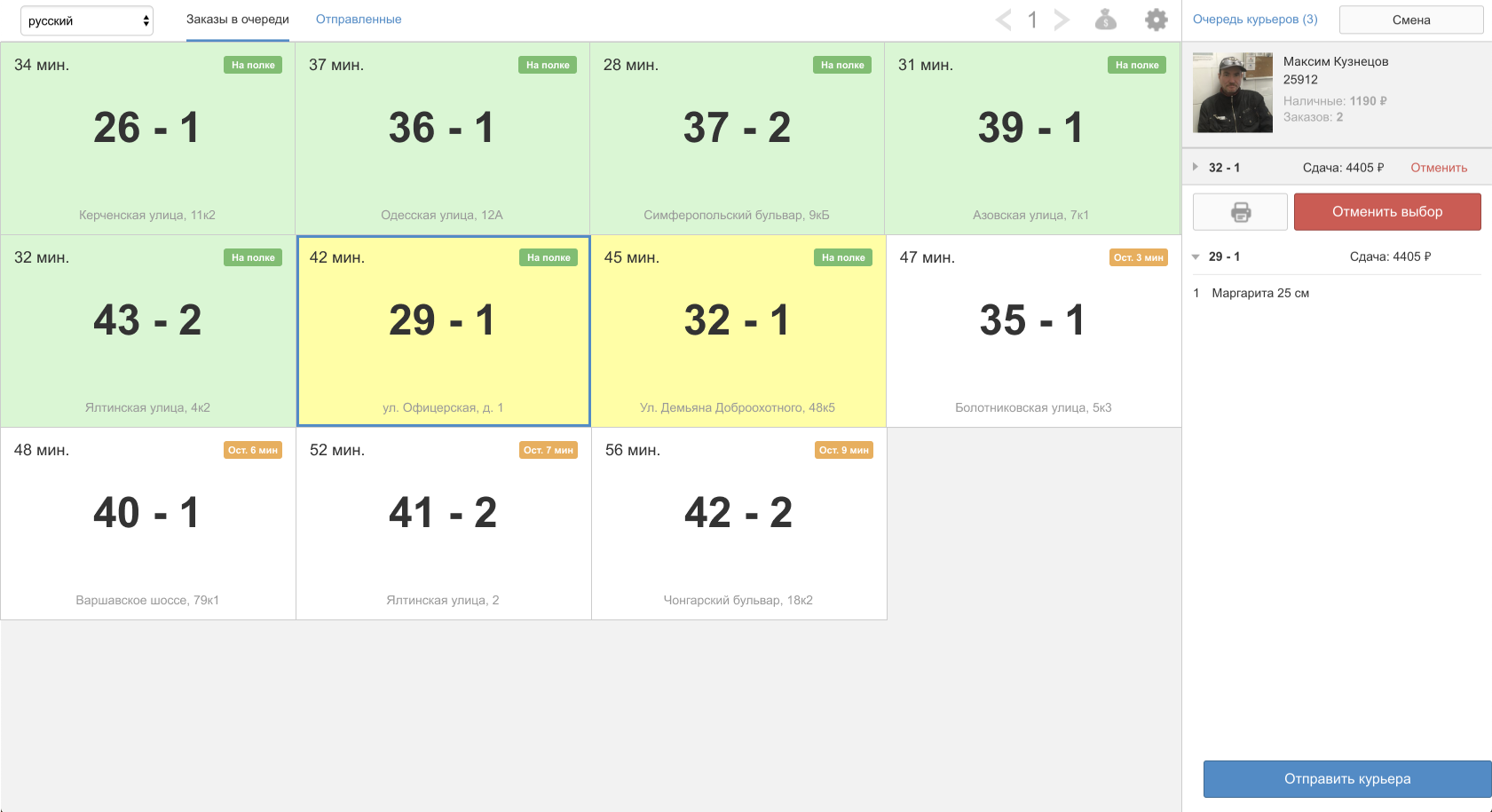
This is the old interface of the delivery cash desk, from which we started our acceleration project. Orders highlighted in green, ready to be sent to the customer, are highlighted in white – those that are still in operation. The black and blue color of the number is the separation of delivery / pickup. The time at the top left of the cell is a countdown of 60 minutes from the moment the order arrives at the pizzeria. The badge in the upper right of the cell shows the status of the order or the time before preparation.
Before taking orders, the courier had to “stand in line” – in fact, check in. This was done with the help of bar codes: each courier was printed a bar code, and he scanned it at the entrance to the pizzeria. The system itself determined the first courier in the queue and made it “active” – that is, those who should take the order.
When the courier is about to deliver the order, he must select it in the interface and hit the road. To select an order, you must first click on the cell, and then click “Select Order”, and then it is already attached to you. Further, either you take another order, or click “Send courier” and leave.
Do not reinvent the wheel
We decided not to change the general design of the interface – it is to some extent a wheel, you cannot go far from it. You always have to choose between two classic display options: either tiles or a list. The list is inconvenient – too small and inconvenient to click. In general, it’s good, we leave the tile and go to think about the content of the cells.
The entire project “Delivery” was built around work over time, both from the side of management / business solutions, and from the side of design. It was very important for us that the timer was visible from afar, right from the door, as soon as the courier entered the pizzeria. And we began to study different options for visualization. You can make a horizontal timer and color it depending on the remaining time:

It seems not bad, but no. The mere presence of a timer creates the feeling that you still have time for procrastination. And we want orders to be taken as soon as they are ready.
But what if you remove the horizontal timer and paint the order number itself? It is large, clearly visible:

No, not ice. Now the emphasis has shifted to problematic orders. And if there is no problem, there is no motivation to leave immediately. Let’s go the other way …
But what if you consider how much time it takes to select an order? As soon as the courier becomes active, time begins to tick. If you choose an order for more than 30 seconds – highlight in red. You can still give tips like “Take an order”, “It’s time to leave.” It is always nice when the system communicates with you:
But we did not take into account that couriers often wait for the second and third order in order to take everything at once. And it’s hard to understand how much time is spent on downtime, and how much is waiting.
Can then consider the downtime of the order, and not the courier? So we give flexibility to choose and at the same time hint not to pull too long. We will show it in addition to the order time and highlight: two minutes – yellow, five – red:
Since orders are waiting for couriers on the heat shelf, we called this time “time on the heat shelf”. Left so and went to think further.
How to count time
Then we thought: is it right to take the time in the reverse order from 60 minutes? It was logical when you just had to meet the hour, but now the courier should deliver the order as quickly as possible. And then opinions were divided:
- The product wanted to show the forecast of the total time from different intervals: cooking (yellow), heat shelf (green), delivery (blue). Cooking time was taken as standard (7 minutes), but updated in the process; time on the heat shelf started to run only when the order got there; a forecast was shown for delivery.
- The Privy Advisor also suggested showing the forecast of the total time, but only by number, and showing separately the time on the heat shelf.
- The designer thought to just limit the time to 30 minutes. Previously, there was a countdown from 60, now it will be from 30. Tough, but simple.
Most of our office employees went through gembu, so we decided to first test all three options on them:
- At the very beginning it became clear that the product option is too complicated. Not a single person ever understood it on their own, and even after the explanation, few understood.
- The designer’s option was quickly understood, but it seemed (surprise!) Too harsh.
- I liked the option of the Privy Advisor most of all, and we decided to take it as a basis.
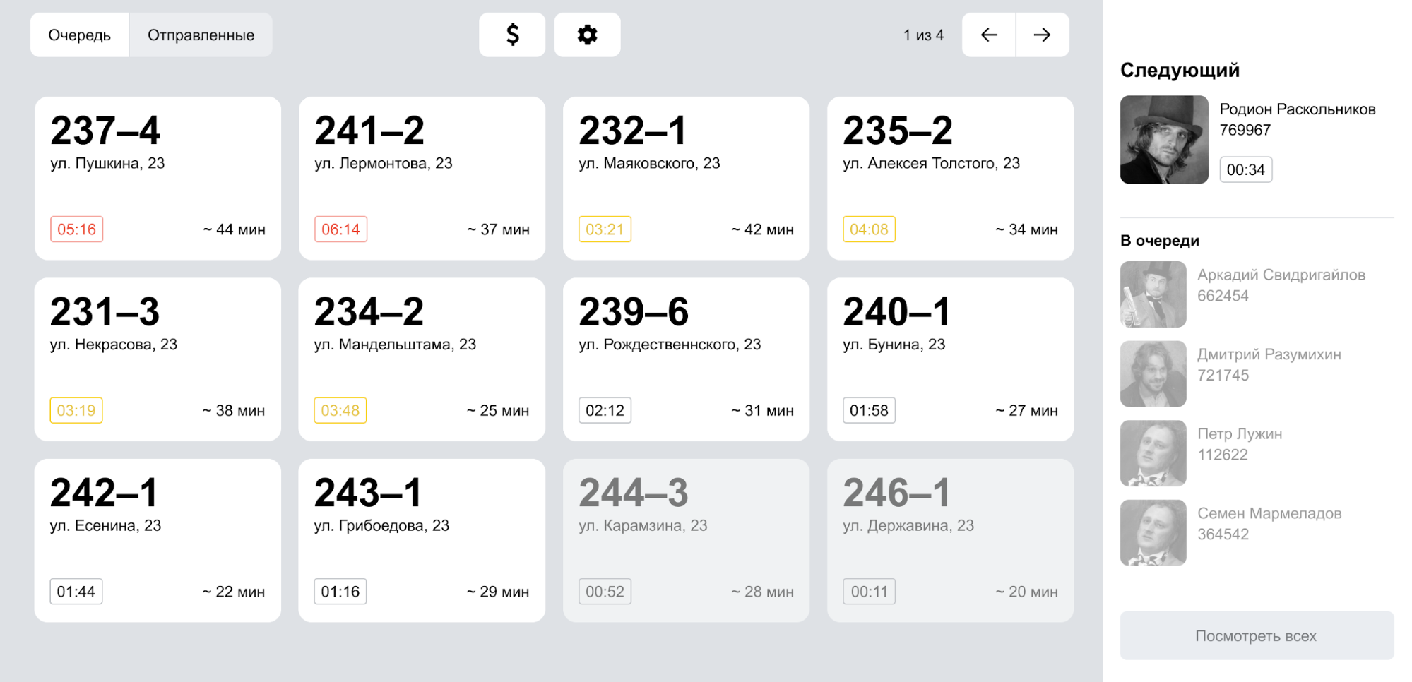
True, in the process of discussion, we realized that it was also worth finalizing. Firstly, we forgot about the order status. Secondly, showing two times in a cell is a bad idea. All the time I want to mentally somehow compare them, add / subtract. Therefore, we still refused time on the heat shelf, leaving only the total order time:
They printed the modified version and went to show the couriers. Everything went well, they quickly understood how the new order time is considered. Of course, the habit still remains, and it will take time to rebuild. But you still have to rebuild, and here it was more important to understand whether the new logic is too complicated.
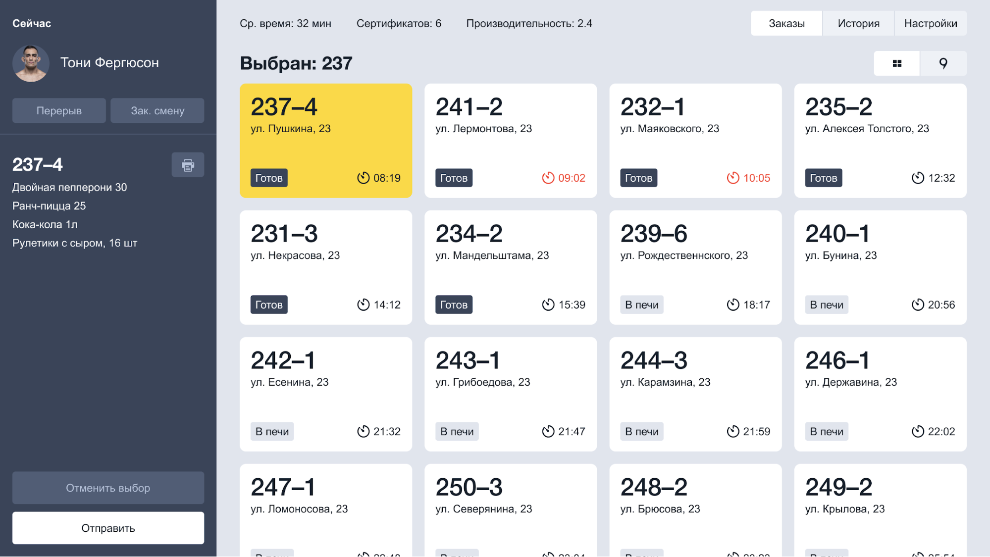
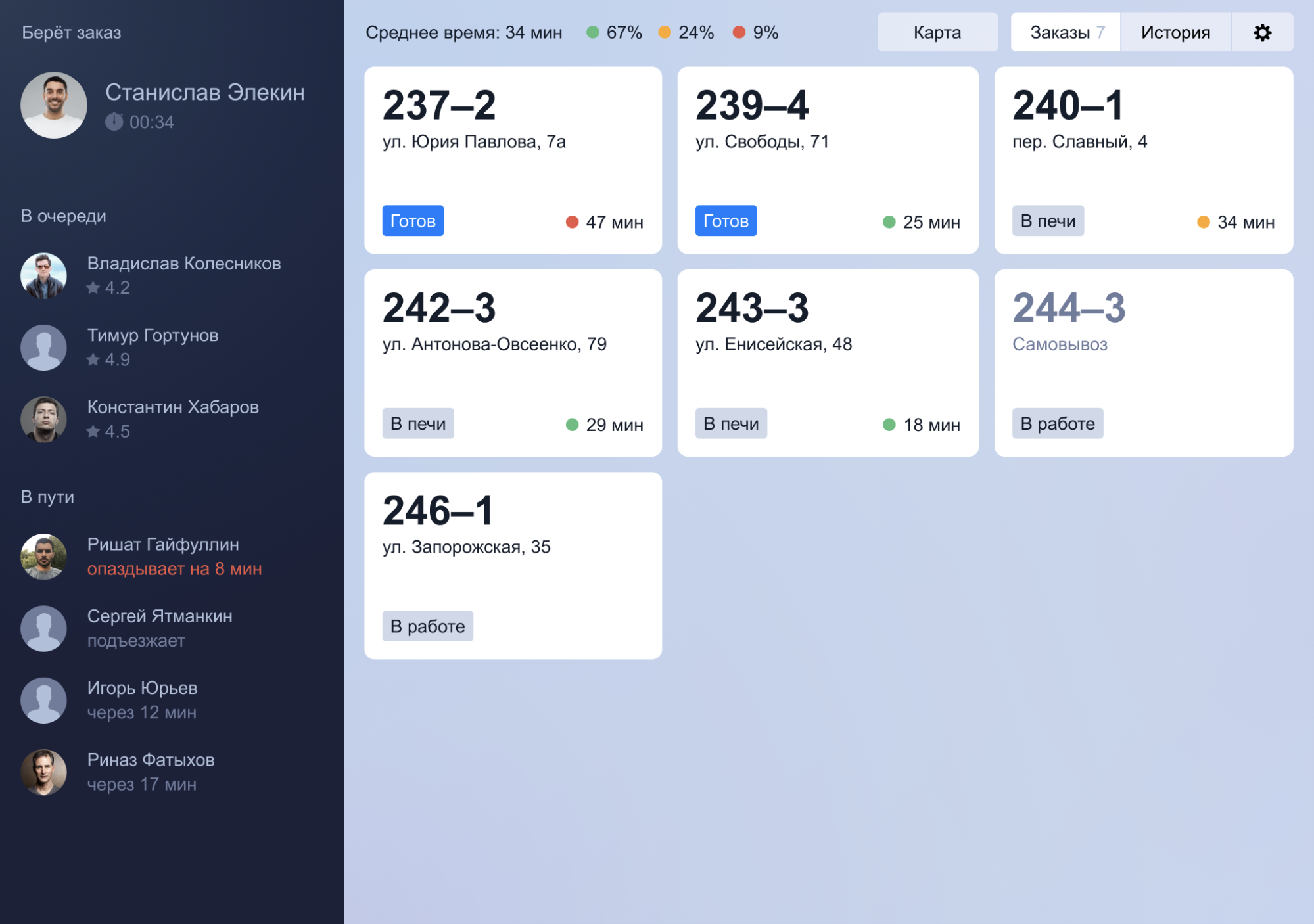
We added beauty to the new logic:
- They returned all additional controls from the old cash desk.
- We collected a full grid of cells and highlighted the status.
- The line of couriers was contrasted and moved to the left – we read from left to right.
How can a courier understand that he’s done: metrics
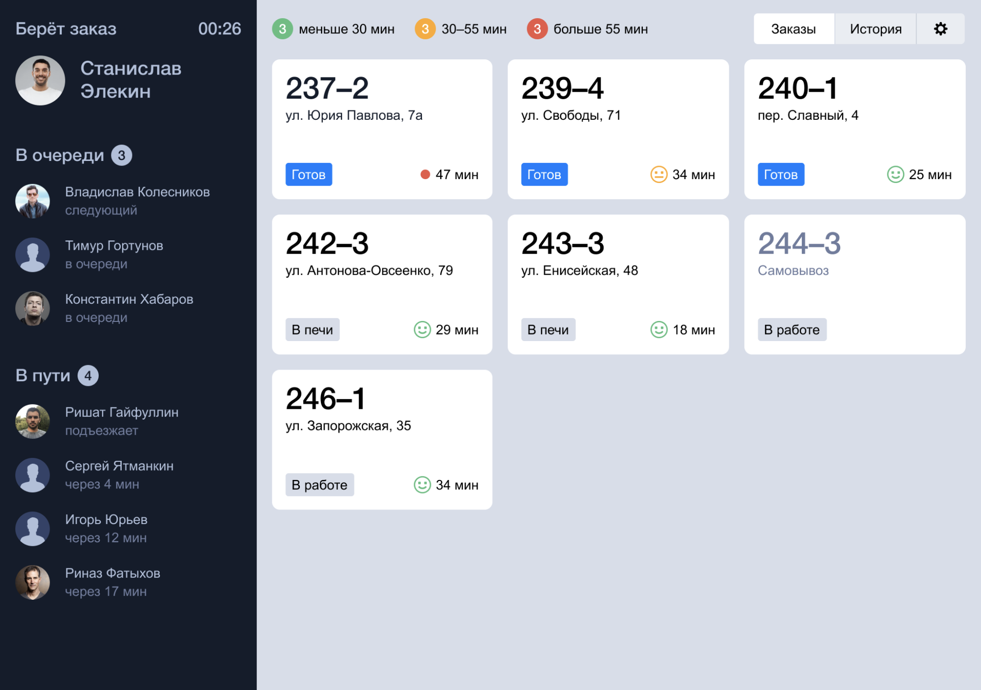
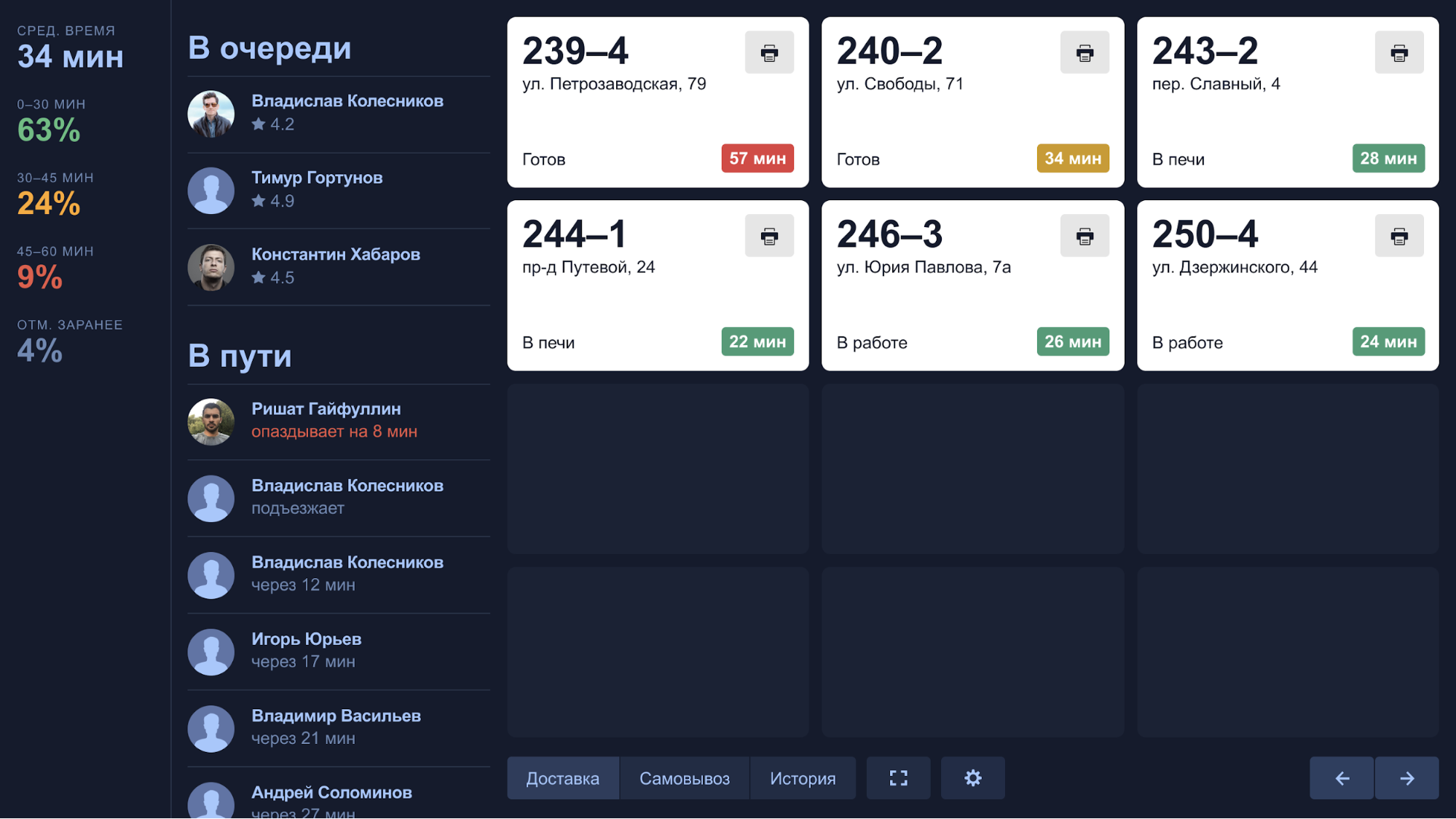
Another important point is the metrics, namely the average order time. This is the metric for which everything was started. We started experimenting with how to show order statistics. At first it was just the average time:

But is it not a bit dry? Let’s try to show the number of orders delivered on time and not on time:
An idea with a number of norms, but without explanation, was not very clear. And I want to see statistics from afar, but I have to peer into the circles.
Let’s try to show through the bars and their ratio, for this we have to transfer the statistics down:

The values cannot be on the border of the strips (there will be overlays), so you have to shift the detail to the right. But when they stand so close, all the time you try to correlate the strips with circles – it is annoying. Yes, and the bottom often falls out of sight. In general, the top is more visible.
As a result, they left interest without explanation and returned the average time:
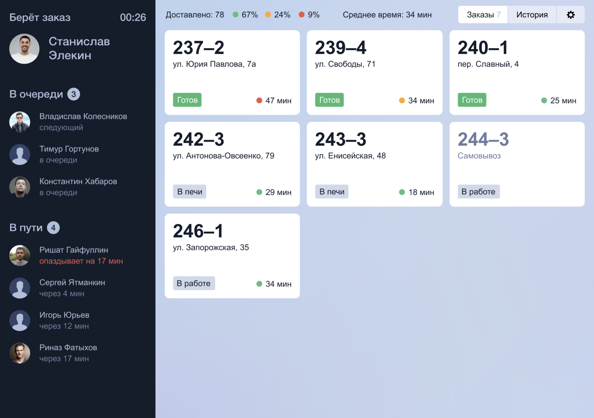
We argued for a long time how to show orders – in quantity or in percent? As a result, we settled on percentages, so interest can set goals. You cannot directly influence the quantity, and pizzerias are different (old / new, different locations). And with percentages there are no such problems.
Then the product threw another idea: keep a rating of couriers per shift. The rating does not have any consequences (fines / bonuses), it is a purely competitive element. It seems a trifle, but adds excitement to the work:
Well, the old kick-box returned in a new guise.
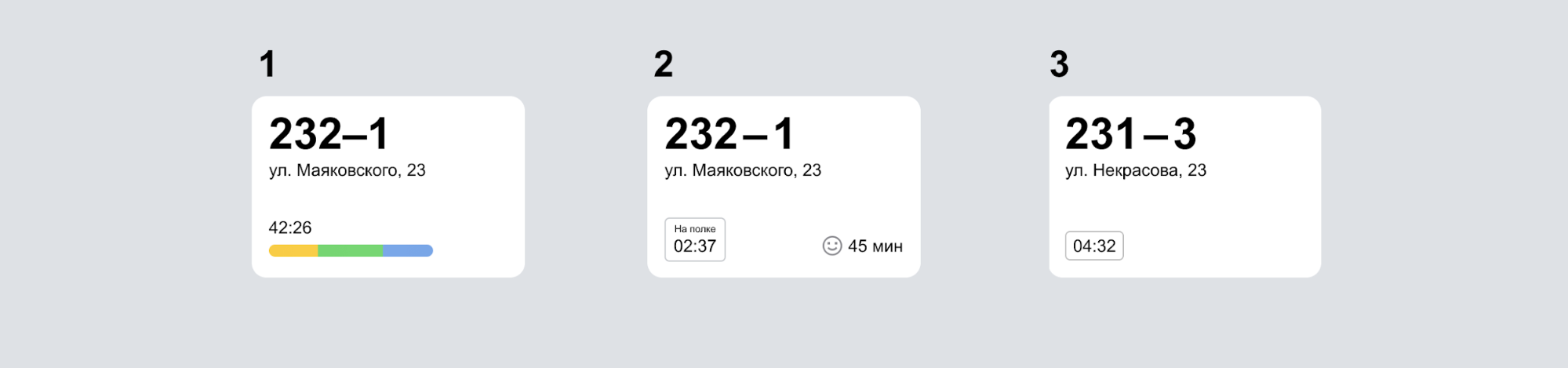
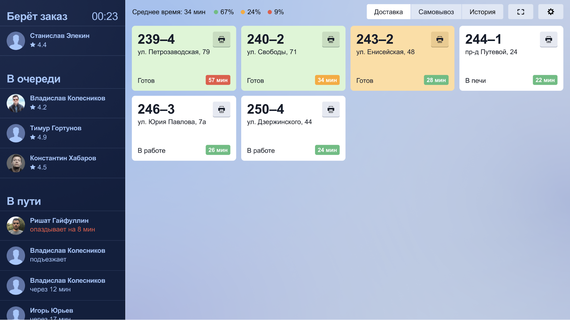
At the very end, the designer came to the conclusion that if the content of the lists themselves is important, it is not necessary to highlight the headings. At the same time, the status was pulled up – it should be visible from afar, so they made it brighter and entered into the general gamut:
Let’s test live couriers
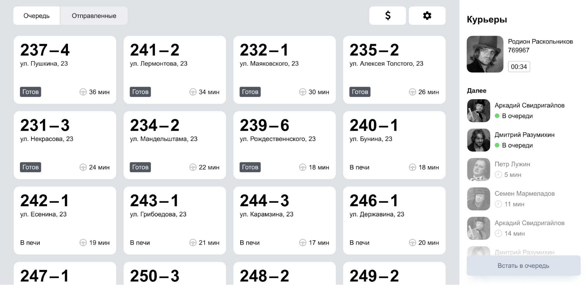
So, we put together a working model and rolled it out to several pizzerias. And immediately flaws became noticeable.
First problem – everything is very shallow. Monoblock cash registers have a high pixel density, but there is no automatic scaling, as on phones or tablets. At current sizes, reading something from a distance is quite difficult.
Second problem – In the queue, everything merged because of the small headlines, the look has nothing to catch on. Headings play the role of pointers and help to navigate, so they should be large and clearly visible.
Third problem – the order time and availability are poorly visible. Everywhere you have to read it.
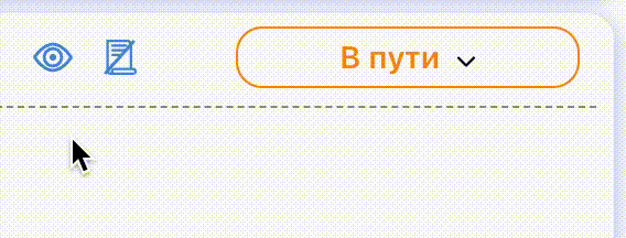
With the first two points everything is clear, but with the third I had to think. It was not possible to isolate time as a status; two similar entities would be confused. On the other hand, in the status the main thing is to know whether the order is ready or not. Therefore, we decided to return to the old version – the willingness to show a green background, and the status is just text. This allowed and allocate time.
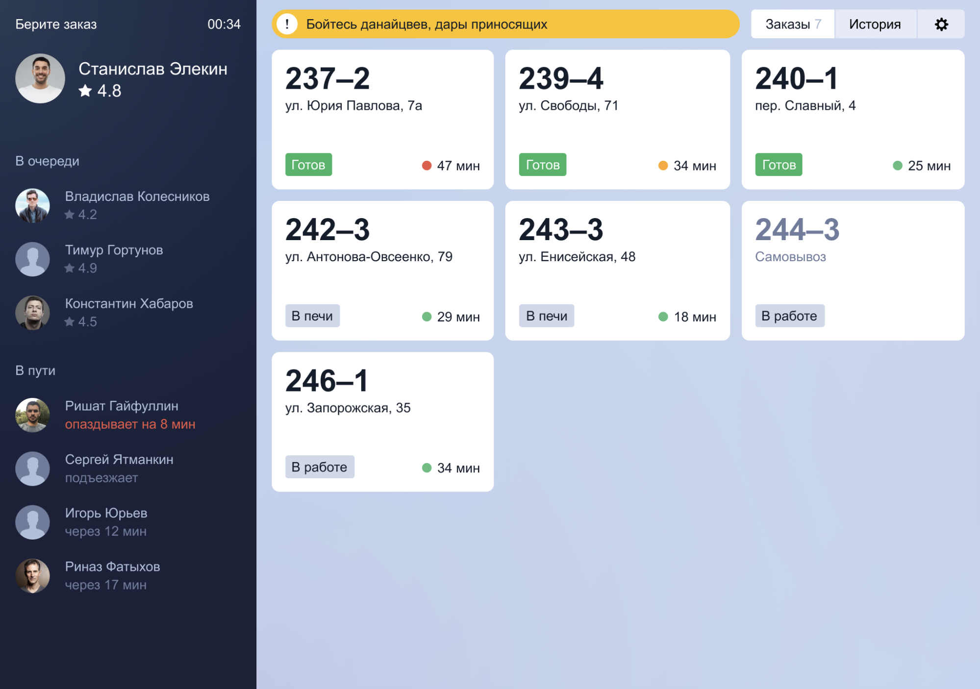
Add color
At one point, the art director came and said: and let’s make all the metrics gigantic and flip a strip on the left? The designer first argued and tried to reason with the art diere, and then he tried and he liked it:
Because it’s so much more noticeable. Here you will not be able to score on them.
At about the same moment, we decided to make the theme dark. Against a gray background, due to the low contrast, the cells merged a little, and against a dark background a white cell can be seen from afar. Yes, we still did it because of the optical effect – white text on a dark background seems to be bigger than black on white (I don’t have a harmonious explanation here, but it seems to be connected with “lightness” – the white color somehow “eats up” “Black letters; but this is not accurate). And yet we are not sure whether it is good to do everything dark, but decided to try as a long experiment.
For comparison – an attempt to “lighten” everything back:

And this is a pre-rolled version, which eventually went into production:

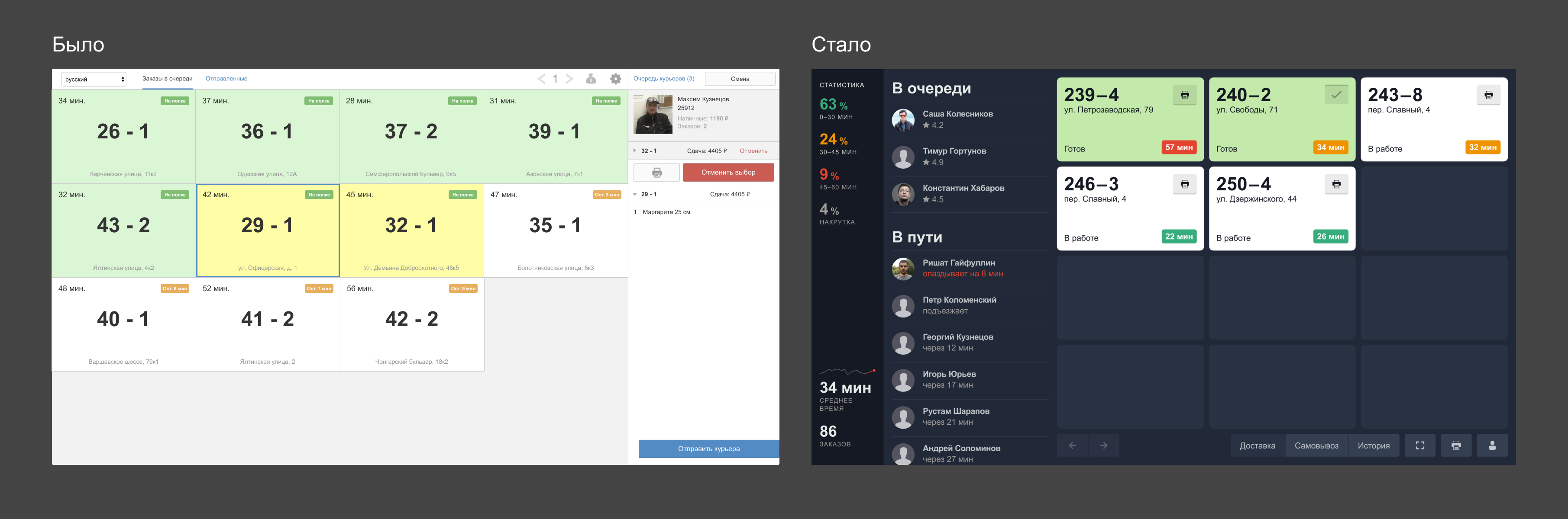
Compare what happened at the very beginning and what happened as a result:
A year later, the average delivery rate throughout the network decreased from 43 to 35 minutes. What was the merit of the new terminal in this? It is difficult to evaluate, but he played his part. In such global projects, design alone cannot (and should not) be a killer feature. But this is an effective tool that helps to clothe the essence in the right form and correctly place emphasis.