Basic analysis of product features
Hi, I work as a product analyst and my tasks are largely related to analyzing user behavior in a product.
Perhaps most often, I have to work with various types of research. Research into interface solutions, individual features or product mechanics can be classified as a separate category. These can be both new releases and old features that the team had never gotten around to before. The main question in such problems sounds something like this: “Do users like this thing that we added, does it bring us money?“
The more similar problems I reworked, the clearer the general patterns of such analysis emerged. As a result, I formed a small “framework” that helps outline a plan for a detailed study and is easily adapted to different products with different specifics.
Here I will tell you about it in general terms.
Why bother disassembling the shelf into features? Isn’t it easier to look at it as a whole? A product (in particular, a website or application) is essentially a collection of mechanics and individual features, and the management of macro-indicators of the entire product can be carried out through the management of micro-indicators of its individual components. Improving each individual part smoothly improves the entire system.
The essence of this approach is to find a system of metrics that is universal for the product, which we use to superficially evaluate the element – from visibility in the interface to economic impact. Each metric should describe some result of the user’s interaction with the feature, and based on the correlation between our expectations at the release and the calculation results, we receive signals for one or another further action.
Basic metrics
Gradually, I came to use 5 such metrics (easy custom based on generally accepted ones), which give a top-level understanding of the effectiveness of a feature or mechanic:
Adoption Rate (or Visible Rate) is a metric that is responsible for the “visibility” of a feature in the interface. It can be calculated as the ratio of the number of users who at least somehow interact with the object under study per day to the total number of active users:

A metric value below the expected value may indicate 2 potential problems:
The touch point with the feature is too hidden from the user. Perhaps the button to launch a feature script is not visible or is located deep in the application hierarchy. Or maybe it is built into a banner, which is extinguished by “banner blindness”;
The touch point is noticeable, but it has a poor CTA. Users may see the button, but it doesn't generate enough interest to click on it.
Engagement Rate — this metric is responsible for completing the key task of a feature or mechanic. Each feature has its own micro-goal, by achieving which the user gets closer to solving his main task. For example, the purpose of the search string is to provide a result for a query, and ideally a result that suits the user. In the context of search, the assessment of success may be a transition to some object from the search results, and the criterion of failure may be a repeated search.
It can be calculated as the ratio of the number of users who performed the target action of a feature per day to the number of users who used the feature per day:

For some features, ER can show user A-ha’s understanding of the feature, i.e. The meaning of the metric may change depending on the design of the feature.
Low ER may signal:
About the complexity of the feature, it’s not clear what to do here and why it’s needed;
About the discrepancy with the user’s expectations – he interpreted the name of the button he clicked as something else and expected to see a different scenario for the feature;
stickiness Feature retention is a metric showing the “stickiness” of a feature in everyday user flow. Excellent, for example, for describing the parallel mechanics of a product and how much users like them.
In meaning, this is similar to the classic Retention, but it is better to count by session days. Those. if a user had 10 days of activity in a month, of which 7 days he returned to the feature, then the indicator will be equal to 70%:

Low Stickiness usually means that the feature is not useful to the user, unless, of course, its design implies a low rating. For example, when this is some kind of one-time event.
Conversion Rate — assessment of the share of converted feature users in the total volume of feature users. Direct logic does not apply to conversion for most features; it is possible to evaluate the impact of, for example, a new promotional code system, but using a dark theme is unlikely. Therefore, you should be careful here and always keep in mind when interpreting the meanings meaning features.
The metric can be calculated as the ratio of the number of converted users who used the feature per day to the number of users of the feature on that day:

A low value of this metric may indicate that the feature is closely related to the business goals of the application, but whether this is bad or normal depends on the design of the feature.
Monetization Impact – This metric evaluates how a feature affects app revenue, including direct impact (for example, in-app purchases related to the feature) and indirect impact (for example, improved retention, which leads to an increase in user LTV).
It is assessed through the income received from the session days in which the feature was used, in comparison with the total income:

A low value may indicate, for example, the weak popularity of the feature among the paying audience.
What to do with all this now?
All these metrics together show “character” features, i.e. conditionally, what is it mostly about – about money, gives a boost in return or motivates conversion, etc.
The most convenient way to work with this is through the Spider/Radar chart. We place our metrics on the axis and launch some set of features into the web. We get something like this:
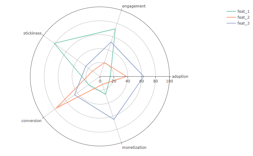
If you put all the main mechanics on a graph, you can see the strengths and weaknesses of the product, segmented by its components.
Having a quick look at the graph, you can already outline a plan for detailed feature research. For example, what can be understood from this graph using the example feat_1 (green line)?
High level engagement, i.e. The feature is easy to understand and its goal is achieved with a high probability. Together with the high value stickiness, we can conclude that those users who took advantage of the feature and achieved its micro-goal are most likely to integrate it into their daily flow of working with the application. Those. the question “did the feature reach the audience” can be safely closed;
Low performance metrics monetization at high stickiness this is not very good, because… shows that users who use the feature are not always paying and make a weak contribution to the total income. But then we see low adoptionwhich slightly corrects this hypothesis – knowing that the feature has been accepted by the audience as a whole, we can conclude that it is simply used by a small share of the audience, which may also result in a low contribution to income;
A low conversion rate speaks about the nature of the feature; it’s cool and everyone likes it, but it doesn’t motivate users to convert at all. If the design allows, you can try to work with this somehow;
But the main problem here may lie precisely in adoption. If the feature is not tailored to a narrow segment of the audience, then perhaps there are problems in the location of the entry point into the script.
In general, the feature is convenient and understandable; there is no need to completely rework its mechanics. But it's hard to find. By increasing this indicator, we can attract more payers here, increasing the final share of her income. And knowing that it is “sticky”, we can indirectly increase the classic Retention of paying users. In addition, you can think about how to increase conversion to also influence your income.
Then we create hypotheses and go testing.
For myself, I built such a system in R in Shiny, so when a new release arrives at work, I simply add the name of the feature to the script and it is added to the general list. Convenient 🙂 I won’t share the script, it’s very specific to our product. But someday I’ll definitely make it more universal for Github. Stay tuned for updates in tg, as they say.
I was told that a similar system was previously (and maybe even now) used in some Yandex products, where in the end all the metrics led to an overall weighted assessment and a rating was built according to this score. Features at the beginning of the list go into development and expansion in the first stream, and features at the end are subject to removal from the product.
Of course, this particular system does not fit perfectly on all types of products, but this is just an example of a tool that can help you with a quick overview analysis to immediately outline vectors for detailed study.
I write more about product analytics in general in Tg, join if you are interested: