Why do all ads look the same today?

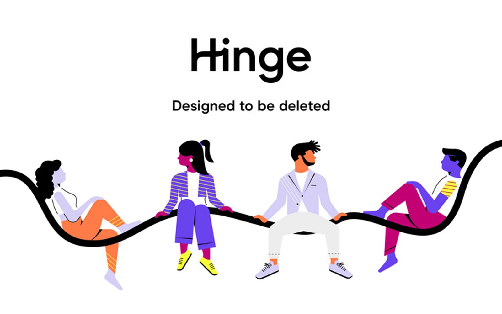
Illustration style: flat, geometric, figurative, usually composed of solid colors. Faceless figures are scattered across train stations and bus stops, from a fintech company Moneyfarm and Trainline to the delivery service “Viagra” GetEddie… Even your own branding Transport for London, which has won a special place in the history of modernist graphic design, is beginning to adopt this style.
This aesthetic is often referred to as Corporate Memphis, it has become a recognizable style of large tech companies and small startups, it is constantly imitated and more and more parodies are created. It uses simple scenes with flat cartoon figures, sometimes with a slight distortion of proportions (the most common of which are long bending arms), signaling that the company is interesting and creative. Corporate Memphis does not offend anyone and is easy to implement, and while its origins are rooted in technology company marketing and user interface design, the trend has begun to devour the visual world as a whole. He also attracted active criticism from the design world.
“To be honest, he pisses me off,” says Jack Harley, an illustrator in Leeds, who is mainly involved in creating “reckless fun at sea posters.” Harley became familiar with this style on the Facebook login page, but then he began to see such illustrations around him. “I live in the student area and there are some really nasty rental agents here. Suddenly they adopted this whole marketing style with people who have very flexible arms. “
Corporate Memphis was especially popular in the fintech and real estate sectors. For small businesses looking to stand out, this quirky styling has become an easier decision than stock graphics. But he was the culprit in the growing visual culture of the Internet. homogeneous and boring. With Corporate Memphis, “big tech companies look friendly, responsive, with a focus on people and community interactions, which is the exact opposite of their true nature,” says tech writer Claire Evans, who began collecting examples of the style in 2018. are.na…
“In terms of design, he’s pretty lazy,” says Harley. “Especially Adobe Illustrator is to blame for it.” Illustrator’s tools make it easy to manipulate crisp lines and colors, allowing you to edit them as scalable vector graphics (SVG) files. From this format, illustrations can be easily animated and distributed across all platforms.
Harley sells his posters and postcards at handicraft fairs, a few years ago he complained about the dominance of owls and foxes wearing monocles, but now the style has changed. “Over the past couple of years, I’ve noticed a lot of red circles or red cheeks,” he says. Corporate Memphis has infected the British craftsmen with its simple shapes, textureless colors and subtle distortions.
Another reason for the prevalence of Corporate Memphis has become image banks in vector graphics. Pablo Stanley is a Mexico City illustrator who has run several major databaseswhere his own flat SVGs are open source.
People from the Internet sent him modified images of him, which they saw in advertisements in many places, even in Germany and India. Although Pablo did not conduct analytics, he estimates that his images have been downloaded hundreds of thousands of times by people and technology companies around the world. Image banks such as FreePik, UnDraw, and the Adobe vector graphics library have played a big role in getting people who can’t do illustrations borrowing the Corporate Memphis style.
The rise in popularity of Corporate Memphis was partly due to changes made by Apple in 2013. Until that time, skeuomorphism was often used in computer interfaces, a style that used shadows and fillets to make buttons and icons resemble objects in the real world. The more embellished style has become less user-friendly over time, and eight years ago Apple ditched skeuomorphic design elements in favor of a “flat” user interface. Illustrators followed. “Tech firms have adapted their UI systems for flat design, and designers have followed,” Stanley says.
While the Claire Evans collection helped popularize the term Corporate Memphis, she says it was coined by Mike Merrill, who began to experience the déjà vu effect of flat and colorful designs while working in the advertising industry. Brands such as Slack, Salesforce, Robin Hood, and WeTransfer, as well as many of their competitors, use this style. The name of the style was a reference to the 80s Italian design and architecture group Memphis, which positioned themselves as ostentatious and childish rebels against functionalist styles. “I think this is a forced step. This is a desperate attempt to appear human, ”says Merrill.
Merrill identified two types of companies using this style. Smaller companies borrow it to mimic high-profile tech companies, and those at the IPO level use it because it’s “lazy and safe.”
However, according to Merrill, Corporate Memphis is a problem not only because of its ubiquity. Influential designer David Rudnik says Corporate Memphis is especially cunning in that it creates a misleading picture of the world. “It displays a world built of complementary components, in which all problems have already been resolved. This is a deliberate oversimplification. “
According to Rudnik, Corporate Memphis usually puts the viewer on the same plane as the objects with the figures in the illustrations, which makes it easier to decipher such distortions as the flexible arms of the characters – the visual puzzle is solved for the viewer. The limited color palette and lack of depth create an extremely simplistic view of the world.
One variation of Corporate Memphis uses a visual technique called isometric projection, which gives the viewer a perspective slightly above the ground to create environments such as a street or row of houses.
“The isometric perspective is interesting because nothing goes to the convergence point. This means that it also eliminates the time variable, ”says Rudnik. He argues that this kind of design is especially popular among fintech companies and mortgage banks – reducing the importance of the passage of time is especially beneficial for firms selling financial products that you may have to pay for for years.

“When you see CEOs of tech companies talking privately or with each other, their worldview is strikingly opposed to the world depicted in the Corporate Memphis illustrations. They boast that they live in a world of complex ideas, constant battles between competitors, cryptographic threats, constant social changes that they seek to track and control. From their point of view, the world is extremely aggressive and rapidly changing. “
Corporate Memphis allows these companies to offer the illusion of a world without hierarchies, where users have the same level of access and privileges as those who operate the platforms. The mine notices a characteristic feature: the style creates the image of a mischievous world that values creativity, but the illustrations made in it are rarely signed by the authors who created them.
Even so, we probably shouldn’t regret the widespread presence of Corporate Memphis or the designs we lost because of it. Ultimately, this style is simply a reflection of the world created by large tech corporations, in which, on the one hand, there are users, on the other, the management of the companies.
Creating a more interesting and visually rich digital space requires more than a new style of illustration; it requires a change in the way the technology economy is managed. Until these changes, Corporate Memphis is likely to stay with us.
Advertising
VDS for projects and tasks of any scale – this is about our epic servers! The latest technology and equipment, quality service. Hurry up to order!
Join the our Telegram chat…


