Think like a front-end developer

I asked on Twitter what else should I write about in CSS? One of the suggestions that caught my attention is about thinking when implementing a CSS layout. It involves thinking about possible solutions and lots of questions to get the design right. Here, I’ll show you my approach to thinking about a new layout and how you can apply the same steps to your work. You are ready? Let’s dive in.
Details to the side
The first thing I usually do is put off the design details for later. This means that I highlight the main parts of a particular layout and start thinking about them first. I know the details are important, but this is temporary so we can focus on the high level details first. Consider the following user interface:

In this construction we have the following:
- Title / Navigation.
- Main section.
- How it works.
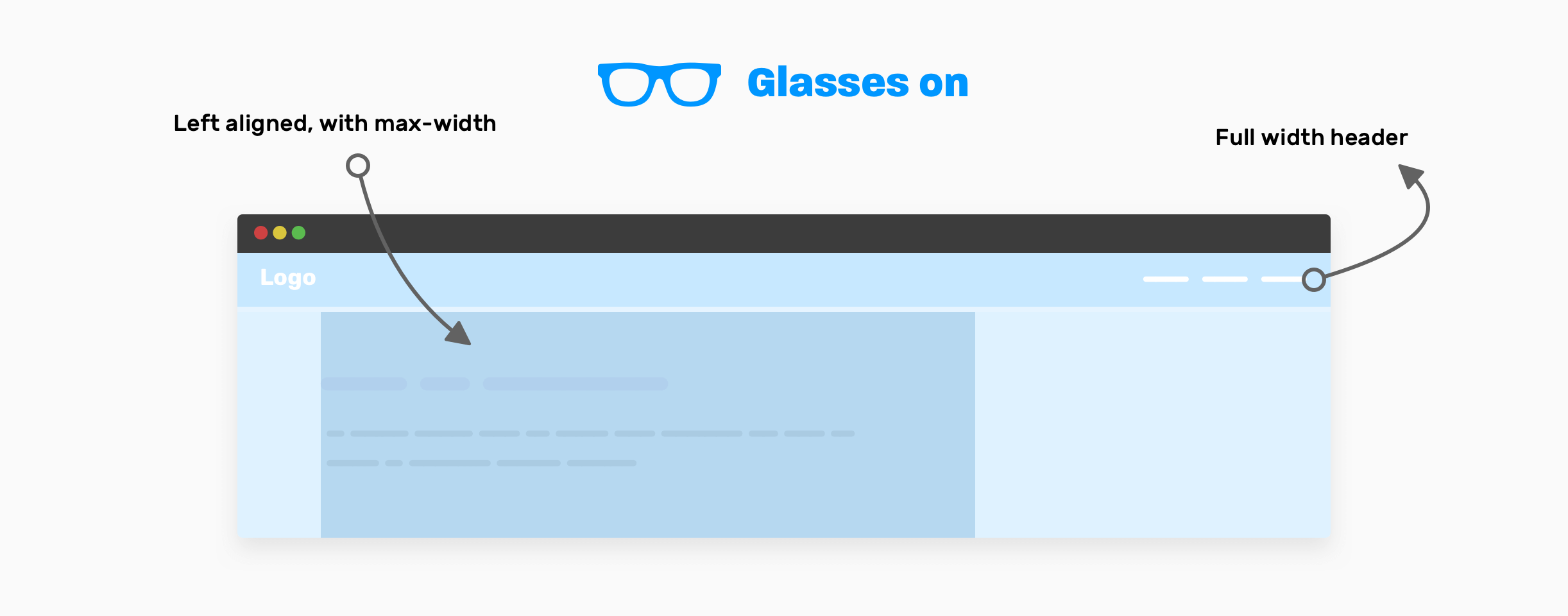
It can be tempting to start thinking about small details first, not at a high level of abstraction. If I were asked to visually simplify the approach, I would say that the front-end developer should wear glasses so that only high-level layout elements can be seen, like this:
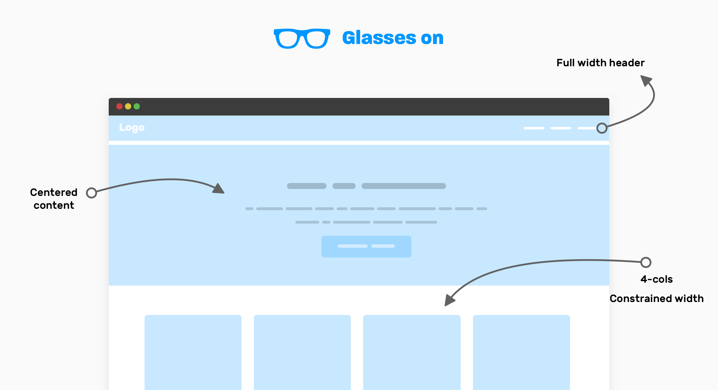
Note that you can only see important high-level UI components in the glasses. This approach will help you think about how to arrange the components, instead of thinking about the small pieces of each component. This is how I think:
- Full-width header: It looks like the header spans the full width of the viewport and its content inside the wrapper is unlimited.
- The hero element’s content is horizontally centered, and note that it needs to be set to max-width (the paragraph has two lines).
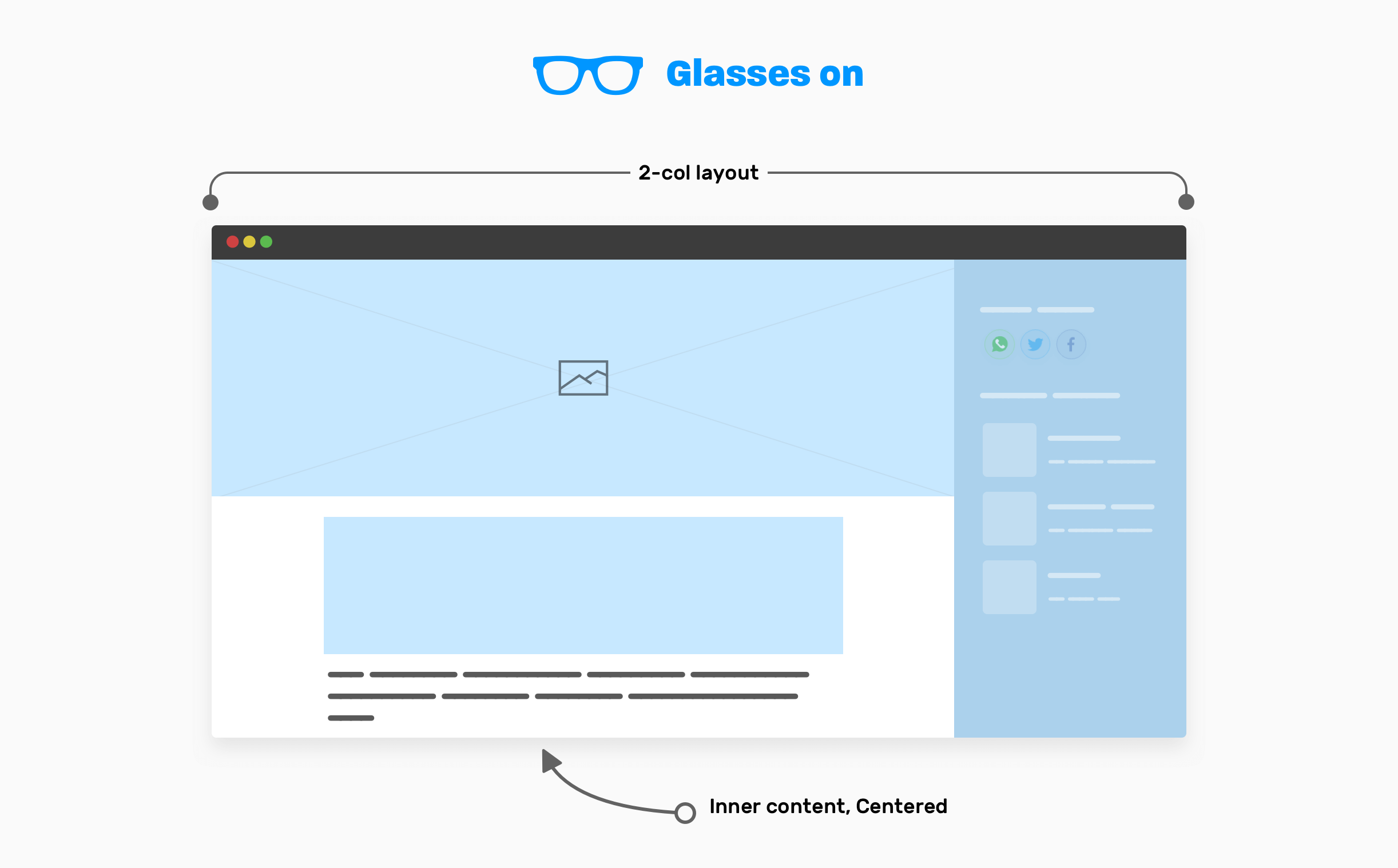
- How it works: This is a 4 column layout, the section as a whole is wrapped around.
Now, when I want to work on the code, I do a quick prototype just to see the progress quickly.
<header></header>

<section class="hero">
  <!-- A div to constraint the content -->
  <div class="hero__content"></div>
</section>

<div class="wrapper">
  <!-- 4-columns layout -->
  <section class="grid-4"></section>
</div>
Since we have a 4-column section, I will use a CSS grid for it. This is the perfect application for her.
.wrapper {
  margin-left: auto;
  margin-right: auto;
  padding-left: 1rem;
  padding-right: 1rem;
  max-width: 1140px;
}

.hero__content {
  max-width: 700px;
  margin-left: auto;
  margin-right: auto;
}

.grid-4 {
  display: grid;
  grid-template-columns: repeat(4, 1fr);
}
It was an example of quick thinking with glasses. Until now, I haven’t even thought about responsive design. I have some questions about the details of some of the components, but I won’t go deep into them now. Read about it in the “dive into details” section at the end of the article. Now that you get the idea, I’ll give you a few more examples of high-level thinking so you can better understand it.
Article page
In this example, we have an article page layout. Here is the user interface that contains:
- Title.
- Page title.
- Image preview for the article.
- The content of the article.
- Side panel (right).
Now that you have an idea of what the design looks like, let’s put on glasses so we can only see the high-level elements.

Here they are:
- Site header that spans the full width of the page.
- Page title containing the title of the article and its description, the content is left aligned using max-width.
- Two column layout containing main (main) and sidebar elements.
- The inner content of an article that is horizontally centered and has max-width…
Article page title
There is no need to apply any layout method here. Plain max-width will do its job. Be sure to add horizontal padding to prevent the edges of the element from sticking to edges in small viewports.
.page-header {
  max-width: 50rem;
  padding: 2rem 1rem;
}
Article – base and sidebar
The main element (main) of the article occupies the entire width of the viewport minus the width of the sidebar. Typically, the sidebar should have a fixed width. A CSS grid is ideal for this.
.page-wrapper {
  display: grid;
  grid-template-columns: 1fr;
}

@media (min-width: 800px) {
  grid-template-columns: 1fr 250px;
}
The inner content of the article should be limited within the wrapper.
.inner-content {
  max-width: 50rem;
  margin-left: auto;
  margin-right: auto;
  padding-left: 1rem;
  padding-right: 1rem;
}
Now that you’ve got an idea of the high-level decisions to make when creating your layout, the next step is to think about working with each section in terms of design.
Diving into details
How it works
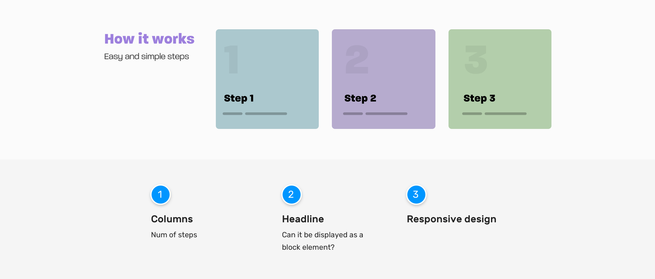
In the first sample article, I said that we will dive into details later. This moment has come.
Loudspeakers
- Do we have cases where the number of steps can be less or more? If so, how to work in such a situation?
- Do the columns need to be equal in height, especially when the card has very long text?
Title
- Do we need to keep the header section aside? Or are there times when it should take up the entire width?
Adaptive design
- In what situation do you need to fold to resize the children of a section? Do we have some sort of folding trigger? If so, what is this trigger?
Here are some possible situations with this section. What do you think? As a front-end developer, you must consider these edge cases. It’s not just about creating a user interface without taking into account such hidden details.
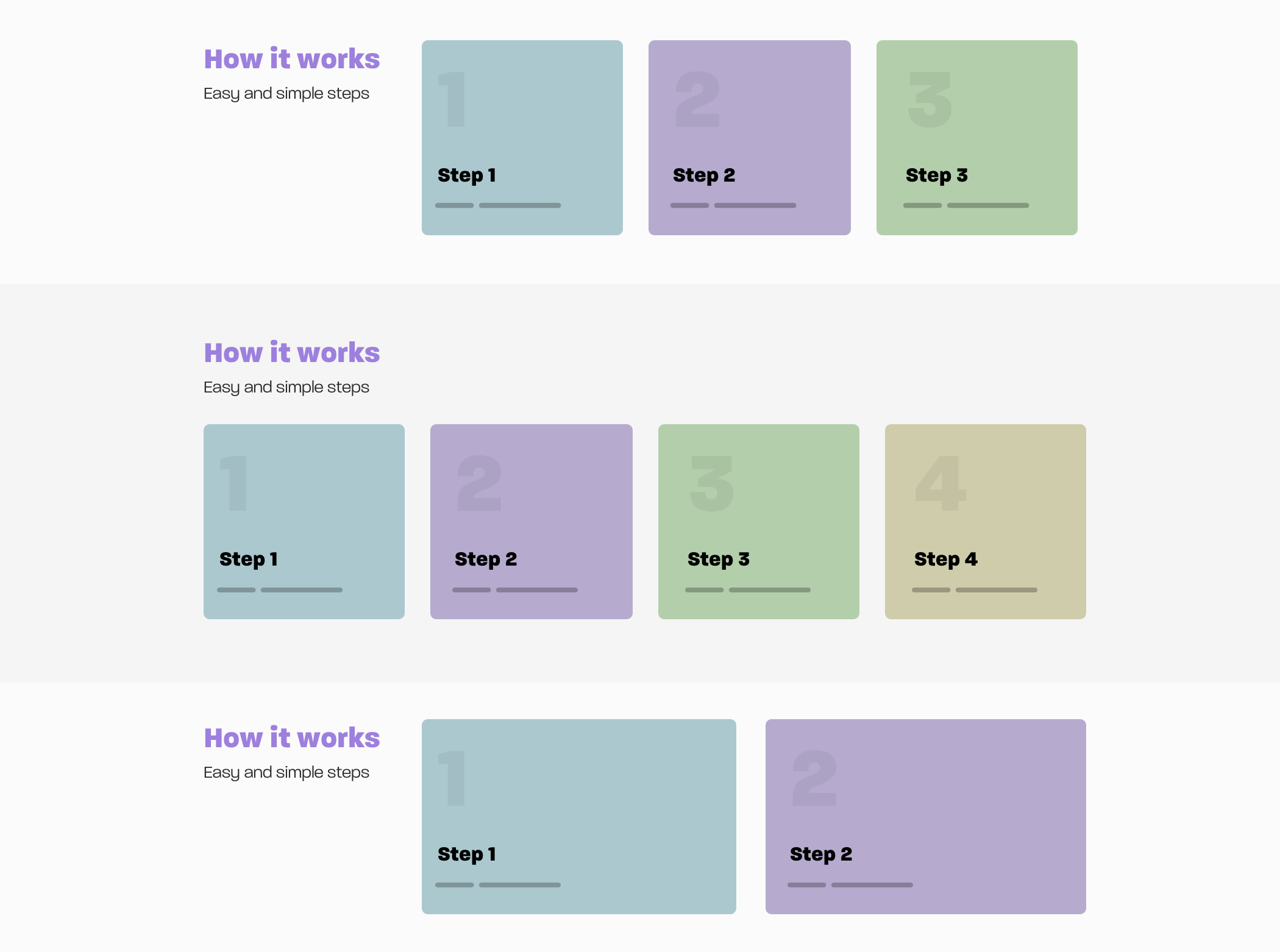
I will not go into details of what the code for each variation should be, since the article focuses on thought process, but I’m eager to show you something like that. Note that in the first and third versions of the previous layout, we have three steps, not two. Can we make the CSS dynamic so that it handles the situation for us? I mean increasing the number of steps from two to three.
<div class="wrapper">
  <section class="steps">
    <div>
      <h2>How it works</h2>
      <p>Easy and simple steps</p>
    </div>
    <div class="layout">
      <div class="layout__item">
        <article class="card"></article>
      </div>
      <div class="layout__item">
        <article class="card"></article>
      </div>
      <div class="layout__item">
        <article class="card"></article>
      </div>
    </div>
  </section>v
</div>
.steps {
  display: grid;
  grid-template-columns: 1fr;
  grid-gap: 1rem;
}

@media (min-width: 700px) {
  .steps {
    grid-template-columns: 250px 1fr;
  }
}

.layout {
  display: grid;
  grid-template-columns: 1fr;
  grid-gap: 1rem;
}

@media (min-width: 200px) {
  .layout {
    grid-template-columns: repeat(auto-fit, minmax(200px, 1fr));
  }
}
I have used a CSS grid with minmax() and the keyword auto-fit… This is useful when the number of cards can be increased or decreased. Watch the video below:

Hero section
The first thing I do when I want to build a new section or component is ask myself a lot of questions. Here’s what I’ll think about when creating the hero section.

Section image
- How should the image be presented? Does this image change every day, or should it be updated with the CMS?
- Should we use HTML or background in CSS?
- What is the expected aspect ratio of the image?
- Do I need to use multiple image sizes depending on the viewport size?
- Maybe we don’t have an image, but a video? I have had situations when, after working on an image, clients said that instead of an image, a video was needed.
Section height
- What is the minimum section height?
Content length
- Do I need to set a maximum length for the title and description? If so, what are the minimum and maximum that the design should work with?
Distance between elements
- How to handle vertical distance?
Centering content
- How to center content horizontally and vertically? Considering that only the width is known, but not the height.
Content limitation
- For the sake of increasing readability, it is better to limit content. What is the ideal constraint width?
Adaptive design
- Do I need to change the font size depending on the width of the viewport? If so, is it better to use pixels, viewport units, or the CSS clamp () function?
Depending on the nature of the project you are working on, you should find answers to these questions. This will help determine how the hero component should be built. It can sometimes be difficult to get an answer to each of these questions, but the more questions you ask, the more likely you are to get a good result without mistakes.
In our component, I will deal with the spacing between the children. For this task, I like to use the flow-space property. I learned about it from Andy Bell’s Piccalil blog. Our goal is to provide the distance between directly related elements:

<section class="hero">
  <!-- A div to constraint the content -->
  <div class="hero__content flow">
    <h2>Food is amazing</h2>
    <p>Learn how to cook amazing meals with easy and simple to follow steps</p>
    <a href="/learn">Learn now</a>
  </div>
</section>
.flow > * + * {
margin-top: var(--flow-space, 1em);
}And the last
As you’ve seen, the process of implementing a component is not only about making it an exact fit for design, but also about asking yourself and thinking about edge cases. I hope you learned something from this article. And don’t forget about the promo code HABRadding 10% to the banner discount.

- Data Science profession training
- Data Analyst training
- Machine Learning Course
- Advanced Course “Machine Learning Pro + Deep Learning”
- Course “Mathematics and Machine Learning for Data Science”
- Profession Ethical hacker
- Unity Game Developer
- JavaScript course
- Java developer profession
- C ++ developer
- Data Analytics Course
- DevOps course
- The profession of iOS developer from scratch
- Profession Android developer from scratch
Recommended articles
- How Much Data Scientist Earns: An Overview of Salaries and Jobs in 2020
- How Much Data Analyst Earns: An Overview of Salaries and Jobs in 2020
- How to Become a Data Scientist Without Online Courses
- 450 free courses from the Ivy League
- How to learn Machine Learning 5 days a week for 9 months in a row
- Machine Learning and Computer Vision in the Mining Industry
- Machine Learning and Computer Vision at beneficiation plants