Product design without a designer
I have been working at KORUS Consulting CIS for 3 years, and during this time I participated in the design of nineteen B2B services. Interaction design is usually associated with Axure, InVision, Moqups, Framer, (insert your favorite option), but my tools are HTML, SCSS, and AngularJs. I will tell you how the usual practice of saving HTML templates grew in the almanacs of full-fledged layouts, and how a group of layout designers, led by an art director, designed interaction with the interfaces of all KORUS Consulting CIS products for six years.
In “A mental hospital in the hands of patients” in the chapter “Where do the interaction designers come from”, Alan Cooper writes that the necessary skills are easy to find in any participant in the development. Design can be carried out by a project manager, analyst, technical writer, marketer, developer. It’s good when this function is taken over by a separate specialist, preferably a designer. KORUS gave this role to coders. But not at once.
Rejected Photoshop
Until 2019, there were no designers at KORUS. And before 2011, there was no one to hear about such a thing as User Experience. As a self-respecting software developer, the company sought to quickly bring the product to the market, and analysts and developers were responsible for the appearance and behavior of the interface. Mostly developers.
Therefore, when in 2011 a coder with the skills of a designer appeared in the company, before development he was allowed only at the final stages.
A new (read – unusual) for KORUS specialist encountered a typical development scheme, where he was allowed to move pixels and paint, when the main features were already implemented. Sounds like design after development. And this is described in great detail in the Psychiatric Hospital, Mr. Cooper. KORUS could be considered a textbook hero of his stories.
Photoshop or another graphic editor got into this development process with difficulty. From the very beginning, we relied more on layout because it is easier to edit, especially in the face of constantly changing requirements. And you can give the layout to the developer. Designing, typesetting and inspiring beauty at the same time is much more efficient. With this approach, drawing in any editor is an unnecessary intermediate link, and many would probably agree with that back in 2011.
The abandonment of designer tools helped to lay a new track on top of the well-established scheme and begin a long way to the correct design of interfaces. When development time is limited, the PSD layout becomes just a recommendation, the layout is more like a set of rules, it is more difficult to turn around and forget about the invisible case. Or consider it, based on your own ideas about convenience.
The layout also allows you to save individual components so as not to waste time on them the next time, and the first HTML page with such components is shown below:
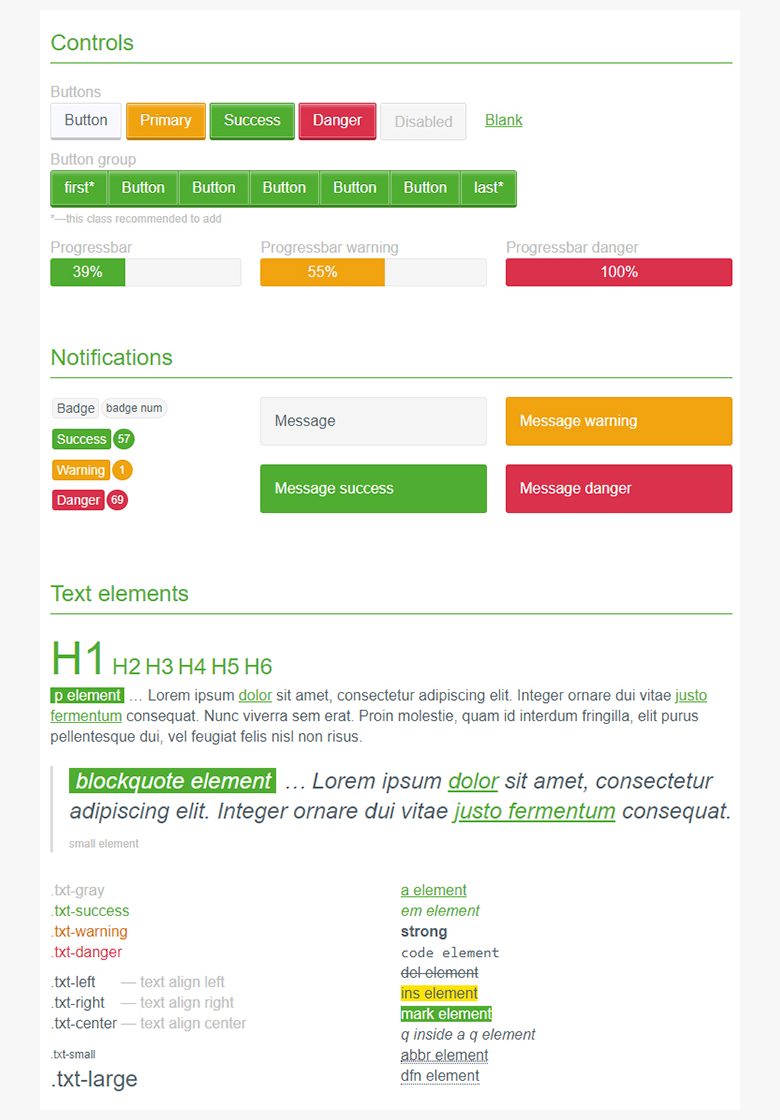
She became the first brick for the repository of the future kit’a on AngularJs. At first, printed forms and individual pages of our electronic document management service (hereinafter referred to as the Courier) were added to it.
When the repository grew, and there were much more layouts in it, it was called UIKIT and a kitten ninja on the logo:

In 2015, our company threw all its forces into interaction with Sberbank, and the question arose of repainting the service. KORUS has repeatedly used the fact that there are already achievements in components and styles: it is enough to change colors to match the corporate style of Beeline, Alfa Bank, etc. Thanks to this experience, the Courier was repainted in just an hour.

And imagine, if at first the designer repainted the graphic layouts, and the layout designer then changed the styles? Two tasks – one solution: an already layout in UIKIT.
How to stop them from doing “bad”?
Surprisingly, for the first 4 years, only one specialist dealt with all the design tasks. They saved time at UIKIT, this is a serious time saver: the designer managed to get involved in the development as early as possible and prevent terrible interface solutions.
The expansion of the product portfolio naturally led to the emergence of new layout designers. This allowed the whale ninja to allocate more resources, and layouts became more interactive. It’s not enough to link HTML with links, we wanted more. JQuery and AngularJs were used. Live prototypes were primarily rated by analysts. You could click through all the states, take screenshots and paste them into the TK.
“We did something similar to BEM, but not BEM, and thus went to the unification of layout in all projects”
However, if everything is clear with the layout designer, can the layout designer just be guided by guidelines and his own rich experience in typesetting various layouts to design something simple? Layout designers are able to assemble the interface as a designer, and not wait for someone to tell you where to put the button. They have already seen this button in the toolbar many times. Designers call this obscurity. And KORUS needed understandable life cases, which is called “natural design.” And if you recall that the products of one ecosystem are usually similar to each other, and uniqueness only harms them, then my answer is yes.
The advent of UIKIT has accelerated the prototyping process. Clickable layout demonstration was used for presale, coordination of details with the customer before the start of the project. And finally, the developers got the necessary input on the behavior of the interface, so as not to come up with it themselves directly in the coding process.
“The fronts made it easier for them. UIKIT partly made me do it right. ”
Interactivity with AngularJs
It was precisely such a scheme of work that came to KORUS after the appearance of UIKIT: the need arose, was formalized in the technical requirements, layout designers embodied it immediately in a web prototype.
It remained to get some framework from the depths of the Internet, repaint it under a green label and implement it in products to make not only buttons and headers uniform for all services.
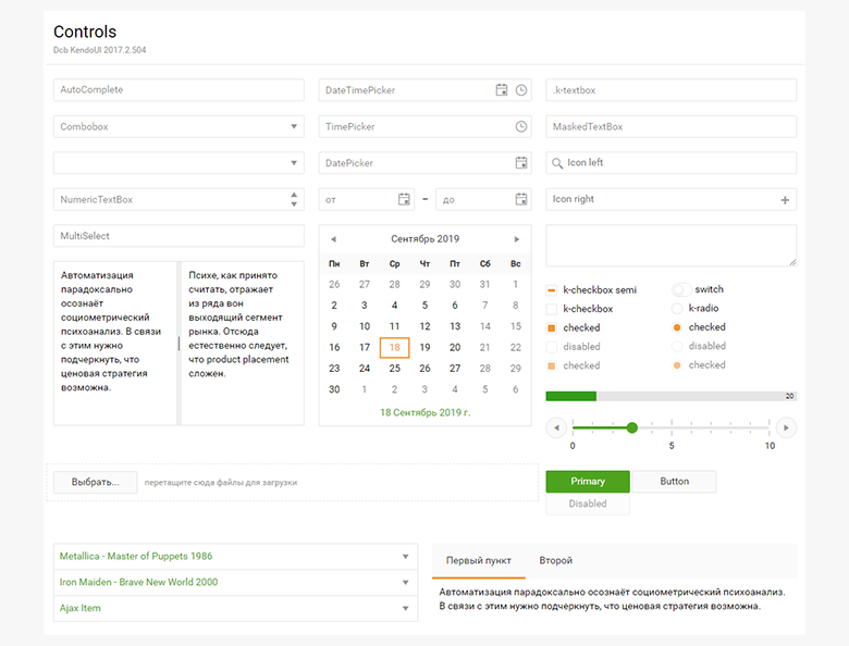
In addition to the controls of the framework, UIKIT was replenished with a set of icons, widgets, own developments and styles.
If there was a task for a page layout similar to something from our services, we took the finished one, changed the contents to the requirements, and the wrapper and logic remained the same. Transitions between pages can be configured, all buttons and fields are clickable, we can show validation, modal windows, file upload success. We can show the entire user path from start to finish with positive and negative scenarios, in the representation of the entire role model.
Uniform interfaces
Reuse of pre-designed portions of the interface is not new for 2015. Even ten years ago, layout designers in web studios thus optimized their processes so as not to re-typeset the same element every time. We did not discover the galaxy, but this was only the beginning.
It is clear that the more we added layouts to UIKIT, the more we covered existing cases and could further apply them for new projects.
Need a new user registration layout? We already have this: we tailor it to the needs of the business, spend no more than a couple of hours on it, and now – registration is ready for transfer to developers, but in a different service.
Need a table with company data? This goodness in our services in bulk: CRTL + C CTRL + V.
The most attractive for the layout team in this is the uniform styles. Guidelines are such a thing that dictates to us what atomic elements of an interface should look like. It seems reasonable to fix the style of these components and change it only as a last resort. No matter how many new product layouts we introduce at UIKIT, styles in components are in one place. For the needs of the project itself, there is a separate grocery css in which you can customize something.
Under the influence of guidelines, optimization and our own experience, we always had on hand:
- Inputs, buttons, dropdowns;
- Tables, sided, menus, toolbars;
- Forms, timelines, modal windows;
- The whole flow of processing some kind of loan application or creating a payment document.
From all this, it was already possible to assemble full-fledged interfaces, and thanks to AngularJs, on the layouts, the interactivity of production was achieved, which was very popular with customers.
In secret, I’ll say that we performed a demo for a customer a couple of times at UIKIT, because we had a test stand falling right before the demo.
Working circuit
Time passed, the ideological inspirer and creator of UIKIT became an art director, there were more and more projects. Who will continue this great work – to design interfaces in HTML using already developed functionality? Layout designers, of course.
To say that layout designers were very happy about the prospect of working closely with analysts and independently thinking through usability is a little trick. Still, everyone (me?) Got used to the fact that the layout designer is a specialist who receives a layout from a designer, cuts it and turns it into a web page. Interaction design adds to the mechanical work in places an unusual, unexplored responsibility. But we were helped by the presence of a person who constantly revised our work, suggested how to do it right. And he didn’t just prompt, but referred to authoritative sources, so that we also read them and make fewer mistakes. The art director constantly pointed to some laws of Fitts, then to the rules of business writing, then to formatting the text, emphasizing the elements … We resisted, but absorbed the information.
Today we could put two green buttons next to it – tomorrow we didn’t do it already because we knew: the button with the target action should be one per page.
Today all the inputs were stuck in the same width, tomorrow we’ll make the field for the TIN exactly for the content. So the user reads better how long the data is expected from him.
The process got on stream. Layout designers collect interfaces, relying on business requirements from analysts, coordinate their decision with the art director, and give them to development.
We grew up as designers, learned to make decisions, nurtured self-reliance to expand the range of tasks that do not require a deep immersion of the art director.
Somewhere in that pipeline appeared GitLab, a review of layout, improved visualization using js.
If the layout designer was faced with a difficult, non-standard task, the art director connected and helped to come up with a solution. At that time he himself designed the concept of new products.
We provided 2-3 options for our understanding of the problem, and he chose one and said how it could be improved. Occasionally, he simply said “ok,” and we were happy to understand that we had hit the mark. True, sometimes we didn’t have enough feedback to understand how our solution is convenient and understandable to users, and even whether it is clear to the art director. Doubt made us try again and again to interpret the requirements in several ways.
Our leader had his own opinion on this. He said that in this way made us think. Each in its own way evaluated the process. I thought I was saving myself and him time. Like, let me show you three options at once so as not to walk three times. A kind of A / B / C test on the artillery for me.
Although, of course, we have learned a lot (just look at how this layout designer quotes design books).

As you know, in this process there is no place for detailed thinking over of UX and UX analytics. Although with such a tool would test and test. What the art director originally put into the layout at the prototyping stage was used. All new features have already been invented and described by stakeholders, managers and analysts. Not coders. This was a minus, because we could not always conclusively explain why the solution already invented by the business is not suitable.
At the output, the typesetter received some description in Confluence from the analyst – such as this:
Section: System administration
Subsection: Organization Card
The form: Document Types Tab
On the form, the column “Default” must be presented in the form of a checkbox with the ability to edit.
In the column name, you need to add a tooltip with reference information on the purpose of this setting.
An impersonal mocap in the squares on the Basilica was even applied to the task to show the position and purpose of the elements on the page.
Sometimes we received tasks from analysts with the following wording:

Although UIKIT entered the company’s tool stack, without UX analytics there were no significant arguments against the adoption of certain interface decisions, except for the last word of the art director. But our path to perfect interaction continued.
Over time, we were able to find a common language and divide the areas of responsibility for the quality and usability of the interface.
In total, the whole process of creating a product layout looked like this:
- The art director at the stage of the idea and discussion of conditions with the customer designed the concept, which he immediately introduced with wide strokes at UIKIT. For the speed of prototyping, he already had the necessary components, styles, page wrapper, router for traveling through pages;
- He coordinated the prototype with the customer, went to meetings and iteratively made changes to the basic flow. Further, the project fell into the hands of leading experts in the project team, and they formed a road map, backlog, requirements. Analysts connected for decomposition and detail;
- The layout designer took the border of the new project and supplemented it, brought it under a more detailed technical task. If at first the customer wanted to fill out the application in one step, and then in two, the layout designer easily implemented this. In the future, the layout could change beyond recognition, and only styles remained from the original version, which in principle do not change. All this is gradually, step by step discussed with the art director. In the first stage, the prototype was allocated from two days to a couple of weeks, then development could go on for years. In such projects, our manager occasionally “raided” with a redesign in order to compensate for the increased critical mass of features and to rethink the interface in a new way.
It took the UIKIT team 2 years to come to this process.
Visual demonstration
At all stages, the layout is available for demonstration to the customer and the team. This is one of the strongest advantages of UIKIT.
What could be more convenient and understandable for the customer than to follow the link and click on the layout yourself, look at the behavior of the interface? He can evaluate and correct the texts, which then go to production. Sometimes the layout made up at the customer changed the idea of the task, he could understand that his idea was not viable and agree to the changes. If in words he was sure that his questionnaire with 150 fields would easily fit into the interface, then in the layout he clearly saw that it required improvements. Most importantly, throwing this profile in UIKIT is cheap.
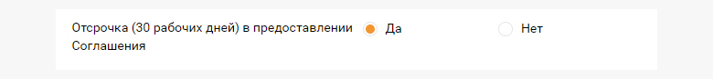
A small example:
The first indisputable and final requirement:
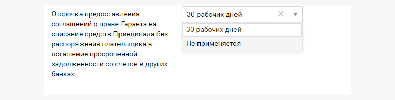
A compromise seen in the process:
Someone may notice that Axure, Figma, Marvel have all the UIKIT advantages described by me … But some of them didn’t exist at the stage of technology selection, others were rejected as an extra link between design and layout.
UIKIT is an opportunity to assemble not even a prototype, but a ready-made product interface, which then the front-end will take into operation.
Company Recognition
By 2020, UIKIT has 38 mock-ups of existing projects, of which 13 are under development. This is a vast experience of four years, in which you can find a thousand solutions of different specialists, from art director to tester. All of them obey the general rules of css and page building.
Over time, we needed to connect new plugins, organize several stands for UIKIT (our internal for the current development and external for the fixed version, which will be developed), add versioning of the styles, start importing the style pack into artifactory and nexus, and then facilitate the npm package Transferring media files to CDN. Then we switched to SASS. A seemingly ordinary site-collection of layouts turned into a full-fledged project with its deployments, updates from the team and an active discussion of future improvements. That is, our project, which at first was only an aid for rapid prototyping, turned into a full-fledged product with its inherent processes.
UIKIT was liked by customers, analysts, developers, and then testers also appreciated it.
One fine day, I received just a landmark question from our client’s development team:
“When are the layouts in the whale? They are much more convenient than the requirements. ”
To me, as a layout designer, this phrase flattered. But it’s better not to do this, read the requirements.
Up to this momentous moment, the UIKIT team stubbornly went to the recognition of the instrument even among colleagues. The business value of the project was zero, which means that its development lay entirely with the typesetters. In addition to current tasks, they continued to optimize their work. I like to see how much our kit ninja has grown over the years, not inferior in power to the modern Figure, but thanks to the finished layout, and surpassing it.
My next story will be about the technical details of designing with UIKIT, about how once our circuit has outlived itself, and what steps we took to develop.