Problems of interaction with external teams on large projects
This is the second part of a series of articles in which I talk about the problems encountered in developing an application for a large bank. In the last article, we talked about the choice of architecture, and today we will touch on the topic of interaction with other teams. In the beginning I will talk about the problems of interacting with the backend team, and then we will switch to the design team.

Backend interaction issues
Let’s start with the backend: I think most front-end developers have encountered a problem backend. This is not always the problem of the backend developers, often between the front and the back there is a manager, analyst, designer and, of course, the customer himself. In this case, the work resembles a game in a broken phone.
During development, we encountered several problems:
- Lack of full API documentation.
- The API is designed by the business backend development team.
- The difference in the perception of business requirements by front and back developers.
- It is necessary to code, but there is no API.
- Slow test environment.
Need to code, but no API
Often, backend developers do not see the application that the mobile development team is developing. This is common in outsource projects if the teams are distributed and interact with each other insofar as.
When we encountered these problems, we had to solve them in a radical way, taking all the API design into our own hands. For this, before the start of development, the leaders took the time to design the specifications, subject to the availability of design and technical specifications. However, this did not solve the main problem: “We need to code, but there is no ready-made API yet.”
To solve this problem, we developed a Mock server. It allows you not to block the development of a mobile application in an environment where the API is not yet ready. Sasha wrote more about the mocha server in the article Developing a mobile application without a server, so I won’t stop in detail. I only note that this solution almost completely covered further integration problems and accelerated development.
Slow test environment
As a result, we need to test and integrate our application with a real backend. For test purposes, we have 4 environments, each of which has its own test data and users. Given the various types and configurations of users, the number of test accounts is large, and it’s easy to get confused.
Hence the need to simplify the authorization process for everyone who works on the project using these accounts.

In the debug version of the application, we made it possible “on a hot” basis to choose our preferred server for testing. This simple step reduced the number of builds so that testers could fully test the application. Previously, at least two assemblies: production and development – occupied a place on CI.
With this simple screen, anyone can log in to the application, no need to waste time searching for test data. An additional plus is that all test data is protected in the debug version of the application, now there is no need to search for data for user registration, just select the one you need and click on “pre-sign up”. In this case, the application will re-register the user and set him the default password.

It would seem that a fairly simple solution lay on the surface for a year, but we did not come to it right away. It is impossible to estimate the amount of time that developers spent to log in each time, look for a working server and rebuild assemblies with different stands. Now in the studio they often resort to this approach on large projects, I can highlight only the pros:
- The need to enter test data and remember them has gone.
- The number of builds on CI has decreased.
- There is no need to reassemble the project in order to test it immediately on production and development stands.
- The threshold for entering the project has decreased.
Design Interaction Issues
As in any large project, with the increase in the number of different screens and elements, we encountered some design problems, and here are some of them:
- Poor elaboration of screen states.
- Lack of reusable elements.
- Ill-conceived navigation.
Each of the above problems influenced both the development time and the writing of TOR, design and decomposition of tasks.
State handling and reusable elements
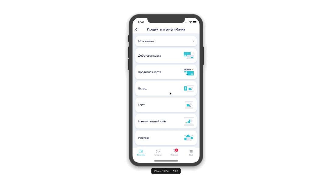
Any application screen that interacts with the network or in any way allows the user to interact with elements on the screen involves a whole set of states. Consider the normal screen of our application.

A simple list of debit cards available for processing, what could have gone wrong? However, there is a network request on this screen, so the screen must have some transitional states. If you select all of them, you get the following list:
- Download data. The user at the moment must understand that the interaction with the network is ongoing and he needs to wait for the successful download to complete before continuing with the interaction.
- Successful data loading. An ideal scenario when an Internet connection allowed us to receive data, and we were able to display them.
- Loading error. In case something went wrong, we are obliged to inform the user that he cannot use this function of the application due to our fault or due to the lack of an Internet connection. In this case, the screen should not be blank.
- Lack of data. There is also a case when we received a successful response from the server, but there is no data.
In real life, the interaction with this screen looks something like this: on a gif you can see only two states, data loading and display.
We can conclude: almost every screen in a design should have several states at once. Unfortunately, from the technical task it is not always obvious, especially to non-technical specialists, where and when the request should be present – this leads to design gaps. When a technical specialist already begins to design the task, he has a lag in time until the designers draw this or that state.
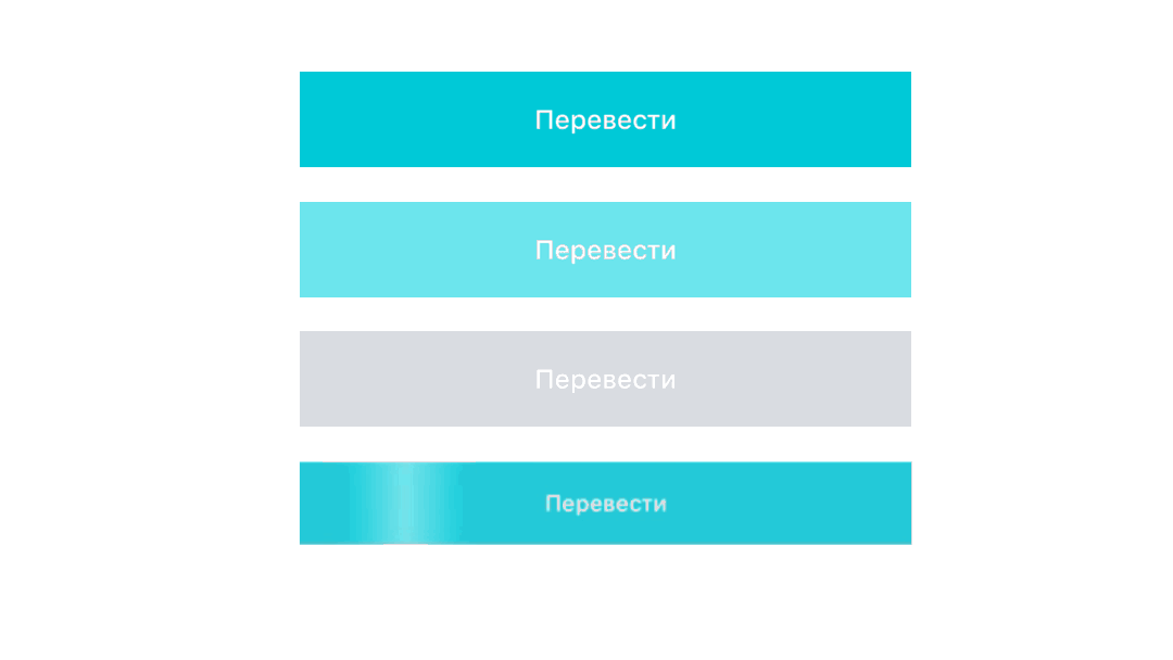
Any interactive elements that are present on the screen, for example, simple buttons, have the same problem. Any developer strives to implement the most responsive design. Therefore, any button must have at least several states:
- The button is active and is at rest.
- Pressing the button should be different from the standard state. Otherwise, the user may not understand that he pressed the button correctly, which will lead to repeated clicking on the button and concern.
- The state when the button is inactive and the user cannot interact with it.
- In the case of our application, the button also has loading states when the user initiates a request by clicking on the button.
Of course, when rendering a design it’s immediately difficult to take into account all the points that may occur during development. Therefore, after many months of suffering, communication with the design department, we came to the conclusion that it is necessary to create a common set of elements and application states.
Thus, a set of reusable elements in design was born. It looks like this:

Now there is no need to draw every element on every screen. We try to keep a set of reusable elements in one place. The same goes for screen states. All screen states are rendered in one place and reused throughout the application.

A large number of input fields overtook the same fate, which, believe me, are enough in the banking application. This approach saved the nerves of many developers. Now you can’t change the input field element on only one screen by changing a couple of indents, now these changes affect the entire application, and designers are much more attentive to random changes in reused elements.
Ill-conceived navigation
The next design problem, including technical specifications, is navigation. When you develop a huge feature, you do not always think: “But how will it work live? How will screens be opened, which screen follows screen N? ”
If you think I’m exaggerating, let’s look at an example of one not the biggest feature that we recently released.
This is an opportunity to pay fines and taxes directly in the application. Nothing new, all other banks are able to do this, however, as users, we rarely think about what is behind a seemingly simple action. Below is a screenshot from Figma, which clearly demonstrates the scale of the feature. I repeat, this is not our biggest feature.

To understand all this large number of screens, an ordinary developer takes a lot of time. A simple solution in this situation is the implementation of User-Flow diagrams from ready-made screens in the design. It looks like this:

Of course, this is a simplified User-Flow feature chart in order to show how it works in action. It would seem a simple solution, but how much time we saved. Instead of reading through the decomposition of tasks or the technical task for the current feature, any developer, tester or manager can now take a look at this diagram and understand how to get on one screen or another. Also, this User-Flow fits well with the previously described architecture with coordinators. The article is here.
conclusions
In this article, I shared the problems of interacting with the backend and design.
Thanks to a small set of rules and approaches, we improved the application development process, made friends of designers and developers in difficult issues, which often blocked development, made us distracted and wasted time. Thanks to this, now in our studio:
- Each project has a single UIKit of reusable elements.
- Elements are less likely to change on separate screens, the design retains consistency. Developers and designers work on the state of the screens together.
- Navigation in complex, large and confusing features has become clearer and more understandable, User-Flow diagrams are used much more often.
In the next article I will talk about the problems of tools in large projects and their solutions. Stay tuned!