People without faces in Kaspersky Lab products
 About a year ago, Kaspersky Lab undertook a rebranding. The main goal is “to stop talking to customers about threats and viruses and instead focus on a positive image of modern technology and a secure future”. The new brand book prescribed to depict people with unrefined facial features – for example, like this:
The branding team and UX specialists wanted to make sure that users perceive this kind of image of people positively, and decided to conduct research on this topic. Look for its main conclusions at the end of the post, and if you are interested in the details, then welcome under cat.
There is nothing unusual in such images – people without faces (and in a neutral context, and not in a film about Slenderman) can be found quite often:

This decision has at least one big plus for mass and international products: ethnic and age differences are erased, which means that more people around the world will be able to say: “These are products for people like me.”
At the same time, we feared that people without faces would seem unfriendly and even intimidating. And it is not unreasonable: at about the same time with us, Konstantin Efimov began to study the problem (see “People without faces: the image of Slenderman in modern advertising“), And his research confirmed that” pictures without faces are assessed as closed, unattractive, alien, distant. “
But the face option is also not without its drawbacks. There was a feeling that he could give the impression of childishness, cartoonishness and frivolity.
So, we had to test three hypotheses:
- Faceless images are more racially neutral. More people will think, “These are products for people like me.” Hence, better without faces.
- People without faces seem unfriendly and even intimidating. Hence, it is better with faces.
- Illustrations with faces are perceived as childish and frivolous. Therefore, it is better without faces.
Our research proceeded in parallel and independently of Konstantin’s work. And our question was formulated differently. Konstantin wanted to find out which images – with or without faces – people like more. We tried to understand whether people without faces are really bad in themselves, if there are no alternatives. Because when working with an application or a website, the client has no choice between two design options, he can only evaluate what he sees. Accordingly, we used a different methodology, and our conclusions differ from those of Constantine, although they partially overlap with them.
Methodology
- Our methodology was based on the fact that the participant saw only one version of illustrations – either without faces (experimental group) or with faces (control group).
- Each participant took turns evaluating 10 pictures taken from different Kaspersky Lab products. The material for testing looked like this:

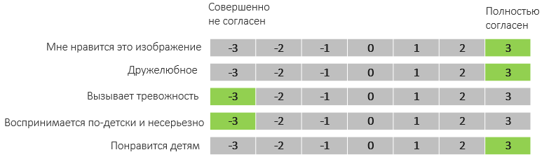
- Each picture was offered to be assessed on four 7-point scales:
- I like this image
- Friendly
- Causes anxiety
- The picture is perceived as childish and frivolous
- For images taken from the Kaspersky Safe Kids product, another scale was added – “Children will like it”.
- After scoring on the scales, the participants were asked to leave a comment on all illustrations in general in free form.
The study involved respondents from seven countries – Russia (on the graphs – RU), USA (US), Great Britain (UK), Germany (DE), China (CH), Brazil (BR) and the United Arab Emirates (ARA). People from four demographic groups were invited: children 8–13 years old (audience of Kaspersky Safe Kids), adults 23–55 years old with children, adults without children, as well as people over 55. In total, we interviewed 4090 people.
results
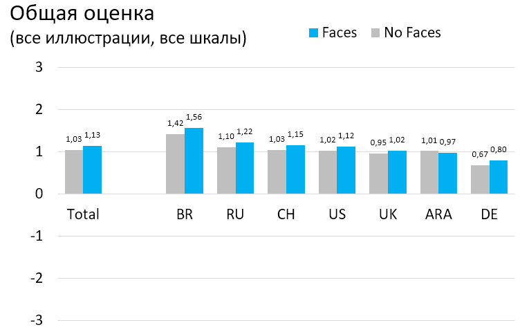
The averaging procedure was applied to the estimates on the scales (the data are normally distributed, the scale can be considered quantitative). For the scales “Causes anxiety” and “Perceived childishly and not seriously”, an inversion (“flip” of positive and negative assessments) was used when calculating the overall average:
The overall impression of the illustrations can be described as “neutral-positive”. In no country did the assessments go into negative territory. Everywhere, except for the UAE, the ratings of pictures with faces are slightly higher. In Brazil, estimates are noticeably higher than average, in Germany – slightly lower. The rest of the countries give approximately the same estimates.
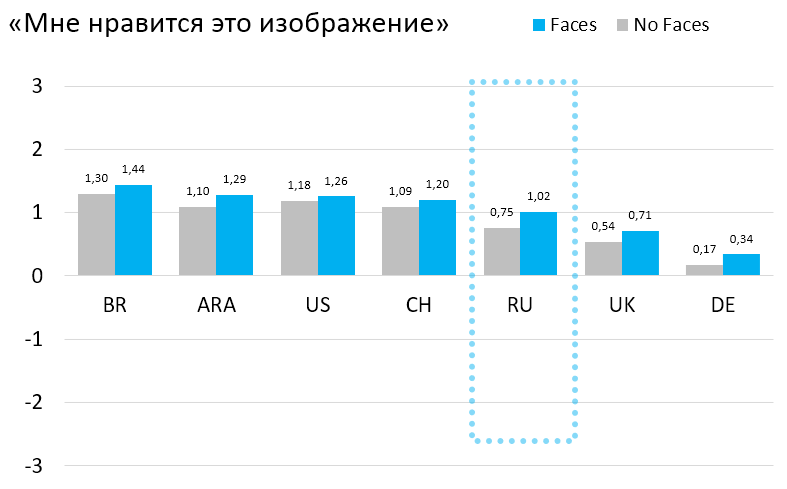
Now let’s look at the scores for individual scales. Images with faces in all countries like slightly more than no faces. Any noticeable difference (in favor of persons) is only in the Russian Federation. In Germany, the share of sharply negative assessments is higher than in other countries.
In the Russian Federation, Great Britain and Germany, images with faces are perceived as more friendly. In other countries, the difference is insignificant.

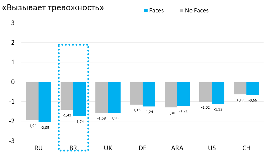
Images without faces are generally NOT perceived as disturbing. People with faces are ranked slightly better everywhere, but only in Brazil there is a noticeable difference.
No images are perceived as childish or frivolous. Both types of pictures seem to be the most “mature and serious” in Brazil. The face / faceless scores within the same country are very close. RF is the only country where there is a noticeable difference (in favor of pictures without faces).

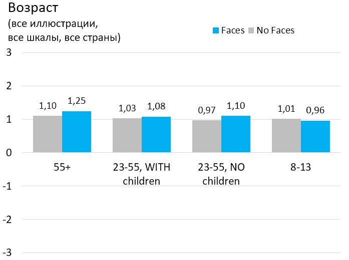
It’s pretty safe to say that face pictures seem more appropriate for children. There is a pronounced difference in China, less noticeable in Brazil, Russia, Great Britain and Germany. This difference is even more pronounced in the answers of the parents: pictures with faces, in their opinion, are definitely better for children.

Age has almost no effect on the perception of pictures, and this rule is followed in all countries.
Interestingly, I like some pictures much more than others. The more people and details, the higher the marks. Almost all pictures benefit marginally from adding faces.
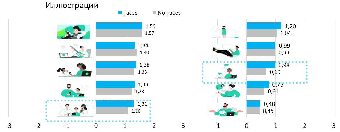
There are two illustrations that look noticeably worse with facial features that are not drawn. Both people are shown full-face and close-up:

As you can see in the ranking table, the first and last places are occupied by pictures with or without faces, and in different countries the least pleasant pictures practically do not differ. The data for different countries looks pretty homogeneous, with the exception of China with a unique set of the cutest and most unsympathetic pictures.
(The table shows the place of the picture in the overall rating by country. The first three and last three places are marked with green and red fill).

Now let’s move on to analyzing comments in free form. The idea was to label all the answers that mentioned topics of interest to us: face or lack thereof, cartoonishness and childishness. For each such statement, its tone was determined – negative, neutral or positive. Comments in Russian and English were processed entirely by hand. We tried computer translation and machine learning to mark up comments in other languages, but were not entirely satisfied with the quality of the model. Therefore, all further conclusions concern only Russian and English-language comments.
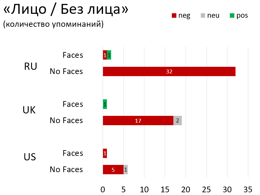
The absence of faces in the characters was mentioned by 32 participants in the Russian Federation and 19 in the UK (10 and 6%, respectively). Almost all the comments are negative:
- “Images of people without faces are rather disturbing.”
- “Faceless and unemotional creatures (no facial features – eyes, nose, mouth) from strange cartoons.”
- “The characters with no eyes appear sinister.”
- “I do not like these illustrations. Firstly, no face features at all, it makes the characters look creepy. “
The “childishness” and primitiveness of the drawings was indicated by 8% in the Russian Federation (3 and 4% in the UK and the USA). Pictures with faces are often described as “childish”. Moreover, the tone of the statement is usually positive or neutral:
- “Very good, attractive pictures – friendly and a little childish.”
- “Funny, primitive art, not bad overall.”
- “Varied, some a bit childish, some more inviting than others, generally ok”.
- “It is very educative, impressive, exposure to children and entertaining.”
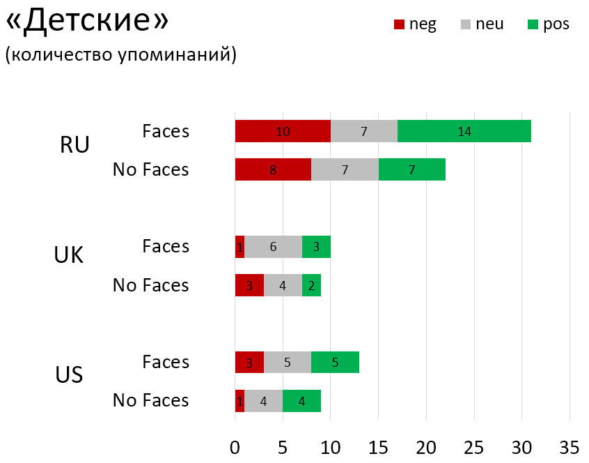
Images with faces are more often described as cartoony. The tone is mostly neutral or positive:
- “Cute animated pictures that will cheer everyone up.”
- “Quite good pictures for children’s comics on the use of gadgets.”
- Fun they are like little modern cartoon pictures.
- “Aimed at a younger audience. Cartoon like and brightly colored “.

Summary
- Any neat and professional illustrations of people seem to evoke a positive or neutral reaction, whether the faces are drawn or not.
- People with drawn faces get slightly higher grades. But the score is much more dependent on the plot of the illustration, the amount of detail in it and the country (some countries generally give higher / lower marks to any illustrations).
- Pictures without faces, according to respondents, are less suitable for children. Pictures with faces are often described as childish and cartoonish. The tone of the statement is usually neutral or positive.
- The absence of a face is a definite disadvantage for 5-10% of respondents (there is a difference by country). Especially noticeable is the absence of a face in the pictures, where the person is depicted large and strictly in full face.
- As a result, we made a joint decision that we will draw people’s faces on close-ups, but on general plans the characters may be without faces.