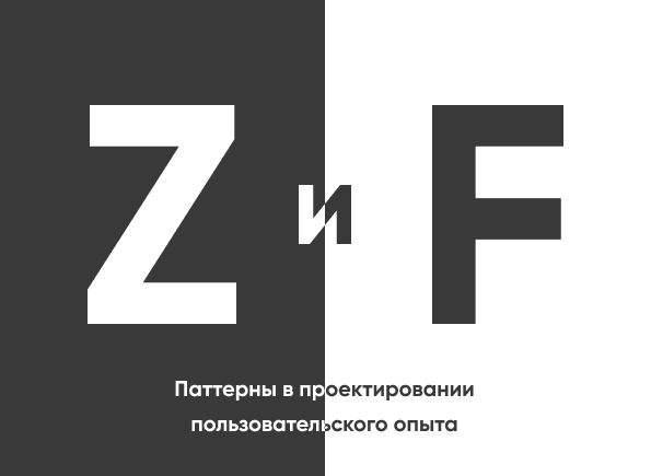
Patterns in User Experience Design
Hello dear reader, my name is Maxim Akimkin, I am a UX / UI Designer and as you can see from the title of the article, today we will talk with you about design
and user patterns. I must say that the user’s experience consists not only of what we show him, but also of his feelings, emotions, some sensations and his contexts. And it would be good to take this all into account when creating those
or other products. But since we are talking about UX design, then we will touch on the topic of designing user experience from the side of interfaces: which
it has artifacts, what steps and what to remember when we create something
and all this in the vein of the two most commonly used patterns Z and F.
Patterns
During the entire existence of the human species, we have formed certain patterns, i.e. templates and they relate not only to our interaction
with an interface, but also characteristic of us as a species. Therefore, patterns are such models of behavior that have already been brought to automatism over the years and with generations, I would even say that we do not notice them. For example, close the door when we leave the apartment, put vegetables in the refrigerator, brush our teeth … that is, what we do all the time and are already accustomed to.
If we talk about interfaces, then one of the patterns that is worth remembering
this is F pattern – it is embedded in us from the moment we begin to read. In our countries, as well as in Europe and the USA, people read from left to right, from top to bottom, and this perception also works when working with the site and with content. The user does not look at the page and does not study every detail of it to the smallest detail, they scan it. It has been studied how the user’s gaze moves across the page and is very similar to the letter F.

If you want to go deeper into the topic even more, then I will give links at the end of the article.
for materials that can be read.
First, the entire top line is scanned, then the gaze goes down a little lower to the middle of the line and down to the very bottom. It turns out a kind of Latin letter F.
In the picture above, you can see the heat map of the user’s eye tracking with the help of which such a pattern was deduced. It turns out that the user does not read the content on the page, and as soon as he sees something suitable for his task, he will most likely click on it and stop studying everything else,
and if he does not find something to catch on for a long time, then as we see from the heat map, the user’s patience ends and he simply leaves the page. And with everyone
it is more and more difficult to keep the user’s attention for a year. the rate of content consumption is growing.
The F-pattern gives the designer control over what the user sees. Knowing about this technique, we can set priorities for content and make a hierarchy with our own hands.

Important content is always at the top of the page. so this is the best part to position the logo and navigation, or whatever we want to show to our user in the first place. The next one is Z pattern this is a kind of zigzag eye movement. When we scan the page, our gaze moves from left to right and from top to bottom and Z pattern perfectly follows this trajectory.
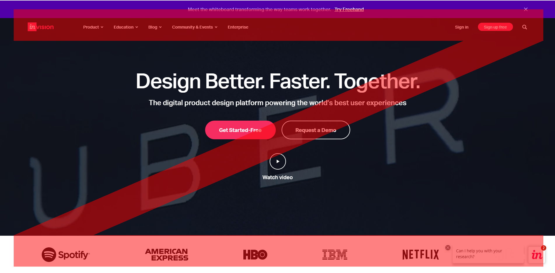
Thus, the Z pattern is better suited for pages with a large visual accent, such as a landing page or a promo site, than for text pages like the same blogs. For text content, designers are more likely to use F pattern and in this case it is more effective. In general, when you design a page, you need to ask questions: what information should the user see, in what order, what should be more important and what should be less important and what will be the key user action, i.e. what
you want the user to do. For example, as we see in the picture above
I showed Invision this is the home page and the first screen of the site. First, the user sees the logo, then the main menu, then his gaze crosses the heading
and Call to Action and below he already sees the logos of famous brands, which makes him understand
that the service can and should be trusted. There are 2 big CTAs on the page
in the center, and the user is quite clear what they want from him on the page.
Before you start designing the site, Z pattern helps us answer
to questions about what information should be seen by the user who entered
to the page and in what order he should study the content, what action should be performed by the user.
Design Z pattern simple enough. You need to line up a letter on the page Z.
Ideally, first the user should see the most important information, then a little less important information, and in between there should be some information that will push him to action. As we saw on the example of the InVision page, its essence is to create a flow for the user and so that his thinking experiences the minimum amount of difficulty while learning what we are showing him. Therefore, we create a flow due to visual weight and our knowledge of how a person’s eye moves and his attention.
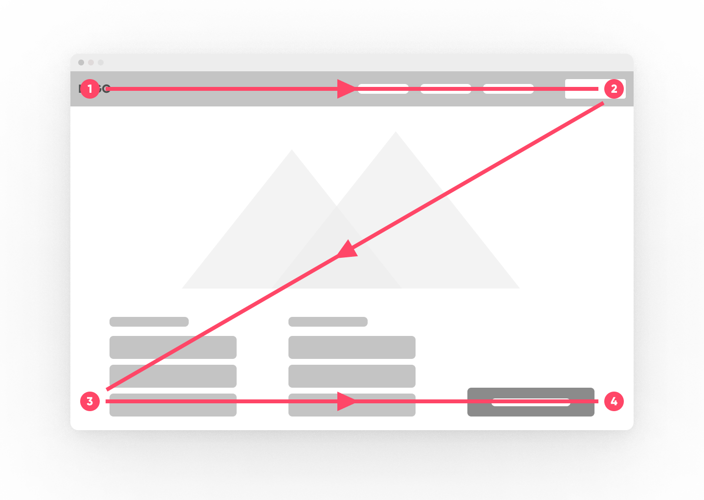
For example, point 1 is the starting point of the user’s path, so this is the best place for a logo and page designation. point 2 is the place to place items you want to pay attention to, such as registration. Since the gaze naturally moves along this pattern, it is important to place a secondary call to action at the end of the top horizontal. And it needs to be visually distinguished among the entire top line. Point 3 is an intermediate point and its main task is to send our user to point 4 where there is the main action of our user to which we want to lead him.
For example, on this page, according to the classics, at the top left is a logo, then at the top right there is a call to action, for example, log into your account or create a new account, then the gaze moves towards something in general for the product and its main properties are highlighted and the final point is the main one. a call to action, for example to sign up for free. It is very important to create a flow for the user because it becomes more logical and more understandable for him what he sees and why he needs this product.
If we do not observe this flow, then the user will most likely get confused why he came and will change his choice in favor of another product or service. In addition to patterns, users have developed certain tendencies and habits over the years of the Internet and technology. They have formed into generally accepted conventions that are most often used by designers when creating websites and applications.
For example, everyone is already accustomed to the fact that the logo is in the upper left corner of the screen, and navigation is at the top of the page or on the side. The same applies to the shopping cart and personal account. Therefore, if we go to the site in a completely different language, then we still understand where what is and what the essence of the product is.
When you design your products, it is important to remember that users are not like you and you should not try to complicate their experience and it is better to keep it as simple as possible (unless there is a good reason). A large study was carried out by the Nielsen Norman group – this is a large research center and the guys who work there were the founders of usability and UX worldwide.
They conducted a longitudinal study from 2011-2015 in which they studied how people of different ages navigate technology and what level of technology they have. 215,942 users, aged 16-65, took part. As a result, they managed to identify 4 levels. Starting with the fact that people cannot use computers at all and ending with perfect possession of various technologies.
It is worth noting that the study was done over five years and some time ago, and that the level of technology proficiency has already significantly increased, especially given the fact that mobile technologies have appeared. But in any case, the result of the research reminds us that we are not like users and users are not like us, therefore, we should take into account the specifics when designing. We have considered two types of patterns, the Z pattern and the F pattern, and also about the generally accepted conventions. All this knowledge will help us improve the resulting artifacts at the design stage. And remember that these are just guidelines, rigid rules and boundaries
no one has installed it yet, and it’s up to you to decide whether to follow them or not.
PS – Share the article if you think that it can help someone.
Useful links:
The Distribution of Users’ Computer Skills: Worse Than You Think
https://www.nngroup.com/articles/computer-skill-levels/
Visual Hierarchy, Gutenberg Diagram, F & Z Pattern
https://lineindesign.medium.com/be-a-designer-who-can-also-help-with-writing-copy-2f4ea02a5646
Z-Shaped Pattern For Reading Web Content
https://uxplanet.org/z-shaped-pattern-for-reading-web-content-ce1135f92f1c