Neomorphism and its problems

Neomorphism is a fresh (relative to skeuo / flat / material) design trend, which is essentially a reincarnation of buried skeuomorphism. Since this style does not have well-documented guidelines, such as material, its various uses cause a lot of controversy among designers. In this article, we will analyze its essence and discuss the problems that have sharply gained relevance due to Big Sur.
Back to basics
In general, neomorphism initially has nothing to do with Apple and Big Sur. It’s just that at some point after the extremely successful Dribbble shot, this far from new idea received a sharp creative push among designers, and everyone rushed to draw icons and prototype interfaces in a new style to move away from the boring flat / material.

It is immediately noticeable that the designer tried to add volume to as many elements as possible, but in general, the prototype repeats almost all the familiar patterns of traditional flat design. It turns out a kind of nice restyling, which succinctly and clearly highlights the main interface elements due to the difference in height (the cards and the circle are noticeably higher than the buttons and auxiliary parts, the eye immediately clings to them). The navigation buttons on the right screen look especially nice; they remind of pleasant tactile sensations from their counterparts on real devices.
Unlike material cards and buttons, here each volumetric element does not “hover” above the surface, but is in contact with it:

In fact, the difference is only in the cast shadow – in material it is of the same brightness along the entire perimeter, and in neomorphism, on the one hand, it is lighter, on the other, darker. By balancing the softness (diffusion) and the amount of shadow, you can make the element protrude from the surface smoother or sharper. In addition, a thin border helps to add height, creating contrast with the shadow. Frames are discouraged in material because they want to create the feeling of a thin air layer. Of course, since all protruding elements are considered “extruded” from the substrate, the background color must be the same or slightly different in brightness.

You can play around with the shadow settings yourself in the generator on neumorphism.io… There are no ready-made rules for drawing the hierarchy and nesting, so for each even slightly complex interface you have to invent your own approach.

Problems
1. Compatibility
Since Apple included icons in Big Sur in its interpretation of neomorphism, there is a chance that their followers will still receive standards and guidelines for using it in all situations, but so far chaos reigns in the community. Dribbble offers prebuilt stencils, but they can take completely different approaches to certain buttons, such as such and such, and they even have the same name. Moreover, icons from Apple itself can both exploit neomorphism and deviate deeply from it towards 3D or various glow effects:
2. Availability
The biggest problem with this design is accessibility. Standards makers and designers have worked for years to make potentially any interface accessible to visually impaired and blind people with varying limitations in speech, hearing, nervous system, and cognitive abilities. More than half of people with such restrictions regularly use the Internet, and here they are in for an unpleasant surprise.
From the examples above, it is already clear that due to the coincidence of colors and the lightness of the shadows, it is difficult to provide even the minimum level of contrast. Even an absolutely healthy person cannot always read the position of the switch at a glance or simply understand whether this or that element is clickable. A pressed button or “depressed” switch can be easily represented by inverting the shadows, but due to the low contrast, this approach may be unacceptable to many people:

Therefore, it is recommended to create an auxiliary indication, for example the following:

But the issue of accessibility isn’t just about contrast. Try to figure out the following interfaces:
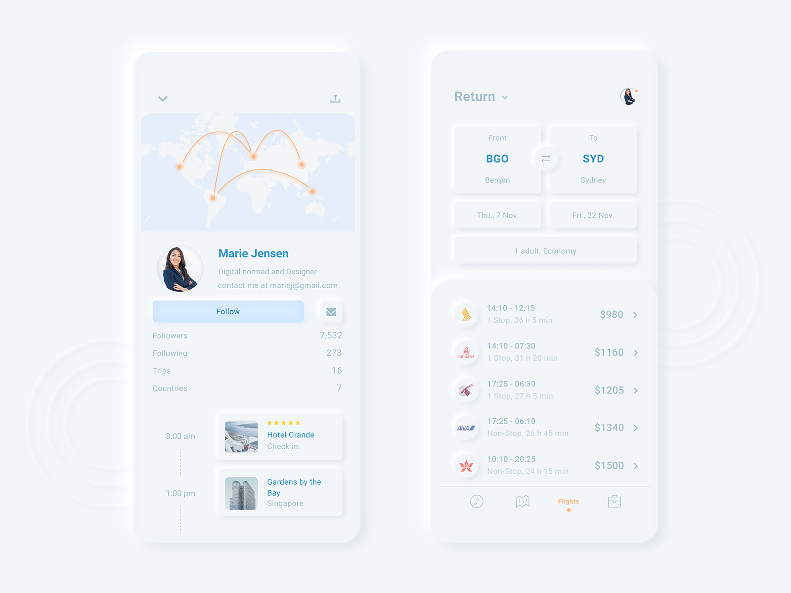
How is the Follow button highlighted? Is the subscriber counter clickable? Why do airline avatars look like buttons? To select a flight, you need to click on them or on the arrow on the right or anywhere in the line?

At least the contrast is better here, but the problem of clickability remains. Is the top bar a button or just a section? Is it possible to click on any cards or only their controls? Why does the Connected / Disconnected status look like two checkboxes and what is the current status for Devices Security? I still haven’t figured out the logic here.
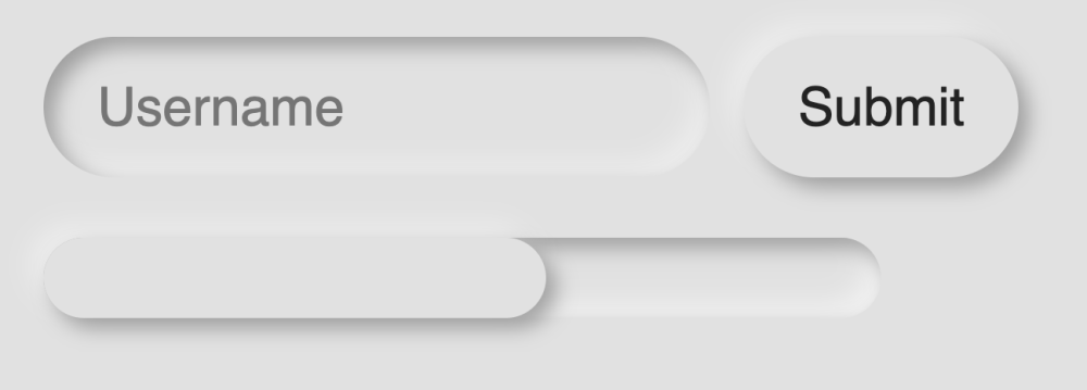
This is the main problem of neomorphism: it was invented by designers from dribble to make it beautiful, not functional. Everything looks like buttons… After clicking the Submit button will bend inward and will look like a field for a username? Below is a progress bar or a horizontal scroll? It can be both, depending on the author’s imagination.
The sadness is that these are not some specially selected bad examples of crooked designers, this is everyday life. See for yourself, here is the link… Some whistleblowers believe that neomorphism is a bloated hack that you shouldn’t even try to implement in real interfaces, and often I’m ready to support them. But since Apple has shown interest in this movement, it may have a chance to grow into something more serious and viable.
Advertising
Epic servers – this is VDS for hosting sites from a small blog on WordPress to serious projects and portals with a million audience. A wide range of tariff plans is available, the maximum configuration is 128 CPU cores, 512 GB RAM, 4000 GB NVMe!