Minimizing label overlap in interactive visualizations
The translation of the article was prepared on the eve of the start of the course “Industrial ML on Big Data”… Is it interesting to develop in this direction? Watch live recordings of free online events: “Open Day”, “Launching ML models into the industrial environment using the example of online recommendations”…

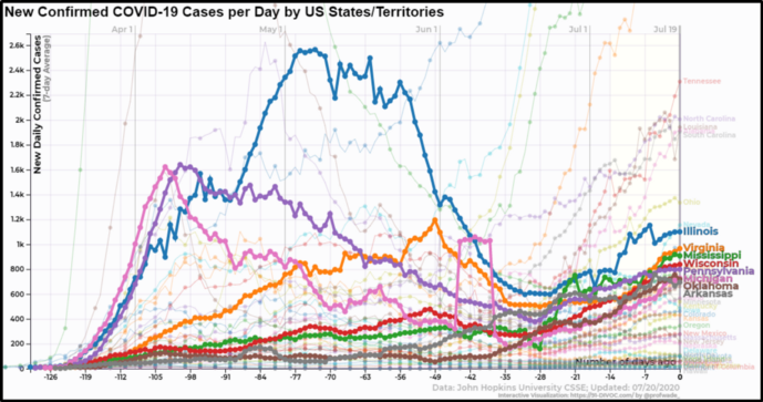
Visualization of new COVID-19 cases by day for each US state without a label positioning algorithm
One of the most difficult areas to control when visualizing data in real time is label placement. In a huge number of visualizations, I tried to avoid a large number of labels altogether so that they did not overlap, but the last time I did not get out of the situation that way.
My 91-DIVOC imaging of the COVID-19 pandemic allows users to get the most recent coronavirus data from Johns Hopkins University using interactive visualization built on the d3.js library. Because a visualization uses data that is updated multiple times a day, and because users have the ability to explore the data and create over a million different visualizations, everything must be rendered programmatically.
There are many limitations that are common when it comes to combining line graphs, so making labels readable can be tricky:
- There can be many lines, and they can all end at one point.
- Some lines are more important than others. In the 91-DIVOC visualization, the user can select one or more countries, then the line will become darker and thicker, and the label will increase in size.
- Most users use mobile devices, which limits computing resources.
Without using a label positioning algorithm, the visualization of new COVID-19 cases displays several unreadable highlighted labels and even more unreadable unselected ones.
Popular Approach: Force Graph Rendering Algorithms
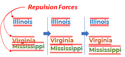
Stages of modeling a forceful algorithm for placing labels on three labels. In the third phase, the Mississippi and Virginia labels finally split up.
A common approach to solving the label positioning problem is the “force” component in d3.jswhich implements a force-directed graph. Force-directed graph is a physics-based model in which all elements have a force of attraction and repulsion relative to other elements. In terms of label positioning algorithms, each element has a small repulsive force from other elements, causing the simulation to push the elements away from each other whenever possible, creating readable labels. When, as a result of simulation, the simulation reaches a stable end state, the result is quite good, so this approach is considered to be quite working.
Unfortunately force-directed graphs slow… The running time of force-directed algorithms grows cubically with respect to the input value, O (n³). That is, areas with many elements required a lot of processing power. In earlier experiments with force algorithms, more time was spent building a force-directed graph than processing and rendering. It’s time for a new solution.
Quick fix: “Render or Nudge”
I failed with force-directed graphs which turned out to be too slow. It was necessary that the execution time of any decision was minimal. In order to save time on positioning one label, placing each of them came down to a render or nudge decision:
- If no labels are currently visible in the area, render it. This solution will work immediately, and the location will not be changed.
- If another label that was rendered earlier is now overlapping with a new label, nudge it to try to find a better position.
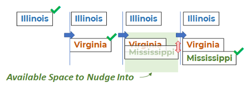
The “Render or Nudge” label positioning strategy illustrated by the three labels where Mississippi is “nudged”
In the process of nudging the label, it moves to the height of the label above or below the intended position. If no suitable location is found, then the label will display in its original position, creating an overlay. (Moving the label further than the intended location often results in a visual gap between the data and the label.)
If the labels are viewed once, then the algorithm is executed in linear time O (n) and will be classified as a “greedy” label positioning algorithm.
Result
After implementing the algorithm, the results in terms of the speed of the algorithm were stunning. Below you can see that all highlighted labels are readable, and many more of the 40+ unallocated labels are also readable.
Visualization of the number of COVID-19 infections per day for each US state with label positioning according to the “render or nudge” strategy
When placing labels during data visualization, think about low-cost solutions that do not affect global positioning. While this solution does not guarantee that no one label overlaps another, it greatly improves the artless positioning and dramatically improves the readability of any render with dozens or hundreds of labels.
(By the way, you can see my visualization with this label positioning algorithm here: 91-DIVOC # 01: “An interactive visualization of the exponential spread of COVID-19”)
Learn more about the course “Industrial ML on Big Data”