Just a vertical monitor doesn’t mean I’m on the phone
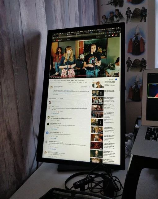
YouTube on a vertical screen
Yes, I’m a strange person, I admit it completely. I have a vertical monitor on my home computer. I compose and read a lot of long documents – and this form factor suits me perfectly.
I I’ve been doing this for a long time… This is a natural part of my workflow. This screen orientation is best for any document that is longer than an email. Most Linux applications work fine in this format, although the menu doesn’t always fit on the screen.
But sites on the Internet are something completely abnormal! Many people think that a vertical screen is definitely a mobile device!
Yes, the problem is minor and concerns me personally, but still it makes sense to explain what the consequences are, what is the reason and how to fix it.
Examples of
Here are some typical websites on my 24-inch vertical monitor. On the left is a real render, and on the right is how must be.

Just eat

The guardian

Poular science
Problems
In such a situation, I have several problems:
- Is the navigation bar hidden behind a button?
- Some elements like carousels only work on the touchscreen
- Images are loaded at low resolution for 6 “screens and then stretched 24”
- A lot of space is wasted on “master images” and finger-friendly buttons
- Some content is simply not available for mobile users
Why it happens
The native resolution of the monitor is 1080 * 1920. But at this resolution, the fonts are too small for me – given how far I sit from the screen. The Pop_OS Linux distribution has a utility called Gnome Tweaks that allows you to scale fonts specifically, not resolution.

Gnome Tweaks with font scaling factor
A scaling factor of 1.5 means an effective screen resolution of 720 * 1280.
User agent sniffing is considered bad practice and is not recommended. Therefore, most sites do not bother checking the iPhone or Android, but instead check the screen resolution using JavaScript or CSS.
They see a 720p screen in portrait orientation and reasonably assume it’s a small screen device.
Solution (user side)
Zoom out in the browser! This is the obvious answer. If you press three times Ctrl минусthen the effective resolution will return to 1080 * 1920. But then some sites will become too small for normal reading. That is, you need to scale down the page and increase the font.
I tried Fractional scaling – it works fine in Wayland, but the fonts are blurry and fuzzy.
So I set the font scale to 1.36, which gives a resolution of 864 * 1536 – enough to prevent most sites from recognizing the tiny mobile device.
But that’s not my problem.
Solution (server side)
STOP NAVELY USING THE PERMISSION!
Yes, there is no way to know physical user’s screen size. This functionality simply does not exist in JavaScript or CSS.
But you can find out the DPI. Well approximately…
CSS lets you know the DPI of your screen
Site https://DPI.lv/ Lea Veru correctly recognizes the resolution of my monitor 1080 * 1920! Regardless of font scaling – it always shows the correct resolution.
var dppx = window.devicePixelRatio;
var screenWidth  = screen.width  * dppx;
var screenHeight = screen.height * dppx;
This is how real resolution is determined regardless of OS scaling.
Other DPI detector shows the number of dots per inch. My vertical monitor is defined as 120 DPI.
Is not quite correctly. And different browser engines calculate DPI differently. Here are the results I get on Linux on the three main rendering engines:
- Chrome: 5.14 pixels / mm
- Firefox: 4.73 pixels / mm
- WebKit: 3.78 pixels / mm
If you physically measure the screen, you get about 3.62 pixels / mm!
Obviously, the metric is not entirely accurate, but it gives the web developer at least a rough idea of the physical screen size.