How we decided to redesign DPD ourselves
Hi, I am Vlad Savin and this KOTELOV in the article we will show how, without demand, DPD redesigned their personal account for legal entities.
Background
We have been using DPD delivery for many years and every time we use the service we have a desire to make the process of sending goods more convenient. At some point after the next courier order, I freaked out and called DPD with a proposal to redesign the front-end of their personal account. It is worth clarifying that we are not engaged in active sales, but in this case I just wanted to make this world a better place for myself, DPD and their clients.
The call, as it should be believed, ended with their proposal to send the KP to the post office. I wrote to them, but naturally did not receive an answer. After half a year, the accountant, ordering a courier, turned to me and said something in the style: “Vlad, it is very inconvenient for me to use their personal accounts, can you suggest making it more convenient?” I was surprised that our thoughts coincided with her even though we had not discussed DPD before. Therefore, we decided to design their office just for our practice and share the results with you.
Process
I give the task to our designer – Anya Fursova, explain the idea, give access to the DPD LC. I give the floor to her)
“:) the topic is complex, but interesting”
The main problem of the existing interface is not even that it does not correspond to the “design trends of 2021”, but that, despite this, it is extremely incomprehensible to the user.
We revised it and made it convenient, first of all, for ourselves.
Order viewing interface
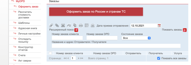
The first thing we encountered was that we almost lost the order, because it is impossible to select orders for a certain period, only for a specific date. At the same time, when you enter this interface, you get the feeling that you did not place an order, since it is not in the list, only then you think of clicking through all the dates. Therefore, the first thing we thought about was convenient filtering – now you can select a time period, and by default all orders are displayed.
It was:
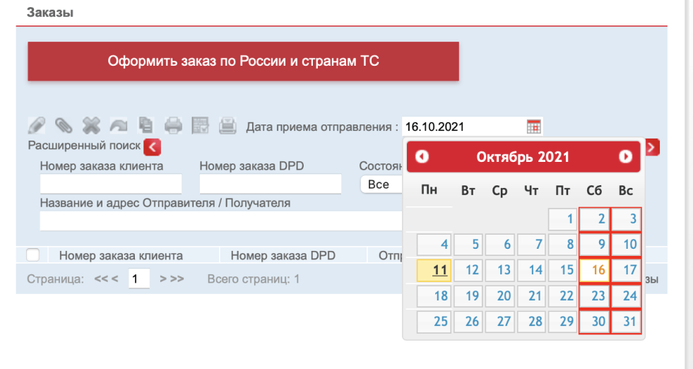
Became:
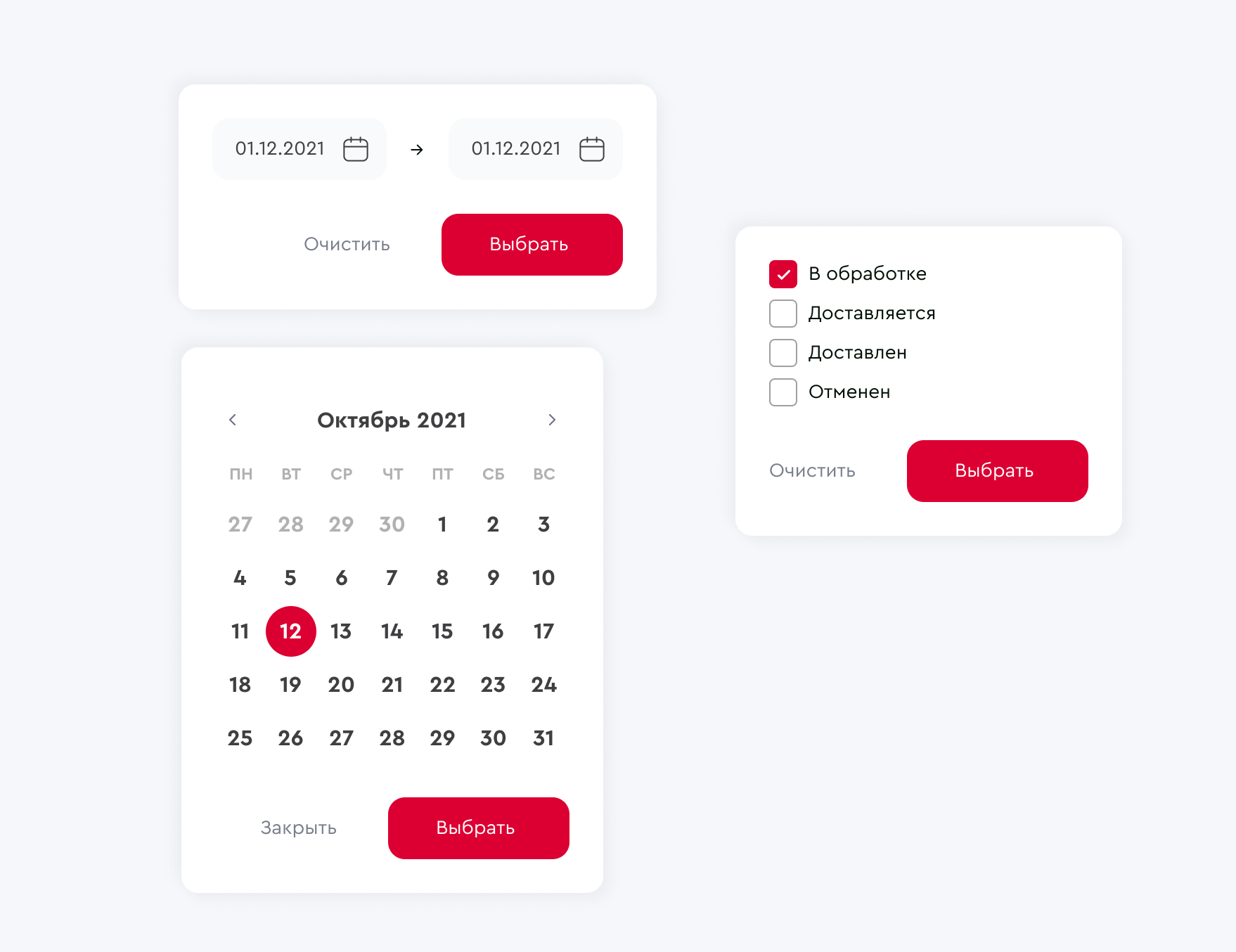
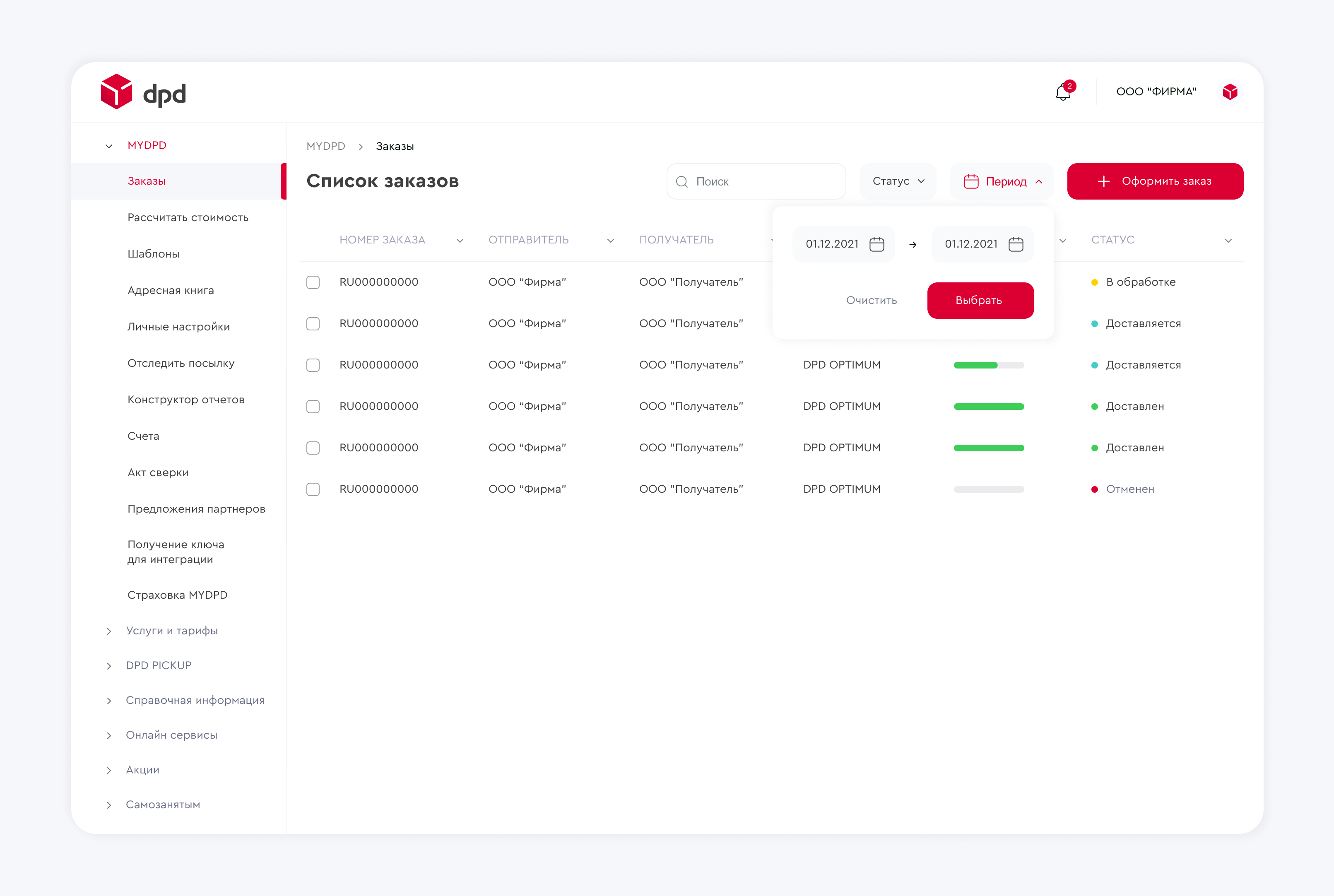
Well, we added search and filtering by the main indicator – status. Instead of advanced filtering, which requires additional clicks and is not intuitively understandable, we have placed a search bar and provided a sorting system for each of the columns.
We also noticed that an incomprehensible system of statuses is used: considered, confirmed, canceled. But the most important thing for the user is to understand whether the order has been accepted for work and the progress of its delivery. Therefore, we changed the status system and marked them with color.
Now they are convenient and understandable for everyone:
– In processing;
– Delivered;
– Delivered;
– Canceled.
We also added a progress bar to the table so that the delivery progress was clear without going into the order itself.
We were also confused by the icons: they are outdated (and not vector) and do not react in any way to user behavior, and also take up a lot of space. The solution was the action pop-up menu – when the inputs are selected, interaction with all selected orders is available.
It was:
Became:
Create order
Well, the main headache is creating an order.
The first thing to do is to fill in the details of who filled out the application.

Further, in order to fill in the data about the sender, you need to press the buttons (which do not look like buttons). There are fields for filling, but they are simply not active and do not react.

When you click on the create sender button, a new window opens with a bunch of optional information (Lunch break? Why then the “Additional information” field?).
We have reduced unnecessary additional steps: now you can fill in the sender’s data right away, or use the address book and choose from those already used before.
It was:


Became:
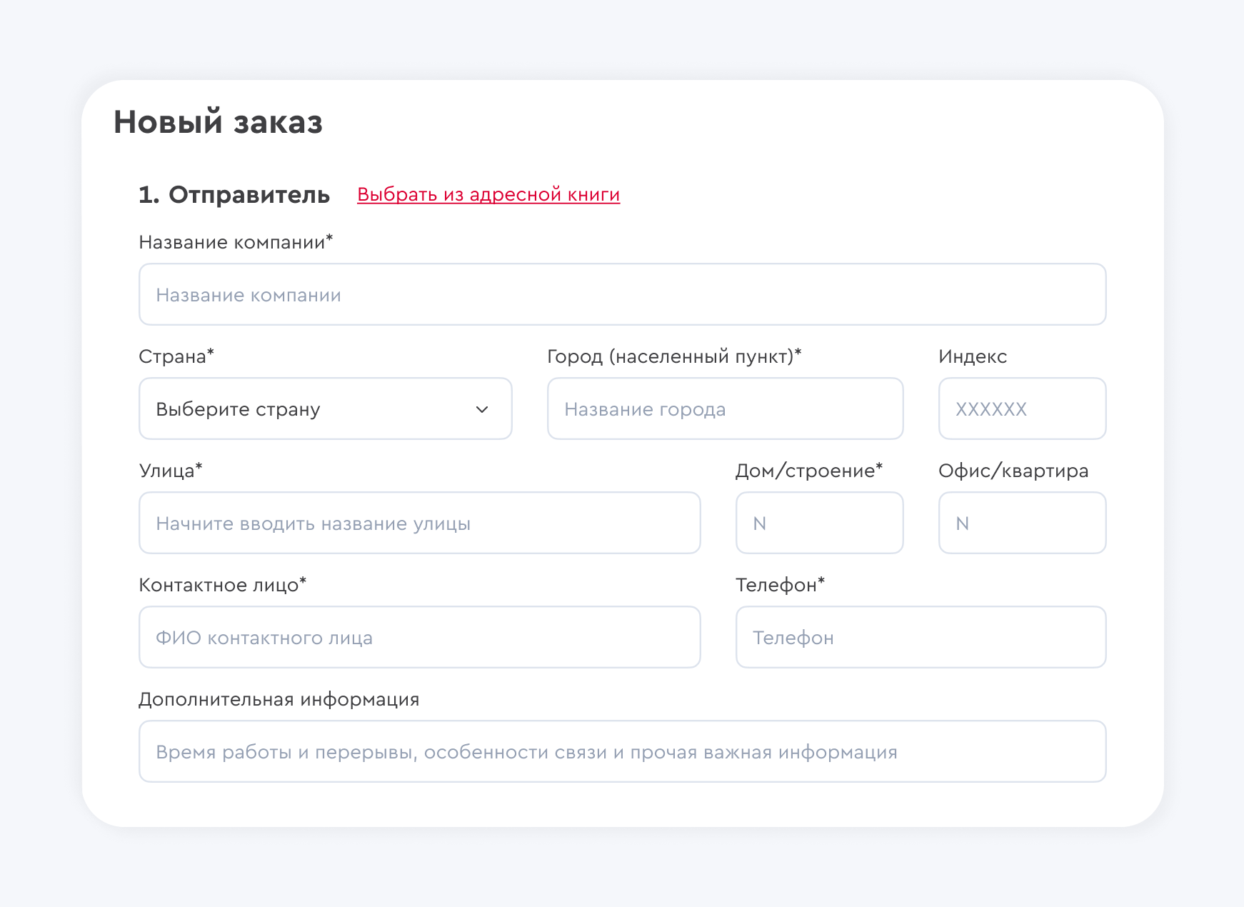
Similar steps need to be done for the sender and we used consistency.
It was:


Became:

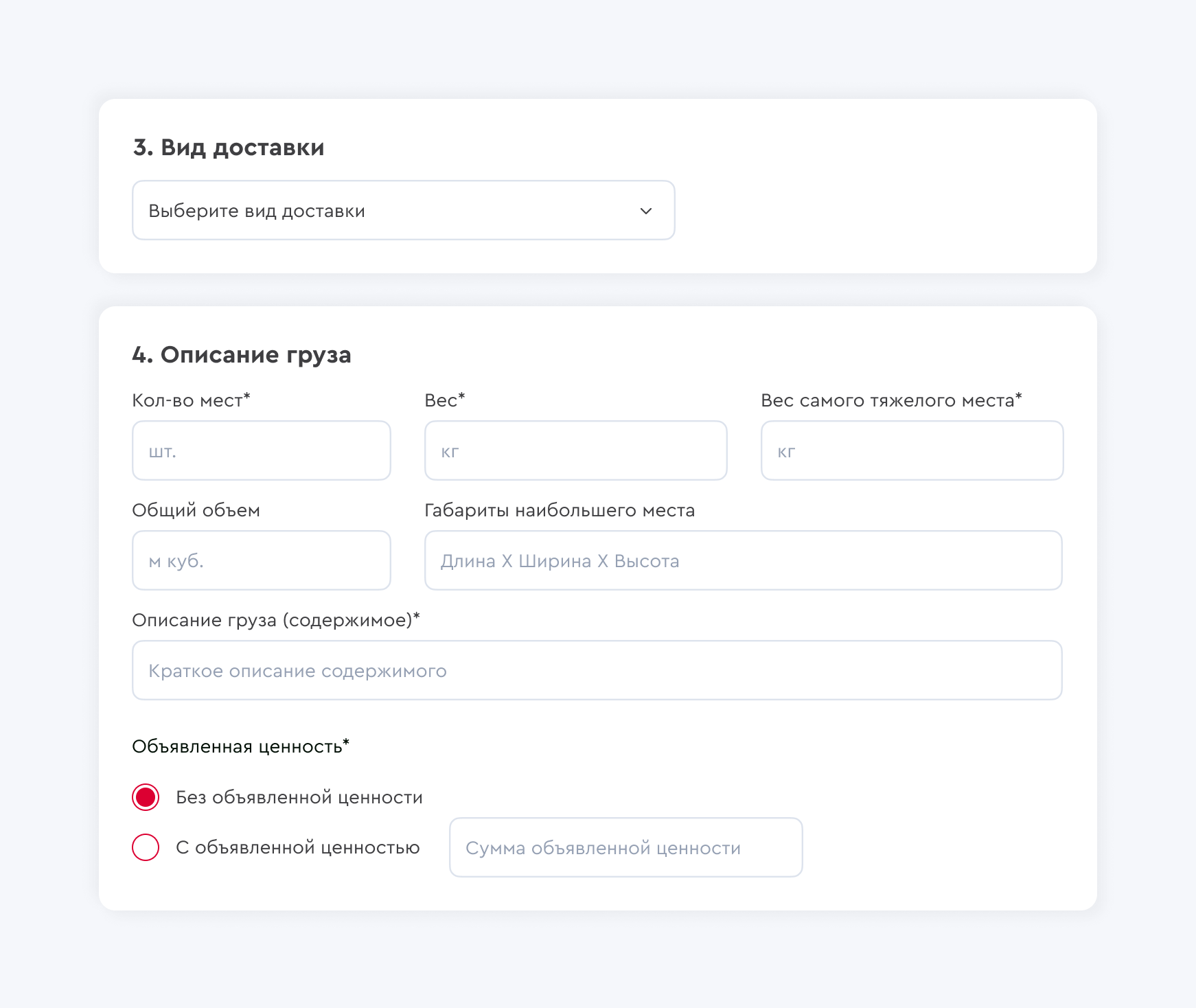
Delivery type
We made the type of delivery and description more visually pleasing
It was:


Became:
Tariff selection
When you choose the date of receipt of the shipment in the frightening option “Date, Service and Options” a huge table appears with a bunch of unnecessary information about the types of delivery. But you already have data on the cargo at this stage of registration: both the weight and dimensions are known. It is logical to display only the types of delivery available for a given cargo and only mandatory information of interest to the user, namely the delivery time and amount.
It was:

Became:

Payment details
We have also reduced and refined the payment data.
It was:

Became:

Additional options
Remember the word “options” from the huge subsection “Date, Service and Options”? We have not forgotten about him. We just added this item to the very end, because these functions are additional (and also paid). Convenient switches allow you to add any additional functions, as well as see how they affect the total cost of the order.
After checking in the window with brief information about the order, you can “Place an order”. And you can also save this order (you don’t want to fill it all over again?).

SAMMARI
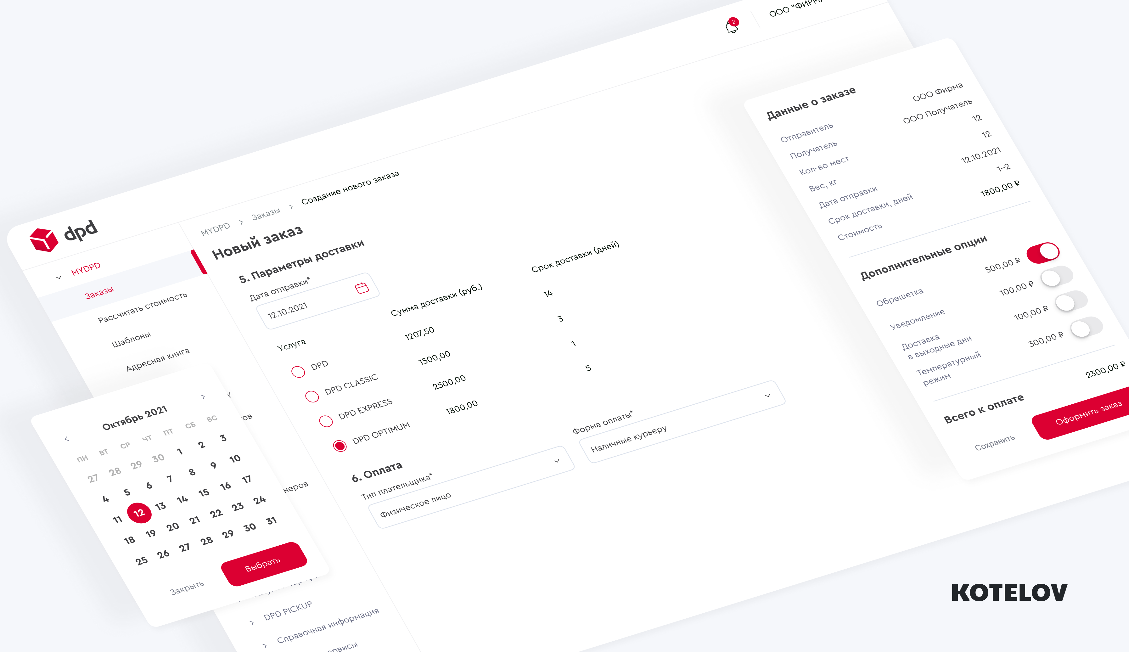
Well, in general, you can compare the interfaces for creating an order before and after: we redesigned the concept and got away from a bunch of pop-ups and unnecessary clicks. There was only always available information and brief information about the order on the right in the assigned zone.
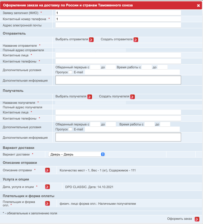
It was:
It is clear that the entire stream of windows and additional unnecessary data cannot be accommodated, so we will only leave a brief view of the old design.
Became:
View at the initial stage of order creation.

View at the final stage of order creation.

TOTAL:
Not that we think DPD will turn to us, but it’s cool sometimes to sit down and pump yourself up with a non-profit project)
Write in the comments, whose interfaces give you pain and what you would like to see redesigned in future articles 🙂
