How the new design of the PVS-Studio website was made
The PVS-Studio website will celebrate its 15th anniversary this year. This is a considerable age for any Internet resource. The distant 2006 in Russia was recognized as the year of the humanities. In June, the then unknown site “Habrahabr” appeared. In November, Microsoft officially completed development of the Windows Vista operating system. And in the same month the domain viva64.com was registered.
Our site celebrated its 10th anniversary with a redesign. Since then, the changes that have been taking place have more to do with the size of the resource and its functionality, but not design. During this time, the number of articles increased so much that it was necessary to enter tags for easy navigation through them. Also, our YouTube channel, which means that the stock of videos is filling up on the site too. The number of pages is growing at a tremendous rate. But the usability remains where it was.
It’s time for massive changes!
Where did we start
The first thing to understand with any global changes is why they are needed (and whether they are needed at all). That’s where we started. The redesign has been brewing for a long time. And here’s what pushed us to him:
-
Comments on articles in which people were genuinely surprised that it turns out that we have a trial key. And it can be requested. And this can be done quite easily on our website.
-
Sometimes we were asked questions about where to see the changes for the latest release.

The Linux version is still being asked about. Although, let’s be honest, there are still fewer questions.
-
The web visor showed us the torment of the user who found himself on the page downloads…
-
Well, in general, something told us that the long text on the description page product not always and not everyone reads (your questions in the feedback told us this, of course).
-
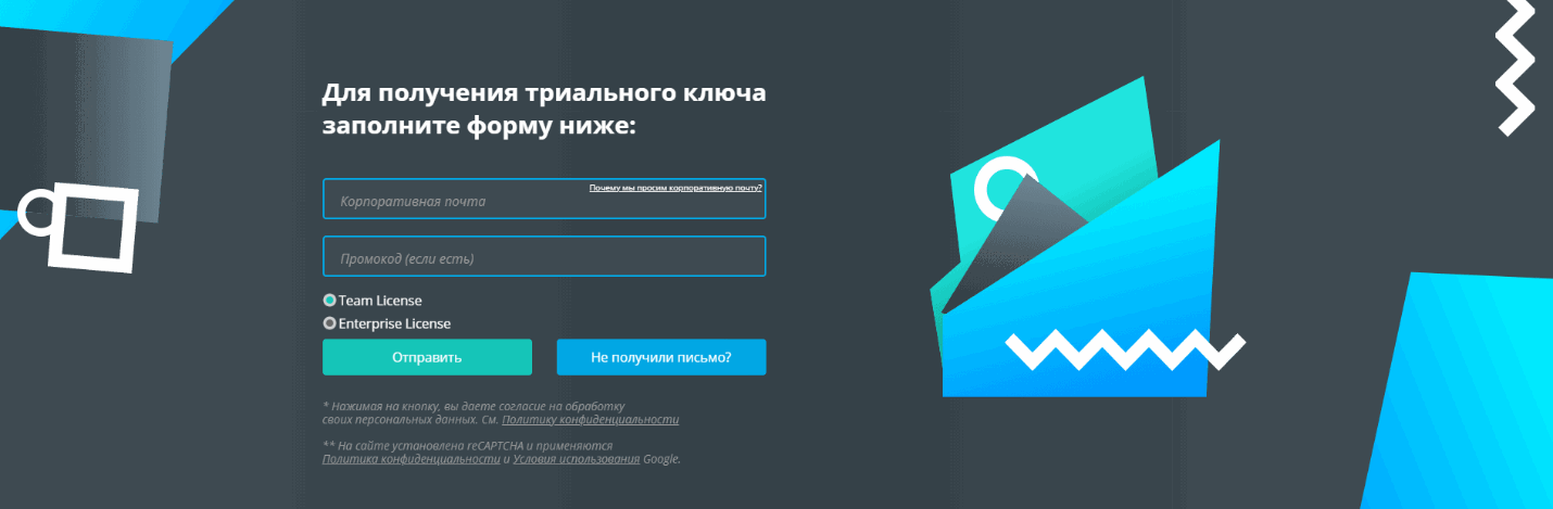
There were also difficulties with advertising and landing pages for it. Not everyone was intuitively aware that to request a trial, you need to scroll a little on the page that opens, fill out a form (select a platform, trial version, add mail, first name, last name, add a comment (we recently made this field optional!) …).
It is from this that we began to build on when prototyping a new site.
Prototype
Prototyping any resource should start with a goal. If it’s an information resource, usually the goal is refunds and time on site. If an online store, the goal is to buy. In our case (for a grocery site), the goal is a trial request and a price request. Lead, to be more precise.
Statistics show that before requesting a trial, a user should look at an average of 3-4 pages. Perhaps read articles, go to the product page, look at different types of licenses, find out where the analyzer is integrated, and only after that, perhaps, download the distribution kit and request a trial.
Where did we come to:
-
A trial request form should be on every page and it should be simpler. Even easier! Quite simple!
-
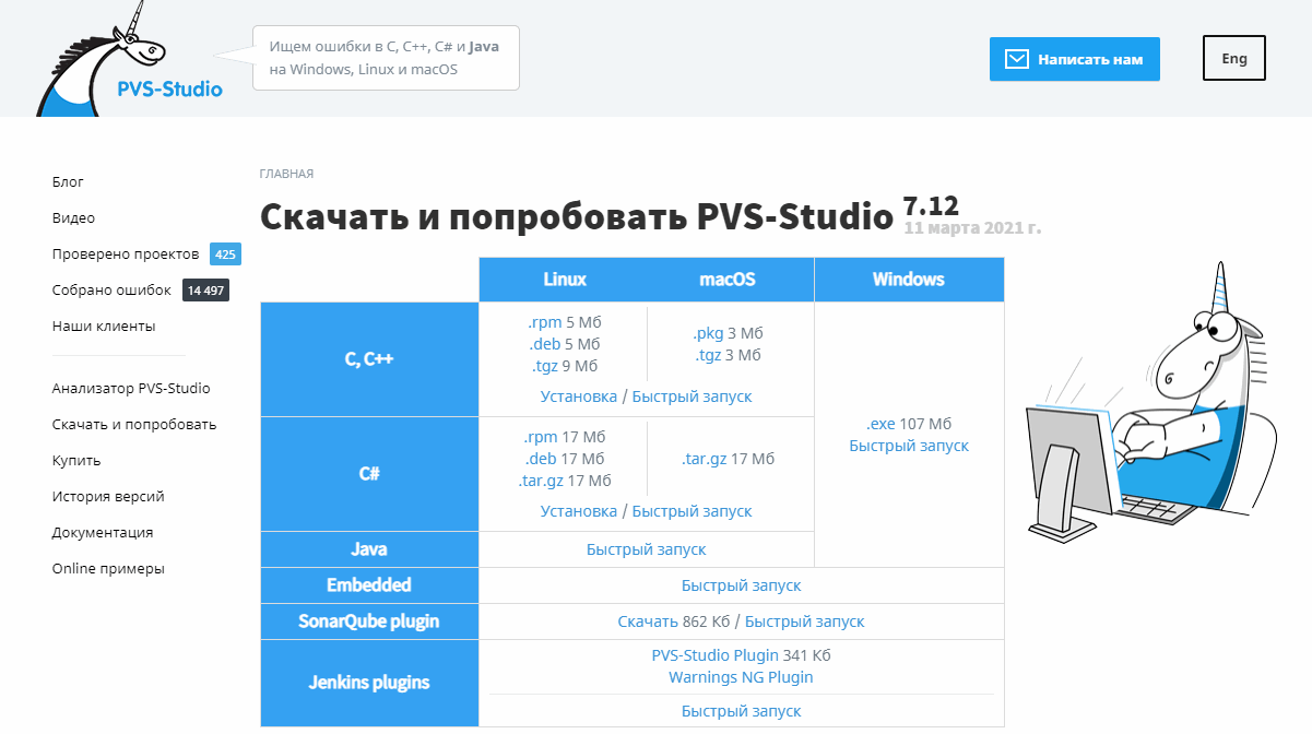
Similarly, in direct access on each page, it should be possible to go to the download of the distribution kit.
-
The ability to download the distribution kit should be implemented in different ways (if someone for one reason or another did not fit one option, he could always use the other).
-
The choice of three platforms should be as visible as possible. It is impossible for someone to see the availability of versions for Linux and MacOS.
-
Product benefits should be clear and concise.
-
The main pages of the site should provide answers to the main questions of users.
-
Publications and documentation should be presented separately so that working with them is as convenient as possible. At the same time, you must not lose the product page.
What solutions have we come up with?
-
We reduced the trial form to a few points and made it end-to-end throughout the site.
-
Added the “Download distribution” button to the header, fixed the header when scrolling the page.
-
Made different forms of downloading the distribution on the product and download page.
-
We highlighted the steps for downloading the distribution kit and the first step was the choice of the platform (Windows, Linux, MacOS).
-
We briefly formulated 10 main advantages of the PVS-Studio static code analyzer, made this block expandable.
-
Goals were outlined for each page. Based on this, the pages were divided into blocks that cover the formulated goals as much as possible.
-
Created separate templates for publications and documentation. However, they united everything by one topic and did not split it into different domains.
Design
As you name the ship, so it will float. In the case of a web resource: what kind of website design you come up with, and expect the result. Indeed, a lot depends on the design. Will the resource be remembered or not. Whether there are all useful elements on it or not. Will the user run away from the site after loading the page or not …
Therefore, we were ready to pay maximum attention to design. Found a third-party contractor with a good portfolio. It doesn’t matter that he was far from us (in another city). We waited 2 weeks while the contracts traveled between cities. Then for another 2 weeks the designer prepared his own version of the main page for us. Finally, we got the result. The decisive moment – and tears of chagrin. It was not at all what we wanted.
As they rightly say: without a intelligible TK, the result will be … the same indistinct. We took into account our mistakes and described in as much detail as possible all the edits that we would like to make to the resulting version. The points. With examples. Apparently, they overdid it. In response, we received a letter:

So, a month later, we were left without a designer.

To look for a new one, again waste time signing contracts and hope that this one will not give up on us – we decided not to follow this path any more. Enough. Let’s walk through it with a layout designer (spoiler).
Came to our in-house designer Galina with a confession. I wonder why they didn’t come right away? Because Galya is always inundated with other tasks from us. She draws us, and animates, and prints, and processes, and comes up with … Too much for one person, right?
But, be that as it may, Galya did not refuse us. Took a stack of our requirements:
-
The colors are muted, taken from the PVS-Studio logo. If you leave our blue and dilute it with white, this contrast hurts the eye. Our lovers of dark themes cried especially. Gray just solved their problem. Yes, and selected all the elements, becoming the perfect background.
-
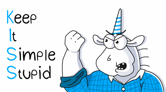
We leave the unicorns, but lower their degree. Unfortunately, not everyone appreciates our mascot. Especially banks, especially serious ones.
-
Instead of the lost unicorns, we add geometry that is now popular.
-
And, in order to keep up with the trends, we dilute with a gradient (have you noticed that many companies have a gradient after the rebranding?;)).
-
Add icons, draw infographics.
-
The most important point is making it beautiful!
Of course, the TK was more detailed, but now it makes no sense to describe all this in the article.
Things went well. Unicorns, geometry, all elements are highlighted. The gaze falls where it is needed.

Layout
Did you think we experienced all the difficulties of working with external performers on design? No, it’s not like that. We were also looking for a layout designer from the outside, since we now have an inveterate backender on our staff. We found a frontend, signed a contract, threw off the technical specification, prototype and layout. We sat down to wait.

We waited 2 weeks, we ask you to show at least something. We get the answer that it’s too early. We look forward to further.

A month has already passed, it’s time to get at least some result. But we hear only promises in response. Another week passes. We insist, stamp our foot. We find out that now the front-end developer has a difficult personal situation. We empathize, we take away our task. And we understand that after a little more than a month we were left without a layout designer.

According to all the laws of the genre, we had to confess to our full-time developer. But no. Backender – he is backender. We nevertheless rushed to an accelerated search for a new layout designer on the side. The rake of the universe is over. We quickly found a new front-end developer. The work started.
First of all, the layout designer tried to lure us to Next.js. We almost agreed (the speed of loading pages conquered). And from the SEO point of view, the problem was easily solved (search engines were given content in html thanks to SPA). However, a short reflection led us to an insurmountable obstacle: who will maintain all this beauty? So we’re back to good old html + CSS + js.
Backend
The new layout required a serious redesign of the functionality. Fortunately, our full-time developer moonlights as a wizard. Therefore, he simply transferred the engine block by block to the finished layout from scratch. It’s just that it’s not easy for us at all.

Domain change
Along with the new design, we wanted to move to a new domain. A domain that will no longer raise questions. If you only knew how often we had to tell why we have a site viva64…
It would seem that the transition is as simple as possible: we create a new site on a new domain, at the right time we set up redirects from viva64.com to pvs-studio.com. Done!
However, search engines have made minor adjustments to our ideal plan. After all, if both the domain and the content change at the same time, then for them this is a new site (which is logical). And the new site takes too long to gain positions in the search results. Therefore, the design change had to be postponed. As the first step, we made the transition to a new domain. We sent a request to the search engines, received a blessing from them. And only after that the website redesign was presented to your court. pvs-studio.com…
In conclusion
Although there is still a lot of work ahead, website in the first approximation it is ready. It is waiting for its visitors, connoisseurs and amateurs. And we are waiting for your comments: what has become more convenient, and what can be made more convenient (we are sure that there is no limit to perfection).
If you want to share this article with an English-speaking audience, please use the translation link: Inna Pristyagina. PVS-Studio’s New Website: How We Designed It.