How City Culture Influences Subway Map Design: New York
My first recommendation would be to download an offline metro map. I was asked to do this when I first came to New York, and it saved me many times.
When I moved to New York, I was almost immediately introduced to the city’s most iconic landmark: the largest transportation system in the world, the New York Subway. I found out which trains to take, to which places you can leave from which stops and, most importantly, where the exit from each station will take me.
I didn’t understand why people advise me to download an offline map, or why they talk so much about the underground railway system, because in Istanbul I used to take the metro every day.
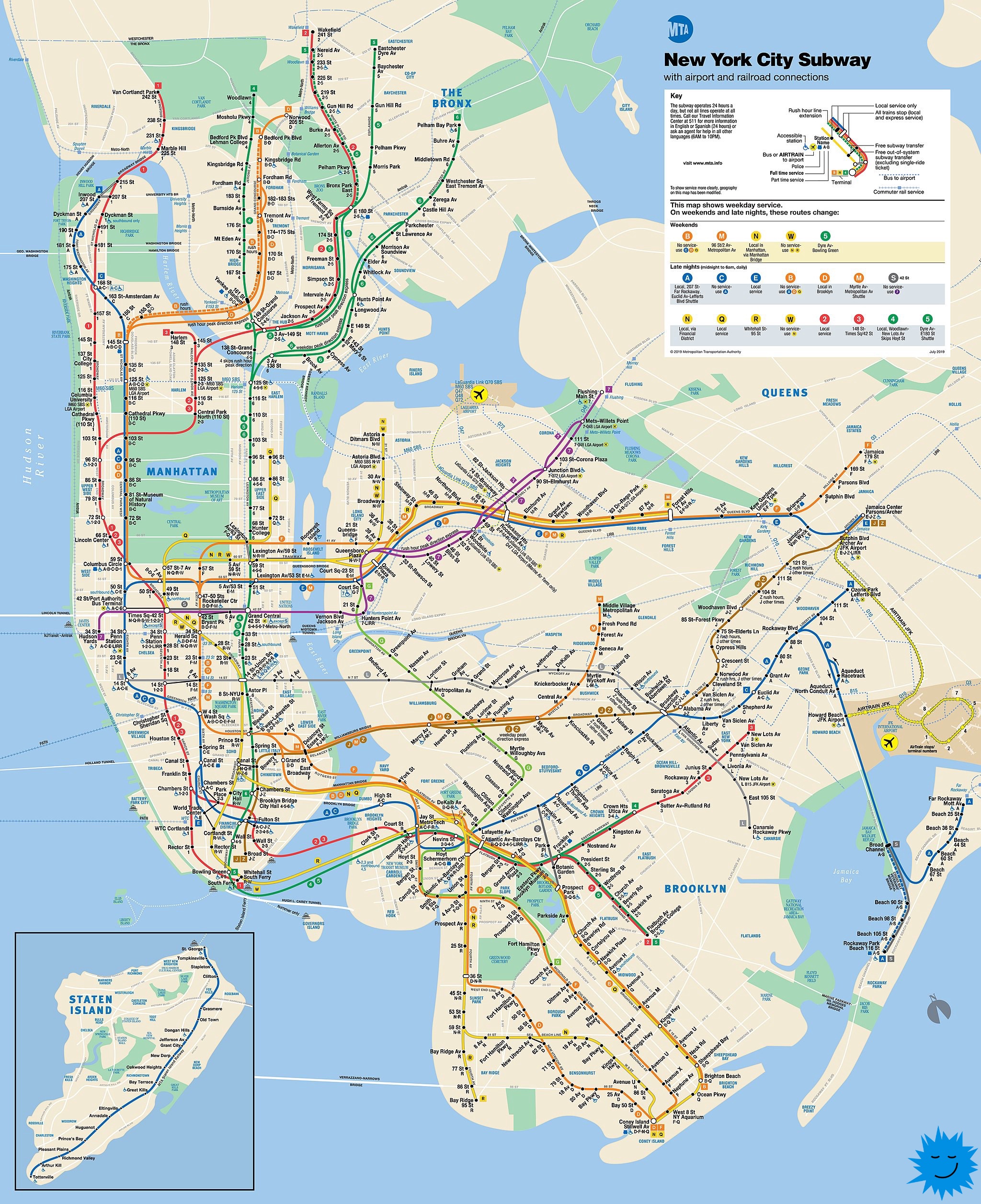
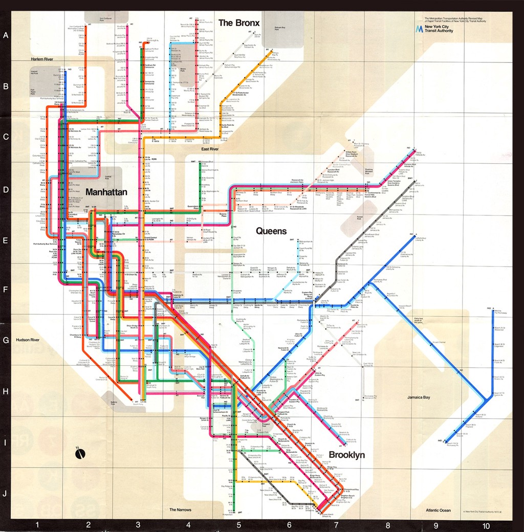
Newest New York Subway Map
When I first saw the subway map, I understood the difference. Metro maps are used all over the world, but each map has its own design. These differences depend on the people, their language, habits and the infrastructure of the city. Culture shapes the structure of many things, including subway maps. The New York City map has geographic details.
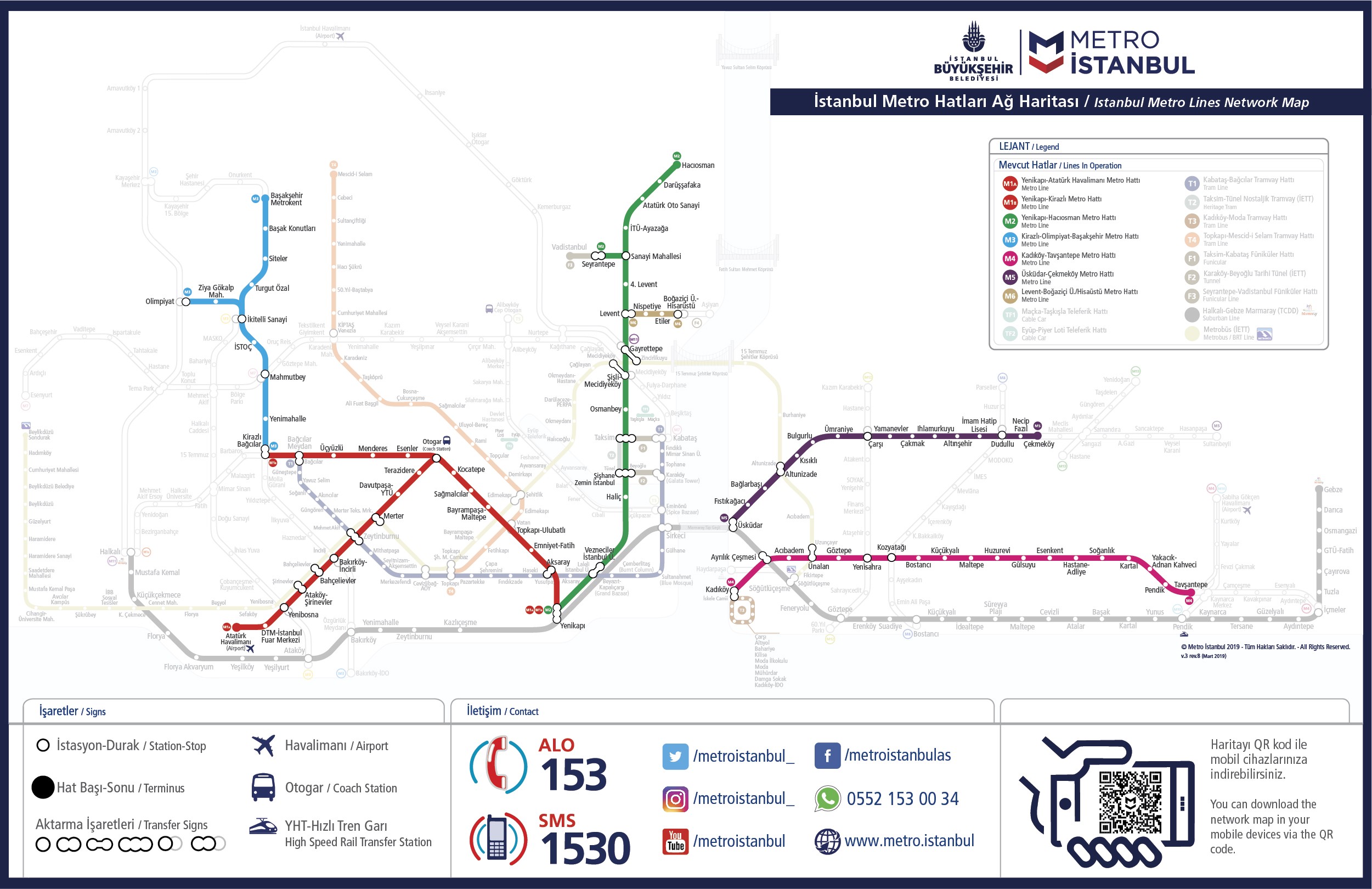
Istanbul metro map

Athens metro map
London Underground map
Has the map of one of the oldest transport systems in the world changed?
With that question in mind, I took Line F to the New York City Transportation Museum. It features a variety of subway maps, from the very first, designed in 1904, to the most recent, released in 2020. How have these maps changed over the past 116 years?
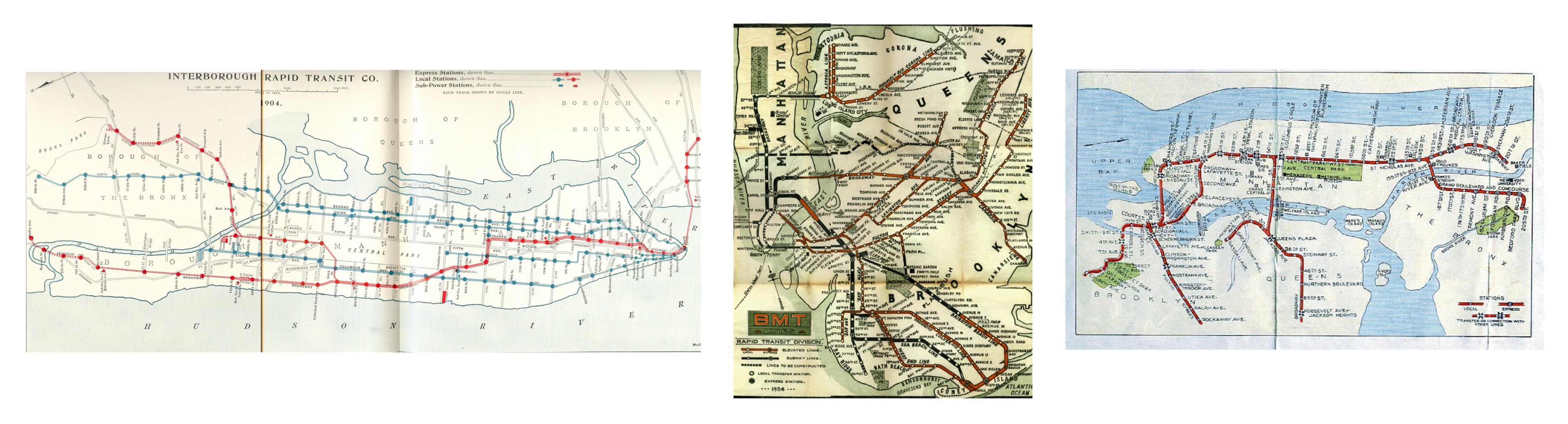
From left to right: IRT 1904, BMT 1924, IND 1939 year
Since the very first subway map, there have been many design changes. The most notable redesign was the map, created in 1972. Massimo Vignelli… Even though his map was based on previous versions, it was only used for seven years. Unlike other cards, it looked like a diagram; the metro lines were colorful and designed to be pleasing to the eye, and the stops were grouped.
New York Subway Map, Massimo Vignelli, 1972
During the short period of use of the Vignelli card, it was not popular with passengers.
Why didn’t New Yorkers like this card?
The main problem was that Vignelli’s map did not show actual distances and locations on the surface. There were other important factors that made the map seem extremely confusing:
- Shades of line colors were close to each other, so it was difficult to distinguish between them;
- The ponds were not colored blue (they were beige);
- The parks were not painted green like in real life;
- The stations were located next to each other, even if the transition between them was impossible.
That is, on paper, the metro map and the real world did not match, which was inconvenient for passengers.
In retrospect, we can conclude that the Vignelli map was used so briefly only because New Yorkers did not like it. However, with further research, one can come to the conclusion that the map did not correspond to the buildings of the city and the appearance of metro maps familiar to people. Before the release of the Vignelli map, people used maps that matched the geographic details and structure of the city. This was an old habit of New Yorkers, so they had difficulty using the chart map.
After the Vignelli map was discontinued, New York returned to the geographic map that is still used today. Michael Hertz designed and developed the map with the Underground Maps Committee, which was led by John Tauranak; Herz was instrumental in the design of the new card. He added the names of streets and attractions to it. Despite criticismto which Herz subjected the Vignelli map, he and Tauranac ended up using Vignelli’s eight-color palette.
With geographic detail, precise station locations, and more vibrant colors, the new and still used subway map is closer to what New Yorkers are accustomed to seeing in their daily lives.
How does culture affect the feel of a product?
Feel and design are equally important to a product. It can be designed in a pleasing way. But does this product meet the needs of people and does it provide the right solution?
To create products that are useful to society, it is critical to find the factors that are most significant for the user and find out how they affect him. Thus, to make the experience as pleasant as possible, it is necessary to study the everyday practices, values, rituals and opinions of users, that is, their culture.
What are the main factors affecting the map?
- New York City has a multicultural structure:
People living in New York come from a variety of socioeconomic contexts. The areas in which they live are divided according to race, ethnicity, income, immigration patterns, and various other social factors. Because of this, the residents of the city developed a close connection with their area of residence. This sense of belonging allows them to feel like they are in the city.
The map also reflects the connection that passengers have with their communities. These communities are indirectly represented on the map. This sense of belonging is reflected on Herz’s map through the names of the neighborhoods: Bronx, Chinatown, Mott Haven. All of them allow passengers not only to understand where they are going, but also to see an important part of their life on the map.
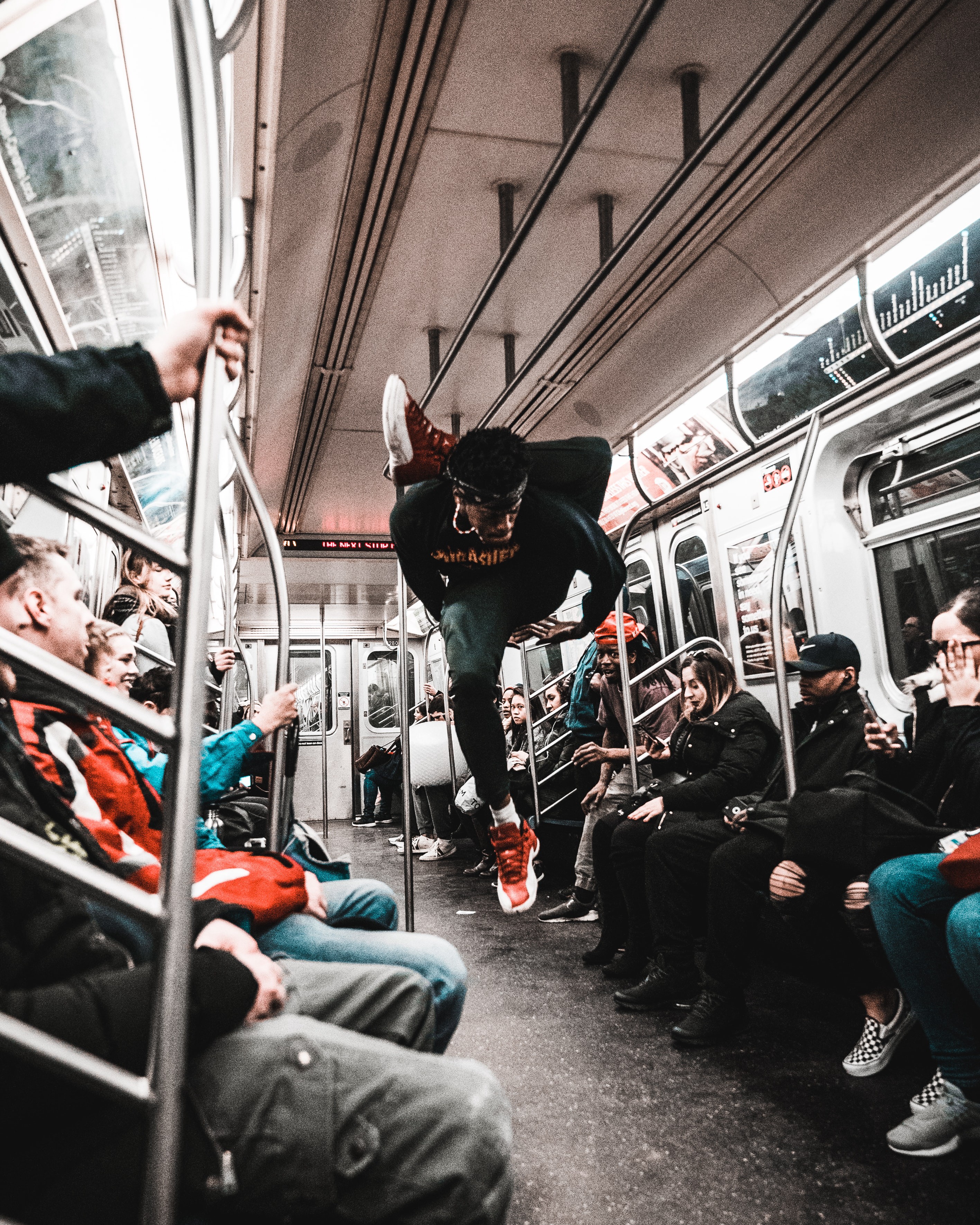
The New York Subway is a meeting place for New Yorkers with very different cultural backgrounds. It provides a kind of social environment for equality. On a trip, you can easily see celebrities like Keanu Reeves and Mariah Carey sitting across from you.
In this multicultural environment, the subway provides a shared space for socialization with the other side of the city. The metro is a stage for dancers and a refuge for those who find themselves in a difficult life situation. And sometimes it is a transport for transporting furniture, as once it was in my case.
The map allows you to represent the connections between systems, spaces and regions. The metro map is a reflection of the city, used as a tool to show the transport system and at the same time to describe the culture of the city.
2. The city has a street grid structure:
The streets of New York are lined up, and the subway is located directly below it. Subway entrances can be found on large streets such as Sixth Avenue, Eighth Avenue and Park Avenue, making them instantly landmarks. The reason for this is that the city’s economic development depended on the metro.
According to director of the transport museum Conchetta Benvivenghi, although New Yorkers use the subway, in their daily lives they are tied to elevated landmarks. There is a clear connection between the supermundane and the underworld. There are many opportunities to get from one point to another in New York. It is almost always possible to reach the destination on foot, so when passengers use public transport, they need to know exactly where they are and where they are going. This desire is probably due to the fact that in the past, the metro was distinguished by high levels of crime.

During the first six months of my life in New York, my friends often asked me if I was used to the subway. New Yorkers were surprised at the speed with which I mastered all the details of the subway. Orientation in the geography of a place is the main factor of belonging to it. New Yorkers are proud to know the location of subway stations. A local resident is ready to help another passenger, proudly telling him all the ways to get from Manhattan to Coney Island.

New York Times, 2012: “Tourists had difficulty matching their routes to the markings on the map. In the pre-Google Maps era, its artwork made travel in the womb of the city more intimidating. “
On Vignelli’s map, it looked like Columbus Circle on 59th Street was only a couple of blocks from Central Park. At first glance, lines 1, 2 and 3 represented separate stations, but this is not the case. The station of all three lines is located at the entrance to Central Park. Trains on lines 1, 2 and 3 stop at the same station as the others. This created a gap between the subway map and the real world.
If a user uses a product that does not take into account his usual practices, his way of thinking and culture, then he loses touch with reality and feels lost.
The New York City subway map is also part of these shared habits, behaviors, and meanings. It is part of the culture and these factors affect how the card is perceived. New York, like other cities, has its own unique character, and the map that describes it must be designed with that character in mind.
How to improve the user experience of the product?
If you look at the Vignelli map, it has a simple and straightforward design showing how passengers can get from point A to point B. Vignelli solved the problem of the chaos of a complex system, and his design is an iconic version of the map. But his decision does not correspond to the actual use of the map in this culture.
To improve usability, you need to know the users. To do this, you need to start by identifying and understanding your target users. Observation is the most powerful and fundamental skill for understanding society and users. This method allows researchers to identify the needs, problems, habits, expectations, reactions, behaviors and thoughts of urban culture. By taking the time to understand these factors, we will gain a deeper understanding of the natural habitat of the target users.
A quick glance at cultural factors is not enough to improve user experience. Analysis is just as important as observation itself. He helps to create product solutions that meet the needs of the user. And this leads to an understanding of how users integrate the product into their lives, an awareness of whether it will be useful, acceptable and valuable to consumers.
The New York Subway map is as famous as the city itself. The design of the card has not changed much in recent years. However, new cards, designed hoping to improve usability. There are also alternative projects designaimed at redesigning the subway map.
IN october 2020 MTA Released New Design cards, combining the best sides of the Vignelli and Hertz cards. The color scheme and features of the diagram were taken from the Vignelli map, and the landmarks and geographic map integration from the Hertz map.
In-depth analysis of cultural elements is vital to improve usability. All of these factors must be considered together. That is, we must put the user in the basis of design decisions.
Sources of
Tylor, EB (1889). Primitive culture: Researches into the development of mythology, philosophy, religion, language, art and custom… New York: H. Holt.
Norman, DA (2004). Emotional design: Why we love (or hate) everyday things… New York: Basic Books.
Norman, DA (2013). The design of everyday things… MIT Press.
Kottak, Conrad Phillip. (2013). Cultural anthropology: appreciating human diversity… New York: McGraw-Hill.
Moalosi, R., Popovic, V. & Hickling-Hudson, A. Culture-orientated product design… Int J Technol Des Educ twenty, 175-190 (2010). https://doi.org/10.1007/s10798-008-9069-1
Tejada, Soledad O., The Public and the Personal: Mapping the NYC Subway System as an Urban Memoryscape (2020). Library Map Prize. 7. https://elischolar.library.yale.edu/library_map_prize/7
https://www.nngroup.com/articles/ten-usability-heuristics/
https://www.nytimes.com/interactive/2019/12/02/nyregion/nyc-subway-map.html
https://www.oreilly.com/content/redesigning-the-new-york-city/
http://www.culturelookingsideways.com/subway-civility-intro
Advertising
Our company offers VDS for rent with Windows or Linux. We do not save on hardware – only modern equipment and some of the best data centers in Russia and the EU.
Subscribe to our chat in Telegram…