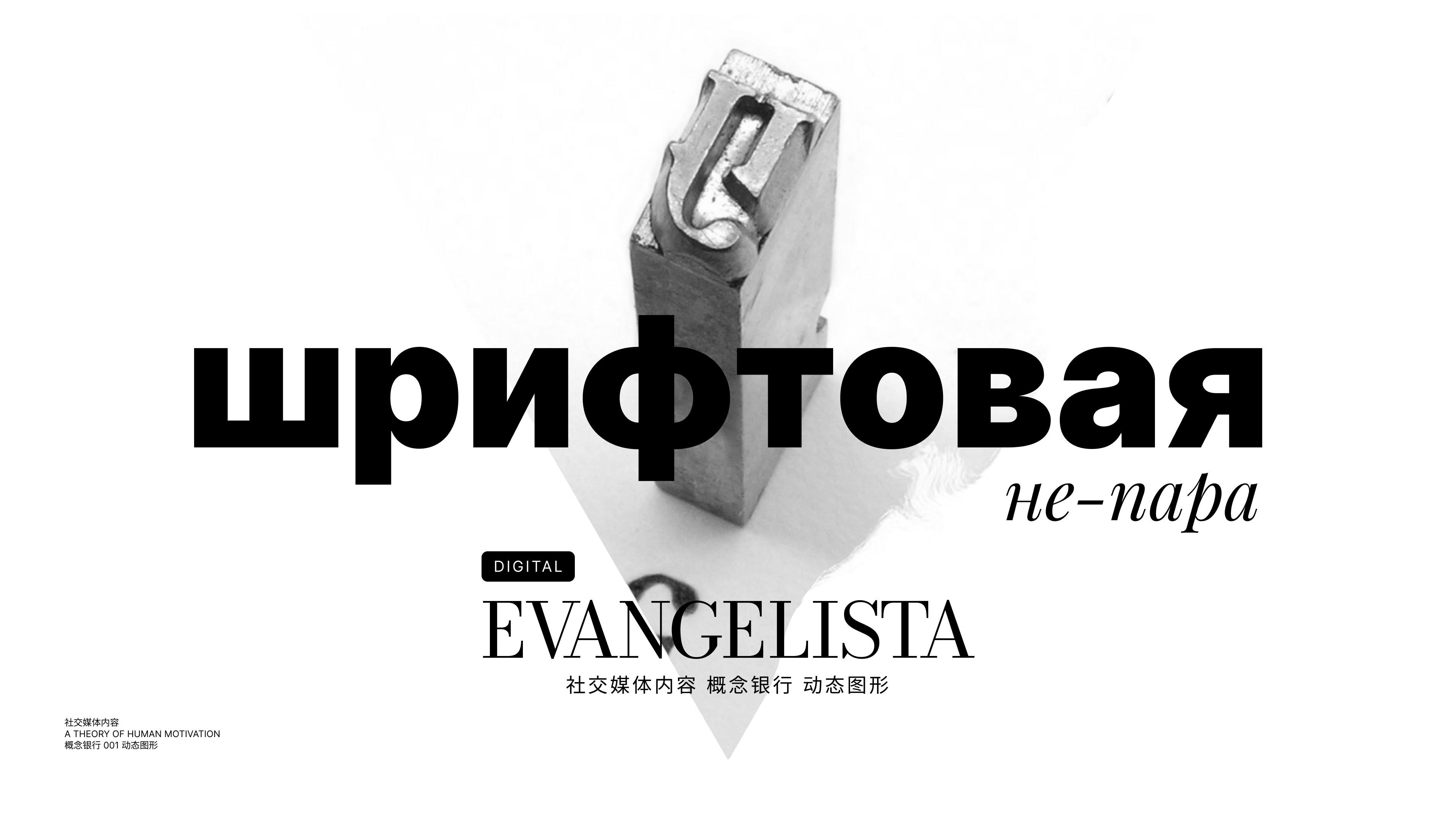
Font “non-pair”
Today there are no technical, technological, financial, neuro-aesthetic justifications for the use of such a design as a “type pair” in digital products. This artificial restriction of design thought is of an exclusively historical nature and does not contribute to the healthy development of specialists who have not found the “printing press”.
Historical parallel
The authority of Jan Tschichold in the design environment is an undeniable authority. His contribution to modern typography is not only monumental, but remains the sole embodiment of all printed and digital output. In the post-war years, a new wave of “Swiss design” has shaped the way we now see and perceive any text format: books, newspapers, websites, e-books, social networks and instant messengers. And Tschichold is rightfully the evangelist of the Futurologists.
However, a hundred years ago the problem of choosing and number of fonts was also relevant. Here are two of my favorite quotes from The New Typography:
I am bringing about a typographical revolution, directed chiefly against idiotic nauseating books, passeistic poems, with sixteenth-century paper adorned with galleys, Minervas, Apollos, capitals and monograms, mythological vegetables, epigraphs and Roman numerals. My book should be a futuristic expression of our futuristic thought. Even better: my revolution is also directed against the so-called typographical harmony, which is contrary to the ebb and flow of style that unfolds on the page. We will use three or four different colors on one page, and, if necessary, twenty different fonts.

Jan Tschichold
New typography
The reason for such revolutionary sentiments is that then, that now is a breakthrough in technology. About the current days a little later, now about history in order to understand the root causes.

It is necessary that the font is readable on an advertising billboard when we rush past it at a speed of 100 km per hour. This phrase can define the entire post-war era, and with it new trends in design and culture. Speed is faster, cities are bigger, printing is cheaper. A local revolution was made by the mass dissemination and accessibility of photography. One click of the shutter has replaced the illustrator’s watch. This compare Midjourney today.
The new world required fast advertising production tools and new means of expression. This is how the grotesque and cult Helvetica, new layout rules and printing principles appeared in the mass consciousness. Which, of course, has always been a matter of price.
The font costs money. It was almost always like that.
In the pre-digital era, a font was a set of letters carved or cast on stamps. They were assembled into words and sentences, lines into paragraphs, and those into pages. Each character size was a separate stamp. Keeping and maintaining a few of these typefaces was an expensive undertaking, as was the ability of typists to work with them.

At the dawn of the digital age, there was something similar. When GUI-enabled operating systems came along, monitor resolutions were low. At that time, all supported fonts were bitmap, which meant that each point of each letter was a separate drawing with deliberately filled pixels. There were no vector fonts, no algorithms for their rasterization, there were only filled and unfilled pixels.

Compared to turning a printing die, the cost of creating a digital type was not as significant, but the labor remained hard. Here’s what Matthew Carter, the type designer who created Tahoma and Verdana for Microsoft, has to say about those times.
Everyone wants their own Helvetica
In 2011, Google introduced the Roboto font. In 2014, Apple introduced San Francisco. In 2016, CNN featured CNN Sans. At the end of 2017, IBM introduced IBM Plex, in part because Helvetic’s annual licensing costs were a million dollars.
On the other hand, most typographic fonts remained unoptimized for display on digital screens and small size for many years. Work on the digitalization of the same Helvetica began in 2004 and ended in 2010.
The fact is that ink has the ability to spread, and until the beginning of the second decade of the 2000s, all the fonts that we used in digital were predominantly typographic. They took into account this property of liquid ink, so they had certain proportions, lettering, width and had “ink traps”. That all changed with the advent of Google fonts and digital output-only fonts.

In total, there are already restrictions on the cost and technical implementation of the fonts themselves, but that’s not all. There were also limitations of the web itself.
Just yesterday
Today, everyone is poking at touch screens, and I don’t even remember the sensations from the hypertapping technique for typing the desired character on the Nokia 3310. Exactly like the concept of “safe” fonts was forgotten.

I don’t remember the exact date of standardization of font support, because for the most part from 2008 to 2011 I was involved in Flash projects. But the Google Fonts library, launched in 2010, did its job – layout designers (another forgotten profession) stopped “cutting” non-standard fonts with JPGs. And lawyers no longer require a font license file to confirm the legality of its use on the site, since many fonts from the GoogleFonts library are distributed under the SIL Open Font License.
And in this small period of the birth of the web, between typographic-“safe”-expensive and open-digital fonts, the concept of “Font pair” was born. Then some “safe” Tahoma was used for the main text, and headings were made with accent Impackt, but with pictures.
This design is based on the principles of classical typography – focusing attention and building a hierarchy. But in print, you won’t find such artificial “steam” restrictions. To do this, just look at the cover or spread of any gloss. Even on the issue of 1949 there are 7 of them and they, all seven, perform their function perfectly.

The limited budget of a small provincial printing house for the production of newspapers in the forties is not considered an artificial limitation – it is real. But today, even digitally, we really do not have such restrictions, neither technical nor financial. However, this design continues to be replicated by leading platforms and educational projects.
Definitions
Font pairs 🌗 You can set a special mood for the site using different fonts for the title and for the body text.

Tilda
A font pair is a set of fonts that visually combine with each other and solve design problems. In pairs, they design one space — an interface, a book, an advertising banner, a brand book, a city design code. Usually the pair consists of a text and heading font. The task of the header is to attract attention, the text is to convey information.
A font pair is two fonts that are used in design to decorate texts in one space: for the title and body text on a sheet in a book or on a landing page, for an advertising call and clarification on a banner, in catalogs, posts on social networks, presentations. For corporate styles, not one font is often selected or developed, but pairs, and guidelines indicate how to work with them.
All definitions combine an example with a title and text. Excuse me, but where did the rest of the text objects go? Have you ever seen a web page or application screen consisting only of headings and texts? But what about navigation, and buttons, and CTAs, and tabs, and checkboxes, and labels, and discrepancies to input fields, and chips, etc.?
IN any interface will have more than two objects that need a hierarchy. That is why in 2013 – ten years ago. Google introduced us to Material Design as a standard for the web and android platforms. It has a hierarchical system various text objects of 13 items. In this case, only one typeface with different styles and sizes is used.

This example also refers to the concept of a “font pair”, but it is not clear what is “paired” here: there is one typeface and three styles and nine letter spacings.
Fonts in a pair can belong to different typefaces and completely differ in style, that is, they can be a contrasting pair. Or vice versa, they can be selected within the same family, maintain a single visual appearance, but differ in styles and form a similarity.
Let me remind you that MD standardization was never about designers, on the contrary, it was released for teams without strong designers in order to bring the performance of all applications on Google Play to one visually acceptable level. Those are the standard for developers. And Google believed that by reading the documentation, a conditional “programmer” would be able to master 13 text styles if they were provided with an example. Which emphasizes that it is not redundant or mega-complicated. And I believe that a designer can master more than two fonts/typefaces in one project.
Hierarchy
Unfortunately, the examples used by the adherents of “font pairs” are mainly printed format: a brochure, a cover, an article, albeit in electronic form. But what if we are talking about a full-fledged website, for example, a media platform or a streaming service, on which the content hierarchy is built not only at the level of one publication or screen, but at the level of content categories: news, announcements, long reads, promotions, articles, blog, stories, etc.
The beauty of a font is determined not by a couple or adjusted parameters of the key and weight, but by its functionality. If there is a significant task that can be solved by adding one more style, one more font, one more size, then it’s worth doing!
In your project, you can get 6 fonts and 8 styles each. The main thing is that it should be functionally justified.

A great example of this approach, when a designer thinks, and does not blindly adhere to a rule, is the Vanity Fair. When even the title and the text have two different sets of fonts, depending on whether it is a logrid or short news. Not to mention the variety of labels, markers, descriptors and buttons both on the main page and in the publications themselves.

You are free to use any number of fonts as long as there is a rationale for this decision. There are no more restrictions on this.